Hello together,
in my last post about Elasticsearch, Logstash and Kibana (ELK), I described, how to configure Kibana to observe the data from our charity platform CHARY.
In this post I want to describe the configuration of Kibana with an easier dataset: the Infant Mortitlity Rate.
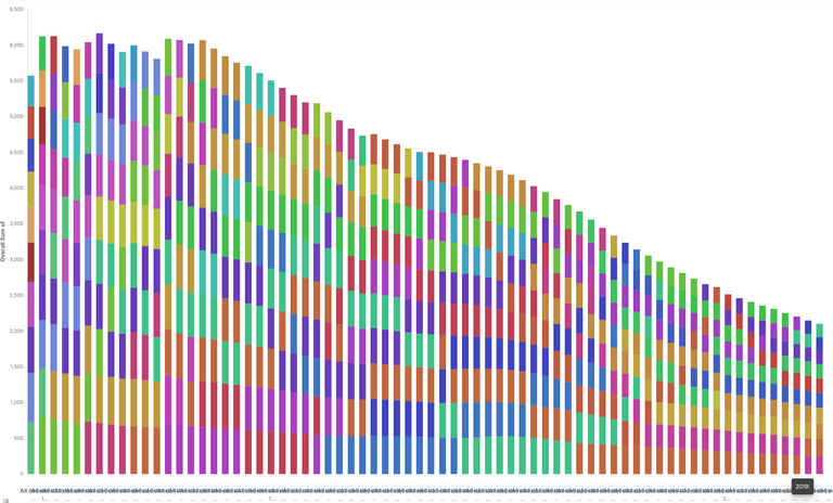
Double number of deathrate (in promille) of Children younger one year old of the top 10 countries per year
Figure 1, Details see below in "Visualization"
The Dataset
As a origin I used a website with lots of data: https://www.kaggle.com
There one can find Covid19, earthquake and lots of health data.
I downloaded this:
https://www.kaggle.com/utkarshxy/who-worldhealth-statistics-2020-complete?select=infantMortalityRate.csv
This dataset shows the number of deaths of children between 0 and 1 year in promille per year and country. Here are the top rows:
Location,Period,Indicator,Dim1,First Tooltip
Afghanistan,2019,Infant mortality rate (probability of dying between birth and age 1 per 1000 live births),Both sexes,46.51 [37.71-55.82]
Afghanistan,2019,Infant mortality rate (probability of dying between birth and age 1 per 1000 live births),Male,49.8 [40.2-59.95]
Afghanistan,2019,Infant mortality rate (probability of dying between birth and age 1 per 1000 live births),Female,43.05 [34.82-51.96]
Afghanistan,2018,Infant mortality rate (probability of dying between birth and age 1 per 1000 live births),Both sexes,48.04 [39.94-56.32]
Afghanistan,2018,Infant mortality rate (probability of dying between birth and age 1 per 1000 live births),Male,51.35 [42.56-60.4]
Afghanistan,2018,Infant mortality rate (probability of dying between birth and age 1 per 1000 live births),Female,44.56 [36.88-52.43]
...
Of course we can download it into excel and have a figure in a few seconds. But here I want to demonstrate, that ELK not only able to observe log-data, but also it can handle csv files.
The Logstash Config File
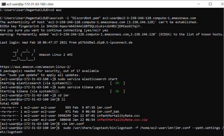
I have put this data to my ELK server on the AWS platform:
scp -i "c:/users/user/MagentaCloud/aws/Discordbot.pem" c:/users/user/downloads/infantMortalityRate.csv [email protected]:/home/ec2-user/imr
Now the trick is, to create the right logstash config file.
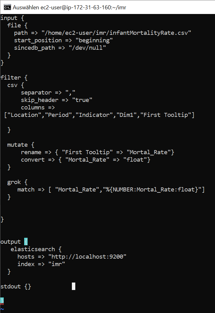
After some tries, I got this one:
input {
file {
path => "/home/ec2-user/imr/infantMortalityRate.csv"
start_position => "beginning"
sincedb_path => "/dev/null"
}
}
filter {
csv {
separator => ","
skip_header => "true"
columns =>
["Location","Period","Indicator","Dim1","First Tooltip"]
}
mutate {
rename => { "First Tooltip" => "Mortal_Rate"}
convert => { "Mortal_Rate" => "float"}
}
grok {
match => [ "Mortal_Rate","%{NUMBER:Mortal_Rate:float}"]
}
}
output {
elasticsearch {
hosts => "http://localhost:9200"
index => "imr"
}
stdout {}
My folder looks like this:
Loading The Dataset Into Logstash
Now, we can upload these data into elasticsearch via logstash:
sudo /usr/share/logstash/bin/logstash -f /home/ec2-user/imr/imr.conf --path.settings /etc/logstash
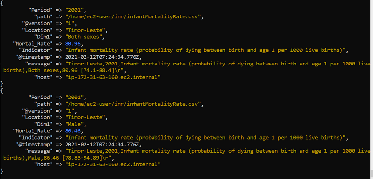
The output of logstash looks like this:
Configuring Kibana
Now we can have a look into kibana by entering the URL into a browser: http://ec2-3-238-246-128.compute-1.amazonaws.com:5601
When we click on "discover" and make sure, that we observe the last 15 minutes (the time where we uploaded the data), we can see that the data arrived in Kibana/Elasticsearch.
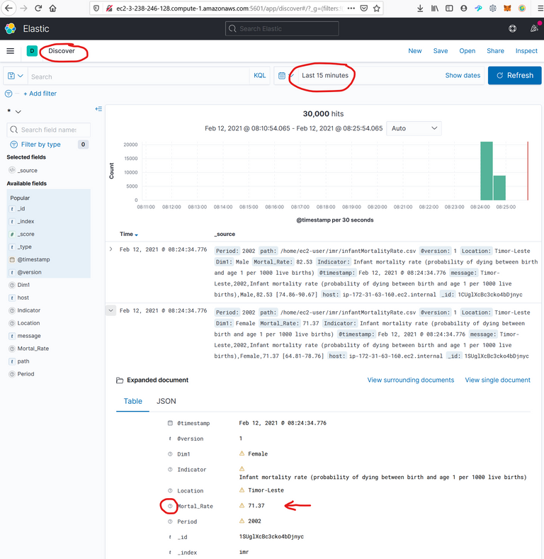
I wondered, that the mortal rate is not recognized as float. The datatype seems to be unknown, which is bad, because then, it cannot be interpreted in figures.
Index Pattern
But this is no problem, because we can create an index pattern by clicking on Home/Management/Stack Management/Index Patterns/create Index Pattern.
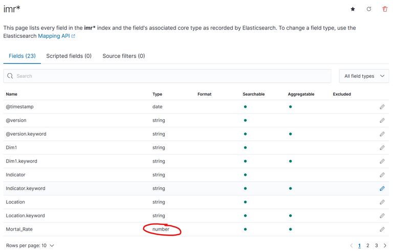
Here we can see, that "Mortal Rate" is correct recognized as a number. (We could edit it, if we want). We just need to save the index pattern, in our case with the name "imr*".
Now let's create a new
Visualization
For this click on Visualize/Create Visualization:
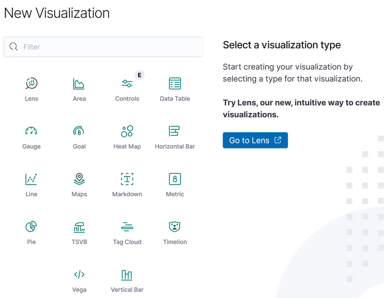
I have chosen lens, but you can experiment with whatever you want.
I also suggest to do so. Because it is not so intuitive to make a graph from your data.
Here is what I did:
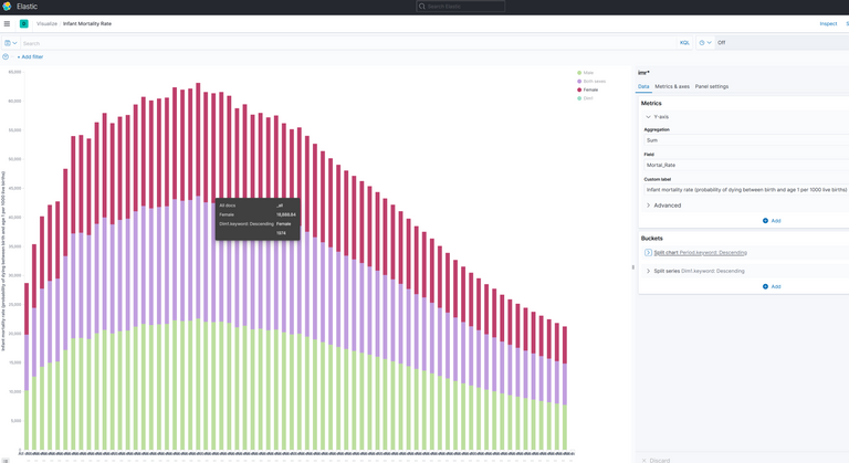
The Y-axis is the mortal rate.
The X-Axis has so called Buckets.
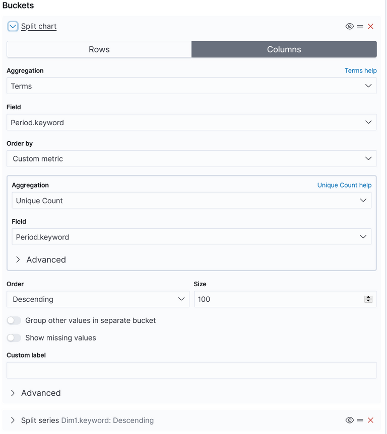
This is the splitted chart. The columns contain the years, which are found in the field "Period.keyword":
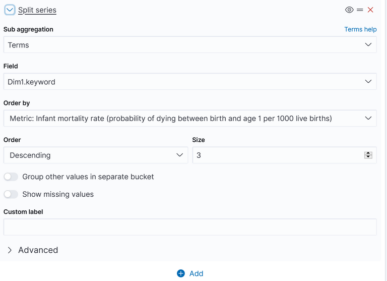
And this the splitted series:
Each column shall contain 3 values: "Male", "Female" and "Both" (Which is an average of Male and female). These values are located in the field "Dim1.keyword":
One can also create other charts (like the very first). As I mentioned, one should explore the figures. But it is always important to understand, what is shown. Here is the explaination of:
Figure 1 - top 10 poorest countries
The first figure 1 shows "Double number of deathrate (in promille) of Children younger one year old of the top 10 countries per year"
It starts in the year 1950 and ends 2019. We only count the top 10 Countries with the highes mortality rate. The most of them are in Afrika (which one could see with mouse hover over). And I counted male + femal + both (I could have prepared the dataset better, to filter out only "both"), so the number is double.
Conclusion
In our case we can see, that the worlds healthy, represented by the infant mortility rate, got really much better in the last 50 years!
I think, that's a good news, that we should be aware of, especialy in these hard Corona days.
I hope with this example, I could help to understand how ELK works.
Regards, Achim