I see nothing but simple probabilities and good search indexing.
The search results you're showing are a mix of reports from countries, states, provinces, cities, and beyond. There's 195 countries in the world. I'll immediately cut that to 100 to weed out the smallest nations and those with minimal Covid impact. If we very conservatively assume that each nation has 100 "reporting sites" (that could be local papers, state or provincial health departments, etc) then there are 10,000 reporting entities probably putting out daily updates and reports. Over the course of roughly 3 months that gives us approximately 1 million reports indexed.
As you search the reasonable number range of 1-1,000, it is highly unlikely you won't find any of those numbers in a daily report as they cover the spectrum of small to large areas and various time periods encompassing smaller or larger infection rates.
There's no evidence of any kind of information manipulation, just simple probabilities at work. The only thing a bit manipulative is the last infographic. Dated March 9th, it is now woefully outdated, representing the area I circled on the graph.
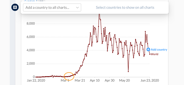
At this point Covid has climbed to the top of the chart and may yet worsen. Shutdowns and measures taken in early March simply show the prescient calls made at the time based on the best information possible. Even with current death counts, you may be able to make a reasonable argument against shutdowns and economically damaging measures, but not retiring a completely inaccurate graph when trying to make your point is just sloppy and undermining.