Hey #pinkyandspiky fans done with my characters let me know your suggestions about these characters esp the color choices. If you want to read about my character design post see this:
https://peakd.com/hive-140877/@shookt/my-other-characters-for-pinky-and-spiky-done
You are viewing a single comment's thread from:
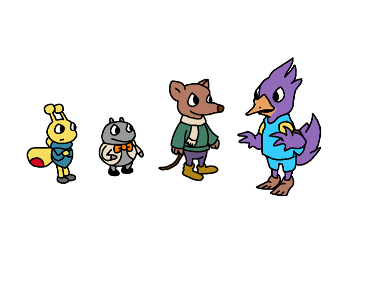
the beak of Conelius maybe more saturated then color blue basketball uniform does not work well for violet I think just my own opinion
These are interesting almost like a classic storybook feel. For the colors, I wonder if exploring some slightly softer palettes might enhance that? Like maybe a muted mustard for the bug instead of such a bright yellow? Just a thought
colors much? Betsy bug's got zero drip the gray spider giving off dad's work outfit vibes. The mouse is kinda cute tho, no cap.
Solid character silhouettes they read well individually. For comics, you'll want to think about how these colors will pop in different panels and against various backgrounds. consider shading and highlights for more depth Keep it up
Betsy: yellow/red = energy, but the muted blue feels contradictory.
Victor: gray/orange = grounded, the bow tie adds a touch of whimsy – does the color support that?
Dietrich: his colors = gentle character 👍
Cornelius: purple and blue contrasting is that aesthetic choice?
You did a great job here Nini I miss the days when I was participating in this contest glad it is back