
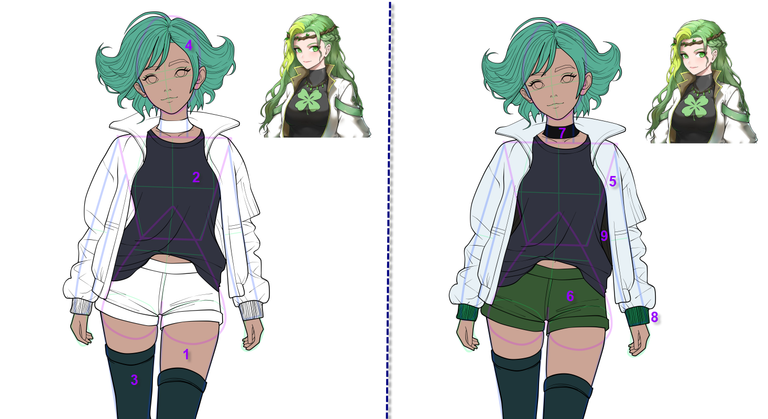
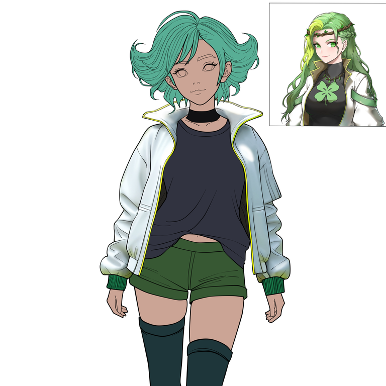
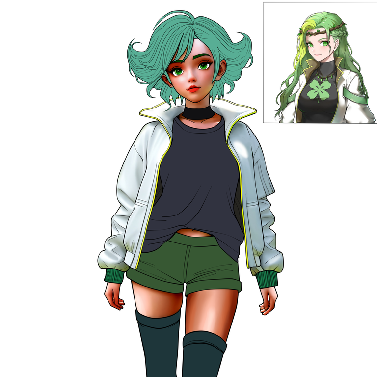
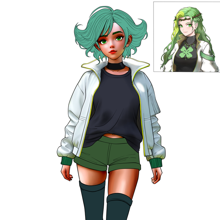
Hello all @holozing people, this time I made a fanart of the forest healer.
For this I made the work in Paint tool Sai, the truth is a huge canvas of 4000 x4000 so this time I took things calmly to paint the character.
There were times when I could only color at night and until the early hours of the morning, then sleep and try the stroke and color the next night, so it was several nights with this design until I was satisfied.
Hola gente toda de @holozing , en esta ocasión elabore un fanart de la sanadora del bosque.
para ello realice el trabajo en Paint tool Sai,la verdad es un lienzo enorme de 4000 x4000 asi que esta vez tome las cosas con calma para pintar el personaje.
Hubo momentos donde transnoche y llegada la madrugada dormir e intentar el trazo y el color en otra noche, asi que fueron varias noches hasta que quede satisfecho.
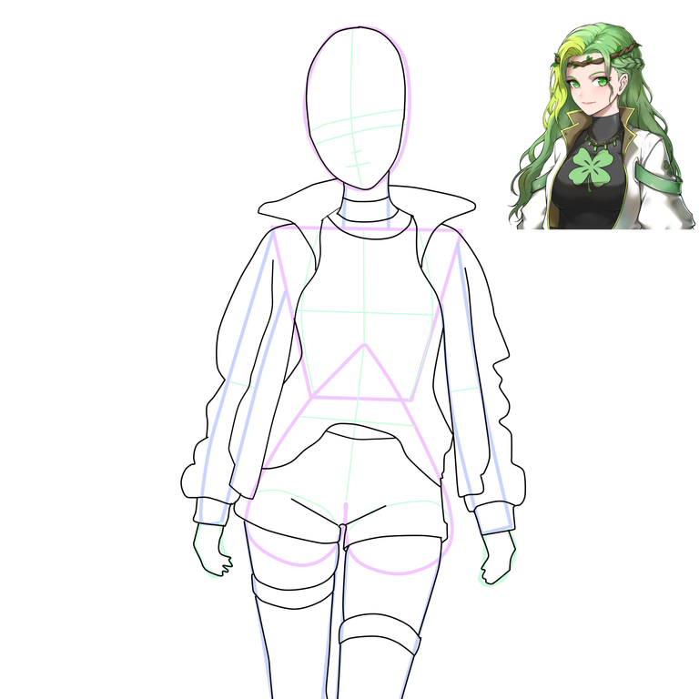
drawing stages
drawing stages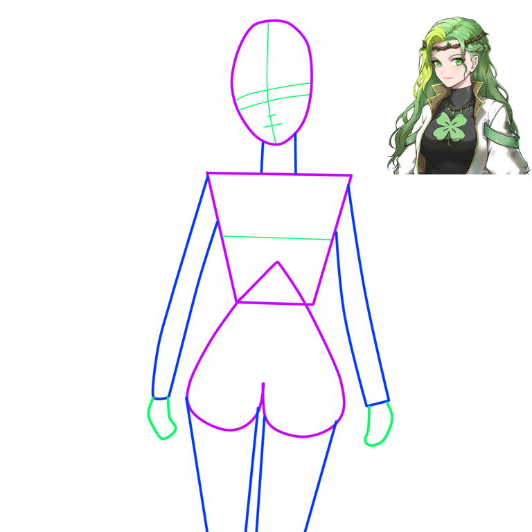
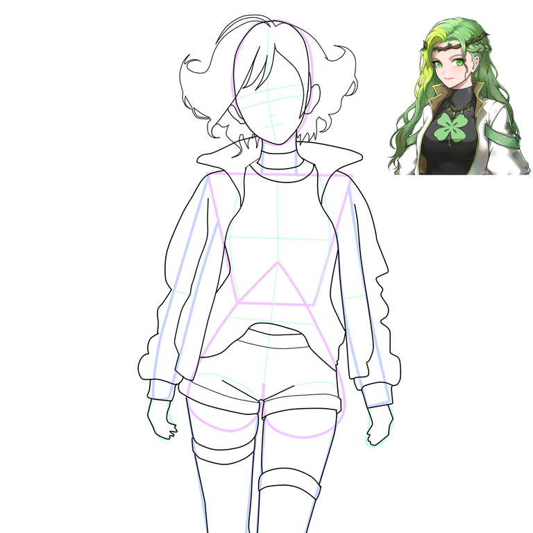
To work out the internal details I like to work on other N°2 line art separately, as it is more convenient to erase lines without destroying the outline of the whole body.
para elaborar los detalles internos me gusta trabajar en otras lineas de arte 2 por separado, pues es mas comodo a la hora de borrar lineas sin destruir el contorno del cuerpo completo.
They may appear to be somewhat thick, although with the pressing tool they can be made thinner or thicker, giving a fine point effect.
puede parecer que son lienas algo gruesas, aunque con la herramienta de presion estas se pueden volver mas delgadas o gruesas dando un efecto de punta fina
This style of retro anime drawing, although I draw in mouse with the pc the truth is that I like to have control of the lines individually, because with pen on touch screen is an infinite cycle of (draw + Z control until you have a line moderately ideal), so if you draw in Paint Tool Sai I recommend you to work with mouse based on the lineart (then edit tool and move any line as you like).
Este estilo de trazo de anime retro, aunque trazo en raton con el pc la verdad me agrada tener control de las lineas de forma individual, pues a esfero en pantalla tactil es un ciclo infinito de (estocar + control Z hasta tener una linea medianamente ideal), asi que si dibujas en Paint Tool Sai te recomiendo trabajar a base raton el lineart. (luego herramienta editar y mueves a gusto cualquier linea).
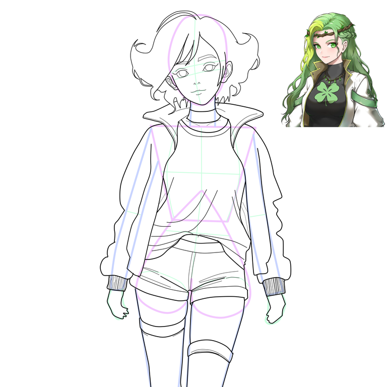
Once the concept of the character is outlined, we proceed to place the base color tones in each of the sections of the character.
You can also use the same shade of purple of the geometric figure as shadow color if you wish, although it is for anime color tones as a 2-color character, skin color and purple shadow color.
Ya perfilado el concepto del personaje, procedemos a colocar los tonos de color base en cada una de las secciones del personaje.
También puedes usar el mismo tono del morado de la figura geométrica como color sombra si a si lo deseas, aunque es para tonos de color anime como personaje a 2 colores, color piel y color sombra.
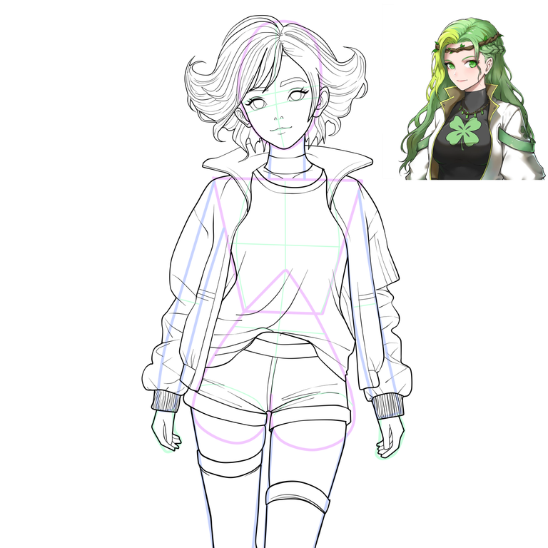
Already finished the base colors to color.
In my case I start with the light tones “as they are white to gray”, because many times if we leave them last, we can have a bad day and the blending will not come out as expected, so it is better to start when you are relaxed with parts that will be a mess later and solve that problem.
ya terminado los colores base a colorear.
En mi caso empiezo con los tonos claros "como son de blancos a grises", ya que muchas veces si los dejamos de ultimo, podemos tener un mal día y el difuminado no saldrá como esperábamos, por eso mejor empezar cuando estés relajado con partes que serán un lio mas adelante y resolver ese problema
 |  |  |  |
|---|
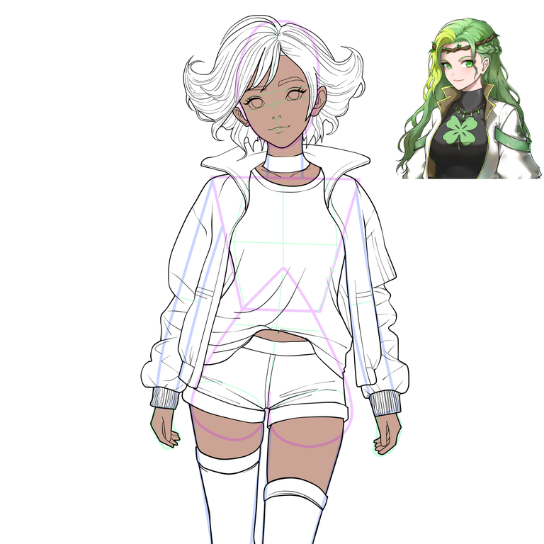
The airbrush and the blurring tool are always useful for this.
el aerógrafo y la herramienta difuminar siempre son útiles para esto.
At this point I started with the airbrush to place colors and try to give a volume effect, “although initially the character was going to be anime style with two colors”, I decided to leave the laziness and start painting something more elaborate as a canvas.
En este punto empecé con el aerógrafo colocar colores y tratar de dar un efecto de volumen, "aunque inicialmente el personaje iba a ser estilo anime a dos colores", decidi dejar la pereza y empezar a pintar algo mas elaborado como lienzo.
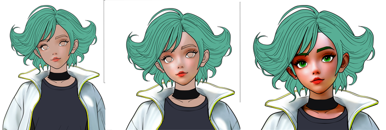
At this point (which is the face) which is where you define how easy or complicated you want the character, the best option is to create a backup SAVE N°2 in case you fail or want to modify the coloring, so don't waste time starting from scratch.
Llegado a este punto (la cual es el rostro) es donde definiras que tan facil o complicado deseas el personaje, asi que la mejor opcion es crear una SAVE N°2 de respaldo por si fallas o deseas modificar, pues no pierdas el tiempo desde cero.
After this, the details of the dark shirt, being a solid color is not as complicated as gray, since it does not matter if the color is scattered, it is still a dark garment.
Luego de esto los detalles de la camisa oscura, al ser un color solido no es tan complicado como el gris ya que solo no importa si se desparrama el color, igual es una prenda oscura
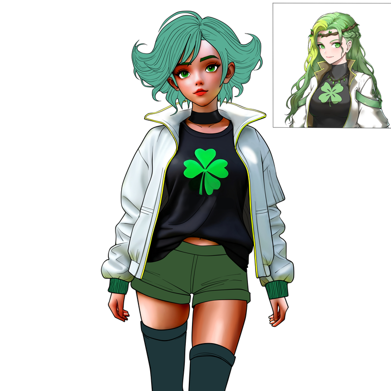
The relief effect gives volume to the drawing, as it is a central color of great intensity together with a fluorescent color such as green.
unos brillos y un trébol después el efecto de relieve da volumen al dibujo al ser un color centrar de gran intensidad junto con un color fluorescente como el verde.
The next step is to elaborate the details of the lower garment, with another line the knot of the cord was elaborated, although it is a process that seems simple, sometimes the undulations are not as you want, so you have to be patient because it is a light color piece that if or if it is going to stand out in that green dress.
el siguiente paso es elaborarlos detalles de la prenda inferior, con otra linea de arte se elaboro el nudo del cordón, aunque es un proceso que se ve simple, a veces las ondulaciones no se ven como uno desea, asi que hay que tener paciencia pues es una pieza de color clara que destacar en esa vestimenta verde.
Incidentally, we add color to the lower garment and some glitter to give relief.
de paso añadimos color a la prenda y algunos brillos para dar relieve.
I didn't want to complicate the hair on the drawing so I just put a dark color, then some glitter and a green fluorescent color.
sobre el cabello no quise complicarme tanto así que solo coloque un color oscuro , luego unos brillos y un color fluorescente verde.
Already a little tired and due to fatigue, the dark stockings did not want to be symmetrical in the gradient on both legs, so I left one stocking for one night and the other one after resting for 2 hours I took the other stocking that was missing at dawn.
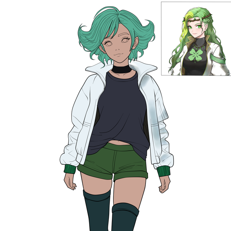
The result is the first drawing above
ya un poco cansado y por efecto de fatiga, las medias oscuras no querían salirme simétricas el degradado en ambas piernas, asi que deje una media para una noche y la otra luego de descansar 2 horas retome en la madrugara la otra media que hacia falta.
El resultado es el primer dibujo de la parte de arribael resultado es el primer dibujo de la parte de arriba

resources used
resources used
Paint Tool SAI
Windows 10
DeepL Translate


social networks

#posh
if you are interested in my art, don't forget to subscribe to my youtube channel, where I will upload sketches and other curious things.
Me encantó el degradado de la piel y los efectos del cabello. Necesito tomar más notas para lograr lo que hiciste en la chaqueta.
Uff, la chaqueta para mi fue un lio, "la empecé de primero porque se que ese color destaca mucho y si no esta difuminado bien" se notara a primer vista.
el borrador si se aplica firme se ve el recorte Blanco con bordes, toca densidad al 4% si tiene de "1 a 100 el valor", lo mismo la herramienta difuminar (mesclar colores) un 6 % de 100.
si queda muy reteñido ese gris (y no sale mesclando los colores ni a palo) tratar el color gris y negro como una capas aparte y darle (opacidad o transparencia) a cada capa a ver si asi se mesclan también.
Y si, a veces el aerógrafo no resultan las cosas bien y toca e mejor curiosear mejor por capas cada color de forma individual para controlar brillos o transparencias.
El tono flourecente es porque la chaqueta tiene una linea como cremallera que da algun reflejo.
Es mejor tratar ese verde como una capa de color aparte y no sobre el gris directo , para darle un efecto
solo las mangas de la chaqueta al inicio, el cuello y parte del cachete del rosto tienen ese fluorescente
Gracias por comentar.
Gracias por comentar...y si a veces uno planea algo simple para rendir y entregar en el fin de semana los 2 trazos de las 2 comunidades de eventos, pero colorear a veces se vuelve como una partida de billar y se alarga el juego...y se va el fin de semana y no terminas, ja, ja, ja.
Ya es Lunes