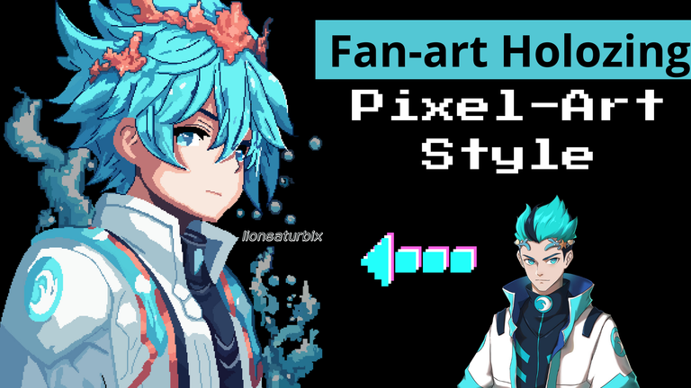
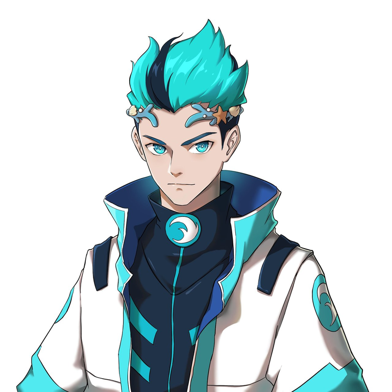
Greetings friends, art lovers and artists, welcome to my post.
This time I present you a new drawing that I made in the style that I love the most Pixel-Art, being the aquatic curator, this time I implemented new enhancement techniques to make my drawing look more amazing.
Next let's start with the step by step of this amazing drawing.
Spanish version
Saludos amigos, amantes del arte y artistas, sean todos bienvenidos a mi post.
En esta ocasión les presentó un nuevo dibujo que hice al estilo que más me encanta Pixel-Art, tratándose del curador acuático, esta vez implemente nuevas técnicas de valorizado para poder que mi dibujo se viera más asombroso.
A continuación comencemos con el paso a paso de este asombroso dibujo.

 |  |
|---|
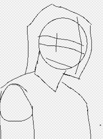
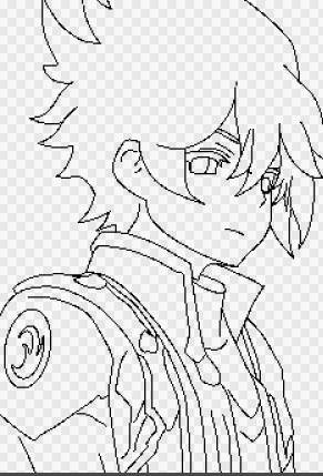
As every drawing, first we start making the base using the techniques of the sketch, they will help us to detect where each part of our drawing will go.
For the head I used a circle, for the neck a square, the same as the body, for the arm I used a circle with a rectangle, to think a little bit about the hair style, I made some marks to help me to know which is the longest and which is the shortest side.
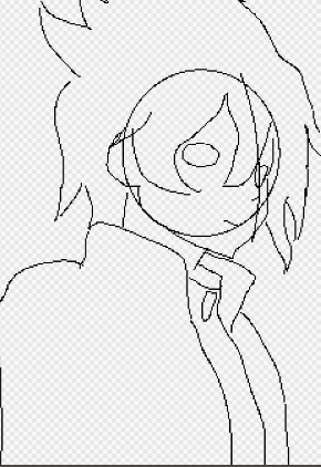
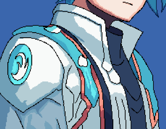
Then I started to make a little improvement in the linear to give shape to my drawing, for the clothing I wanted to make it a little similar to the original character, so I changed some things to my style.
Spanish version
Como todo dibujo, primero se comienza haciendo la base usando las técnicas del boceto, los mismos nos ayudara a detectar en donde irá cada parte de nuestro dibujo.
Para la cabeza se usa un círculo, para el cuello un cuadrado, al igual que el cuerpo, para el brazo use un círculo con un rectángulo, para pensar un poco en el estilo del cabello, hice algunas marcas que me ayudaran saber cuál es el lado más largo y cuál es el más corto.
Después comencé a hacer una pequeña mejora en el linear para ir dándole forma a mi dibujo, para la vestimenta la quería hacer un poco similar al personaje original, así que le cambie algunas cosas a mi estilo.
 |  |
|---|
Finally, in the sketch part, I continued improving some lines and I gave the last details I wanted to add to make it look stylish.
When I want to add some details, I imagine some video game characters and I create one of my own, I have always liked this style of costumes and therefore I try as much as possible to be totally satisfied with the results, I take a lot of time to do them, and as always, I try as much as possible that each drawing is better than the previous one.
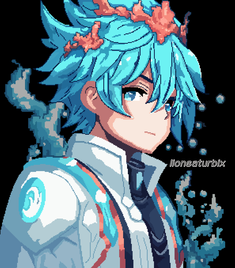
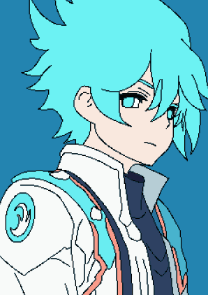
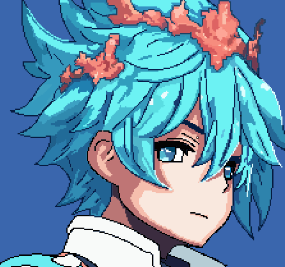
When I finished with the sketch, I began to value it, as the original character is of water element, I used colors that resemble the water element, blue hair, pale skin, ornaments of the suit of the same color of the hair, with a slightly darker tone that simulates the depths of the ocean and white by the movement of the waves when colliding with each other.
Spanish version
Por último, en la parte del boceto, continúe mejorando algunas líneas y le di los últimos detalles que quería agregarle para que tuviera estilo.
Cuando quiero agregarle algunos detalles, me imagino algunos personajes de videojuego y creo uno propio, siempre me han gustado este estilo de trajes y por ende trato en lo posible quedar totalmente satisfecho con los resultados, me tomo mucho mi tiempo en hacerlos, y como siempre, trato en lo posible que cada dibujo sea mejor que el anterior.
Al terminar con el boceto, comencé a valorizarlo, como el personaje original es de elemento agua, use colores que se asemejaran a dicho elemento, cabello azul, piel pálida, adornos del traje del mismo color del cabello, con un tono un poco más oscuro que simule las profundidades del océano y blanco por el movimiento de las olas al chocar una con otra.
 |  |
|---|
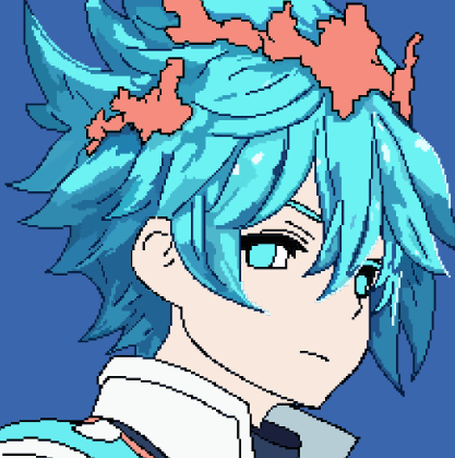
Now comes the part that for me is very interesting, according to my reference image, our aquatic curator has a kind of headband in his hair, I wanted to do the same, but this time, it's a totally coral headband, at first I wanted to add it, that's why I had previously left a small space that would serve me to do it, I wanted it to have an effect like a little more retro, since that's the style I love.
Next, I began to give shading and depth to the hair, which for me is the most complicated part of a drawing, I added each detail little by little until I had what you see in the screenshots at the top of this text.
Then I gave value to the corals and gave them their respective depths and illuminations.
Spanish version
Ahora viene la parte que para mí es muy interesante, según mi imagen de referencia, nuestro curador acuático tiene una especie de diadema en el pelo, quise hacer lo mismo, pero esta vez, es una diadema totalmente de coral, al principio lo quería agregar, por eso anteriormente había dejado un pequeño espacio que me serviría para hacerlo, quería que tuviera un efecto como un poco más retro, ya que ese es el estilo que me encanta.
Seguidamente, comencé a darle sombreado y profundidad al cabello, que para mí es la parte más complicada de un dibujo, fui agregando cada detalle poco a poco hasta tener lo que observan en las capturas en la parte superior de este texto.
Después le di valor a los corales y le di sus respectivas profundidades e iluminaciones.
 |  |
|---|
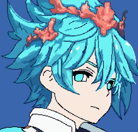
When I finished with the hair I started to give shading and lighting to the face, although it was not necessary to add the lighting because the tone of the main layer of the skin already gave that effect. The same shading has 2 different tones to add that gradient effect, which is what makes the drawing look more amazing.
Advancing a little more in the drawing, I started to deepen the parts of the suit, it was an easy part, the truth, since the lighting was in the right corner of the drawing canvas, but of course, it's an imagination that helps you to know where to add each detail.
Spanish version
Al terminar con el cabello comencé a darle sombreado e iluminación al rostro, aunque no era necesario agregarle la iluminación porque con el tono de la capa principal de la piel ya daba ese efecto. El mismo sombreado tiene 2 tonos diferentes como para agregar ese efecto de degradado, que es lo que hace que el dibujo se vea más asombroso.
Avanzando un poco más en el dibujo, comencé a profundizar las partes del traje, fue una parte fácil, la verdad, ya que la iluminación se encontraba en la esquina derecha del lienzo del dibujo, pero por supuesto, es una imaginación que te ayuda a saber donde agregar cada detalle.
 |  |
|---|
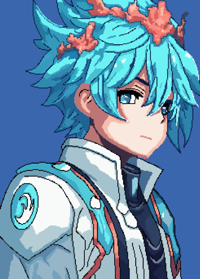
When I finished with all the structure of my drawing, I only needed two things, the first one is to eliminate those black lines that I used as a base in the drawing, to give it that touch of realism and to make the depth of the drawing stand out.
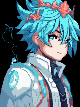
I felt that the background looked very simple, so I decided to go up a little level in my drawing, so it was time to add some extra details, this time I wanted to add some water waves, something like the Cosmos of the zodiac knights or the Ki of Dragon Ball of our character, but a little more aquatic, something that would show that it belongs to that element and these were the results.
The truth is that I love the final result, without any doubt it is one of the best drawings I have done in this style, and being that as I advance I am improving more.
Thank you very much for coming this far in my publication, I hope you like it, until next time.
Spanish version
Al finalizar con toda la estructura de mi dibujo, solamente me faltaba dos cosas, la primera es eliminar esas líneas negras que use como base en el dibujo, para darle ese toque de realismo y que la profundidad del mismo destaque.
Al hacerlo sentía que el fondo se veía muy simple, así que decidí subir un poco de nivel en mi dibujo, así que llego la hora de agregarle algunos detalles extras, esta vez quería agregar algunas ondas de agua, algo como si fuera el Cosmos de los caballeros del zodiaco o el Ki de Dragon Ball de nuestro personaje, pero que sea un poco más acuático, algo que demostrara que pertenece a ese elemento y estos fueron los resultados.
La verdad es que me encanto el resultado final, sin duda alguna es uno de los mejores dibujos que he realizado de este estilo, y siendo que a medida que avanzo voy mejorando más.
Muchas gracias por llegar hasta aquí en mi publicación, espero les sea de su agrado, hasta la próxima.


Discord
LionSaturBix#7545
Los separadores son de mi autoría, las imágenes tienen su fuente, las ediciones del GIF son creados por mí.
The separators are my authorship, the images have their source, the GIF edits are created by me.
Programas que utilicé para crear mi diseño es este:
This is the program I used to create my design:
Gif y portada cortesía de Canva
Gif and cover courtesy of Canva
Traducido por Deepl
Herramienta de dibujo, tableta digitalizadora Huion 420 black
Drawing tool, digitizing tablet Huion 420 black
Dibujo realizado en MediBan Paint Pro
Drawing made in MediBan Paint Pro
Oh wow! It is very beautiful, you are quite talented, my friend!
thanks brother, I'm glad you liked it
En lineas generales esta bien tu dibujo, pero como te dije en el pixel art anterior a este, el suavizado de las lineas debe trabajarse para darle un aspecto mas suavizado.
Y cuando se hacen estos dibujos de tan gran tamaño, en mi opinión resulta mejor usar otras técnicas de sombreado que son mas apropiadas para estos artes, tal vez con multicapas y sus filtros para lograr el efecto deseado, es una de las tantas opciones que se suelen utilizar.
Sigue mejorando mi amigo, me gusta vez como vas progresando haciendo estos pixel.
Gracias por tus consejos bro, son muy apreciados viniéndolo de usted, que tambien es amante del estilo, aun tengo muchas cosas que aprender, hace años que había descubierto mi interés por el estilo pixel, y no hace mucho lo retome una vez mas, siempre trato de hacerlo mejor que el anterior, gracias nuevamente por tus consejos y tratare de ponerlos en practica la próxima vez.
La cuestión del tamaño del lienzo es algo que toma mucho su tiempo y me gusta destacar mucho cada detalle, ya que los dibujos pequeños siempre me han costado hacerlos aunque suene loco.