Hello Splinterlandians,
today there is a new edition of my blog series "Flummis Thoughts". As always, I'll be discussing a wide variety of topics and recording my thoughts and opinions on them as compactly as possible. Possible topics can be anything related to Splinterlands: changes in the game, analysis of cards, current problems and much more. The blogs will be published at irregular intervals, depending on whether I think I have something to say about a topic and how I find the time.
It's been a while, but today it's about the fact that the “Battle” tab of Splinterlands has been modernized and we got a new UI. This was announced in the Release Notes from 04/16/2024, which are also regularly shared on Discord. This means that we have not only received a new interface for the desktop version, but also for the mobile version. Whether these changes are practicable or not and how I like them will be discussed in more detail below.
Have fun reading!
Desktop
Battle Tab Overview:
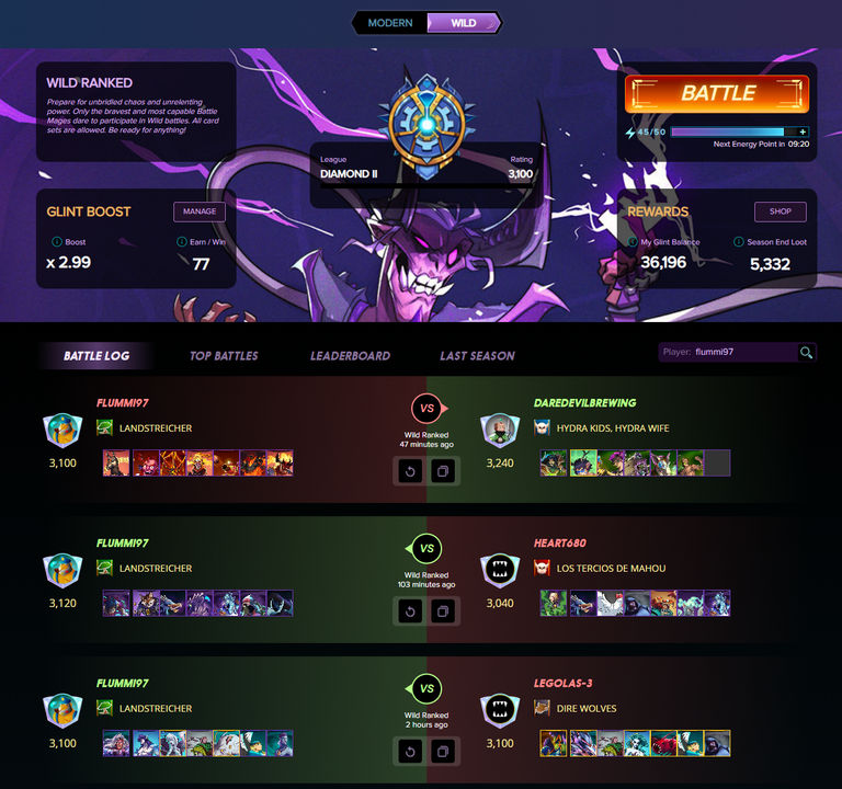
This is what the new UI in the Battle Tab looks like after the change. I think it's very well done and it looks really modern. You can immediately recognize victories or defeats in the battle overview and can also see the rating, glint balance, end of season reward and the remaining energy. I also really like the new square pictures of the monsters and summoners used. And last but not least, I think it's great that you now have to click in the middle for the replay and can also see the rewards when you move the mouse over it. I think the changes here are very good and I got used to them very quickly.
Team Composition:
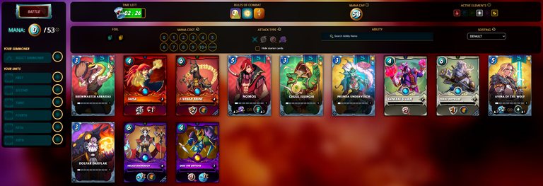
In the next picture you can see the overview in a battle when you put together your team. The middle bar, where you can edit the filters for your monsters, has been changed and now looks more modern. The same applies to the left bar, where you can see the monsters already in the line-up. Thanks to a new animation, you can now change the positions of your selected monsters really smoothly. There have been minor changes here, but in my opinion they have a positive effect.
Mobile
Battle Tab Overview:

Generally speaking, it can be said that the desktop UI is largely adopted for the mobile UI. This was also the aim of the developers, as it makes it easy to design an app that uses the Splinterlands website. On the right you can see the new overview in the battle tab, but in my opinion there is a small problem here. The Splinterlands battle tab simply has too much information for a mobile version and you have to scroll down for quite a while before you get to the battle overview. Personally, this doesn't bother me much, but I don't think it's particularly appealing to new players. On the other hand, it has to be said that you have all the same information as with the desktop version, so there is no disadvantage to using the mobile version. That is of course also an advantage. Ultimately, I still think the change to the mobile version is good, the old UI was simply no longer up to date. And yet perhaps one or two changes could have been made compared to the desktop version.
Team Composition:
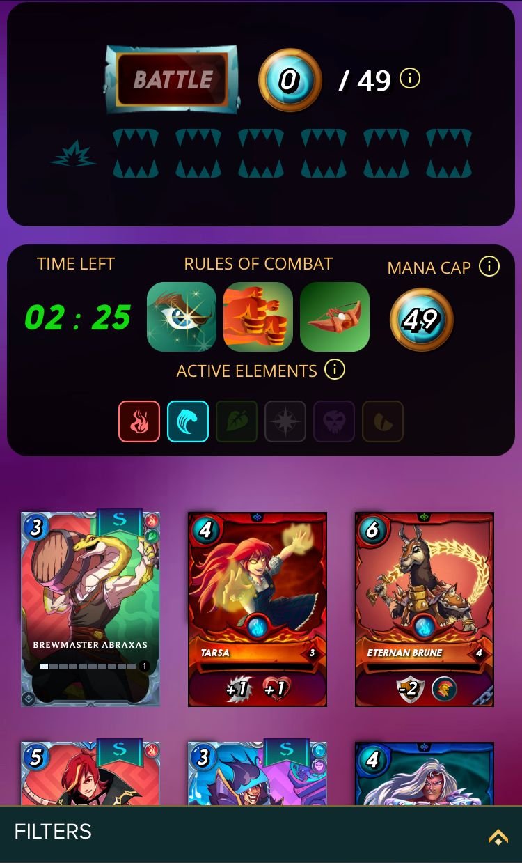
Compared to the desktop version, a few things have changed in the overview where you put together your team. The filters in particular are very different here and that's a good thing. Otherwise, putting together a team would be very difficult, as the filters would take up the whole screen. So you unfold the filters, select what you need and then unfold the filter tab again. This is an elegant solution, but the entries are not always applied directly, so you sometimes have to be a little patient. I also like the fact that you can now easily change the positions of the monsters you have already selected, even if it is sometimes very tiring to hit the right monsters on the small cell phone screen. Compared to the old UI, I find this one much more pleasant and, above all, more user-friendly.
Conclusion
Overall, I find the new UI very refreshing and also more user-friendly than the previous one. I particularly like the desktop version and the mobile version has also received some changes, so I think Splinterlands is playable again here. Nevertheless, in my opinion, the focus should be more on a nice app.
What do you think of the changes? Have you already gotten used to the new UI?
Thanks for reading this far and have a good time!
Hallo Splinterlandians,
heute gibt es eine neue Ausgabe meiner Blog Reihe "Flummis Thoughts" (dt.: "Flummis Gedanken"). Hier werde ich wie immer die verschiedensten Themen besprechen und dazu möglichst kompakt meine Gedanken und Meinung festhalten. Mögliche Themen können alles mögliche rund um Splinterlands sein: Änderungen im Spiel, Analysen von Karten, aktuelle Probleme und vieles mehr. Die Blogs werden in unregelmäßigen Abständen veröffentlicht, je nachdem ob ich denke etwas zu einem Thema sagen zu können und wie ich dafür Zeit finde.
Es ist zwar schon etwas her, aber heute soll es darum gehen, dass der "Battle" Tab von Splinterlands modernisiert wurde und wir ein neues UI erhalten haben. Ankündigt wurde dies in den Release Notes vom 16.04.2024, die auch regelmäßig auf Discord geteilt werden. Damit haben wir nicht nur bei der Desktop Variante ein neues Interface bekommen, sondern auch bei der Mobile Variante. Ob diese Änderungen praktikabel sind oder nicht und wie sie mir gefallen möchte im folgenden näher darauf eingehen.
Viel Spaß beim Lesen!
Desktop
Battle Tab Übersicht:
So sieht das neue UI im Battle Tab nach der Änderung aus. Wie ich finde ist es sehr gelungen und es sieht richtig modern aus. Man erkennt sofort Siege bzw. Niederlagen in der Battle Übersicht und kann auch das Rating, Glint Guthaben bzw. End of Season Rewards und die verbleidende Energie erkennen. Auch die neuen viereckigen Bilder der eingesetzten Monster und Summoner finde ich sehr gut. Und zu guter Letzt finde ich es toll, dass man das Replay jetzt in der Mitte anklicken muss und hier auch die Rewards erkennen kann, wenn man mit der Maus drüber fährt. Hier finde ich die Änderungen deswegen sehr gut und ich habe mich auch sehr schnell daran gewöhnt.
Teamzusammenstellung:
Im nächsten Bild sieht man die Übersicht in einem Battle, wenn man sein Team zusammen stellt. Die mittlere Leiste, bei der man die Filter für seine Monster überarbeiten kann, wurde verändert und sieht jetzt moderner aus. Selbes gilt für die linke Leiste, bei der man die bereits in der Aufstellung befindlichen Monster sieht. Hier kann man jetzt dank einer neuen Animation richtig smooth die Positionen seiner bereits ausgewählten Monster verändern. Hier gab es daher eher kleinere Änderungen, welche sich aber meiner Meinung nach positiv auswirken.
Mobile
Battle Tab Übersicht:
Im großen und ganzen kann man sagen, dass das Desktop UI weitestgehend für das Mobile UI übernommen wird. Das war ja auch das Ziel der Entwickler, da man so einfach eine App gestalten kann, die auf die Webseite von Splinterlands zurückgreift. Rechts sehen wir die neue Übersicht im Battle Tab, allerdings tut sich hier meiner Meinung nach ein kleines Problem auf. Für eine Mobile Version hat der Splinterlands Battle Tab einfach zu viele Informationen und man muss erst mal eine ganze Weile nach unten scrollen, bis man zur Battle Übersicht gelangt. Mich persönlich stört das wenig, allerdings denke ich, dass so etwas für neue Spieler nicht besonders ansprechend ist. Andererseits muss man auch sagen, dass man alle Informationen hat wie bei der Desktop Variante und somit keinen Nachteil hat die Mobile Variante zu benutzen. Das ist natürlich auch ein Vorteil. Letztendlich finde ich die Änderung an der Mobile Variante trotzdem gut, das alte UI war einfach nicht mehr zeitgemäß. Und doch hätte man vielleicht die ein oder andere Änderung im Vergleich zur Desktop Variante vornehmen können.
Teamzusammenstellung:
Bei der Übersicht, in der man sein Team zusammenstellt, hat man im Vergleich zur Desktop Variante, einige Dinge verändert. Vor allem die Filter unterscheiden sich hier deutlich und das ist auch gut so. Den ansonsten wäre die Teamzusammenstellung sehr schwer, da die Filter den ganzen Bildschirm einnehmen würden. So klappt man die Filter aus, sucht sich heraus was man braucht, und dann klappt man den Filter Tab wieder runter. Das ist eine elegante Lösung, allerdings werden die Eingaben hier nicht immer direkt übernommen, sodass man manchmal etwas geduldig sein muss. Auch gut finde ich, dass man jetzt einfach die Positionen seiner bereits ausgewählten Monster verändern kann, auch wenn es manchmal sehr anstrengend ist die richtigen Monster auf dem kleinen Handybildschirmen zu treffen. Im Vergleich zum alten UI finde ich dieses hier aber insgesamt viel angenehmer und vor allem benutzerfreundlicher.
Fazit
Insgesamt finde ich das neue UI sehr erfrischend und auch benutzerfreundlicher als das vorherige. Vor allem die Desktop Variante finde ich gelungen und auch die Mobile Variante hat einige Änderungen erhalten, sodass ich Splinterlands hier wieder für spielbar empfinde. Trotzdem sollte man sich meiner Meinung nach mehr auf eine schöne App fokussieren.
Wie findet ihr die Änderungen? Habt ihr euch bereits an das neue UI gewöhnt?
Vielen Danke fürs Lesen bis hierhin und ich wünsche euch eine gute Zeit!
Why I'm blogging about Splinterlands?
I want to increase the growth of my Splinterlands account with the rewards of blogging about my experiences, tactics and much more on Splinterlands.
Not playing Splinterlands yet?
You can use my link to sign in. Write me a message or a comment under this post and I will help you to start!
Congratulations @flummi97! You have completed the following achievement on the Hive blockchain And have been rewarded with New badge(s)
Your next target is to reach 900 replies.
Your next target is to reach 7000 comments.
You can view your badges on your board and compare yourself to others in the Ranking
If you no longer want to receive notifications, reply to this comment with the word
STOPCheck out our last posts:
Are you looking for Tier 5 brawl guild? THE GUILD OF NEOXIAN looking for wild silver fray player. If you are good in that fray and interested to join then contact with our Guild Officer
xawi& Also Don't Forgot to Checkout our BDVoter Daily Hive Showcase & Participate into our Daily giveaway to win various prize.Thanks for sharing! - @yonilkar
