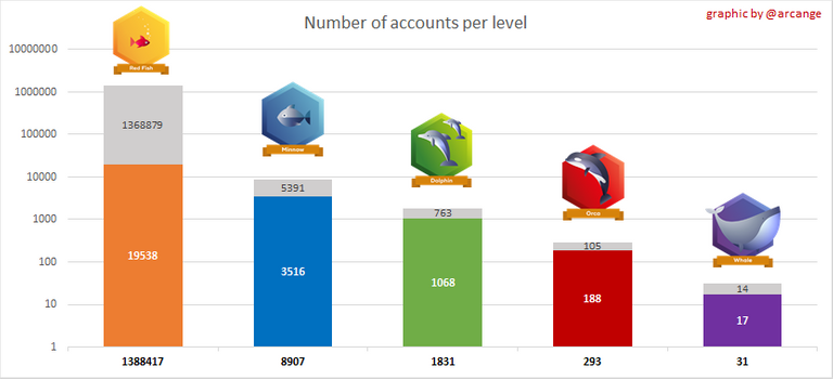
Does this graph look better to you? I simply inverted actives/inactives. While not perfect, because it still uses the log10 scale, I think it's a bit less confusing...
Does this graph look better to you? I simply inverted actives/inactives. While not perfect, because it still uses the log10 scale, I think it's a bit less confusing...