Como sabes, soy diseñador, tengo ya varios años en esto de manera empírica, cosa no suelo mencionar porque al parecer desacredita mi trabajo frente a diseñadores que solo tienen un titulo pero no experiencia.
Como diseñador me he enfrentado a muchas situaciones difíciles, situaciones que he superado a veces bien y a veces mal, pero de todo queda la experiencia.
Aqui esta vez, vengo a presentar un pequeño rebranding de este evento, que también se presenta en el lugar que habito desde hace mucho tiempo y que eventualmente apoye con otros recursos.
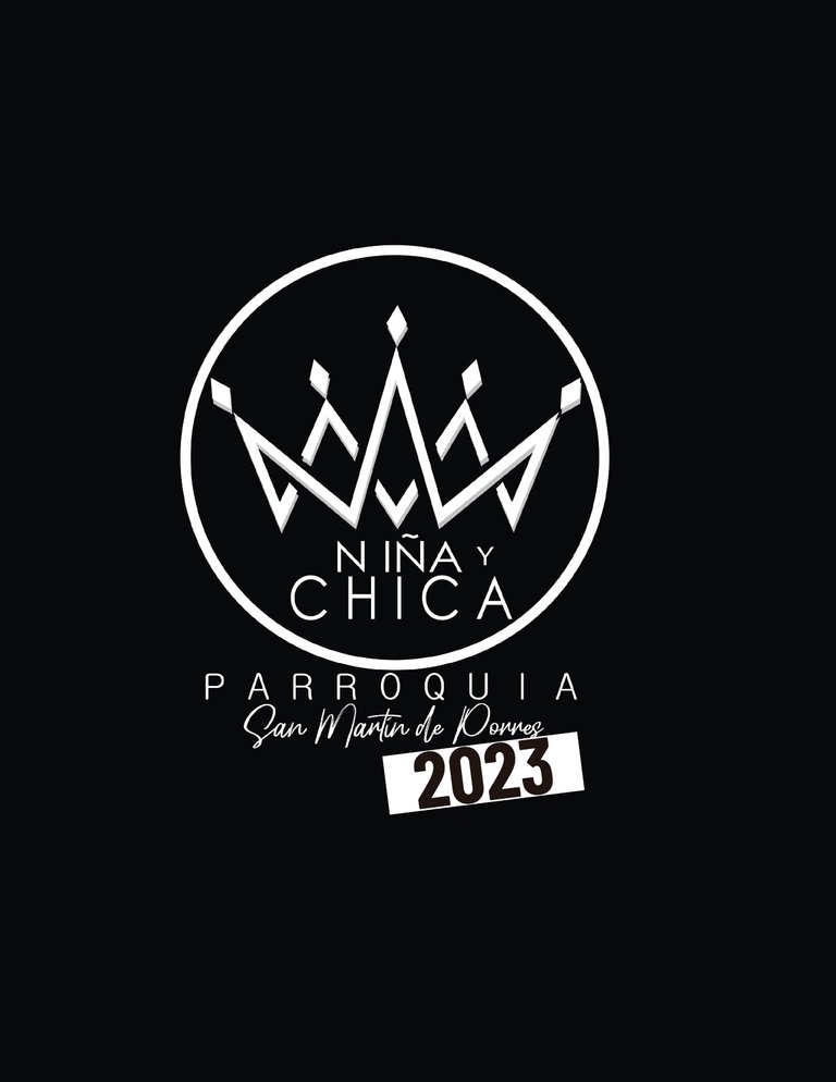
Esto que ves arriba es la imagen que tenían actualmente para el evento, lo que se concebía como logo y nada más. ¿Una solución funcional? Tal vez, dado a que no cuentan con apoyo desde el diseño gráfico, pero que se justifica bajo la optica del venezolano promedio (Nuestra economía no funciona lo suficiente como para pensar en pagar los servicios de un diseñador gráfico); sin embargo, para esto estoy yo, que apoyo este tipo de eventos desde tiempos inmemoriales con diseños que sus inicios fueron menos funcional que el que aqui muestro.
Cabe destacar que este diseño según me comentan, nace de una situación un poco intensa en la que intentaron hacer algo bueno para el evento sin tiempo para trabajarlo. La persona que lo realizo, si bien cuenta con el conocimiento para hacerlo, no contó con el tiempo para ejecutar todo lo que lleva hacer un branding inicialmente.
Bueno, teniendo todo esto en mente, partimos en la labor de corregir todo lo corregible de este evento.
As you know, I am a designer, I have been doing this for several years empirically, something I don't usually mention because apparently it discredits my work compared to designers who only have a degree but no experience.
As a designer I have faced many difficult situations, situations that I have overcome sometimes well and sometimes poorly, but the experience remains.
Here this time, I come to present a small rebranding of this event, which is also presented in the place that I have lived in for a long time and that I eventually support with other resources.
What you see above is the image they currently had for the event, which was conceived as a logo and nothing more. A functional solution? Perhaps, given that they do not have support from graphic design, but that is justified from the perspective of the average Venezuelan (Our economy does not work well enough to think about paying for the services of a graphic designer); However, this is what I am here for, as I have supported this type of events since time immemorial with designs that at the beginning were less functional than the one I show here.
It should be noted that this design, as they tell me, was born from a somewhat intense situation in which they tried to do something good for the event without time to work on it. The person who did it, although he has the knowledge to do it, did not have the time to execute everything it takes to do branding initially.
Well, with all this in mind, we set out to correct everything that can be corrected about this event.
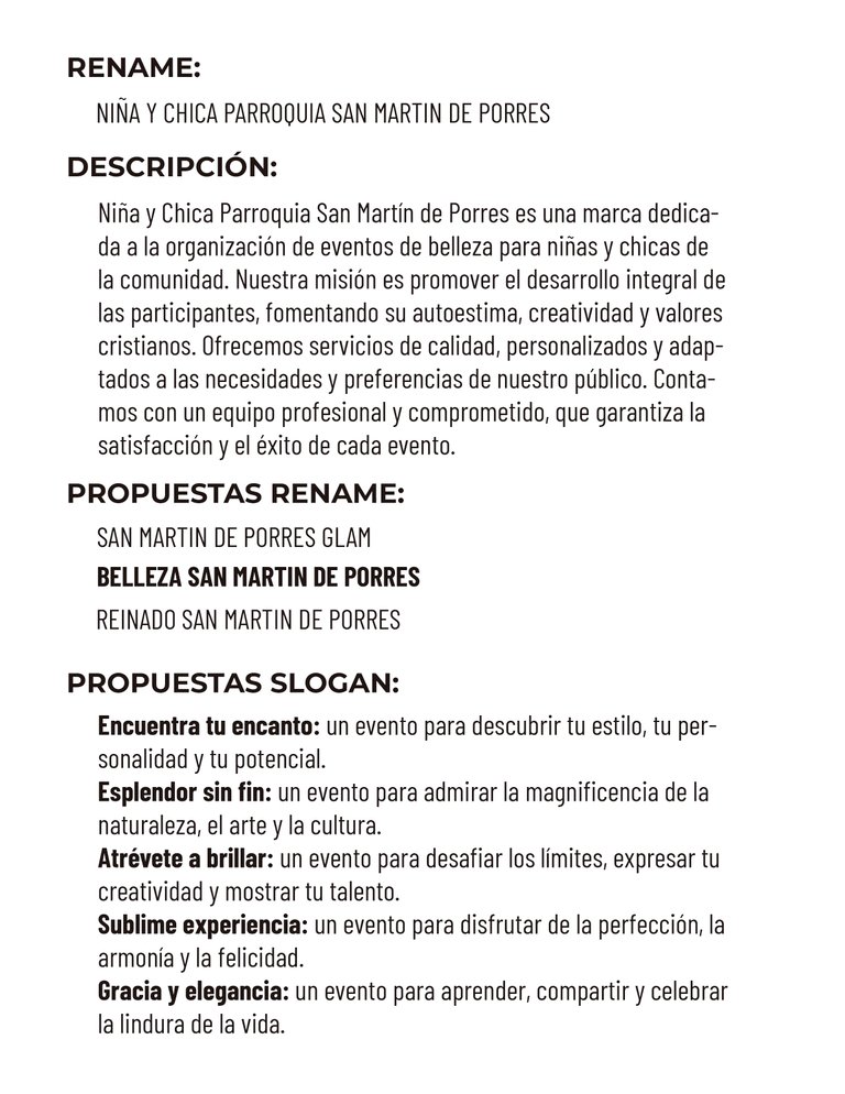
Comenzando por el nombre del mismo, "Niña y chica Parroquia San Martin de Porres" es un nombre muy largo, que no transmite nada de dinamismo, todo lo contrario, suena a trámite gubernamental. Asi que se realizaron 3 propuestas de las que decidí tomar la más interesante según mi experiencia. Para lograrlo primero realizamos una descripción del evento en sí y de ello partimos a la formulacion de los posibles nombres. Una vez elegido el nombre, pasamos a elegir un asunto no menor pero que decidi dejar a los organizadores elegir, el SLOGAN.
Starting with its name, "Niña y chica Parroquia San Martin de Porres" is a very long name, which does not convey any dynamism, on the contrary, it sounds like a government procedure. So 3 proposals were made, of which I decided to take the most interesting one according to my experience. To achieve this, we first make a description of the event itself and from this we begin to formulate the possible names. Once the name was chosen, we moved on to choose a no small matter but one that I decided to let the organizers choose, the SLOGAN.
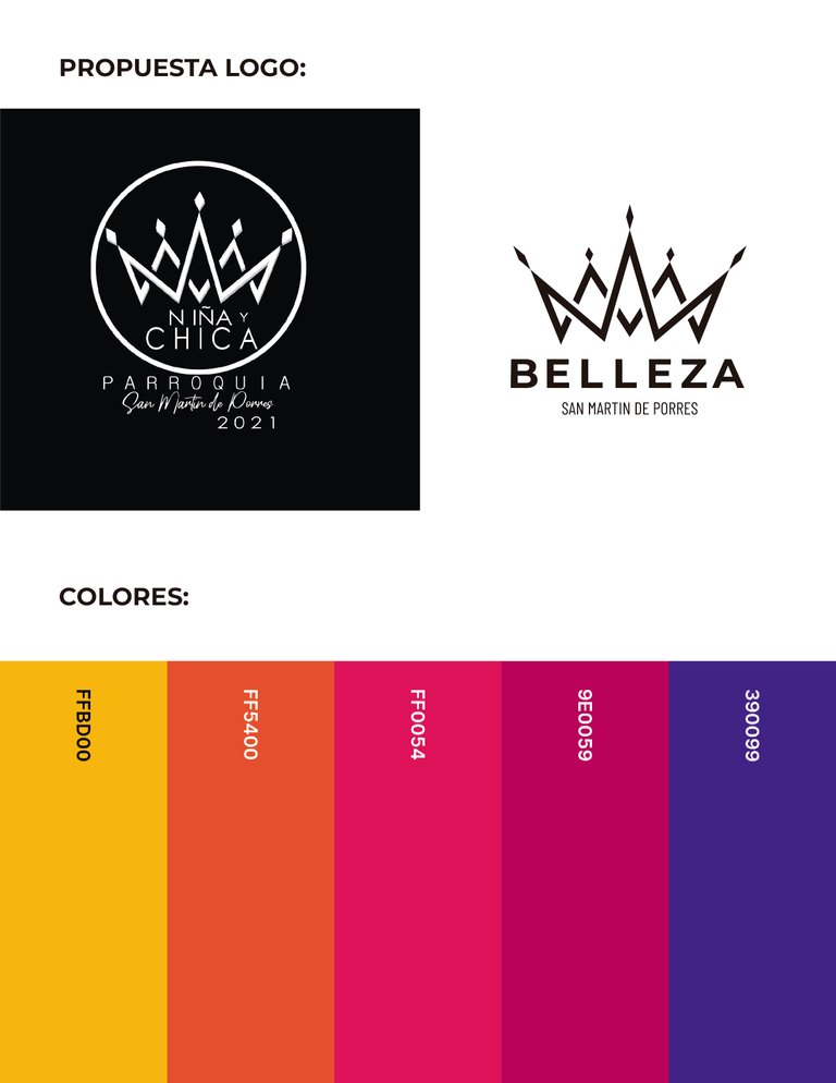
Una vez definidos estos detalles, presentamos los cambios. Unas de las condiciones de este Rebranding, era que debía utilizar el mismo logo, solo mejorarlo, ya que creen haber conseguido el icono que quieren que los represente por unos cuantos años.
Con esto en mente, presento esto, el mismo icono, pero con las correcciones que necesitaba, todo debidamente justificado y limpiamente presentado, junto a la paleta de colores que decidí anteriormente con los organizadores.
Once these details are defined, we present the changes. One of the conditions of this Rebranding was that they had to use the same logo, only improve it, since they believe they have achieved the icon that they want to represent them for a few years.
With this in mind, I present this, the same icon, but with the corrections it needed, all properly justified and cleanly presented, along with the color palette I decided on earlier with the organizers.
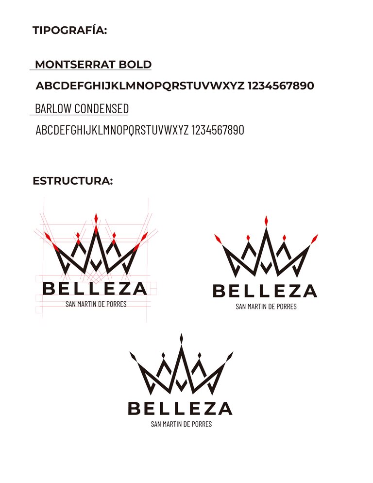
Para comprender el cambio en el icono debemos partir por la selección de tipografía, crucial para transmitir adecuadamente la personalidad del evento. Las tipografías, son capaces de transmitir emociones tal como los colores, por eso es crucial una buena elección de tipografías.
Monterrat Bold: Seriedad, elegancia y fortaleza.
Barlow Condensed: Elegancia, sutileza y delicadez.
Amas tipografías, transmiten lo que el evento es.
Lo siguiente es la justificación del icono, definiendo sus trazos de forma limpia, adecuando los tamaños y grosores de cada parte del mismo.
To understand the change in the icon we must start with the selection of typography, crucial to adequately convey the personality of the event. Fonts are capable of transmitting emotions just like colors, which is why a good choice of fonts is crucial.
Monterrat Bold: Seriousness, elegance and strength.
Barlow Condensed: Elegance, subtlety and delicacy.
You love fonts, they convey what the event is.
The following is the justification of the icon, defining its lines in a clean way, adapting the sizes and thicknesses of each part of it.
Lo siguiente en este proceso es la colorización del logo.
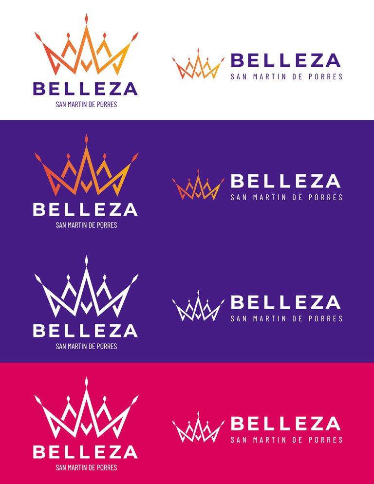
Teniendo en cuenta los colores de nuestra paleta, generamos diferentes versiones del logo con el fin de establecer su uso bajo todas las circunstancias posibles, sin embargo en esta ocasion solo presento 4 variantes por economizar tiempo.
Estableciendo los colores, dónde y cómo van aplicados, ya tenemos todos los pasos completados en nuestro Rebranding, ya no es mas que presentar nuestro diseño aplicado a cualquier medio en el que sepamos va a ser utilizado.
Next in this process is the colorization of the logo.
Taking into account the colors of our palette, we generated different versions of the logo in order to establish its use under all possible circumstances, however on this occasion I only present 4 variants to save time.
By establishing the colors, where and how they are applied, we now have all the steps completed in our Rebranding, it is nothing more than presenting our design applied to any medium in which we know it will be used.
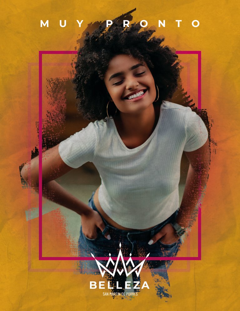
Como por ejemplo un Flyer.
Like for example a Flyer.

O un video.
Or a video.
Espero que te haya gustado este contenido, si es así déjamelo saber con un voto positivo, comenta si te gusto o si tú lo habrías hecho de otra forma y comparte si crees que alguien más debería verlo.
Estoy en redes sociales como AnthonyZerok para negocios.
Todas las imagenes aqui presentadas son de mi propiedad. Traducido con tecnologia de Google Translate.
I hope you liked this content, if so let me know with a positive vote, comment if you liked it or if you would have done it differently and share if you think someone else should see it.
I'm on social media as AnthonyZerok for business.
All images presented here are my property. Translated with Google Translate technology.
Congratulations @anthonyzerok! You have completed the following achievement on the Hive blockchain And have been rewarded with New badge(s)
Your next target is to reach 200 upvotes.
You can view your badges on your board and compare yourself to others in the Ranking
If you no longer want to receive notifications, reply to this comment with the word
STOPTo support your work, I also upvoted your post!
@tipu curate 5
Upvoted 👌 (Mana: 19/69) Liquid rewards.
Congratulations @anthonyzerok! You received a personal badge!
You can view your badges on your board and compare yourself to others in the Ranking