
 Español
Reveal spoiler
 English

¿Qué tal están? Yo, feliz de traerles otra entrega de Re:Diseño por Pandiseño, prácticas que suelo realizar como diseñador para mantenerme activo en el mundo del diseño, despejar la mente y evitar los bloqueos creativos, aprendiendo mientras voy rediseñando y corrigiendo logos que veo en la plataforma de #Hive, valga la pena aclarar que aunque mucha gente asocia el corregir con arreglar algo que está mal, rediseñar implica realizar modificaciones desde una posición personal y basado en conocimientos y gustos parcializados, en este caso los míos.
Dicho lo dicho, hoy será la primera vez que rediseñe el logo de un usuario y no una comunidad, es el avatar e imagen de una a la que aunque no seguía, había visto, es diversas comunidades y ya había tenido la oportunidad de ver sus post; Se trata de @ikasumanera un joven con mucho tiempo en la plataforma, cuyo blog se divide entre la música con excelentes covers, videojuegos y arte digital simplemente espectacular.
How are you? Me, happy to bring you another edition of Re:Design by Pandiseño, practices that I usually do as a designer to stay active in the design world, clear my mind and avoid creative blocks, learning while I'm redesigning and correcting logos that I see on the #Hive platform, it is worth clarifying that although many people associate correcting with fixing something that is wrong, redesigning involves making changes from a personal position and based on knowledge and biased tastes, in this case mine.
That said, today will be the first time I redesign the logo of a user and not a community, is the avatar and image of one that although not followed, I had seen, is various communities and have already been able to see his post; This is @ikasumanera a young man with a long time on the platform, whose blog is divided between music with excellent covers, video games and spectacular digital.

Logo ikmusicarte Source
Aunque su imagen suele ser su rostro, que aparece en la gran mayoría de miniaturas para sus videos, este logo es el utilizado como avatar en #Hive, pero me causo curiosidad ver que no es el mismo que utiliza en su canal de Youtube y tampoco en su Twitter. Supuse entonces que este logo era algo que busco para emplear de Avatar, y aunque como diseñador en branding le recomendaría utilizar su imagen como logo, el poseer un icono personal da la posibilidad de tener ese sello, firma o imagen que permita asociar tu persona a otro proyecto.
Pero antes de comenzar a hablar de diseño, quiero tocar muy por encima el tema de la apropiación, y espero no me malentiendan, quienes me han leído saben que estos post no van con la intención de realizar ataques; Como alguien que tuvo la oportunidad de trabajar en la organización de Eventos y participar en eventos oficiales de RIOT y TFT, el logo de Rising Legends la rama oficial del competitivo de TFT salto ante mis ojos de inmediato.
Although his image is usually his face, which appears in the vast majority of thumbnails for his videos, this logo is the one used as avatar in #Hive, but I was curious to see that it is not the same one he uses in his Youtube channel and also in his Twitter. I assumed then that this logo was something he was looking for to use as Avatar, and although as a designer in branding I would recommend him to use his image as logo, having a personal icon gives the possibility to have that stamp, signature or image that allows to associate your person to another project.
But before I start talking about design, I want to touch on the subject of appropriation, and I hope you do not misunderstand me, those who have read me know that these posts are not intended to make attacks; As someone who had the opportunity to work in the organization of events and participate in official events of RIOT and TFT, the logo of Rising Legends the official branch of competitive TFT jumped before my eyes immediately.

TFT Rising Legends Logo Source
Algunos lo llamarían plagio, yo no creo que Isaac como persona lo haga desde la mala intención; sin embargo, utilizar cualquier asset de RIOT en algún contenido que no tenga que ver con la compañía y sus ramas, resulta en una violación de derechos de autor, si bien hubo un leve cambio en el mismo, incluso a los profesionales no se les permite utilizar imágenes o fragmentos de imágenes en cualquier contenido no relacionado con RIOT.
Por lo que dejando de lado el hecho de estar cometiendo una ilegalidad con una tontería, @ikasumanera ha demostrado en sus más de dos años en la plataforma, tener el talento y la capacidad de ir más allá, a otras plataformas, a otros lugares y es ahí donde emplear un logo cuya imagen le pertenezca a otro puede ocasionar un problema.
Some would call it plagiarism, I don't think Isaac as a person does it from bad intention; however, using any RIOT asset in any content that has nothing to do with the company and its branches, results in a copyright violation, although there was a slight change in it, even professionals are not allowed to use images or fragments of images in any content unrelated to RIOT.
So leaving aside the fact of committing an illegality with a silly thing, @ikasumanera has demonstrated in its more than two years on the platform, to have the talent and ability to go beyond, to other platforms, to other places and that is where using a logo whose image belongs to another can cause a problem.
Dejemos de lado los temas legales y vamos a enfocarnos en el diseño, y es que si se pasean por el blog de ikmusicarte, notarán que suele jugar y consumir los productos de RIOT Games, desde el área visual y de diseño, considero que RIOT tiene de los mejores grafismos y un equipo de diseñadores majestuoso, su uso del color, el orden de sus infografías e incluso lo funcional que es su logo, es algo digno de admirar.
Ahora teniendo en cuenta el contenido de Isaac, dirigido más al arte y entretenimiento, se aleja mucho del estilo gráfico que tiene RIOT con bordes afilados y colores vibrantes, orientados claramente hacia su fuerte, el aspecto competitivo y los deportes electrónicos. Y aquí la pregunta es ¿Inspirándonos en RIOT podemos crear una imagen que represente a ikmusicarte?
Let's leave aside the legal issues and let's focus on the design, and is that if you stroll through the blog of ikmusicarte, you will notice that usually play and consume the products of RIOT Games, from the visual and design area, I consider that RIOT has the best graphics and a team of majestic designers, their use of color, the order of their infographics and even how functional is their logo, is something to admire.
Now taking into account the content of Isaac, aimed more at art and entertainment, it is far away from the graphic style that RIOT has with sharp edges and vibrant colors, clearly oriented towards its strengths, the competitive aspect and e-sports. And here the question is, inspired by RIOT, can we create an image that represents ikmusicarte?

PeakD ikmusicarte Blog
Yo personalmente le recomendaría tomar el camino de los futbolistas, utilizar un avatar trabajado empleando una fotografía suya, que permita que su contenido se asocie a su cara y transformarse él en la imagen de todos sus proyectos. Un icono es una herramienta extra, como lo tienen CR7, Messi, u otros deportistas de otras disciplinas como Tiger Woods y Jordan, incluso es usado por grandes Streamers de la actualidad como Ibai Llanos, quienes usan su icono para asociar su imagen a proyectos que no permiten o no combinan con tener una fotografía de sus rostros.
Estos iconos se emplean a modo de firma, es otra forma de decirle a los que te consumen quien está detrás de ese proyecto, no puedes colocarle un rostro a la suela de tus zapatos, sin embargo, si colocas ahí el icono de Jordan, el usuario entiende de forma automática la calidad del mismo y quien respalda la calidad del producto. Un icono para Isaac podría emplearse en Banners, Headers, Miniaturas y mucho más, incluso si en un video no quiere mostrar su rostro, al ver el icono la gente entenderá que el contenido tiene esa calidad que él imprime en su contenido.
I would personally recommend him to take the path of soccer players, use an avatar made using a picture of him, which allows his content to be associated with his face and transform him into the image of all his projects. An icon is an extra tool, as CR7, Messi, or other sportsmen from other disciplines such as Tiger Woods and Jordan have, it is even used by great Streamers of today as Ibai Llanos, who use their icon to associate their image to projects that do not allow or do not combine with having a photo of their faces.
These icons are used as a signature, it is another way to tell those who consume you who is behind that project, you can not put a face on the soles of your shoes, however, if you put Jordan's icon there, the user automatically understands the quality of it and who supports the quality of the product. An icon for Isaac could be used in Banners, Headers, Thumbnails and much more, even if in a video he doesn't want to show his face, by seeing the icon people will understand that the content has that quality that he prints in his content.

Brandemia
Los iconos pueden ser casi infinitamente diferentes, esto no quiere decir que no deban de seguir unos lineamentos básicos y que tengan unas características necesarias para funcionar; Todo icono para ser realmente bueno debe seguir unas bases para lograr ser Reconocible a simple vista, tener la menor cantidad de elementos posibles para hacerlo Sencillo y estas dos ayudan a que a su vez sea Escalable para permitir que se use en múltiples plataformas, del mismo modo debería ser Atemporal, una vez que consigues estas características logras tener un icono que te brinda la capacidad de utilizarlo a placer y conveniencia.
Para el icono de IK note que los elementos importantes son estas iniciales, ya que aunque su blog esta bañado con la música, videos y el arte en general, otros temas como Podcasts y videojuegos forman parte importante de su contenido, por lo que el icono no debe cerrarse a un par de temas y para mantener la sencillez tampoco debe abarcarlos todos. Es asi que comence a bocetear y tras un rato encontre una forma que me acabo gustando, fue entonces que decidí llevarlo a lo digital.
Icons can be almost infinitely different, this does not mean that they should not follow some basic guidelines and have some necessary characteristics to work; Every icon to be really good must follow some basics to be Recognizable at first sight, have the least amount of elements possible to make it Simple and these two help to make it Scalable to allow it to be used in multiple platforms, in the same way it should be Atemporal, once you get these features you get to have an icon that gives you the ability to use it at your pleasure and convenience.
For IK's icon I noticed that the important elements are these initials, because although his blog is bathed with music, videos and art in general, other topics such as Podcast and video games are an important part of its content, so the icon should not be closed to a couple of topics and to maintain simplicity should not cover them all. So I started sketching and after a while I found a form that I ended up liking, then I decided to take it to digital.
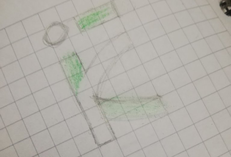
Digitalizarlo fue sencillo usando una retícula de guías y al tenerlo listo me di cuenta de que el resultado es un símbolo semi abstracto, con un estilo moderno/futurista y que por alguna razón que al momento desconozco me da una vibra hacia un Kanji coreano o algo parecido; Como ya dije me gustó, pues aunque es sumamente simple me di cuenta de que cumple con las premisas y es sumamente sencillo de leer, y a diferencia de esos logos descriptivos, recuerden que la idea de esto es utilizarlo a modo firma.
En cuanto a colores, RIOT hace simples sus iconos por una razón y es la de poder utilizarlos en múltiples aplicaciones, y que con simples cambios de colores puedan identificar categorías, temporadas, etapas, idiomas y más ramas de la compañía; En el caso de nuestro icono, lo mismo pensé que debía suceder, un logotipo que permita usarse de forma monocromática, a dos colores, con degradados e incluso con texturas, dejando un icono Versátil
Digitizing it was easy using a grid of guides and when I had it ready I realized that the result is a semi-abstract symbol, with a modern/futuristic style and for some reason that I don't know at the moment gives me a vibe towards a Korean Kanji or something similar; As I said I liked it, because although it is extremely simple I realized that it meets the premises and is extremely easy to read, and unlike those descriptive logos, remember that the idea of this is to use it as a signature.
As for colors, RIOT makes its icons simple for one reason and that is to be able to use them in multiple applications, and that with simple color changes can identify categories, seasons, stages, languages and more branches of the company; In the case of our icon, I thought the same thing should happen, a logo that can be used in monochrome, two colors, with gradients and even with textures, leaving a Versatile icon.

La elección en este caso de gris y verde fue una decisión netamente personal y sin un sentido especifico, son colores con los que me es más facil trabajar y ver resultados, pero con un logo como este y aplicando la estrategia que usa RIOT, el logo se puede emplear utilizando una infinita dupla o tripleta de colores que permita ser aplicado en cualquier lugar, sin que deje de ser identificable, al no casarnos con ninguna paleta no existe un color que nos identifique y podemos usarlos todos como herramientas.
Cuando suelo utilizar esta estrategia, suelo recomendarle a mis clientes la web de Adobe Color CC con la cual encontrar colores que tengan una buena sinergia entre si, incluso encontrar colores que complementen un color que ya tengas en mente, técnica usada por muchos cuando deciden usar el 'Color of the Year' para sus firmas; El unico contratiempo que le veo a esto, es la necesidad de tener un editor de vectores a manos o un programa de edición para realizar estos cambios, y eso porque personalmente no conozco una forma sencilla de editar los vectores, o al menos no se si pueda hacerse en programas sencillos como Canva.
The choice in this case of gray and green was a purely personal decision and without a specific sense, they are colors with which it is easier for me to work and see results, but with a logo like this and applying the strategy used by RIOT, the logo can be used using an infinite dupla or triplet of colors that can be applied anywhere, without ceasing to be identifiable, by not marrying us with any palette there is no color that identifies us and we can use them all as tools.
When I use this strategy, I usually recommend to my clients the Adobe Color CC Website with which to find colors that have a good synergy between them, even find colors that complement a color that you already have in mind, technique used by many when they decide to use the 'Color of the Year' for their signatures; The only setback I see to this, is the need to have a vector editor at hand or an editing program to make these changes, and that because I personally do not know a simple way to edit the vectors, or at least I do not know if it can be done in simple programs like Canva.

Para ir cerrando, quiero explicar algunas cosas por las cuales este tipo de iconos funcionan y por los que no basta simplemente con que nos guste, incluso RIOT como avatar de sus cuentas para TFT usa imágenes e ilustraciones y no su icono, esto debido a que en reducciones ocurre lo mismo que con el avatar de @ikasumanera que a 16x16 Px se vuelve totalmente irreconocible. Otra cuestión que afecta a la legibilidad y que es algo que muchos diseñadores inexpertos suele hacer, es encerrar los iconos, ya sea en círculos, cuadrados, rectángulos o hexágonos, aunque colocarle marco a tu Icono parece una buena idea, esto en reducciones hace que tu icono se reduzca aún más y pierda legibilidad.
Muchos son los diseñadores Koi que deciden ir contra corriente y se niegan a entender la necesidad de simplificar, de pensar en reducciones, y de prelar la funcionalidad por sobre la belleza, pero los medios digitales cada vez son más importantes y obtener buenos resultados consiste en aprender de los cambios, no en forzar estilos hasta que las necesidades cambien.
To close, I want to explain some things why this type of icons work and why it is not enough to simply like it, even RIOT as avatar of their accounts for TFT uses images and illustrations and not their icon, this because in reductions happens the same as with the avatar of @ikasumanera that at 16x16 Px becomes totally unrecognizable. Another issue that affects readability and that is something that many inexperienced designers usually do, is to enclose the icons, either in circles, squares, rectangles or hexagons, although placing a frame to your Icon seems a good idea, this in reductions makes your icon is reduced even more and loses readability.
Many are the Koi designers who decide to go against the current and refuse to understand the need to simplify, to think in reductions, and to prioritize functionality over beauty, but digital media are becoming more and more important and getting good results is about learning from changes, not forcing styles until needs change.

Teniendo esto, todos los diseñadores solemos sufrir de un mal, y es que comenzamos a darle vueltas al diseño intentando cambiar o mejorar cosas, y aunque siempre se puede ir a mejor, la gran mayoría nunca estará conforme con ningún diseño, es por esto, que yo aprendí a tener en mi aplicación de organización una Check-list y la suelo aplicar a los logos, ¿En qué consiste?, en una serie de preguntas básicas, ¿Se entiende? ¿Se puede reducir? ¿Es Visualmente agradable? ¿Funciona bien en digital e imprenta?, y una vez que logro descartar la gran mayoría de preguntas, me doy por servido, pues podría pasar meses dándole vueltas a un logo.
El icono puede gustar más o menos, me alegra que a diferencia del anterior sea más identificable en reducciones de 16x16 gracias a la paleta de colores y que en grande tenga una historia detrás, me alegra que el logotipo pueda emplearse de forma monocromática, me gusta haber podido lograr que se pueda aplicar de formas diferentes y tanto logo como iso por separado, y por último me alegró que la nueva paleta permita a pesar de ser colores que personalmente no me gustan, permitan combinarse bien con una casi infinita gama.
All designers tend to suffer from an error, and that is that we start to go around the design trying to change or improve things, and although you can always go for the improvement, the vast majority will never be satisfied with any design, this is why I learned to have in my organizational application a Check-list and I usually apply it to the logos, what does it consist of? It consists of a series of basic questions, Is it understandable? Can it be reduced? Is it visually pleasing? Does it work well in digital and print? and once I manage to rule out the vast majority of questions, I am satisfied, because I could spend months thinking about a logo.
The icon can be liked more or less, I am glad that unlike the previous one, it is more identifiable in 16x16 reductions thanks to the color palette and that in large it has a story behind, I am glad that the logo can be used in monochromatic form, I like to have been able to achieve that it can be applied in different ways and both logo and iso separately, and finally I was glad that the new palette allows, despite being colors that I personally do not like, to combine well with an almost infinite range.

Este fue el resultado, un icono tan sencillo como funcional, que representa no el contenido de Isaac sino a la calidad que imprime en sus contenidos, no es un símbolo que hable de música, arte y videos, es un símbolo que puede identificar a un creador de contenido y no al contenido creado.
Para cerrar el Post, recordarles que cualquier retribución me sirve, pues muchas veces observo los logos y marcas desde un punto de vista técnico, y los comentarios de cualquier persona que lo perciba desde otro lugar es lo que me ayuda a conocer qué aspectos se pueden mejorar y como el diseño entra en la psiquis de las personas. También dejar claro, nuevamente, que estos post no tienen mala intención alguna, que bajo ningún concepto se busca atacar, ofender o herir a otros, y que es netamente con fines prácticos.
This was the result, an icon as simple as functional, that represents not Isaac's content but the quality he prints in his content, it is not a symbol that talks about music, art and videos, it is a symbol that can identify a content creator and not the content created.
To close the Post, I would like to remind you that any retribution is useful to me, because many times I observe logos and brands from a technical point of view, and the comments of any person who perceives it from another place is what helps me to know what aspects can be improved and how the design enters into the psyche of people. Also make clear, again, that these posts have no bad intentions whatsoever, that under no circumstances is intended to attack, offend or hurt others, and that it is purely for practical purposes.

PIC #2 - Pandiseño
Gracias por llegar hasta el final de mi post, me acabas de dar tu tiempo que para mí es sumamente valioso, y si no te importa, ahora me gustaría que me dejes un comentario sobre lo que aprendiste, sentiste o te generó mi post.
Thank you for reaching the end of my post, you just gave me your time which for me is extremely valuable, and if you don't mind, now I would like you to leave me a comment about what you learned, felt or what my post generated in you.
The rewards earned on this comment will go directly to the people( @daniel2001 ) sharing the post on Twitter as long as they are registered with @poshtoken. Sign up at https://hiveposh.com.
@tipu curate 3
Upvoted 👌 (Mana: 25/55) Liquid rewards.
Estás recibiendo un voto por parte del proyecto "HiveArte" (@hive-134572). Su publicación fue seleccionada para nuestro reporte de curación Semanal.🎨 Contáctenos para saber más del proyecto a nuestro servidor de Discord. Si deseas delegar HP al proyecto: Delegue 5 HP - Delegue 10 HP - Delegue 20 HP - Delegue 30 HP - Delegue 50 HP - Delegue 100 HP.
Estas recibiendo un voto por parte del proyecto "Sound Music" (@music1sound) y este post fue seleccionado para el reporte de curación diaria. Contáctenos para saber más del proyecto a nuestro servidor de Discord. Si desea delegar HP al proyecto: Delegue 5 HP - Delegue 10 HP - Delegue 20 HP - Delegue 30 HP - Delegue 50 HP - Delegue 100 HP.