My entry for the #monomad challenge.
Sometimes you just know monochrome will work for an image.
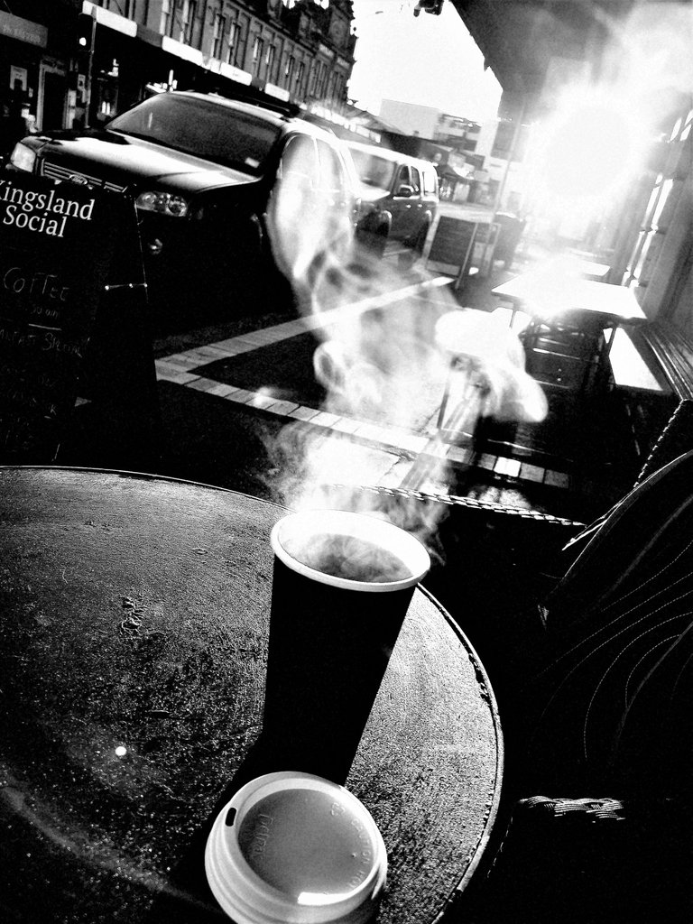
Like this one.Shot into the rising sun with the steam rising off the freshly made coffee.Full of strong contrasts and tones.The steam and traffic give the atmosphere of an urban scene.
Other situations just don't have the same impact in monochrome.Compare these two.
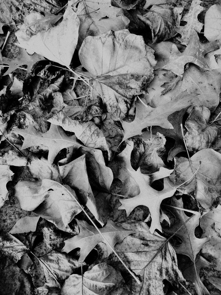
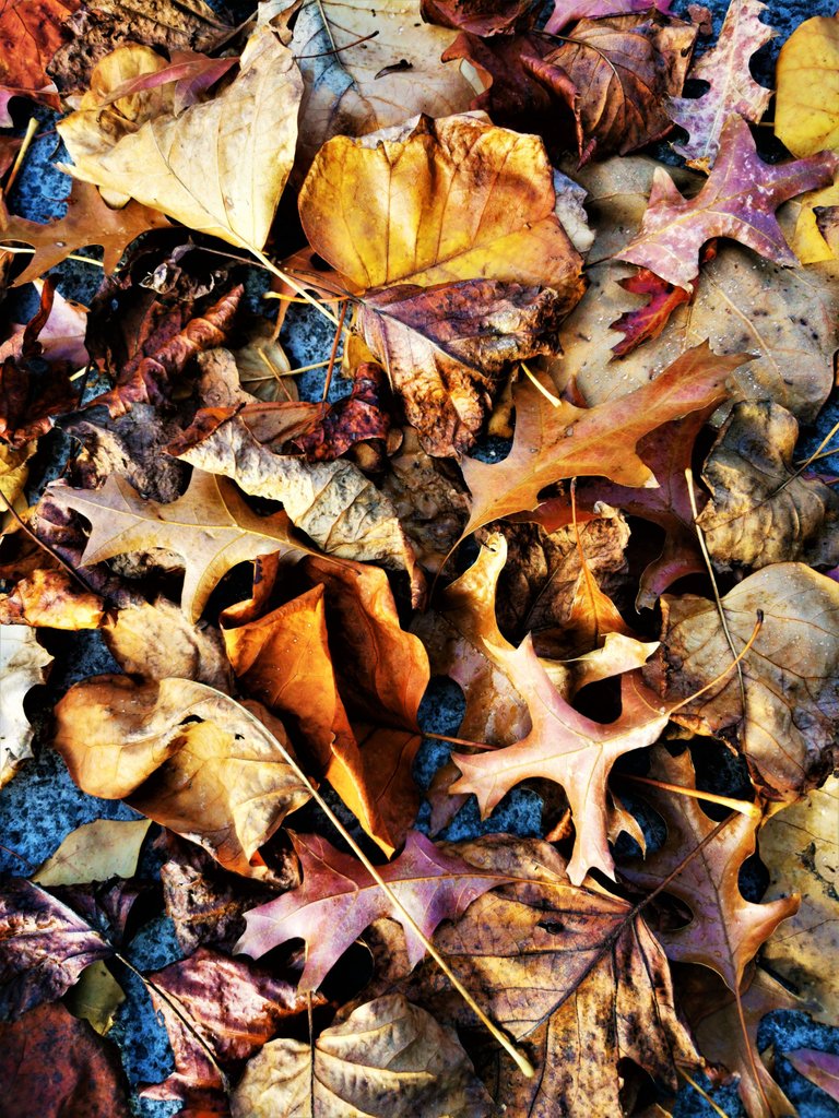
The colour photo works best because the rich hues of the leaves convey the sense of Autumn,rather than the shapes of the leaves.The tones are less defined and strong.
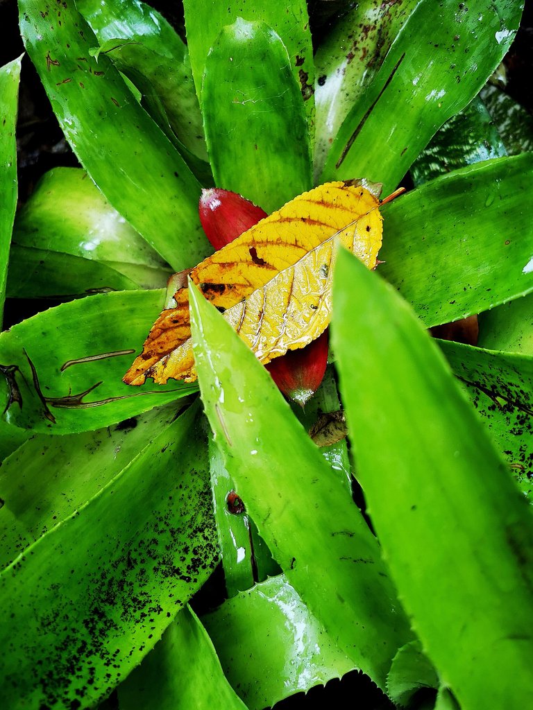
Again colour works best here
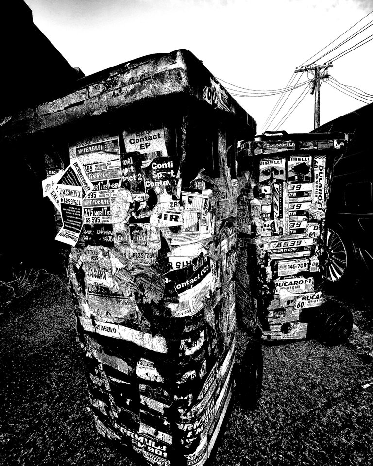
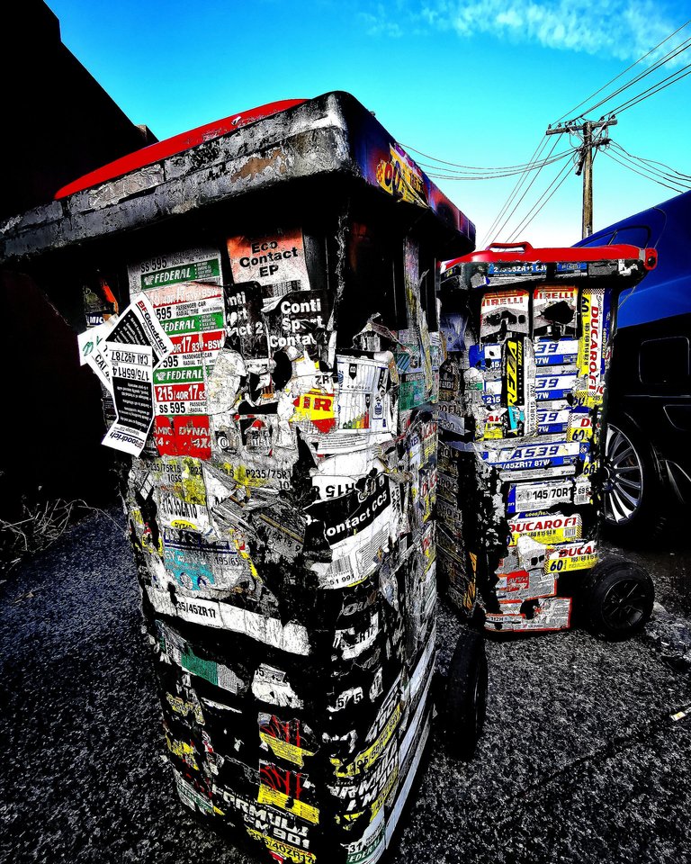
Again I think the monochrome image works because of the subject and environment-a gritty city scene where mono captures the mood of the image better.
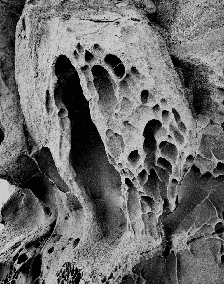
This image suits mono because the strong contrasting tones highlight the textural qualities of the rock and it's flowing lines.

Again strong tones rather than hues suit mono.The stark contrast between sand and skeleton highlight the beauty of the exposed skeleton stripped bare.The theme of the the struggle for survival is also shown by the huge bite out of the fish and is dramatic and elemental, suiting mono better.
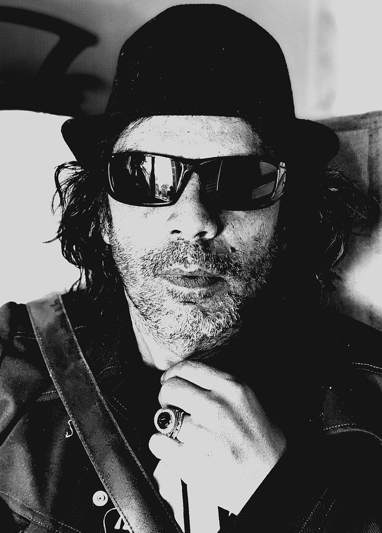
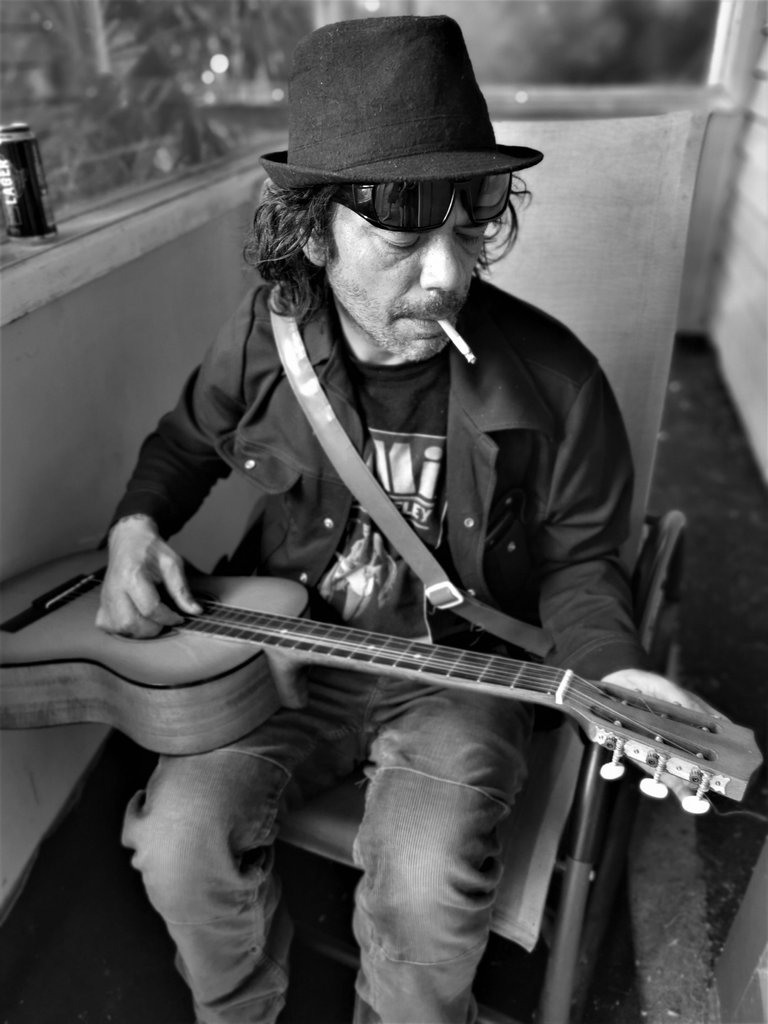

Portraiture is one area where mono seems to really stand out by taking away the disraction of colour and making us form a story of the subject from the atmoshere the image conjours up.
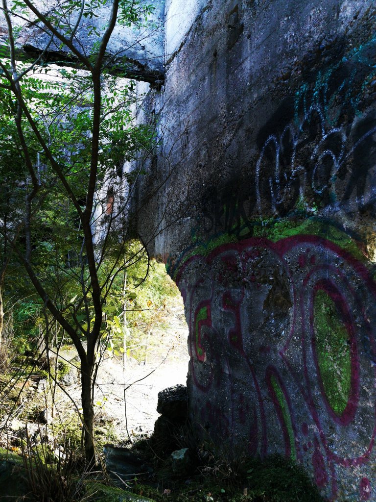
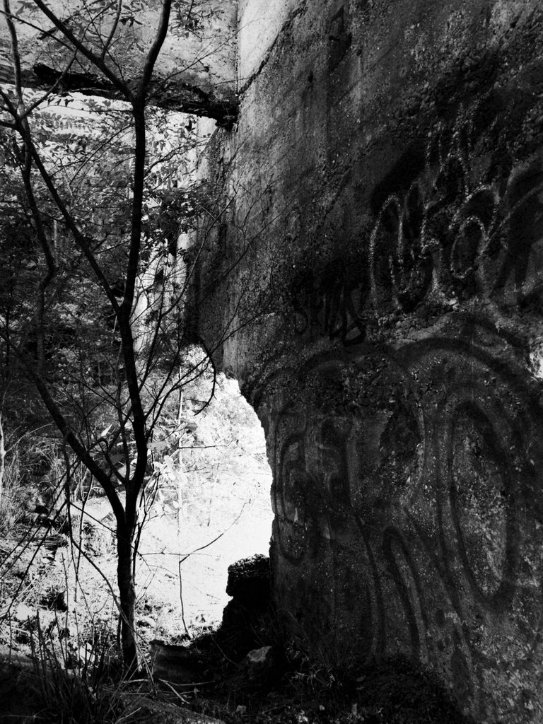
Here the mono emphasises the age of the subject,seeming to depict something from a much earlier era.The strong lighting from the side seems to be stronger in effect in the mono.
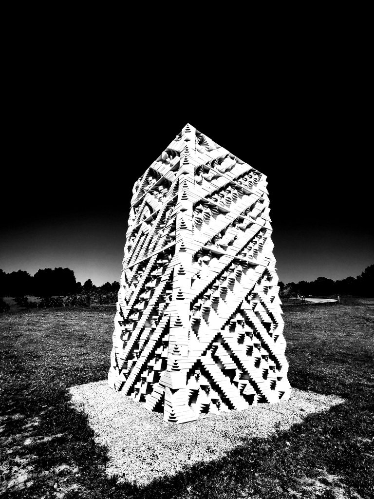
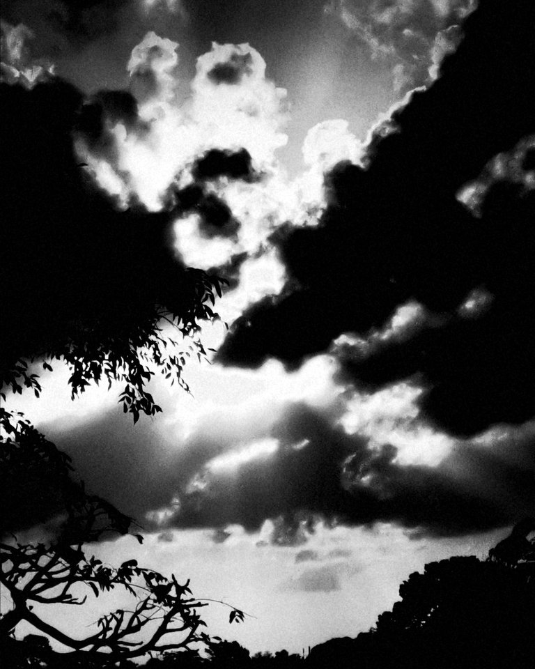
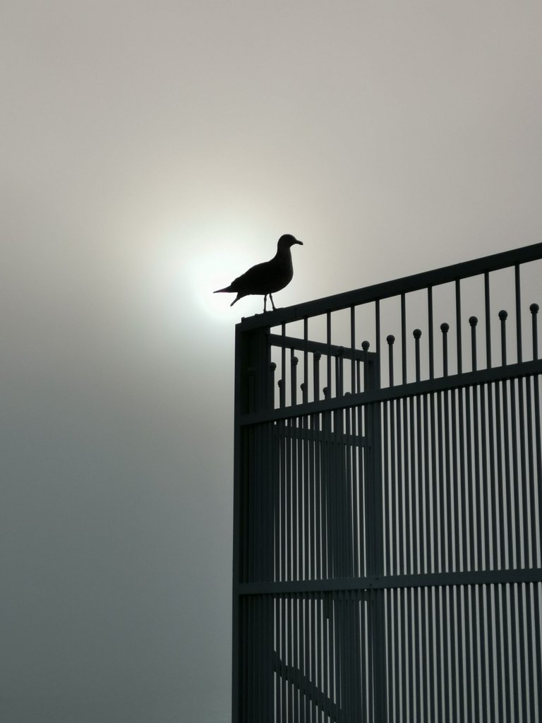
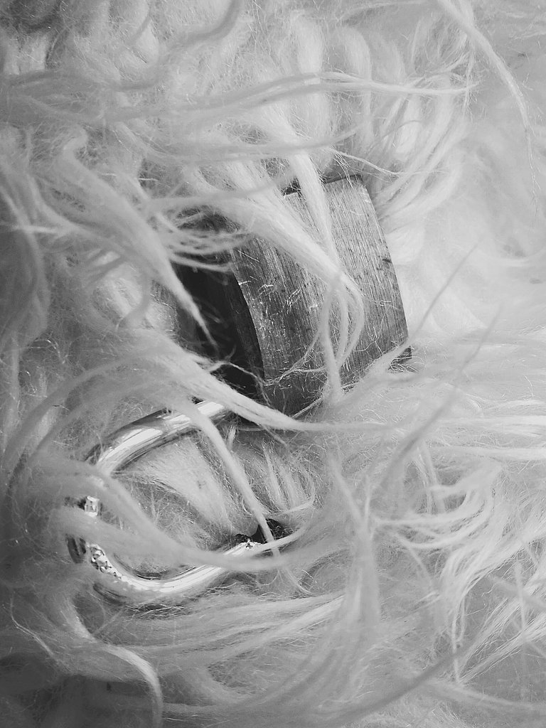
By now you'll get the reasons I chose mono for these shots.Next time you are about to snap that colour image stop and think if mono will give you a better outcome.
I've included some info from a site fleshing out what I've try to get across but in a much clearer manner.
Black and white images appear to be more timeless than color images. As evidenced by the color schemes produced by particular types of film or by trends in digital processing, color can sometimes suggest a specific era. Removing the color makes it more difficult to put an exact date on a photo. A lack of color in a photograph often accentuates the light and shadows. Backlit subjects and dramatic shadows are brought to the audience’s attention quickly in black and white images. Silhouettes emphasize the subject
Many fine art photographers prefer black and white images for their tendency to distance the subject matter from reality. Humans see the world in color, and a rendition of the world in monochrome makes us pause and look closely. Textures and their contrast to one another are captured sharply. Removing color from a picture helps the viewer to focus on a subject’s emotional state. Black and white portraiture lets the audience see the subject’s face and read his or her eyes without distraction.
When to Use Black and White
In short, convert images to black and white when the light, form, or texture in the scene is more compelling than the hues of the subject matter. Black and white is a good choice when the color in a photo serves only as a distraction from the message you want the image to convey.
Images with a wide range of tonal values tend to work well for black and white imagery. Most black and white images are most successful when there are definite blacks and whites–that is, the tones in the photo range all the way from the blackest black to the whitest white with lots of varying gray tones in between.
Opt for color images when color is a key element in the story your photo is telling. A photograph of a child eating the season’s first red, ripe strawberry on a golden summer evening, for example, probably benefits from deep colors.
When the relationships between distinct hues in your image are important, color is often the best choice. Contrasting color tones don’t always translate well to high contrast in black and white. Green and red, for instance, are quite distinct in a color image, but in a black and white image they may appear to be rather similar in tone.
Thanks for reading this post,hope it helps!