NO PENSARON MUCHO A LA HORA DE DISEÑARLOS
La creatividad puede verse involucrada en momentos incómodos como le pasó a los logos que te voy a mostrar a continuación.
THEY DIDN'T THINK MUCH WHEN DESIGNING THEM
Creativity can be involved in uncomfortable moments as happened to the logos that I am going to show you below.
Instituto de estudios orientales / Institute of Oriental Studies.
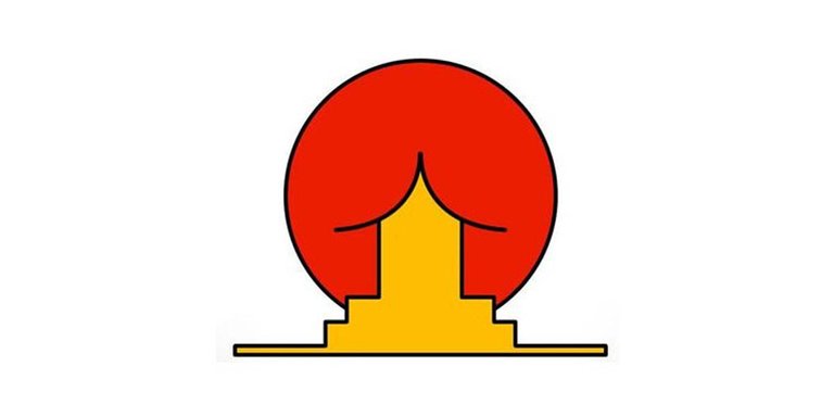
Creo que el diseñador que realizó este logo quiso representar el sol naciente con alguna edificación de estilo oriental. Pero no precisamente se observa eso.
I think the designer who made this logo wanted to represent the rising sun with some oriental style building. But that is not precisely observed.
Comisión Juvenil Arquidiocesana de la Iglesia Católica / Catholic Church's Archdiocesan Youth Commission.
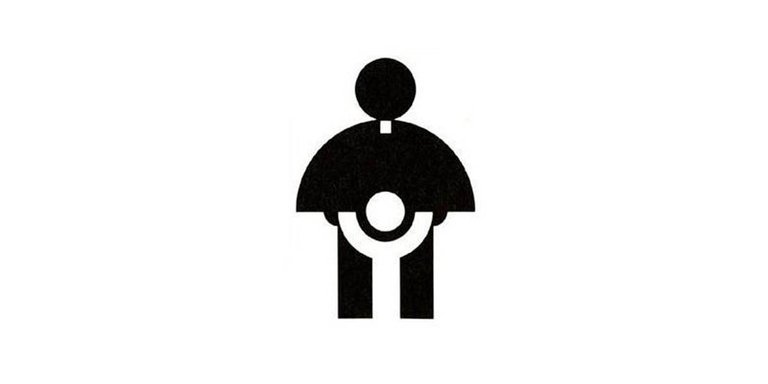
Aquí la idea era que se observara un sacerdote alentando a un niño con sus brazos arriba, pero dada a la mala fama que se tiene rápidamente interpretamos otra cosa.
Here the idea was to observe a priest encouraging a child with his arms up, but given the bad reputation that it has, we quickly interpret something else.
A-STYLE
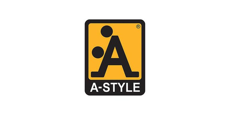
Esta marca de ropa buscaba algo bastante funcional pero ¿por qué esos dos círculos allí? nos da a entender otra forma 😅
This clothing brand was looking for something quite functional but why those two circles there? gives us to understand another way 😅
Clases de danza para niños / Junior Jazz Dance Classes
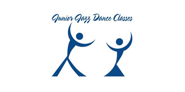
Claramente se observan dos niños bailando, ¿o no?🤔
Clearly two children are observed dancing, right? 🤔
Oficina de Promociones de Salud / Bureau of Health Promotions
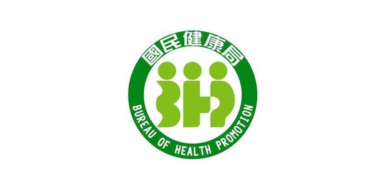
Esta marca de Taiwan promociona el cuidado de la salud a sus ciudadanos. Pero esa idea de unir la "H" con la "P" da a entender otra cosa.
This Taiwan brand promotes health care to its citizens. But that idea of joining the "H" with the "P" implies something else.
Dirty Bird
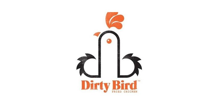
Quizás esta es la única marca que le favorece el doble sentido y seguramente fue realizada de esa manera. Dirty Bird es un restaurante de pollo frito por lo que unieron la "D" y "B" con el pollo. Pero ustedes también ven otra cosa ¿cierto? 😄
Perhaps this is the only brand that favors the double meaning and it was surely made that way. Dirty Bird is a fried chicken restaurant so they put the "D" and "B" together with the chicken. But you also see something else, right? 😄
Centro pediátrico americano / American Pediatric Center
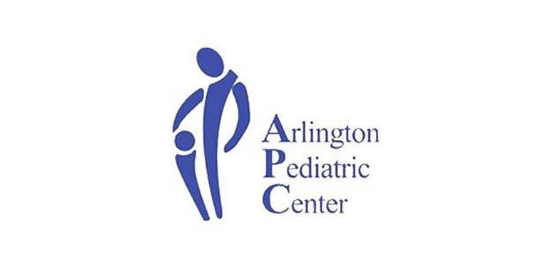
Más de un padre dudaría en llevar su hijo a este centro pediátrico, hubo una mala posición de formas. Pero muuuuuy mal 😮
More than one parent would hesitate to take their child to this pediatric center, there was a bad position of forms. But sooo bad 😮
Luego de ver esta lista nos queda claro que las decisiones a tomar para realizar un logo tienen que pensarse mucho para evitar malas interpretaciones. Seguramente estas marcas ya habrán cambiado su logo por algo menos polémico pero internet siempre se encargará de recordarles 😄 ¿ya los conocías?
After seeing this list it is clear to us that the decisions to be made to make a logo have to be thought through a lot to avoid misinterpretations. Surely these brands have already changed their logo for something less controversial but the internet will always remind them 😄 did you already know them?


Your post has been curated by us! Received 20.00% upvote from @opb. Do consider delegate to us to help support our project.
Do join our discord channel to give us feedback, https://discord.gg/bwb2ENt
* This bot is upvoting based on the criteria : 1. Not plagiarised, 2. Persistent previous quality posts, 3. Active engagement with other usersDo upvote this commment if you 💚 our service :)