All the elements and the images contained in this post are taken and post processed by me. All the images in this post are copyright-protected. All the uses of the images and their derivatives are strictly prohibited without the explicit consent of the author.
Hello Hivers!
In recent days I was thinking of themes on which to base the creation of some logos so as to be able to insert them in the list of logos offered by Digitall Project. A classic for my country is certainly pizza, food often known even by people far from our national scene.
The first step was to create a sketch, made on an old sheet of paper that I had on hand. I have outlined the contours of the shape and finished the draft of my pictogram. I have inserted guidelines and a leading space between the area reserved for the main name and the secondary description.
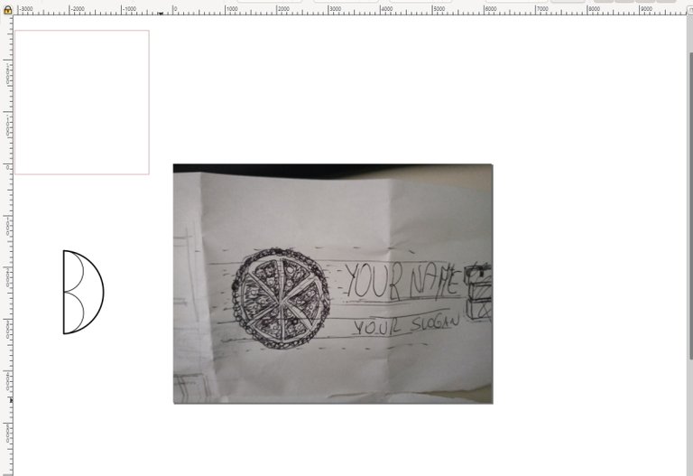
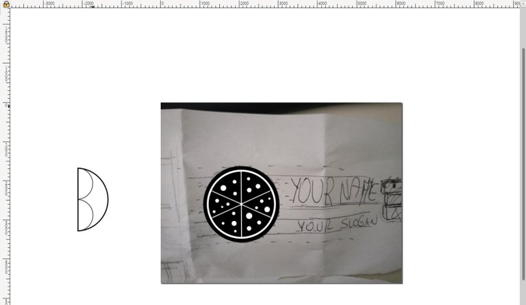
I took a picture of my sketch and opened the image on the interface where I create my new graphic designs. I started shaping the digital equivalent of my pictogram, not paying too much attention to the search for precision.
Once the pictogram was finished, I moved on to the logotype. I immediately chose a font that I had noticed lately, thinking it might work. There are dozens of more suitable ones, but in this case, I didn't care: the name and description are only fictional, and don't refer to any particular activity. I just wanted to create a more practical alternative instead of completing the logo with a simple "Your Text", the formula most used to indicate the areas of the graphics dedicated to logotypes and pay-offs (the textual elements present within a logo).
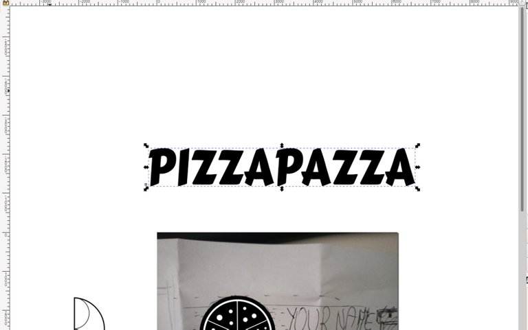
Before continuing, I balanced a few the characters of the logotype and the spaces between them.
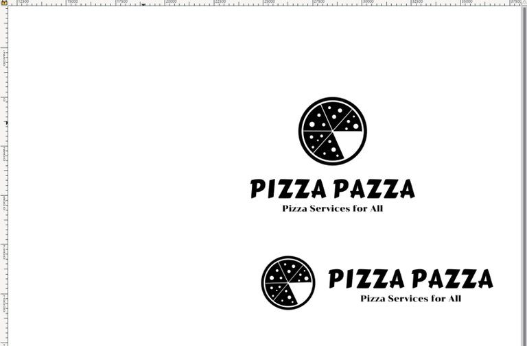
Then, I also looked for a font for the pay-off, different from the previous one. A couple of tests and I decided that the last one would be fine. I mounted the logo following fixed spacings that are not seen in the images. I centered the logo following 2 alignment variants, one horizontally and the other vertically.
Ok, work done. No, one moment. Something is obviously missing: up to this point, we have worked on the logo in one color, establishing shapes and contours. After this phase, however, it is necessary to give the logo different shades, creating color versions.
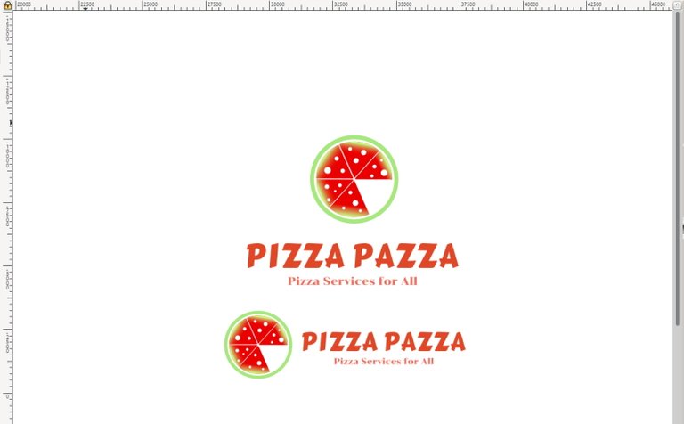
The first version I created is the one for white background. I used some classic colors such as red, combining them with less classic color blends that could be clear but clearly visible. Obviously the coloring, as well as the logos and the pay-offs, are purely indicative, variable according to your tastes.
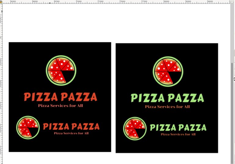
For the black background, I created 2 different versions. In the first one, I simply added a black background to the color version intended for white backgrounds; in the second, I made the logo color uniform with one of the pictogram colors, combining a last more intense color for the pay-off.
After that, I cropped all the screens - taken during the creation process - to the right point.
I hope you enjoyed this short presentation of my work. Take a look at the articles of my Digitall Project if you want to know more about the first steps towards its birth. You can find them by clicking on the #digitall hashtag.