Saludos cordiales apreciados lectores de Hive.Blog!
Hoy quise pasearme por un Supermercado que queda cerca de mi casa, se llama Hiper Lider y quedé encantada de cómo exhiben la mercancía en general, pero déjenme decirles que el área de pescados se llevó el premio de oro. Y es que esto no es casualidad, se trata de una estrategia de mercado.
El pasar de los años y el marketing han logrado observar que la psicología es un campo influyente cuando deseas comprar un producto. Si lo ves bonito, fresco, limpio, seguro que ganará tu confianza y con mayor probabilidad decidirás comprarlo.
Musicus y otros (2014) realizaron un estudio científico (Referencia Nro. 1), concluyendo que cuando los niños estaban en contacto visual con los personajes de los cereales, aumentaban las ventas, esto se encuentra asociado a la conexión del niño con el cereal, lo que inmediatamente aflorará emociones y el enorme deseo de adquirir el producto .
Este tipo de estudio junto a otros, ha llevado a evolucionar al neuromarketing, que en términos sencillos, refiere a la ciencia que estudia el cerebro en el proceso de compras.
Ver referencia Nro. 2.
Y de esta manera es que podemos ver supermercados tan bien pensados en sus anaqueles, y en el caso que les presento hoy en la exhibición del área de pescados.
La idea es llamar la atención y de manera positiva. Esto se logra con un diseño agradable a la vista y al olfato, porque no solo debe ser bonito. Si huele mal inmediatamente llegará un mensaje a nuestro cerebro diciendo "No lo compres, no está fresco".
Y la estrategia visual en este caso se compuso de varios aspectos:
- Presentar un diseño colorido:
Esto lo lograron mezclando hielo granizado con colorante, empleando varias capas de diferentes colores, y además, adornando con lechuga que resalta con su verdor.
- Formas circulares y semicirculares:
Esto lo realizaron para tener una visión de movimiento, dinámica, contrastando de manera excelente con las diferentes capas de colores.
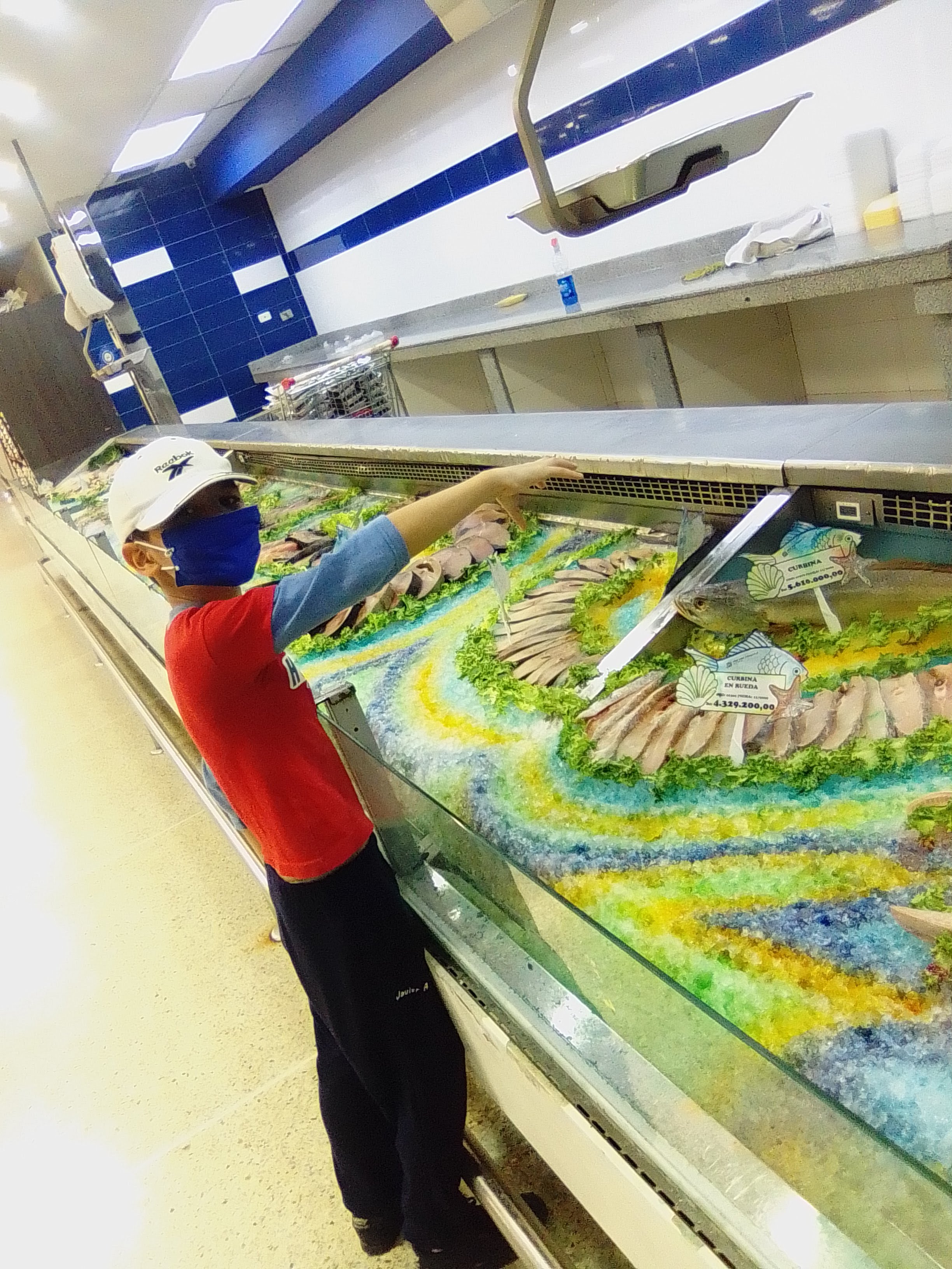
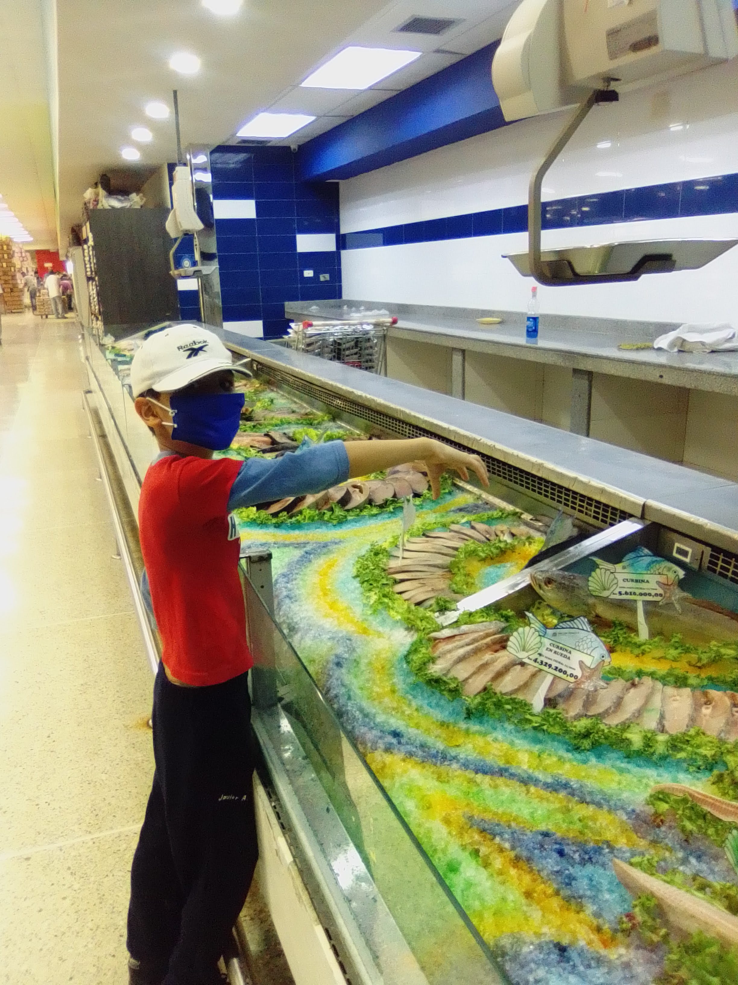
- Exhibir para cada rubro el pescado o marisco en la parte central y alrededor sus cortes respectivos de presentación de venta:
Como dicen por allí lo que no se exhibe no se vende, y aquí se lucieron colocando el pez en el centro conectando visualmente a la persona con el producto que desea comprar y presentando sus cortes de una manera agradable.
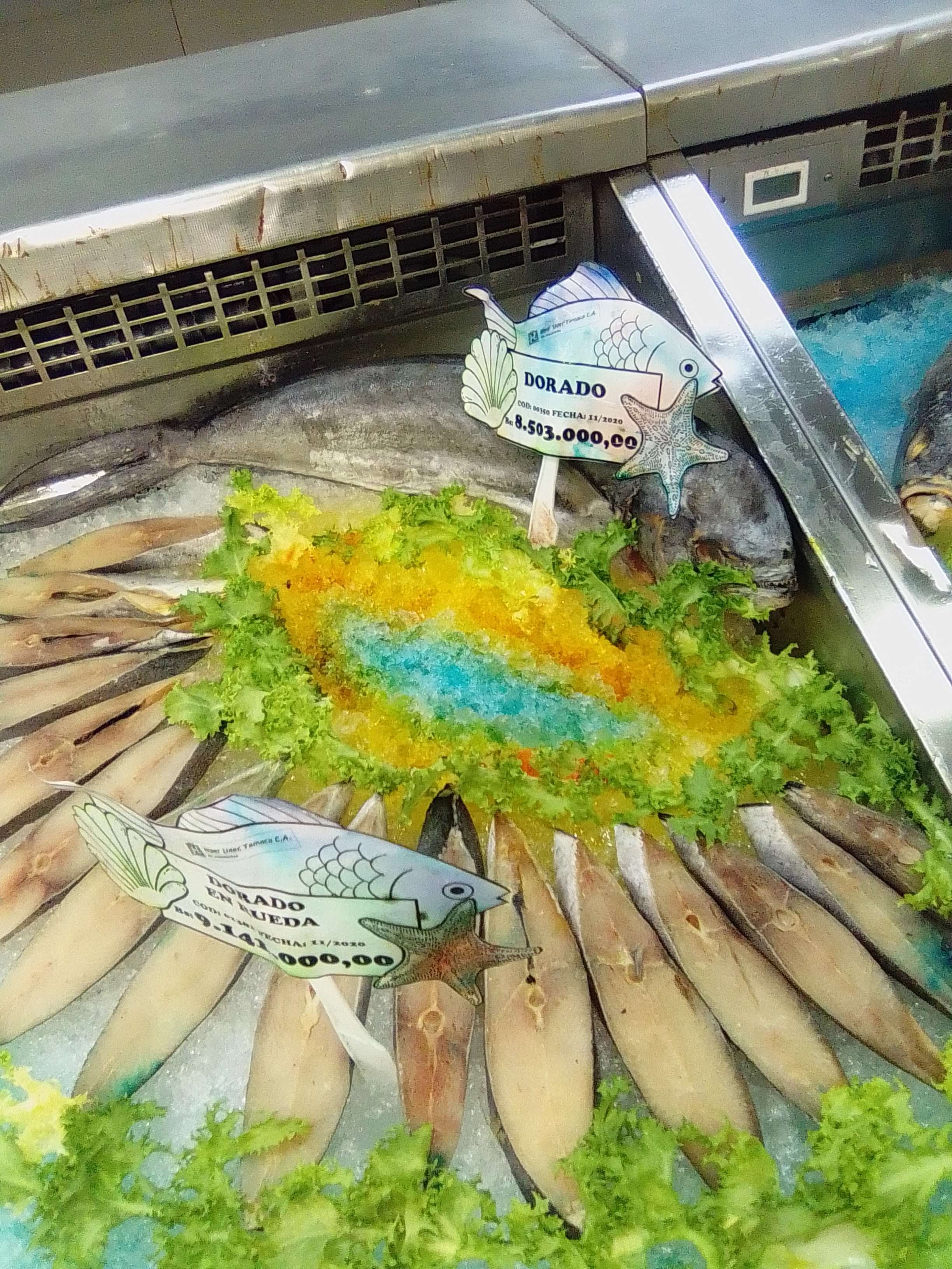
Fíjense en este caso del pescado llamado "Dorado", el pescado entero se encuentra al fondo y alrededor en semicirculo las ruedas. Ambos con sus etiquetas de nombre y precio. No hay dudas en cuánto al producto que se está vendiendo y en qué forma de presentación; la última palabra la tendrá el cliente.
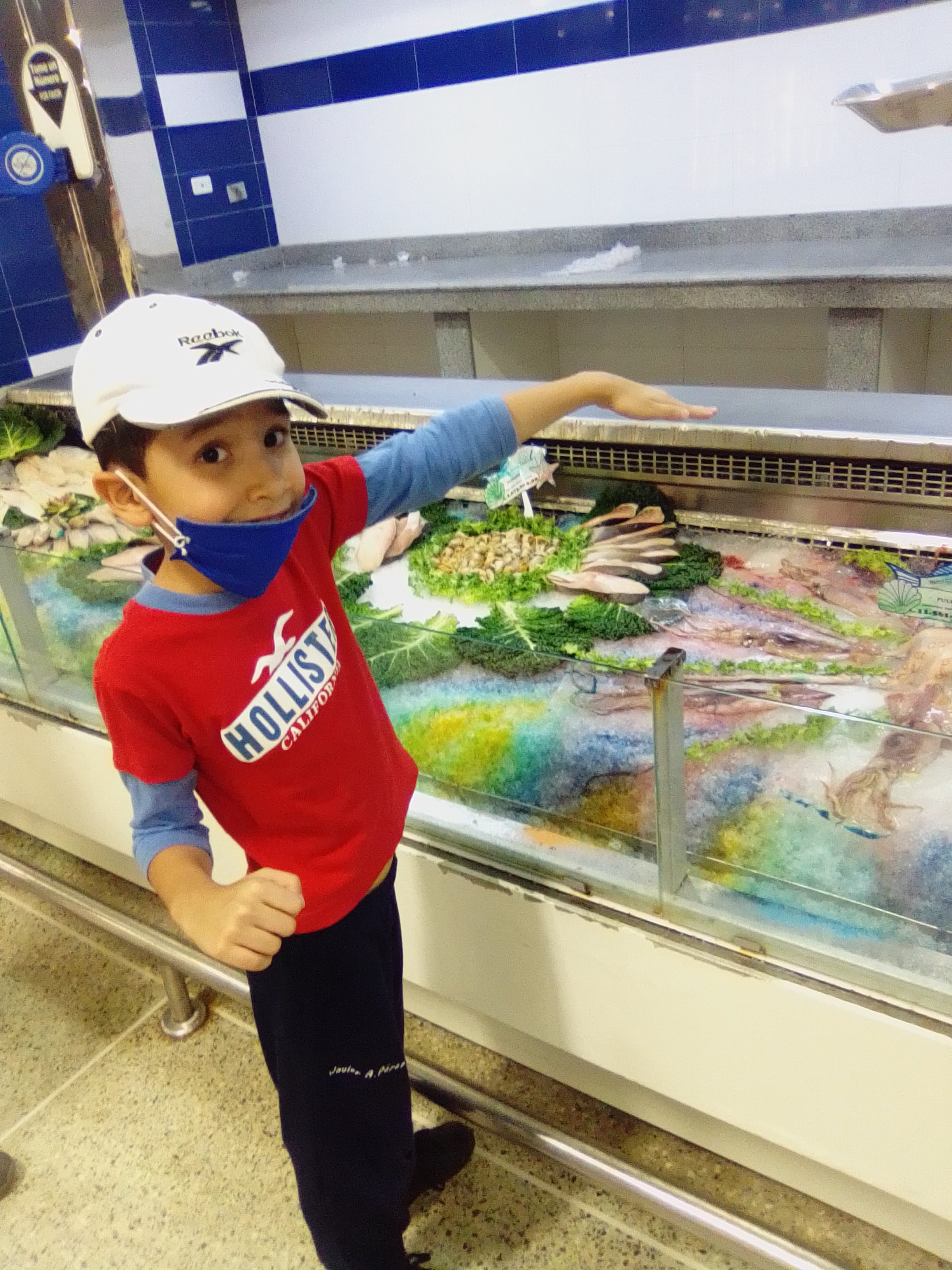
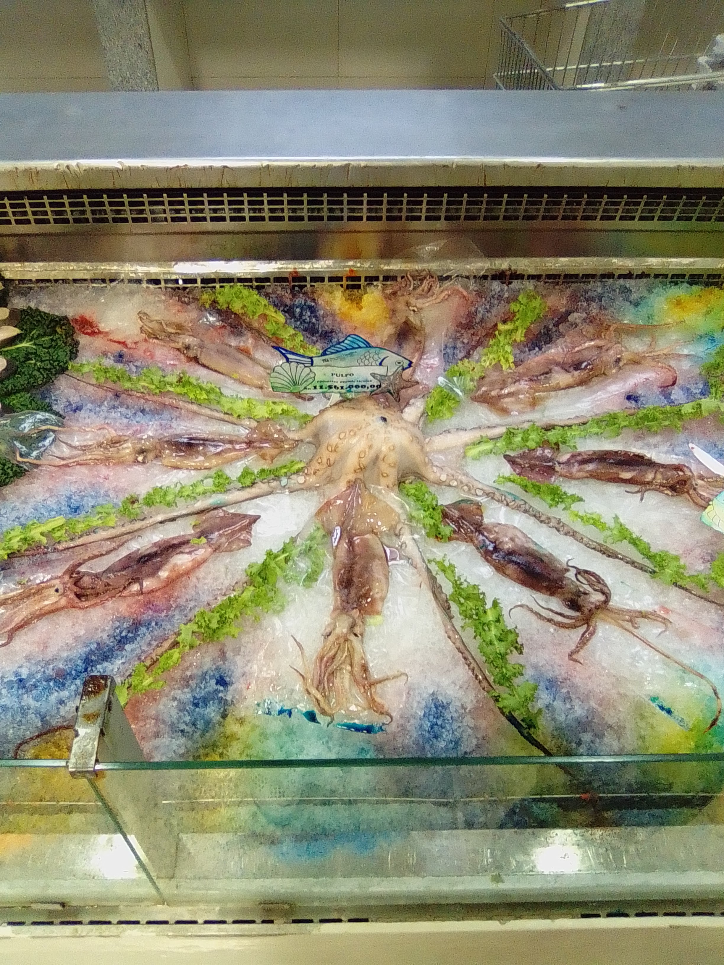
Este pulpo llamó mucho la atención de mi hijo, y cuando nos acercamos, observamos con sospresa que en el diseño incorporaron calamares entre los espacios de los tentáculos. Por más que se vea muy bonito, no lograré que el niño acepte comer pulpo (risas).
Espero que haya sido de su agrado esta publicación. Nosotros la pasamos super divertido y terminamos con broche de oro, comiendo un postrecito.
REFERENCIAS CONSULTADAS
- Sage Journals (02-04-2014). [Estudio publicado]. Eyes in the Aisles: Why Is Cap’n Crunch Looking Down at My Child?. Disponible en
- Sitio web Muy Interesante (S/f). [Artículo onine]. ¿Qué es el neuromarketing?. Disponible en. Consulta: Enero, 2021.
Las imágenes son propias, capturadas con mi dispositivo celular WIN M3.
Soy Alexandra Torres y nos vemos en una próxima entrega. En hive @xandra79.
No dudes en dejarme algún comentario que con gusto te responderé.

Mis anteriores publicaciones:
Diseño realizado en power point utilizando imágen de
Best regards, dear Hive.Blog readers!
Today I wanted to walk through a Supermarket that is close to my house, it is called Hiper Lider and I was delighted with how they display the merchandise in general, but let me tell you that the fish area won the gold award. And this is not by chance, it is a market strategy.
Over the years and marketing have seen that psychology is an influential field when you want to buy a product. If you see it nice, fresh, clean, it will surely win your trust and with greater probability you will decide to buy it.
Musicus et al. (2014) conducted a scientific study (Reference No. 1), concluding that when children were in visual contact with the cereal characters, sales increased, this is associated with the child's connection with the cereal, which will immediately surface emotions and the enormous desire to acquire the product.
This type of study, along with others, has led to the evolution of neuromarketing, which in simple terms refers to the science that studies the brain in the purchasing process.
See reference No. 2.
And in this way it is that we can see supermarkets so well thought out on their shelves, and in the case that I present to you today in the exhibition of the fish area.
The idea is to attract attention and in a positive way. This is achieved with a design that is pleasant to the eye and to the smell, because it should not only be beautiful. If it smells bad, a message will immediately reach our brain saying "Don't buy it, it's not fresh."
And the visual strategy in this case was made up of several aspects:
- Present a colorful design:
They achieved this by mixing slush ice with coloring, using several layers of different colors, and also decorating with lettuce that stands out with its greenness.
- Circular and semicircular shapes:
They did this to have a vision of movement, dynamic, contrasting in an excellent way with the different layers of colors.
- Display the fish or shellfish for each item in the central part and around their respective cuts of sale presentation:
As they say over there, what is not exhibited is not sold, and here they showed off by placing the fish in the center, visually connecting the person with the product they want to buy and presenting their cuts in a pleasant way.
Note in this case the fish called "Dorado", the whole fish is at the bottom and around the wheels in a semicircle. Both with their name and price tags. There is no doubt about the product that is being sold and in what form of presentation; the customer will have the last word.
This octopus caught my son's attention, and when we got closer, we noticed with surprise that squid was incorporated into the design between the spaces of the tentacles. No matter how pretty it looks, I won't get the child to agree to eat octopus (laughs).
I hope this publication has been to your liking. We had a great time and ended up having dessert.
REFERENCES CONSULTED
- Sage Journals (02-04-2014). [Online article]. Eyes in the Aisles: Why Is Cap’n Crunch Looking Down at My Child?. Available in
- Sitio web Muy Interesante (S/f). [Online article]. ¿Qué es el neuromarketing?. Available in. Consulted: Enero, 2021.
The images are my own, captured with my WIN M3 mobile device.
#science
I'm Alexandra Torres and we'll see you next. In hive @xandra79.
Do not hesitate to leave me a comment that I will gladly answer you.
Hola @xandra79, este post ha sido propuesto para ser votado por la cuenta @Cervantes, saludos!
Muy agradecida con el Proyecto @cervantes y @fridakahlo por el valioso apoyo a mi publicación. Les auguro el mayor de los éxitos en este año 2021!