Every ideal web application would always have a navigation bar which helps or makes it easier for users of the web application software or visitors on the web application to see all other important pages on the application and be able to navigate through them easily.
When it comes to responsiveness of the Navbar, it is a very essential factor any web developer or the developer of the web application to consider so that on any device the web application is been viewed or opened from the navbar fits in appropriately with a good UI (User Interface) and UX (User Experience).
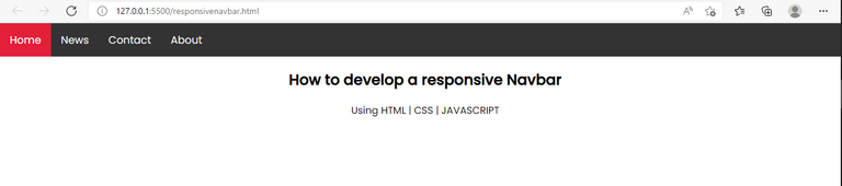
In modern design or development of navbar, the way it displays on desktop screen defers from how to shows on mobile or tablet screens devices.
On the desktop screen the navbar is meant to show in full, that is, showing all links to the webpages on the web application because on the desktop view or screen their is enough space to the links to fit in. But on the other hand when it gets to the mobile or tablet screen devices, their isn't no more enough space to actually make all the links to web pages on the web application to show and by forcing it show show in full would greatly affects the UI (User Interface) of the web application that is why the navbar needs to collapse on the mobile screens where by their would be an icon to replace the links, and when the icon is been clicked on it shows the links to other web pages in the web application.
<!DOCTYPE html>
<html>
  <head>
    <meta name="viewport" content="width=device-width, initial-scale=1" />
    <link
      rel="stylesheet"
      href="https://cdnjs.cloudflare.com/ajax/libs/font-awesome/4.7.0/css/font-awesome.min.css"
    />
    <link href="https://fonts.googleapis.com/css2?family=Poppins:ital,wght@0,400;0,500;1,400;1,700&display=swap" rel="stylesheet">

    <link rel="stylesheet" href="style.css" />
    <title>Responsive Navbar</title>
  </head>
  <body>
    <div class="topnav" id="myTopnav">
      <a href="#home" class="active">Home</a>
      <a href="#news">News</a>
      <a href="#contact">Contact</a>
      <a href="#about">About</a>
      <a href="javascript:void(0);" class="icon" onclick="myFunction()">
        <i id="ic" class="fa fa-bars"></i>
      </a>
    </div>

    <div style="padding-left: 16px">
      <h2>How to develop a responsive Navbar</h2>
      <p>Using HTML | CSS | JAVASCRIPT</p>
    </div>
    <script src="main.js"></script>
  </body>
</html>
body {
  margin: 0;
  font-family: Poppins;
  text-align: center;
}

.topnav {
  overflow: hidden;
  background-color: #333;
}

.topnav a {
  float: left;
  display: block;
  color: #f2f2f2;
  text-align: center;
  padding: 14px 16px;
  text-decoration: none;
  font-size: 17px;
}

.topnav a:hover {
  background-color: #ddd;
  color: black;
}

.topnav a.active {
  background-color: #e41f3a;
  color: white;
}

.topnav .icon {
  display: none;
}

@media screen and (max-width: 600px) {
  .topnav a:not(:first-child) {display: none;}
  .topnav a.icon {
    float: right;
    display: block;
  }
}

@media screen and (max-width: 600px) {
  .topnav.responsive {position: relative;}
  .topnav.responsive .icon {
    position: absolute;
    right: 0;
    top: 0;
  }
  .topnav.responsive a {
    float: none;
    display: block;
    text-align: left;
  }
}
function myFunction() {
    var x = document.getElementById("myTopnav");
    var i = document.getElementById("ic")

    if (x.className === "topnav") {
        x.className += " responsive";
        i.classList.remove("fa-bars")
        i.classList.add("fa-times")

    } else {
      x.className = "topnav";
      i.classList.remove("fa-times")
    i.classList.add("fa-bars")
    }
  }
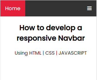
On desktop or large screen devices, all the links to webpages on the web application are made to display while the icon are been set to not display using this CSS code.
.topnav .icon {
  display: none;
}
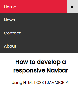
When it get to mobile screen devices, all the links to webpage are set to not display except the first one which is the HOME link and also it can be replaced with a logo and also the icon is been made to display using this CSS code.
@media screen and (max-width: 600px) {
  .topnav a:not(:first-child) {display: none;}
  .topnav a.icon {
    float: right;
    display: block;
  }
}
On clicking on the toggle icon on the navbar the function myFunction() is been executed with the code:
function myFunction() {
    var x = document.getElementById("myTopnav");
    var i = document.getElementById("ic")

    if (x.className === "topnav") {
        x.className += " responsive";
        i.classList.remove("fa-bars")
        i.classList.add("fa-times")

    } else {
      x.className = "topnav";
      i.classList.remove("fa-times")
    i.classList.add("fa-bars")
    }
  }
with the function been executed, it adds a class name of responsive to the div with topnav class. Thereby making the CSS code below to execute and changes the bar icon to a cross or times icon:
@media screen and (max-width: 600px) {
  .topnav.responsive {position: relative;}
  .topnav.responsive .icon {
    position: absolute;
    right: 0;
    top: 0;
  }
  .topnav.responsive a {
    float: none;
    display: block;
    text-align: left;
  }
}
With the CSS code above, the links to the webpages on the web application then shows on clicking on the icon and collapse or stops showing when the time or cross icon is been clicked.
Thanks for reading and visiting my blog 🤝. Kindly support this post by reblogging, upvoting, and commenting, it would be highly appreciated.