
The title of this artwork has a triple meaning. Toe or Tow the Line is a figure of speech. It's actually TOE the Line from a military standpoint and it means to get in order. You literally get your toes on the invisible line to line up in rank and file. Tow the Line is a common error in using this expression but I find it to be quite similar in symbolic value. The overall value of this expression is to get in line and follow orders or in essence to conform to a standard without causing problems.
Towing is to pull something along as with a rope/line. Toeing a line is getting in a proper position. I think we are all being pulled into a standard of conformity in the world and at some point, we will realize WE ARE THE LINE! Hence the title of this work "toWe The Line." This title encompasses all three values into one.
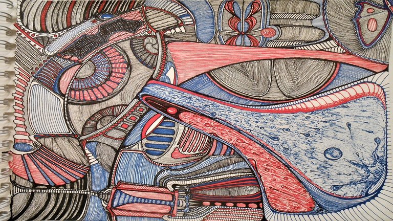
I finally decided to split this post into two for the sake of what little brevity I can offer. I will be making a secondary post with more images like the one above to explore the artwork from different angles and vantage points of view. Below, the progress and process is shown in many steps finishing with my first ever created gif of the process forward and backward. I do hope you enjoy this artwork and the creative process it took to make the final image.
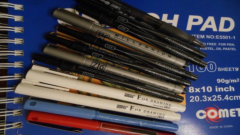
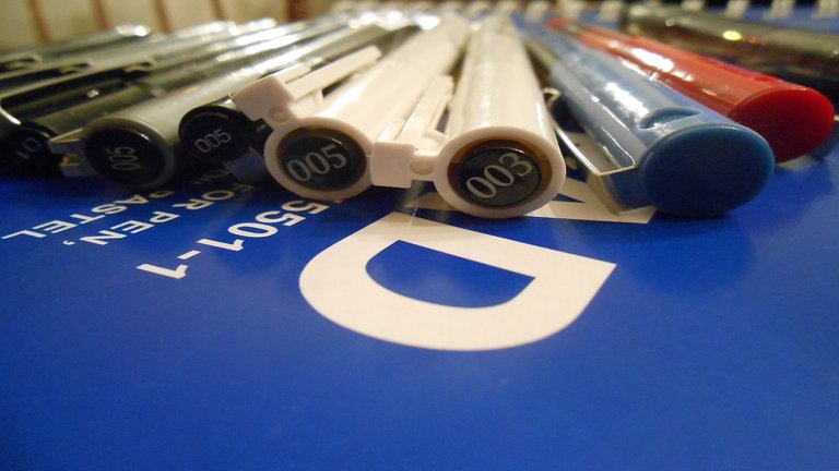
Just below are all the pens on top of the cheap sketch pad that I used to do this artwork. I originally started with pencil to ink over but the paper didn't allow for erasing... so i just skipped the pencil and went all-in with the ink.
Originally this was just going to be an exercise in line design to knock the rust off since it's been so long since I made any art. However, I happened upon another inspiration along the way though. I came across a musical artist called The Caretaker and a project he worked on called 'Everywhere at the end of time' to simulate through music the process and stages of going through Dementia.
I couldn't resist the opportunity to get lost in this artwork as well as in my mind. To be honest, it did take me into a pretty dark headspace but overall I am quite appreciative of his project and the chance to try my best to empathize with those that have or had loved ones with Dementia and the folks actually going through the stages of it themselves.
I have put the link to the 6 and a half hour complete audio version of this project for anyone interesting in taking the journey too. This was the theme for a vast majority of the art creation process although I couldn't actually listen to the full audio in one sitting. I did have to give my brain a break from the madness. This artwork also took more than that time would have allotted as well.
EVERYWHERE AT THE END OF TIME - Stages 1-6 (COMPLETE)
'Everywhere at the end of time' was a series exploring dementia, its advancement and its totality.
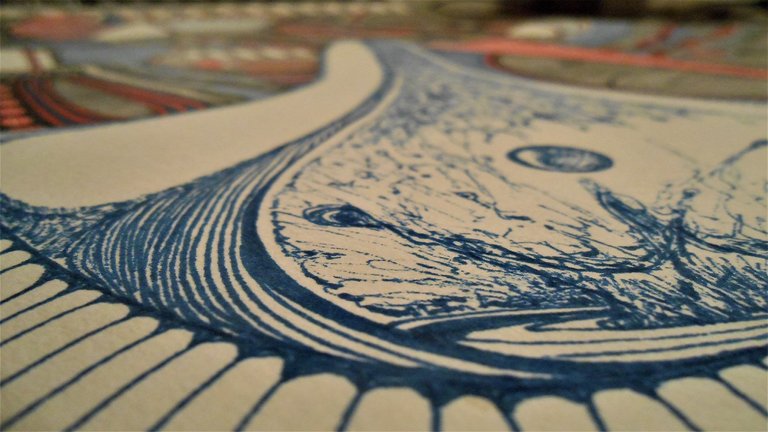
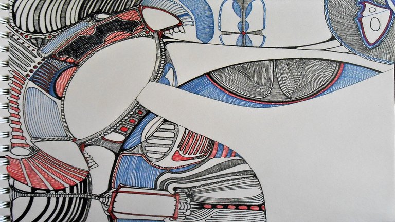
Here is where we begin the process. I wasn't sure if this initial shape was going to be a mouth or an eye but i was pretty sure that the thing at the bottom would be a type of lamp or lantern of some sort. Generally, I am never too sure on anything in an artwork of this kind. I generally am extremely flexible at modifying and adapting the subject matter to the process.
At this stage, I was pretty sure this would end up becoming an eye of sorts and wanted to leave the cascading shape outpouring, to represent a flow of tears, blank until the end. I tried to not have as much substance in the subject matter and overall design. I kind of wanted lines to just do all the towing of the eye and interest.
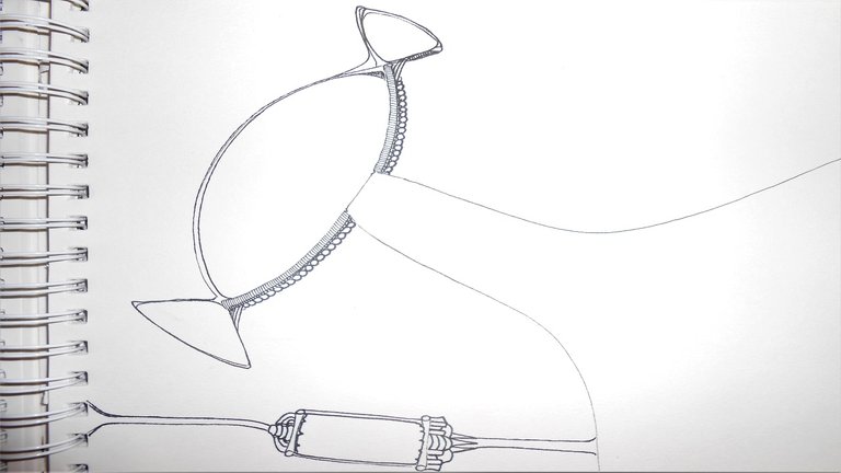
My original intent was to only use the black ink pens but the red ink seemed to want to get into the fray! Red ink pen is a totally different kind of ink and a much larger size with a more fluid ink that tended to bleed causing some additional technique challenges. I enjoyed accepting the challenge of testing the precision and pressure as well as the angles needed to get everything to produce the way that was more uniform to the overall continuity.
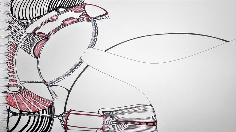
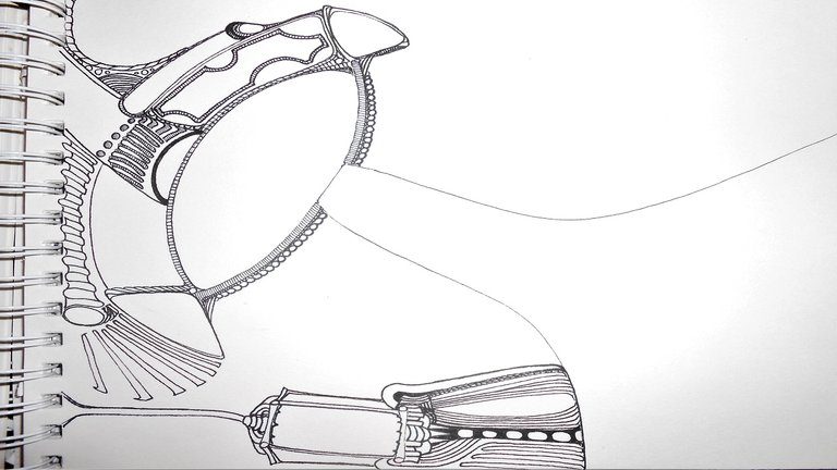
I added some teeth pretty randomly. They harkened back to my intention of making the original shape an eye or a mouth. Now, it can kind of be both at the same time. I also thought as the music and confusion progressed of being swallowed up in thought and losing the normal expectations of what we see. These teeth are the only truly organic thing in the entirety of the art piece. After what i thought was the random addition of the teeth, i began to feel the old influence of the Xenomorph from Alien created by H. R. Giger.
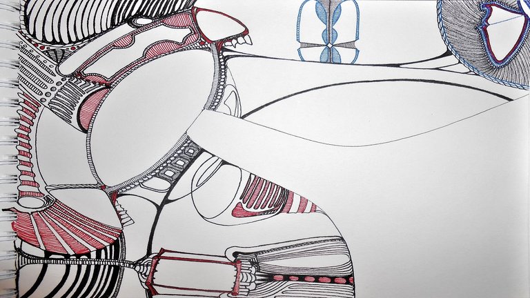
After adding some circular shapes to create layers of negative space and using lines within lines to create some interesting flows of movement often times in opposition to one another blue ink found it's way onto the page. The blue pen and ink is the exact same as the red pen affording me some of the same challenges. I also added a recognizable shape. I put a butterfly in a corner. I wanted to make that organic and delicate shape less and less organic as the art progressed. This was a mild litmus to see how far the normality could escape. There was also a digital aspect to what I wanted to have the viewer feel or experience. I also added a type of scarab shaped digital shell close to the braided circle encompassing the butterfly.
Close to the lamp or lantern I thought about making a digital eye isolated from it's housing... but it didn't come together to be that in the end. At this point in the music and dementia experiment... nothing would be finished the way it was intended when it began. There was quite a bit that went on from the last image to this one. Sometimes, i forgot to add an update in the progress. You will probably thank me for that if you are still reading this now! hahahaha
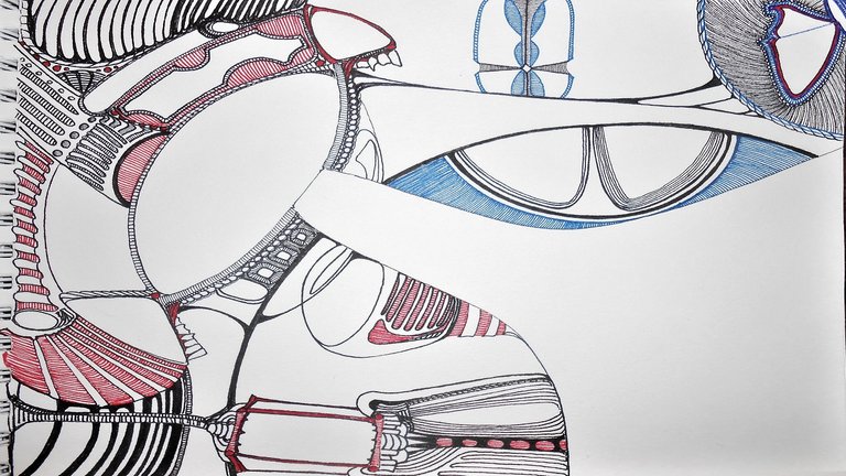
I didn't intend it but the shape similar to an eye by the butterfly continued to remind me of a fingerprint. This was just a happy accident as old Bob used to say. I did one and only one area of cross-hatching and it's my least favorite part of this entire artwork. Let's see if you can find where! I did fill in some more of the blue to try and balance out how much red was already on the page.
In the fingerprint semi-circle i wasn't sure if that plane should continue on the same layer as the other portion of that negative space on the other side of the cascade. I did end up unifying the blue lines in similar form to create the circular texture and motion and the continuity was carried over in the background for it. This stage became more layered and in some regards geometrically oriented. The music was growing more abstract and i felt that taking the abstraction filling in voids would be expressive in holding on the shapes that were more geometric than fluid. One last attempt and holding on to the familiar.
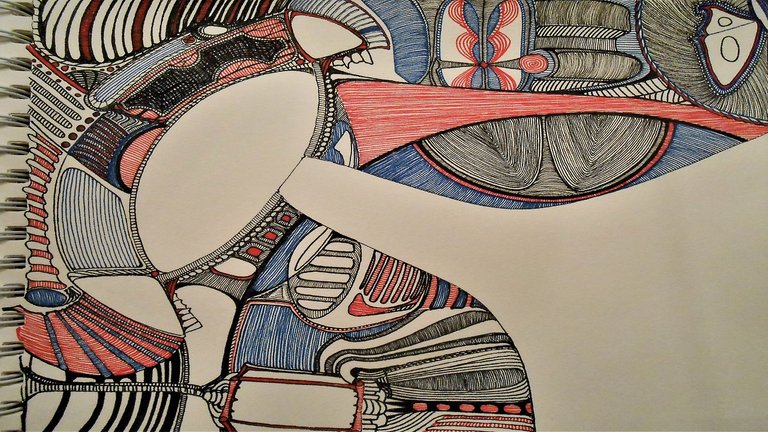
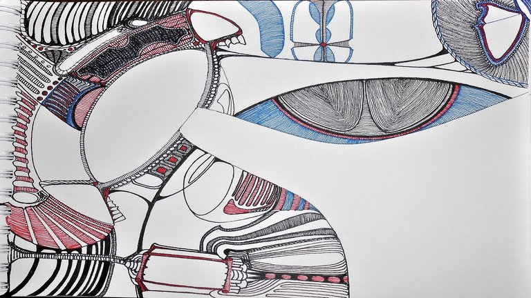
In this stage i began to not just fill in voids but to outline particular areas solidifying in black the enveloping lines that created textures and oriented to eye to see motion where there is none. My eyes themselves had a hard time locking in to the row of line i was on. It was pretty difficult to maintain focus between losing my literal eye and distracting from my focus in the madness of the music. I didn't feel i was losing my mind as much as i felt i was just moving in different places of thought and memory.
Negative space became positive space and positive space became negative. Lines broke up background from foreground and ther rhyme and reason behind much of what was going on at this point was probably only known to me. I found myself thinking of people and events i hadn't thought about in years. I found myself losing myself to the line and being towed up and down and around the page. Red to blue to black and back again. Line upon line... here a little and there a little.
At this point... the eye-mouth was coming together in a way that i wasn't sure anymore if it was either one of those things any longer. I considered making it a series of lights. I had considered adding a glowing green to accent certain areas and simulate light. However, i ended up sticking to the dementia simulation and allowing the black, blue, and red to dictate all forms and flows. Much detail was added by decreasing the size of the nibs. Certain outlines that were inside were added to create abnormal contrasts. The largest of which was .o8 mm and the smallest of nibs consisted of .003 mm. I took out my contacts to draw blind (almost literally) and accommodate the minutest of details.
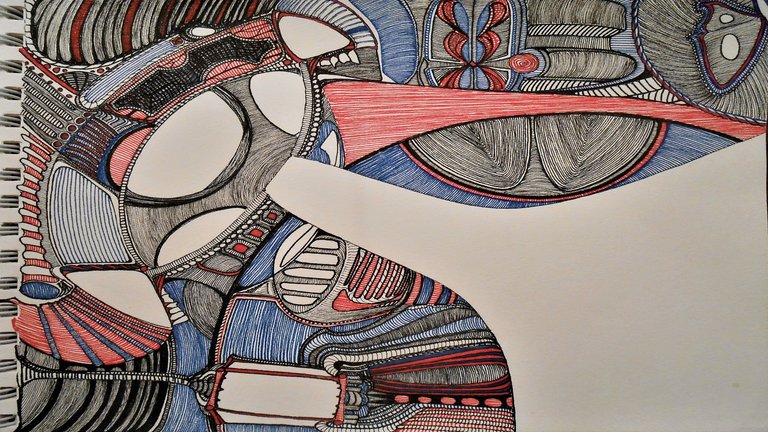
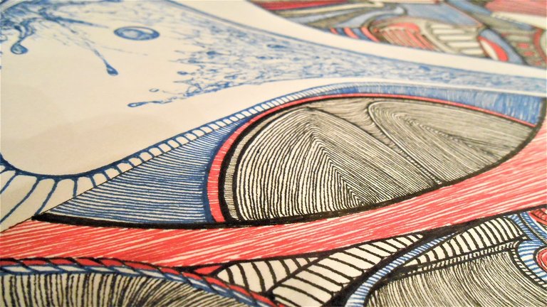
Filling in the three eyes in one was something i had looked forward to from the onset but found to be more randomized and less planned than i had hoped for. This project was definitely nothing too planned and the plans changed at almost every opportunity to choose a direction. The only true flow to this art was in the lines themselves. I truly found myself lost in the lines. I did notice that some experiments were more pleasing than others in how things turned out. For example, the area between what looks like two fingerprints was cool to me. Is it behind or in front of the two fingerprint looking areas? I don't know. The perimeter of the mechanical Irises is another area that looks bent and over and under-lapping creating a fluidity while maintaining shape.
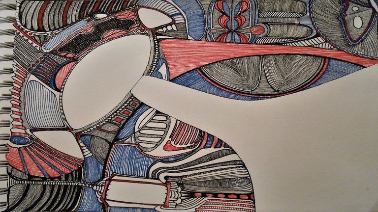
Around this time, i believe, the music was over. The dementia experiment had come to it's finality... but since the art wasn't finished i carried on the theme moving forward. I did chang music though and just kept the feel going. Coming to the end of an artwork can be bittersweet. I was running out of room to fill in voids and knew things were coming to a close. It was almost anti-climatic....ALMOST! You probably didn't notice, but for the last prior four images i had gotten a spot of coffee in the bottom right corner of the cascade area. Needless to say, that was the first thing i addressed once starting on the only area of the paper that was best saved for last.
In this area, i had decided to do lines on the perimeter and use it as a type of border but fill the leftover negative space with texture and shading. The cascade would be mostly in the form of water representing many things but mostly tears. This waterfall of tears would be oriented to fall down in relation to the eye. I wanted to have this be something more in reference to us as viewers rather than an inner reflection of the person if this art were one. I wanted to have the drop splashing up as well to give a depth where there isn't one and the concept of time not following the normal rules either since the cascade hasn't quite reached the bottom yet.
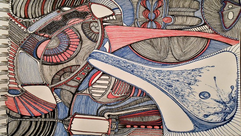
By now as we conclude i am thankful you have read this far for anyone/everyone that has! If you look the cascade is falling up at the same time as rolling down out of the eye. In this art there no true orientation. The red counter sides and backs of the cascade reminded me of it raining blood. I made the rain go up and the cascade come down if you are looking at the eye as being on the top side. I have always enjoyed making my art enjoyable to look at from any and all sides when possible. Some of the nuances of these images can only truly be appreciated by turning it around or flipping it upside down and looking closely in all areas. There isn't really much hidden in this piece. I usually hide things away in my art... but this one has no room to hide much. The lines are lines.
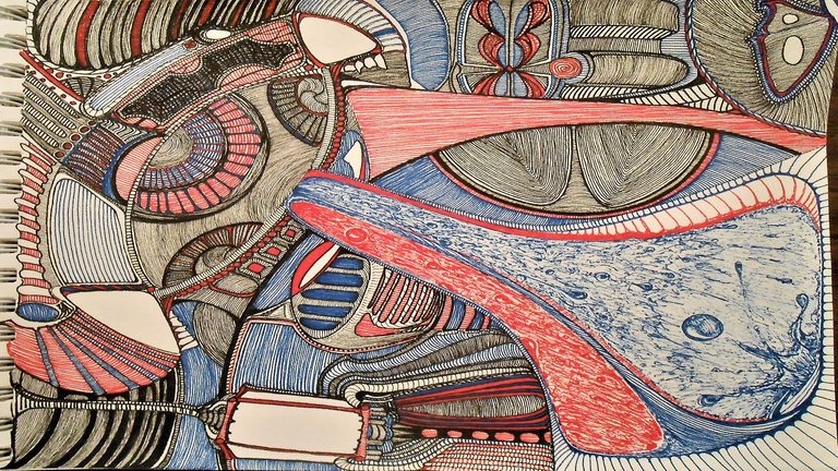
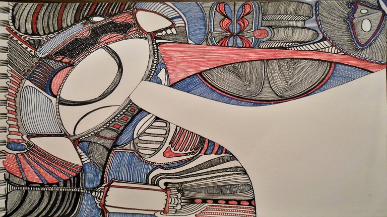
With the last stage of finishing this work i went back and used some outlining for depth and clarity in areas that felt a little flat. I also filled in the few and last remaining empty spaces. I could have spent more time cleaning things up but felt i would end up over-working this thing. My mind was gone and i didn't want to come back and clean things up when the point was to lose all order and normalcy. I don't really feel i did dementia justice but the process was quite an experience for me. The cascade is my favorite part but probably because it's most recognizable as something tangible. I feel like it rightly symbolizes the sadness and blood relation of someone losing themselves and their memory to dementia.
Not that the affected person would know though. After reading many of the comments from people experiencing it with a loved one or going through the progressive stages themselves the descriptions are across the board. The cascade best represents the emotional aspect of it. The black also helps give the cascade the depth i felt it was lacking in just the red and blue... which i originally wanted to leave it as. I am glad that i did finish with that touch.
I did optimize my commentary, believe it or not, and i did photo edit to optimize the images. I left a couple up in a larger format for those that want to inspect more closely. Thank you for sharing in this experience with me. I promise my follow up post won't be as long to look at or read. I do appreciate anyone and everyone that has taken the time to go over the process of creating here with me.
I wanted to show the tools once more and another image that will orient more in alignment with the follow-up post.
Here at the very bottom, you will see the gif of the process. Hopefully, some folks just scrolled and scrolled and scrolled down and got the Cliff's Notes version by checking that gif out. toWe or Be your own line!

(normally i would put my signature Bob Ross gif with some uplifting words of wisdom... but not this time for your sake!)
Thanks for joining me in this endeavor. Hive is Alive and i look forward to contributing to the community more often. Thanks for all the encouragement and inspiration here! Be thankful for all that you have and make the best of your opportunities. Time and chance happen to us all. Take your time and maximize your chances. To adventure, you have to add venture. Remember, nothing ventured.... Nothing Gained!
Great work! Your post was selected for curation by one of @curangel's dedicated curators for its contribution to quality!
...unfortunately, it had to be excluded from curation because of the use of a service (reward.app) to liquify rewards.Our upvotes are reserved for content which is created with a commitment to long term growth and decentralization of Hive Power.
This exclusion only applies to this and eventually other future liquified posts and not all your publications in general.
Take care and hive five!
Thank you for the consideration! I used the reward.app not so much for the liquid option as I will be fully powering up all rewards... but rather to give back to curators. I hope to be considered in future posts or perhaps to the follow up post for this artwork. Thanks again and HIVE FIVE back at ya! =)
Now, I do get to throw in my Bob Ross signature gif!
That is really great work! I am guessing it is "patience building" in the time and precision it takes, as well as developing "frustration management" when lines get too close together, or too far apart :)
Do you ever do them at larger scale?
Thanks man! It is definitely a patience and precision builder. I abhor it when the lines don't go where they are meant to, especially when too close together or wavy. This paper had some grip to it so every now and again my palm or wrist would catch during a slide or pivot. You have to just do better on the next row. I can tell my eyes aren't what they used to be and that my hand is out of practice.
In school back in the day I was using markers and colored pencils to decorate my wall and I did do a series of murals that had some of this kind of style to it. So, i guess the simple answer is yes. I don't know why i always liked working small though. Big is an interesting perspective in reverse though. Thanks for taking the time out of your late busy day/night to stop by over here!
Cool idea, and how lot pens did get empty ? 😅😊👌👌
Thank you! I actually didn't drain any pens all the way... yet! I do appreciate you coming over and taking the time to check it out! I will do a black and white one for you too!

Cool ... I be more back then :))