It's a wishful thinking that one's got to be taught by Victo Ngai - a known digital illustration artist. However, it's now possible and easily accessible, thanks to Skillshare.
As a budding self-taught artist, I rely heavily on tutorials, from written to videos. Many videos are freely available in platforms such as Youtube. The key difference with Youtube and Skillshare is that there are more chances you can find well-explained classes in the latter.
So, I stumbled upon Victo's class entitled "Color Masterclass: Simple Steps to Create Vivid Art." The steps are really simple. Key takeaways are to (1) know the basic principles <relativity, consistency, value contrast, accent color, ratio) and (2) try "stealing" a color palette to start your practice if you're still not confident in choosing your own.
Immediately, I tried to apply what I learned and although it's messy, I'm quite happy with how this turned out. I felt that at least, I have some direction now.
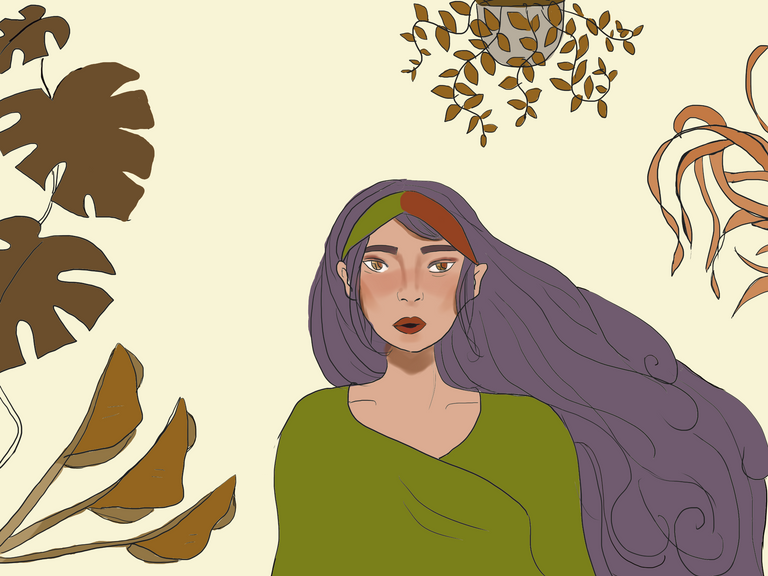
STEPS
Step 1: SKETCH THE OUTLINE. I love plants so I want to incorporate them in this piece. I'm also into drawing girls if it's not obvious in my IG account dedicated for my drawings. Hairlines are not consistent but yeah, I pushed through with that. lol
Step 2: PICK/STEAL, PERSONALIZE, and REFINE THE COLOR PALETTE. Since I'm new to all of these, I tried Victo's suggestion to borrow colors from other artworks. So I found this:
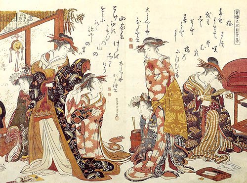
I personalized this and with some mix and match of ratio, I created a plain-colored piece below.
Step 3: LAY THE COLORS.
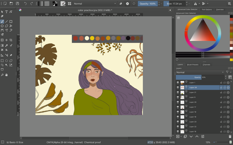
On the upper right, you can see the colors I color-picked from Kitao's piece. Victo suggested that you put these colors on top of a gray background so you can see their "true" colors because the contrast will be different (principle #3: value contrast) if the background color is.
Personally, I like how it is now but I tried to do more and see what can I add or if adding anything actually helps.
Step 4: DO THE FINISHING TOUCHES.
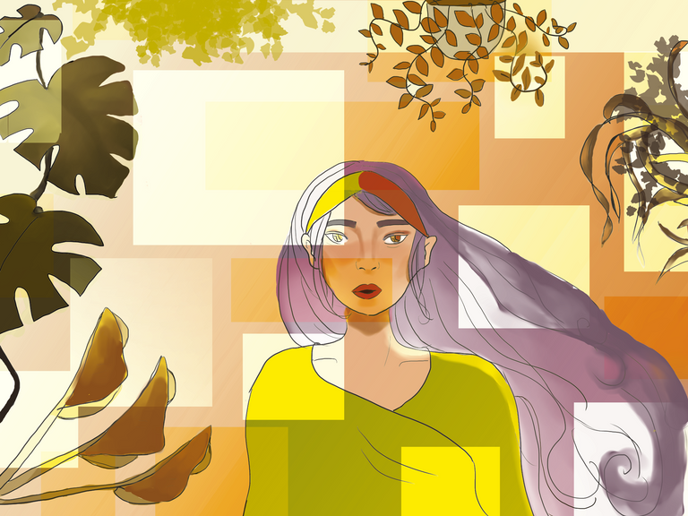
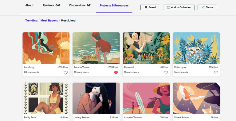
In Skillshare, you can upload your projects and share it with your classmates and Victo. She can also leave some notes, too! Here are some of the most liked projects uploaded there:
I drew digital artworks to ease the sadness and anxiety brought upon by the pandemic. I upload my artworks on munimuni.space/artworks/debi.
It's a beautiful paint. I love the colours. I create custom palettes from paintings or pictures I like and tweak the colours to satisfaction. It has cured me of using the same colour scheme over and over again and claiming it's my style
Thank you! I saw your works and they're so good. Looking forward to learning more <3
Skillshare is indeed helpful. That's also my go-to site aside from YT whenever I need to learn/enhance skills (for work purposes). How I wish I have a talent like yours. I really like what you did there. :)
Thank you! I'm still learning and I wish I get to improve more <3
Very nice artwork. Keep on doing that good artwork.
Thank you! I'm humbled. 🌼
Keep on creating art, it is very satisfying and can also inspire others. :)
This is very neat! I like the colors, they are calm and bright at the same time. I also learn a lot from tutorials)
Thank you! I'm glad I'm not the only one <3