Hello all~
Let's see the process~.
Step by step
First I started doing some quick sketches by hand to get an idea and some inspiration. I read some links inside the contest post and @ragnarok.game posts where they explain more about the game and where they showed the art style of the game. I also researched some Ragnarok symbols, in which a specific type of letters appeared, the Uroboros and Fenrir, among other elements too.
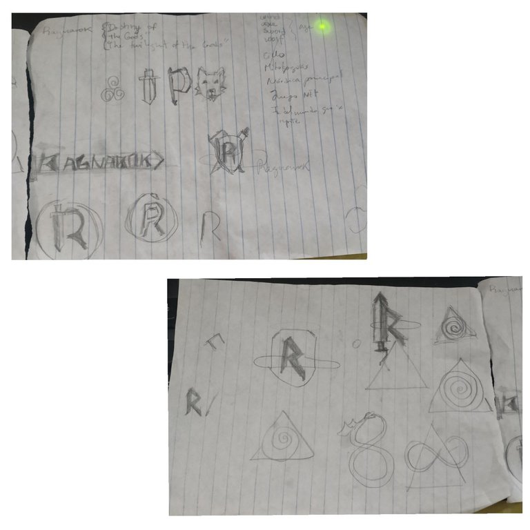
Since @ragnarok.game is a card game based on chess and will include many mythologies around the world, I didn't want to focus on the Norse one so as not to exclude the others. So I decided and preferred to use the name of the game. Here you can see the tries I was doing. I downloaded the reticles from the description of this video.
I developed this typography style (simple and straight) based on the letters and symbols that I was able to research from Norse mythology, also based on runes and engravings that are something more general that can be observed in many cultures. In addition, the game is about a war in which gods, deities and creatures from all mythologies have to fight, so I used sharp, pointed letters, that can give an aggressive appearance.
After defining the typography I decided to add a metallic gradient and try textures that would give it a rustic, strong and engraved finish, specifically I used cracks and a slight bevel. The detail of infinity comes from the Uroboros symbol, so I wanted to simulate that infinity was the kind of snake that wants to eat its tail, also in the game they emphasize this fact that this fight is infinite and is repeated over and over again.
Infinity is in red because it represents the color of blood, in this detail I also try to capture the concept of the fight that occurs within the game.
I did 3D versions too.
Here I share color tests with the same flat and 3D design.
I think the black and white versions are always fundamental to show because sometimes the logo, isotype, imagotype, etc. is needed on backgrounds that do not favor the color version or because its simplest version is required for a specific purpose. So it is good to have the design in different colors that do not go out of the identity of the brand (as they are in black and white).
This is a screenshot of my After Effects project of the short intro for my logo :D.
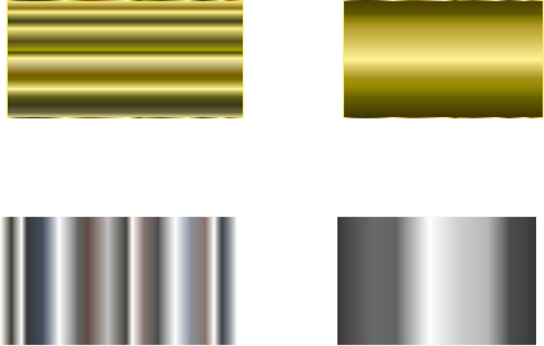
The gradient for the gold and silver version.
I hope you have liked it and thanks for watching!
News section
Remember that I receive requests to illustrate whoever you want, click here for more details ✅😊.
You can follow me on My Twitter where I promote Hive with my art.
All these photos and designs / drawings belong to me, please do not reproduce or distribute for personal or commercial use without my permission.
Hola a todos~
En esta ocasión les quiero explicar mi idea en esta participación en el Concurso del Logo de Ragnarok, un nuevo juego NFT próximo a estar disponible. Realmente me gusta hacer logos así que esta fue una buena oportunidad. Espero también me de chance de mostrarles el otro concepto el cual estoy desarrollando para este reto.
Veamos el proceso~.
Paso a paso
Primero empecé haciendo unos bocetos rápidos a mano para tener una idea y algo de inspiración. Leí algunos links dentro del post del concurso y los posts de @ragnarok.game donde explican más acerca del juego y donde mostraron el estilo de arte del juego. También investigué sobre algunos símbolos del Ragnarok, en los cuales salía un tipo específico de letras, el Uroboros y Fenrir, entre otros elementos.
Como @ragnarok.game es un juego de cartas basado en el ajedrez y que irá incluyendo muchas mitologías al rededor del mundo, no quise centrarme en la nórdica para no excluir a las demás. Por lo que me decanté por usar el nombre del juego. Acá pueden ver las pruebas fui haciendo. Las retículas las descargué de la descripción de este video.
Este estilo de tipografía (simples y rectas) lo desarrollé en base a las letras y símbolos que pude investigar de la mitología nórdica, también basados en runas y grabados que son algo más general que puede ser observado en muchas culturas. Además el juego trata de una guerra en la cual tienen que luchar dioses, deidades y criaturas de todas las mitologías, por lo que usé letras afiladas, puntiagudas, que dan una apariencia agresiva.
Luego de definir la tipografía decidí agregarle un degrades metálico y probar con texturas que le dieran un acabado rústico, fuerte y de grabado, específicamente usé grietas y un leve biselado. El detalle del infinito viene del símbolo del Uroboros, por lo que quise simular que el infinito era la especie de serpiente que quiere comerse la cola, además en el juego recalcan este hecho de que esta pelea es infinita y se repite una y otra vez.
El infinito está en rojo porque este representa el color de la sangre, en este detalle también intento plasmar el concepto de la lucha que se da dentro del juego.
Hice versiones en 3D también.
Acá les comparto pruebas de colores con el mismo diseño plano y en 3D.
Las versiones en blanco y negro creo que siempre son fundamentales de mostrar porque a veces se necesita el logo, isotipo, imagotipo, etc sobre fondos que no favorecen a la versión a color o porque se requiere de su versión más simple para algún propósito en específico. Entonces es bueno tener el diseño en diferentes colores que no salgan de la identidad de la marca (como lo son en blanco y negro).
Esta es una captura de mi proyecto en After Effects de la breve intro para mi logo :D.
El degradado para las versiones dorada y plateada.
Espero les haya gustado y muchas gracias por leer.
Sección de noticias
Recuerde que recibo solicitudes para ilustrar a quien desee, Haga clic aquí para más detalles ✅😊.
Puedes seguirme en Mi Twitter donde promuevo Hive a través de mi arte.
Todas estas fotos y diseños / dibujos me pertenecen, no reproduzca ni distribuya para uso personal o comercial sin mi permiso.
▶️ 3Speak
Very cool... I like this small video and logo ☺🍷👌👌👌
Thanks koit! I really appreciate your support (≧▽≦).
You always impress me, great job! I love the metallic effect of the letters ❤️❤️❤️❤️❤️😽😽😽
Thanks Tav! I'm glad to see you liked it, I put my best there 😆😆😆✨🎉. I really like making logos and was a nice experience because I practiced with illustrator and after effects.
Ae is one of my future learning goals <3 I may ask you questions later! I'm proud of you! ❤️❤️❤️
Thankiuuuuu hehe, si va.
The rewards earned on this comment will go directly to the person sharing the post on Twitter as long as they are registered with @poshtoken. Sign up at https://hiveposh.com.
Nice work on the logos!!! Congratulations!
Thanks! Your comment is really appreciated ✨☺️.
Yay! 🤗
Your content has been boosted with Ecency Points, by @pandx3.
Use Ecency daily to boost your growth on platform!
Support Ecency
Vote for new Proposal
Delegate HP and earn more
Thanks @pandx3 for use your points, hope you can use them on your posts too.
Your help it's really appreciated ✨☺️.