Hello friends!
I recently started taking an online course on oil pastels. I love this plastic drawing material. I can always correct my drawings as I can erase a layer of pastel or overlay another layer of pastel on top. I paint with oil pastels and then rub it with my finger.
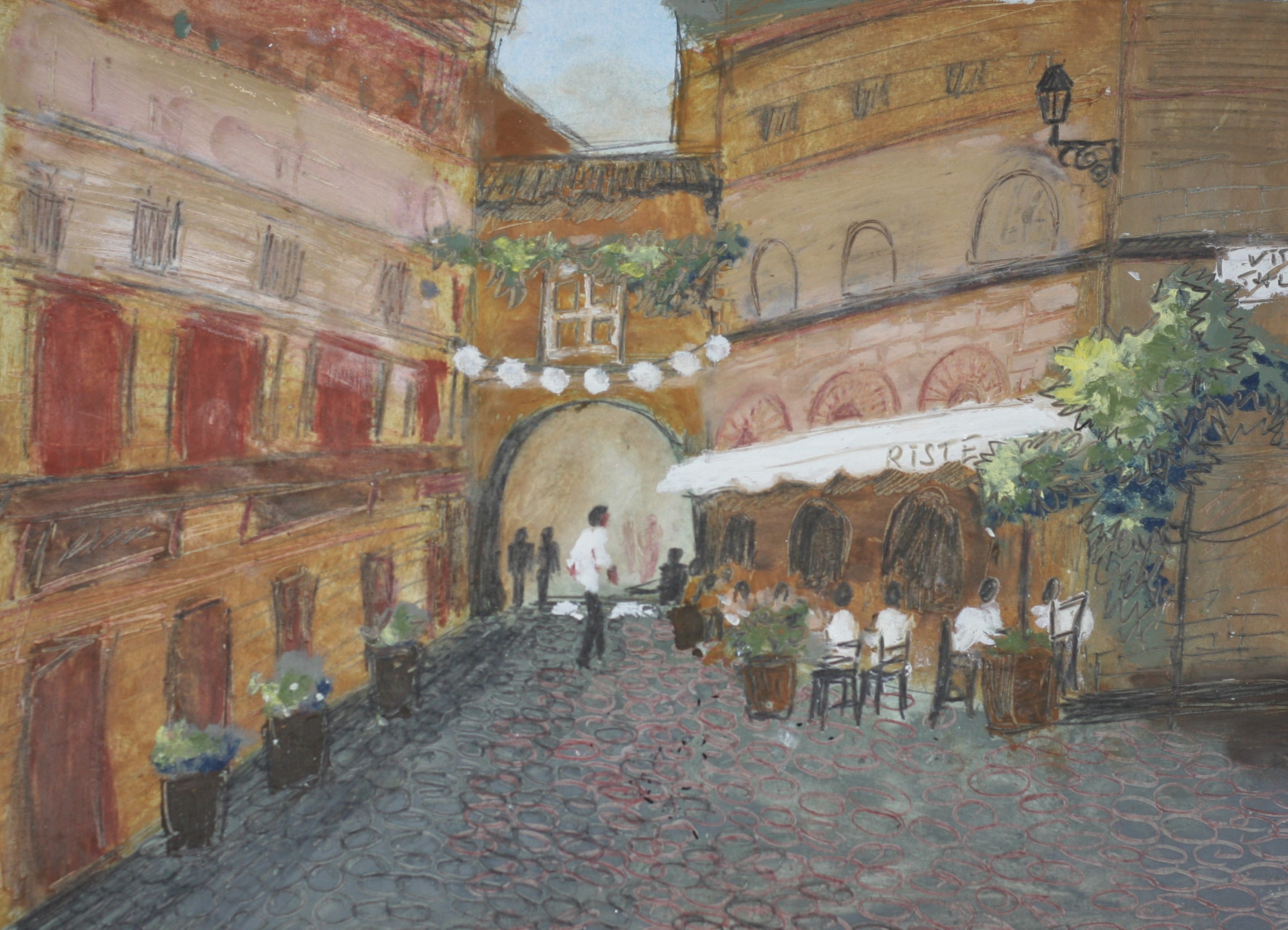
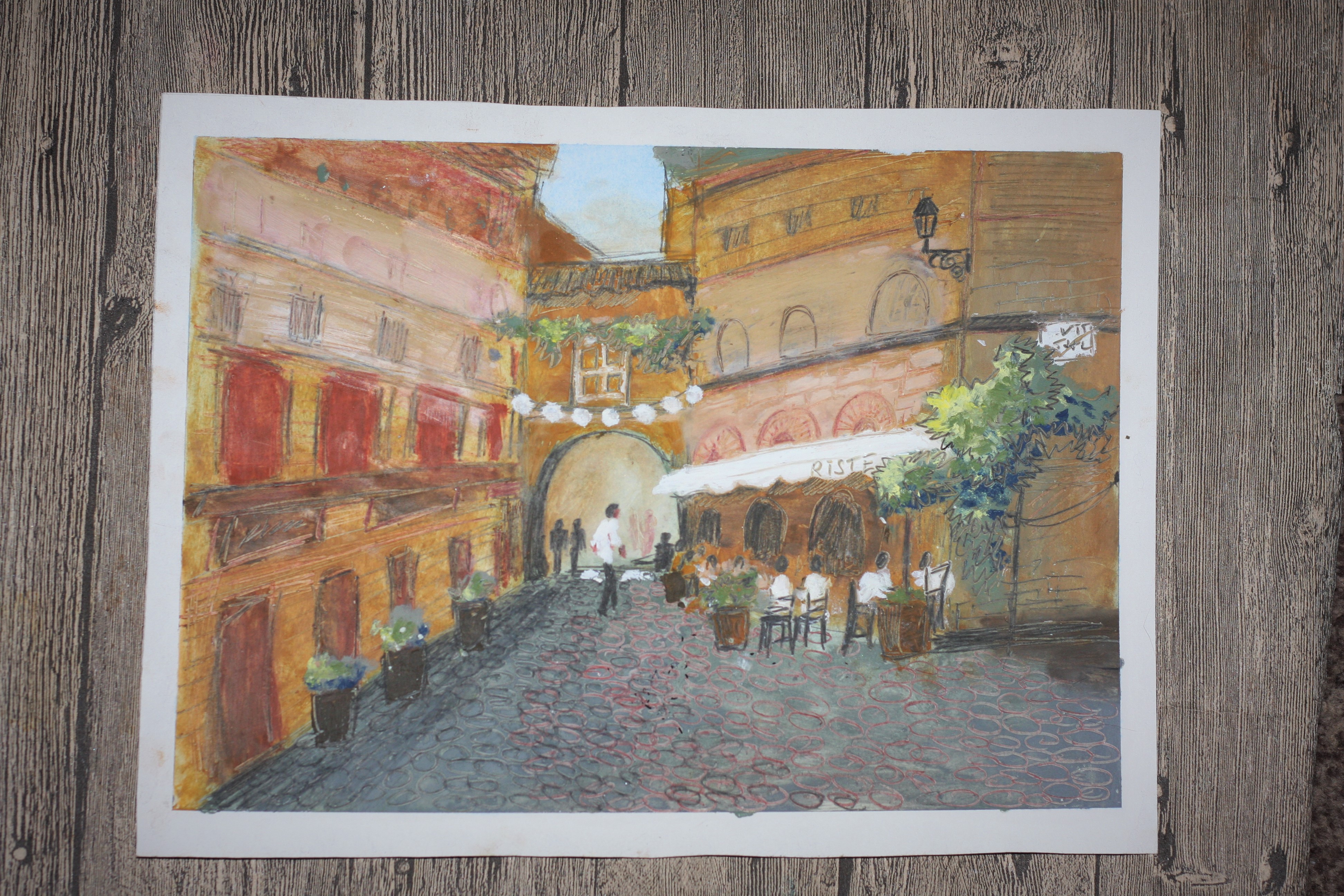
It seems to me that some of the oil pastels are reminiscent of Impressionist paintings ... For example, this one, which depicts a quarter in Rome.
Tools
- sketching paper
- oil pastel (Sennelier or Mungyo Gallery)
- сolour pencils
- solvent
- wet wipes
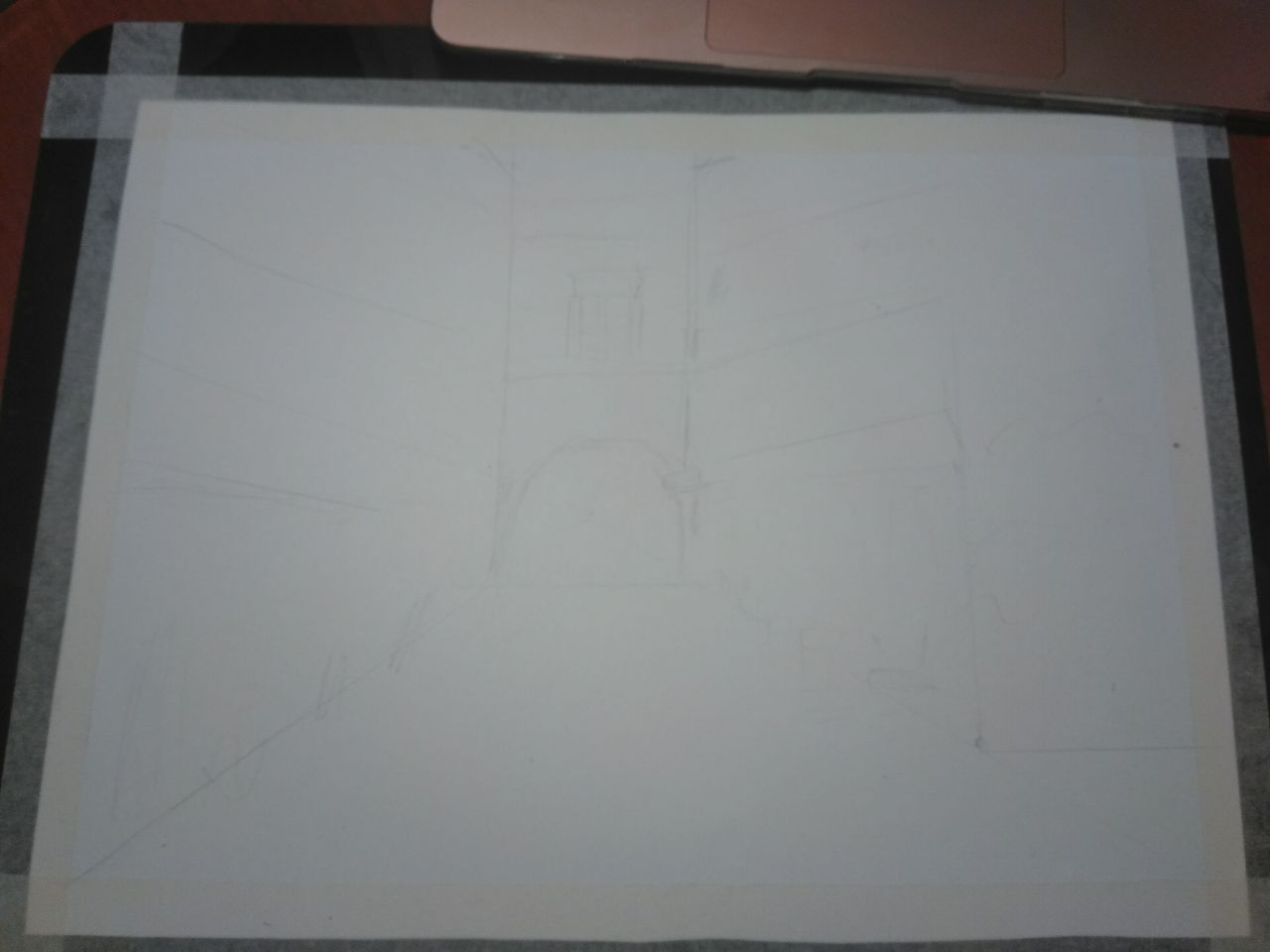
I took paper and made a small sketch of the buildings. This will help me not to distort the perspective in the future.
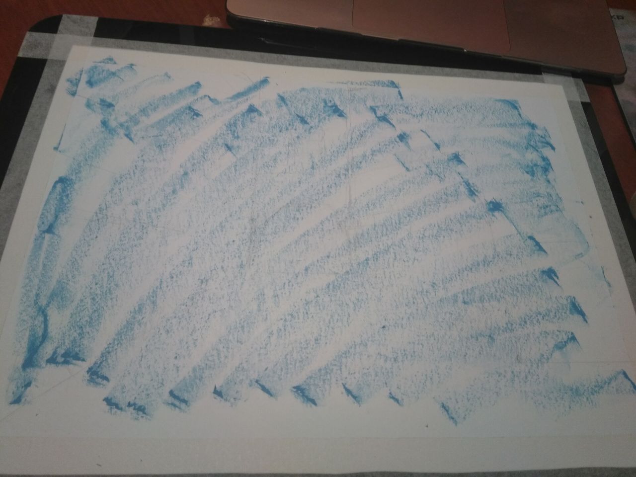
The first thing I do is tint the paper. My drawing will be in ocher tones, so for toning the paper I will use blue. These colors complement each other well. I applied a rough stroke in blue and then rubbed the paper with a solvent napkin. My paper turned blue.
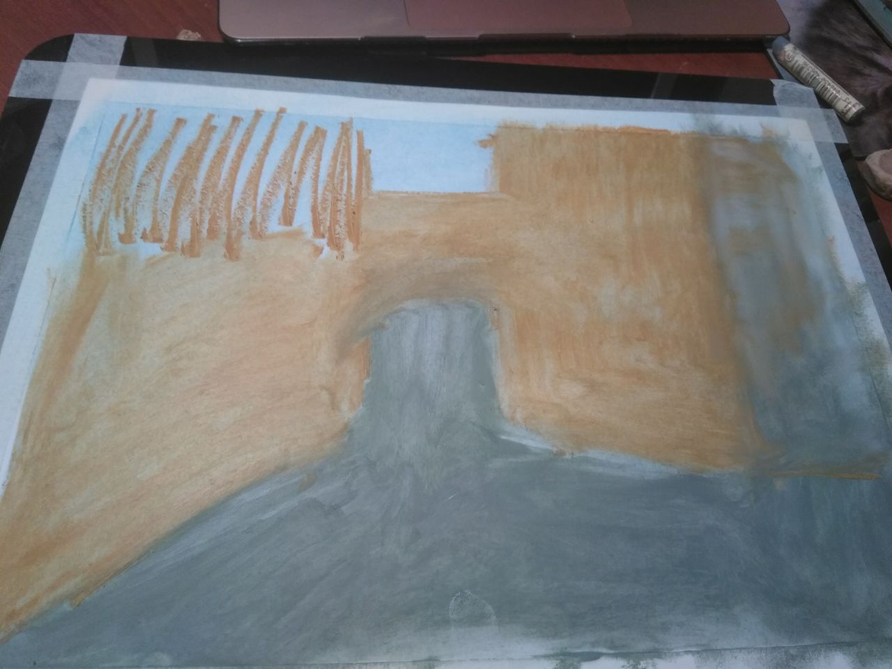
Then I took crayons and began to outline the lines of the buildings. And also to introduce color into buildings. At the same time, I rub the strokes with my finger. This is the base of the buildings, which I will detail next.
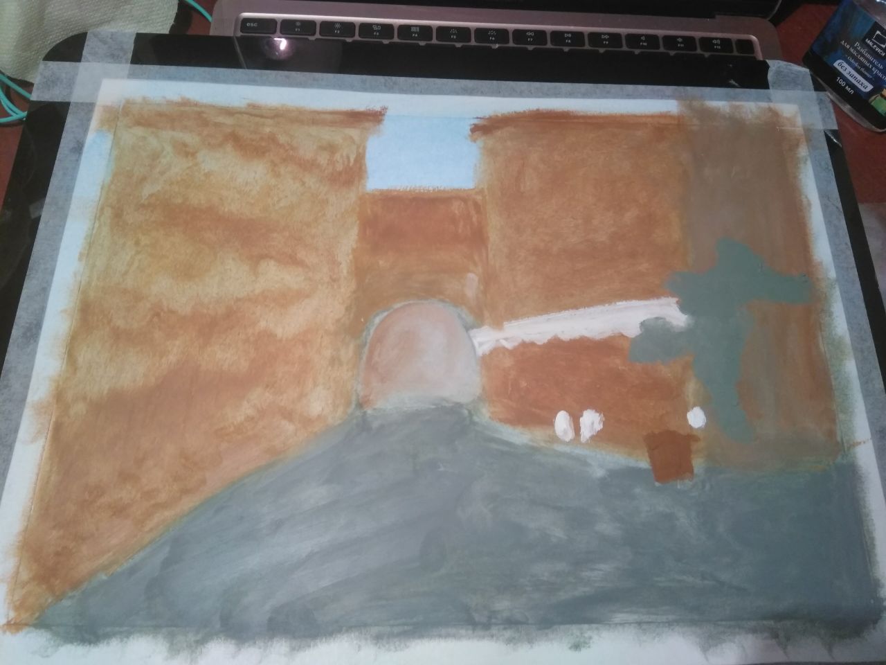
I add brown, gray colors to my drawing. I make spots of gray-green color, where I will paint the plants, and I also paint the cornice in white.
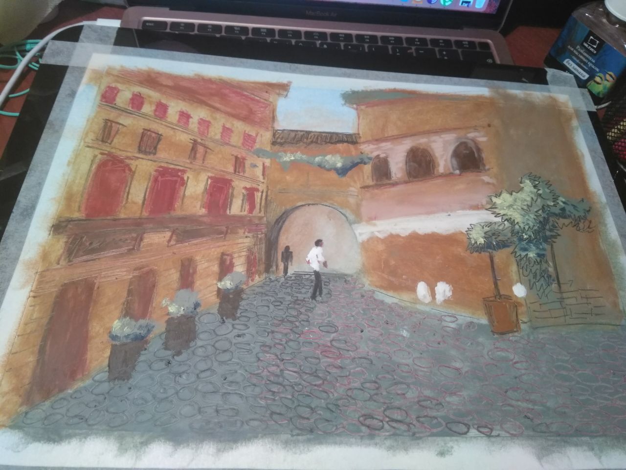
I took colored pencils and began to detail my drawing. This is a very interesting mixed technique - oil pastels and colored pencils. The drawing becomes clear and rich in details. I painted windows on buildings, small details on paving stones, a plant in a tub, and a plant on the wall of a building. I also drew a cafe waiter.
I add more and more detail to the drawing with colored pencils and oil pastels. In some places I add brighter colors. I paint the walls of buildings, chairs in cafes, tubs of plants, people ...
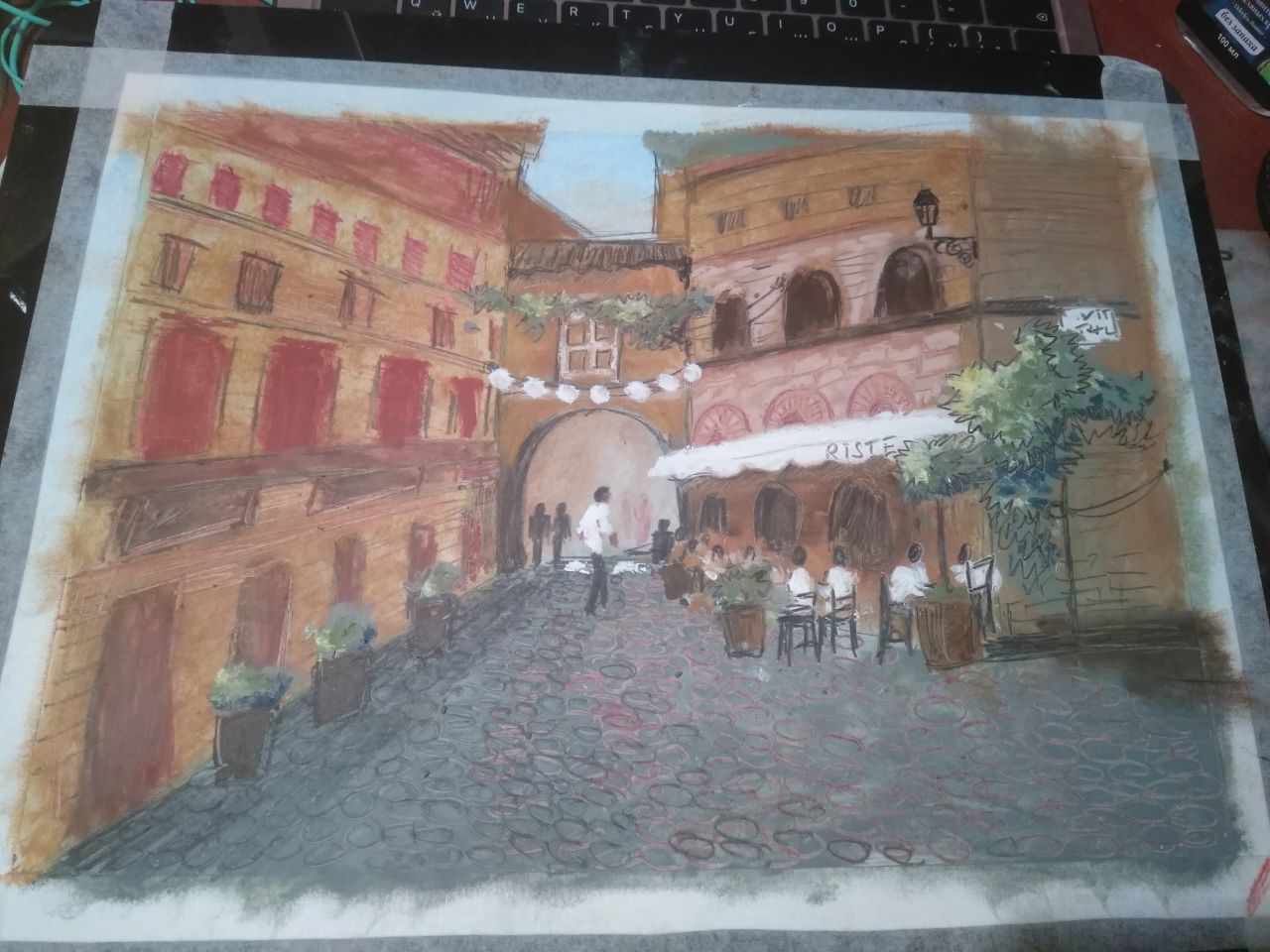
In the process, I decided to fix the details on the walls of the buildings. I painted the windows too bright, so I took the light colors of oil pastels and applied over them. My drawing has become less colorful.
My drawing is ready!
Veta
Your content has been voted as a part of Encouragement program. Keep up the good work!
Use Ecency daily to boost your growth on platform!
Support Ecency
Vote for new Proposal
Delegate HP and earn more
Привет, Света!
Здорово получилось!
Работы в смешанной технике всегда интересно смотрятся))
Wow!! Great work👌💯
Though, your drawing, maybe is less colourful, but it is beautiful and the concept of it seems accurate and understandable! :)
Dear @veta-less, we need your help!
The Hivebuzz proposal already got an important support from the community and is close to be funded. However, it misses a few votes to get past the return proposal and your could make the difference!
May we ask you to support it so our team can continue its work this year?
You can do it on Peakd, ecency,
https://peakd.com/me/proposals/199
Thank you!