Hi everyone! Today I am going to share the process of a painting I did yesterday. I painted a loving couple standing close to each other. The medium I used is oil pastels. I chose this because oil pastels give artworks a bright appearance and make the colours pop in vibrant shades. I did the artwork in my sketchbook because the pages are a little rough in texture and they hold the colours well.
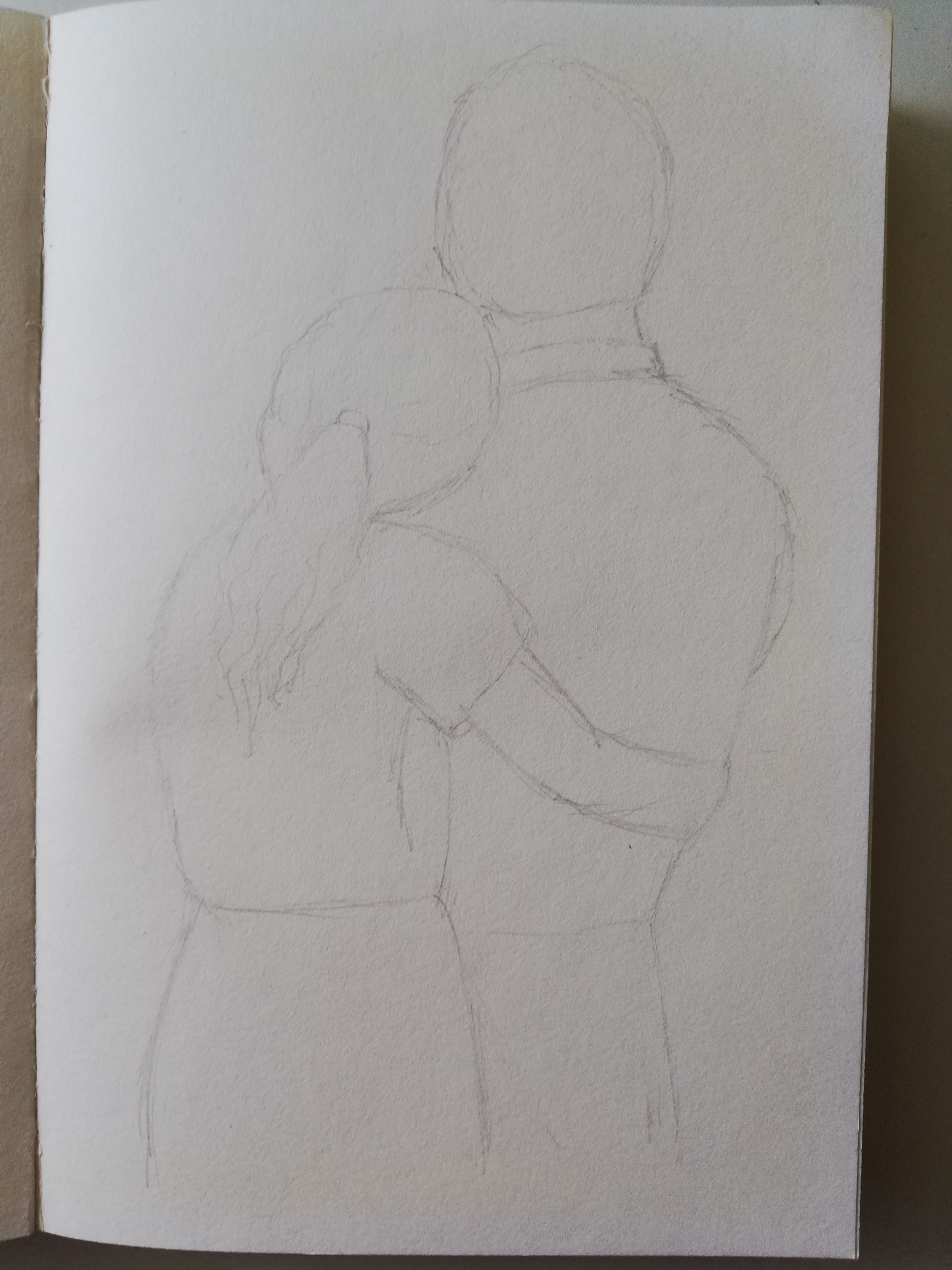
This is basically the prototype of the drawing. It is the first rough sketching I did using a HB pencil which is why you can see some grizzly lines all over.
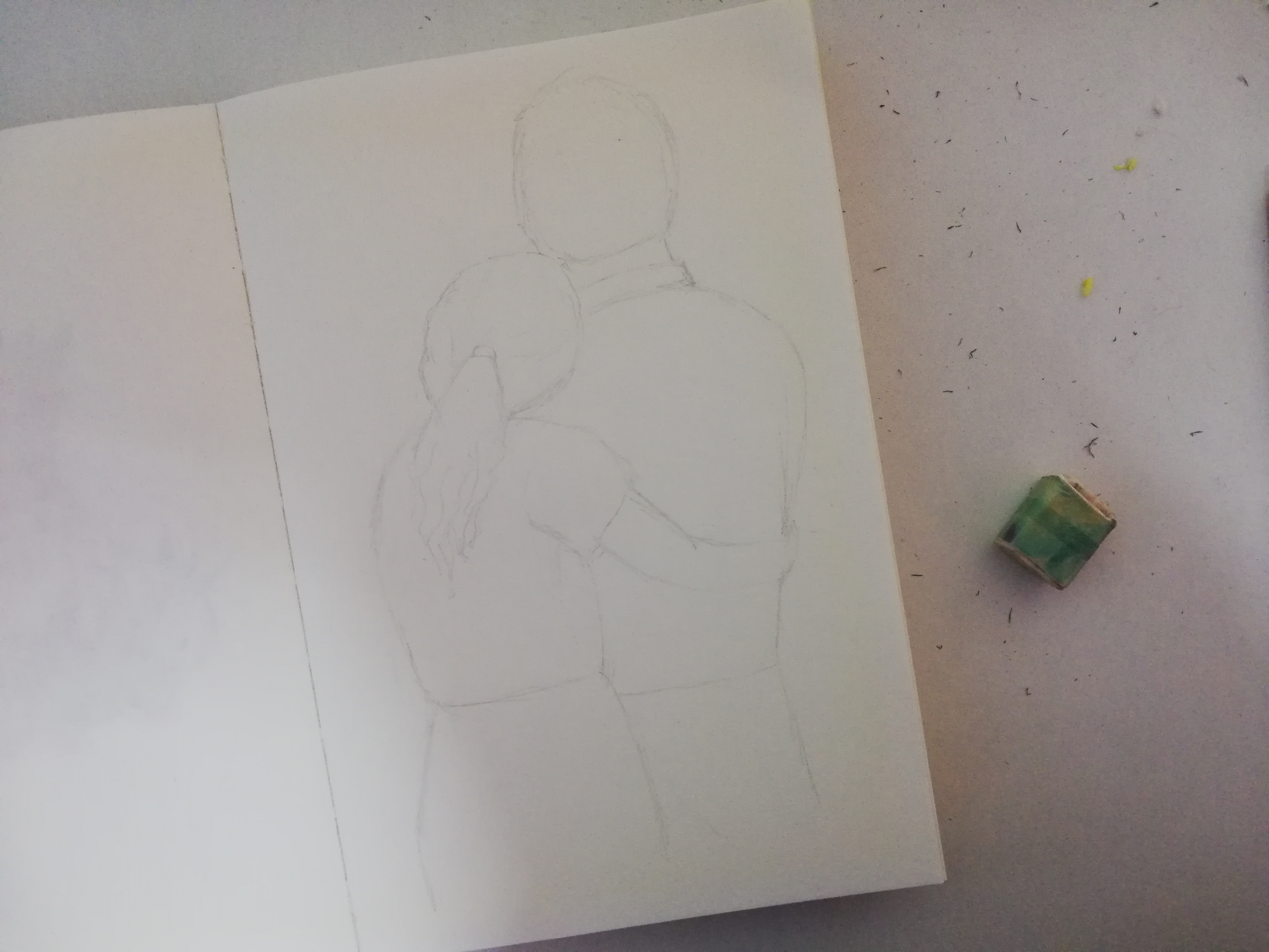
It took many eraser shavings to land on the drawing that I was satisfied with.
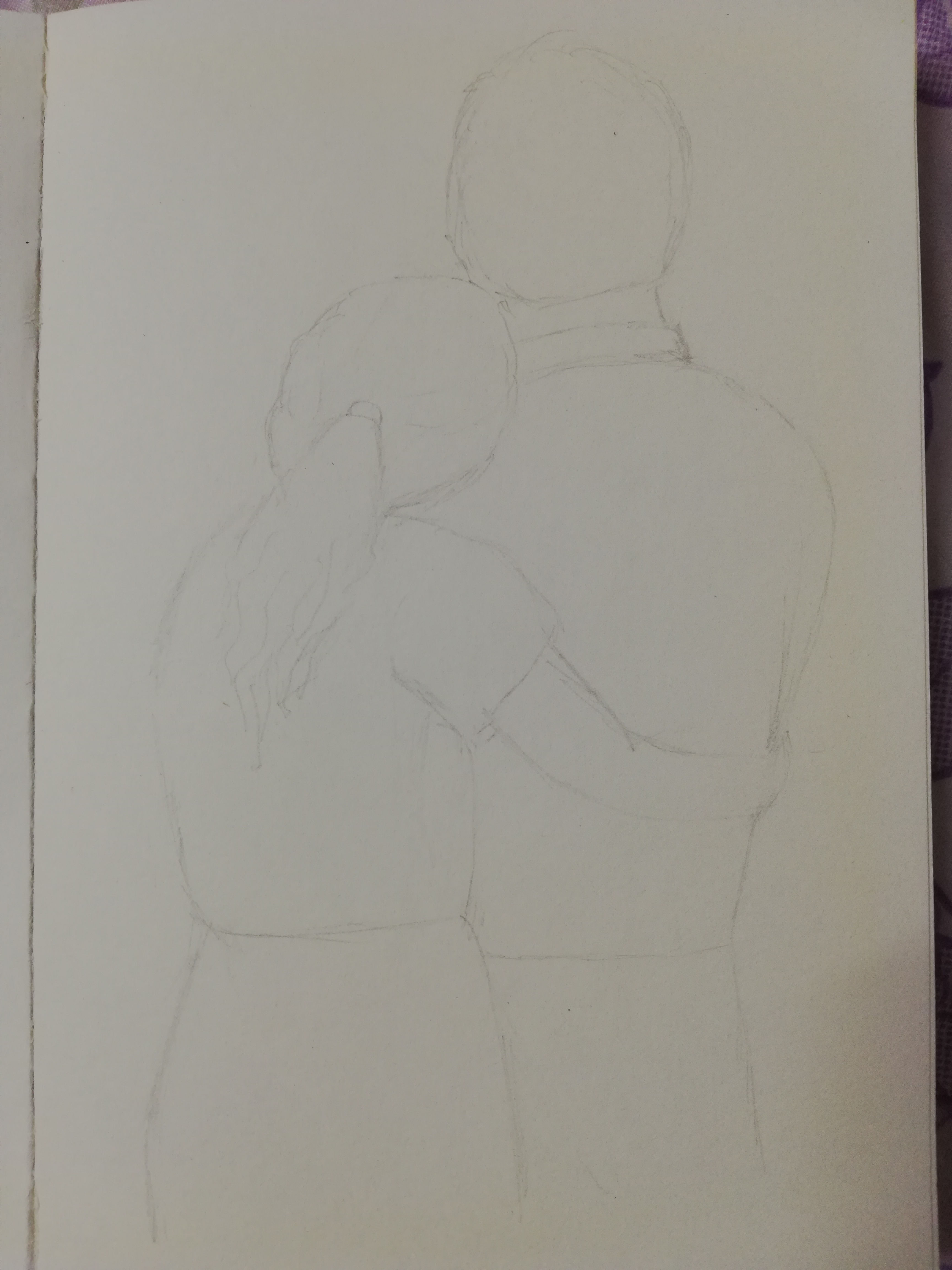
Here's the final drawing. I made changes to her arm and made it smaller and adjusted the man's abdomen shape as well.
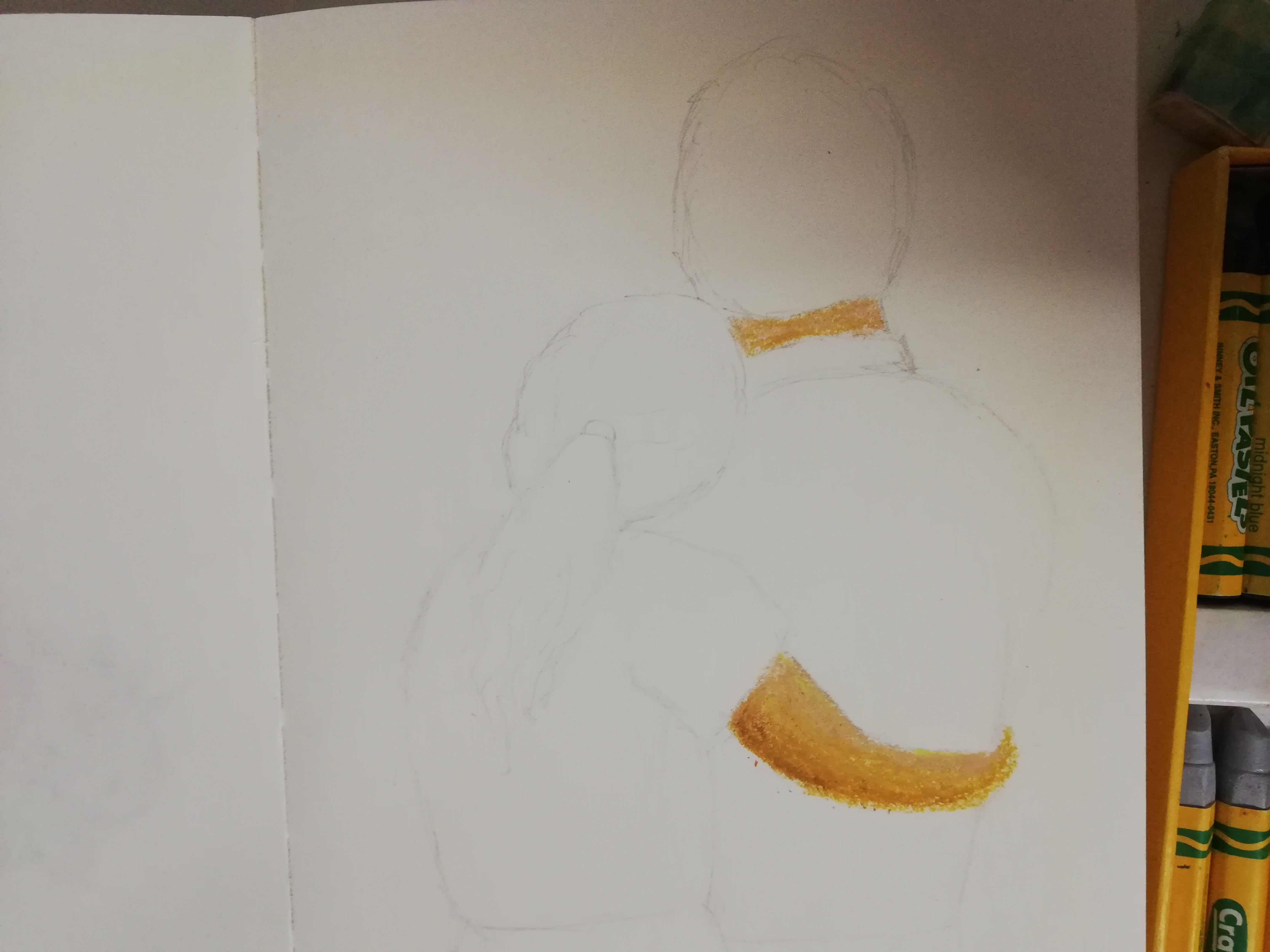
I started painting with the lightest shades which are the skin of both people. I blended some medium shades for that. By the way, that is the oil pastel set that I used for this artwork.
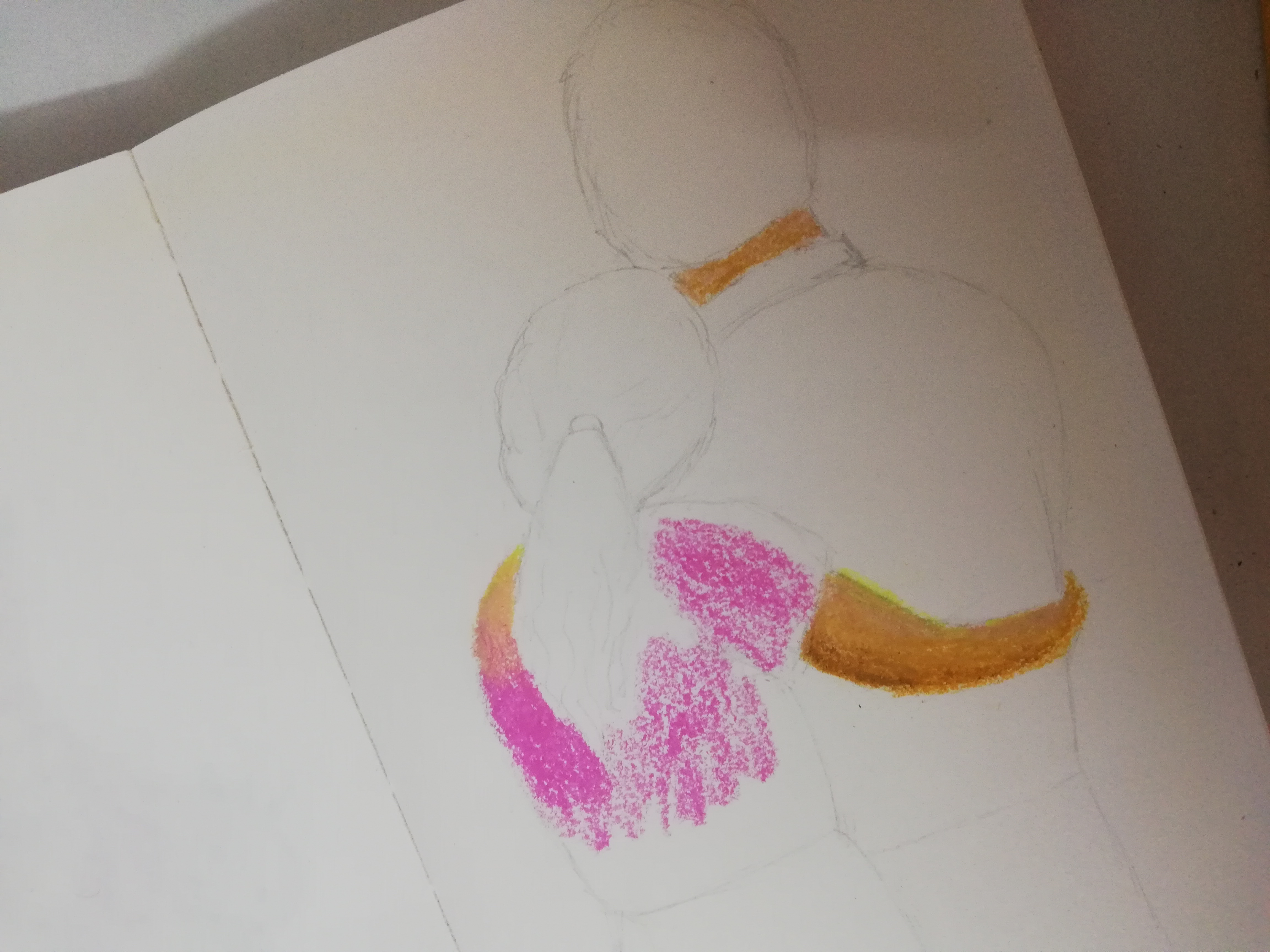
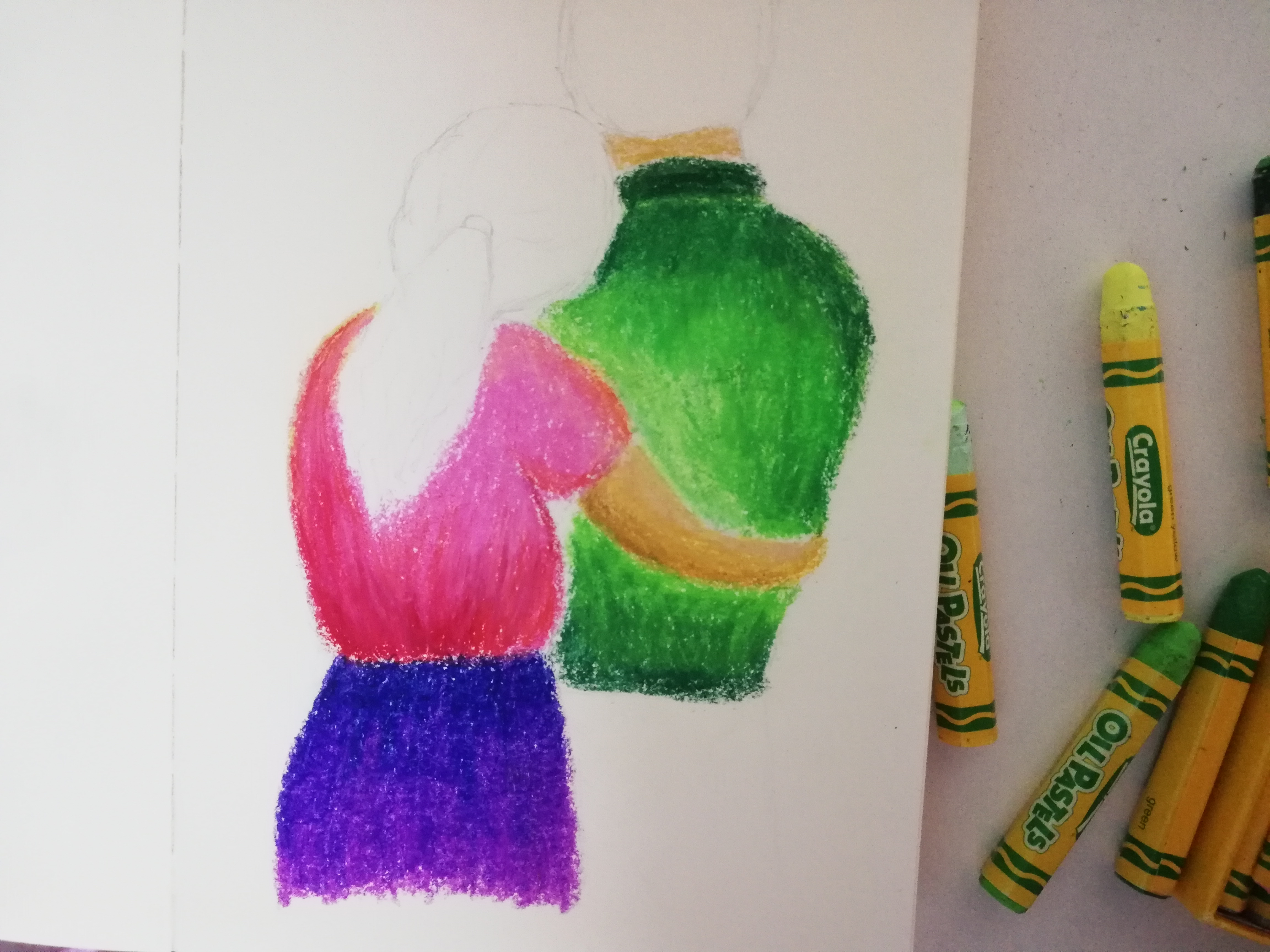
I gave the girl a pink blouse. This is the colour before any blending or shading.
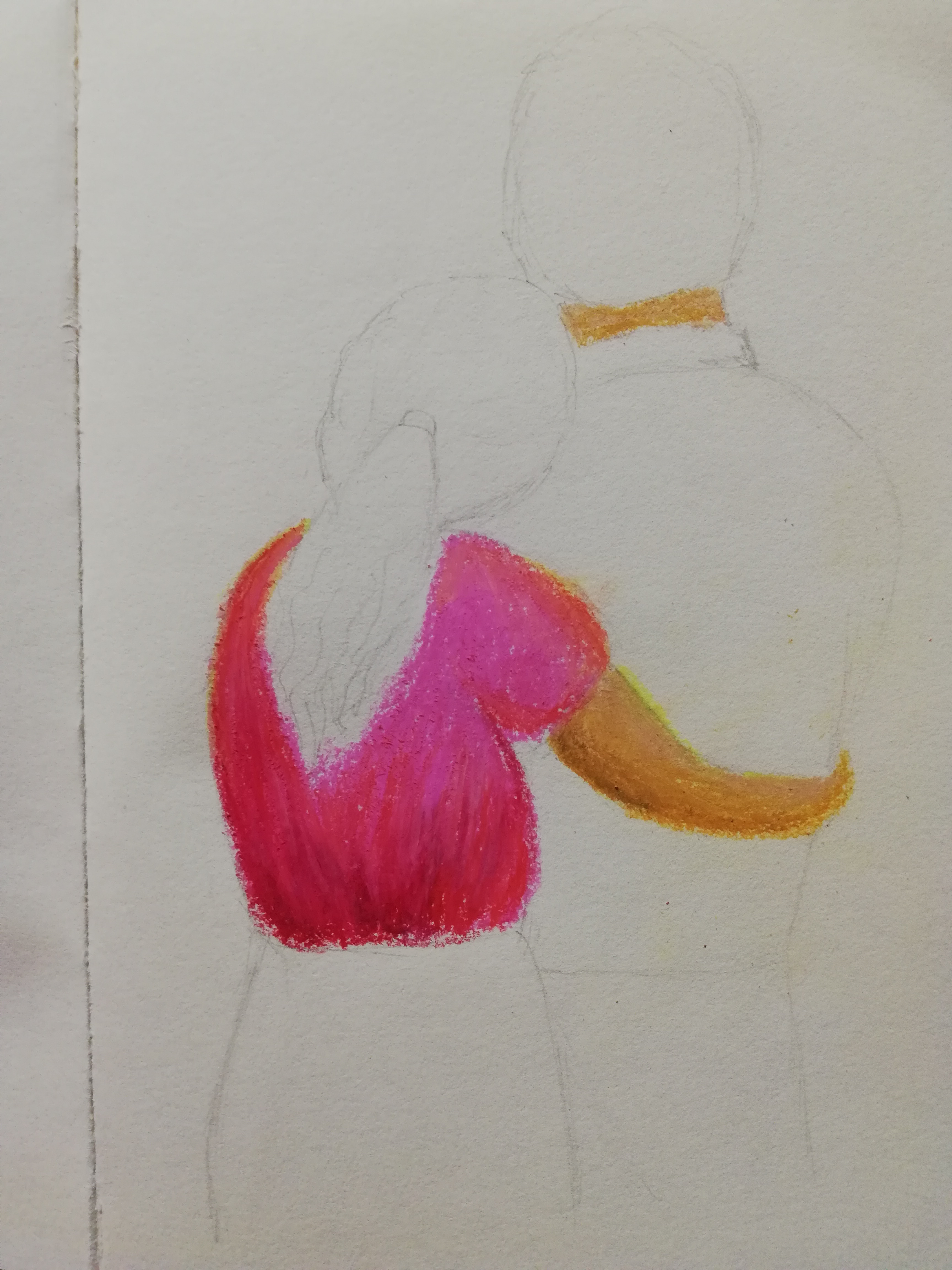
Then, I added a few different shades of red on her blouse to give it a more realistic look so it won't look flat in a single colour. When we work with oil pastels, this also creates more contrast in the artwork and make it pleasing to the eye as long as it is not overdone.
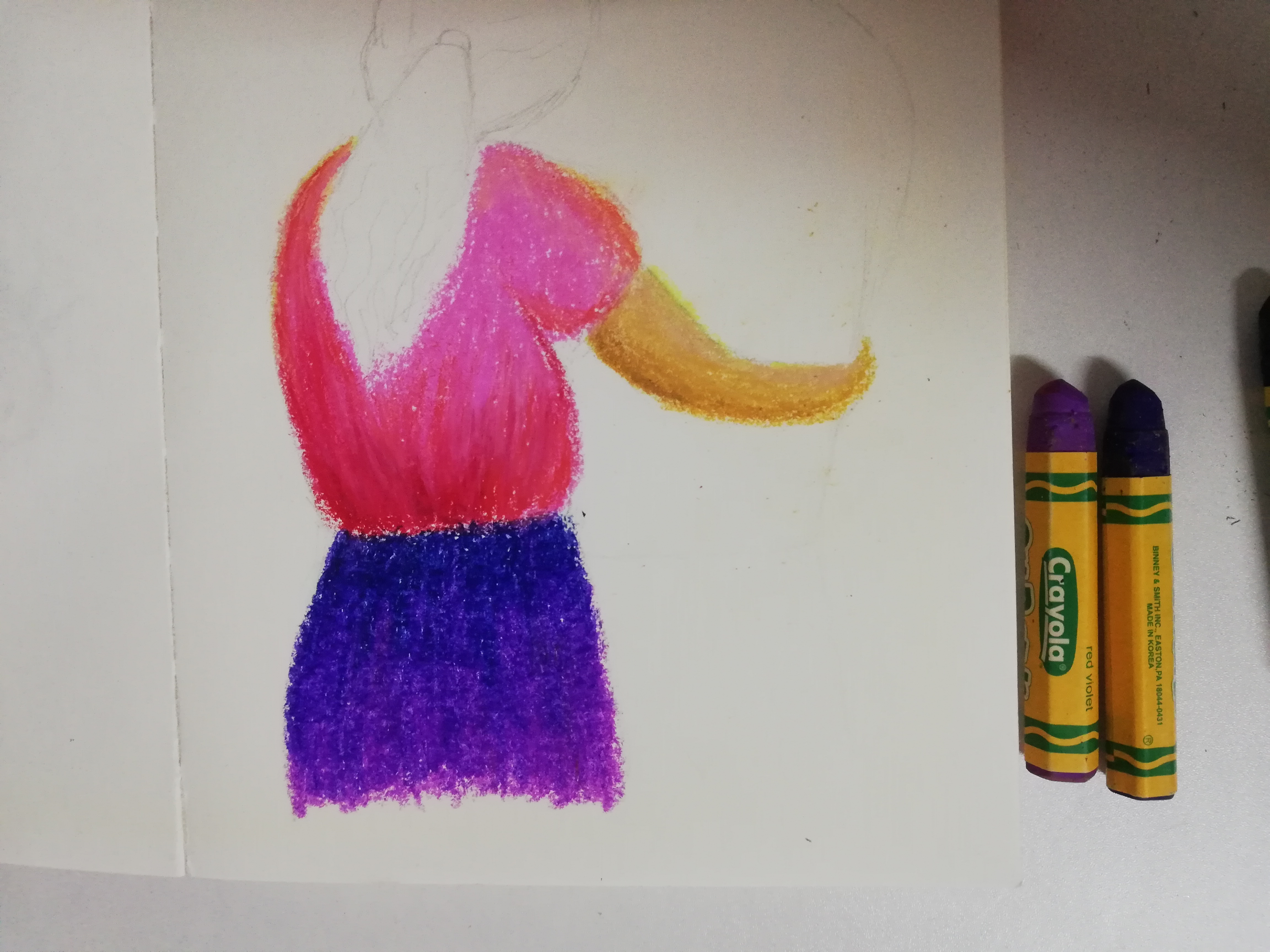
Next, I painted her skirt in different shades of purple and a dark blue. I chose purple because it is close to pink in the colour wheel and not contrasting.

After that, I painted the man's shirt in seafoam green. I will add more colours later. All of the greens that I have are too bright and will contradict the girl's outfit too drastically. So to make the colours a little muted, I am using this shade of green first as a base layer.
I have painted other shades of green over the first layer I applied previously. Somehow I felt something was off with the shirt.
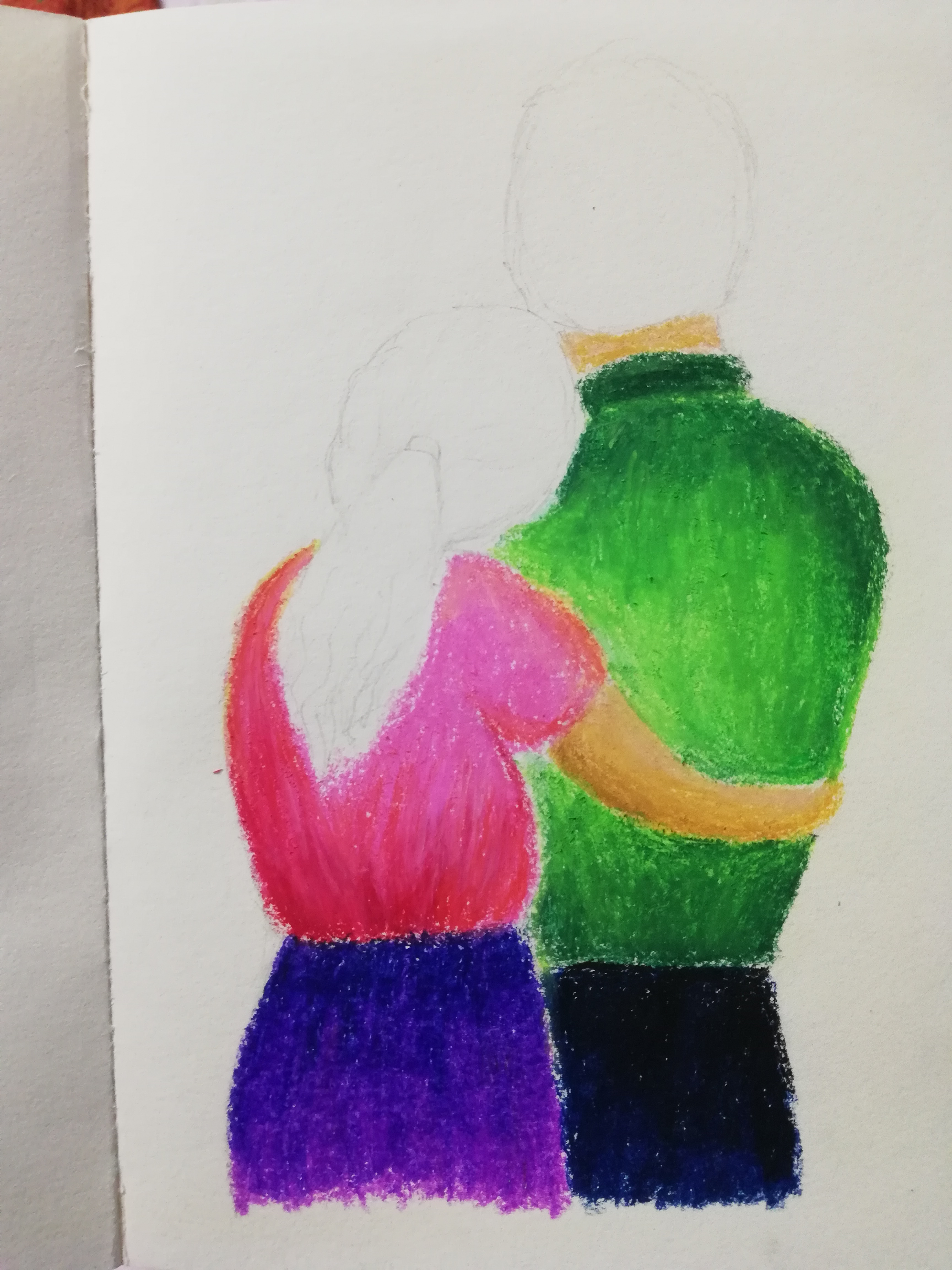
I straightened the edge of his shirt and I guess now it looks neater. I also painted his pants in dark blue and black. I blended the black with the blue so it has a tint of colour.
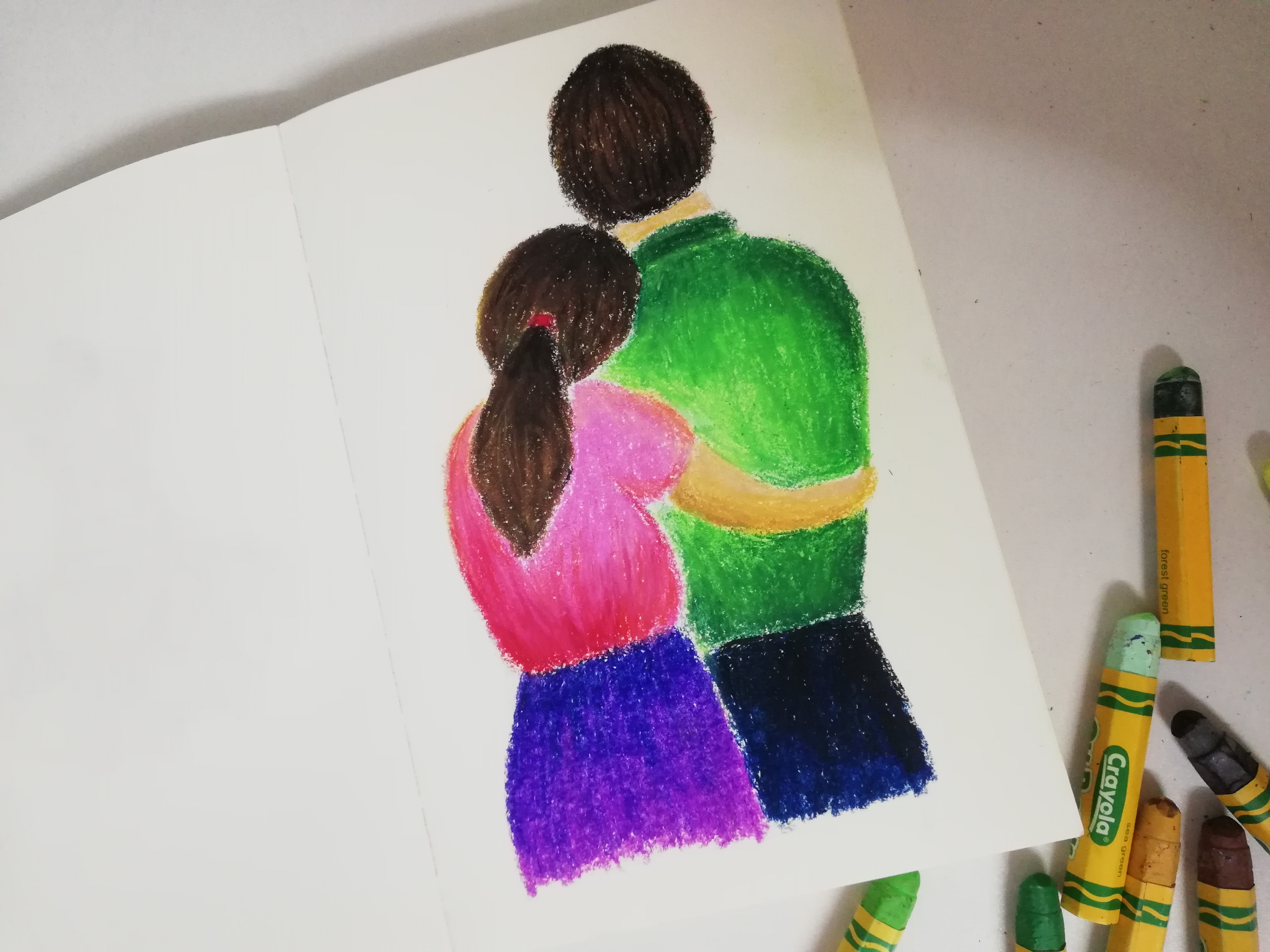
I finally painted their hair. Of course I did not use plain black so I can add some dimension and volume to their hair. Different shades of browns helped create a nice blend of highlights and shadows.

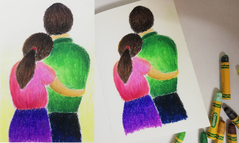
I wanted a touch of yellow so I added some lemon yellow which is the lightest shade. I didn't want it to be overwhelming. This is the final outcome. I cropped the image so it looks neater with proper borders. I felt so happy painting this artwork. It just made me feel warm and created occasional butterflies in my tummy.
I hope that my artwork reminded you of someone special. Thank you for dropping by and I wish you a lovely day ahead ♥
Yay! 🤗
Your content has been boosted with Ecency Points, by @yashny.
Use Ecency daily to boost your growth on platform!
Support Ecency
Vote for new Proposal
Delegate HP and earn more