~ Illustrious Old School ~
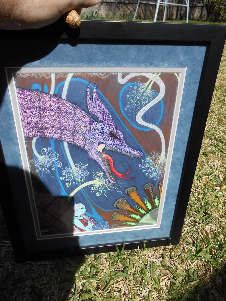
I have many photographs to share with you in this post... not just the art itself. I decided to take my old original illustration out of it's frame today. I used to do custom framing and this was one of the few of my own artworks that i did up. I hope you enjoy seeing the process as well as appreciate the art!
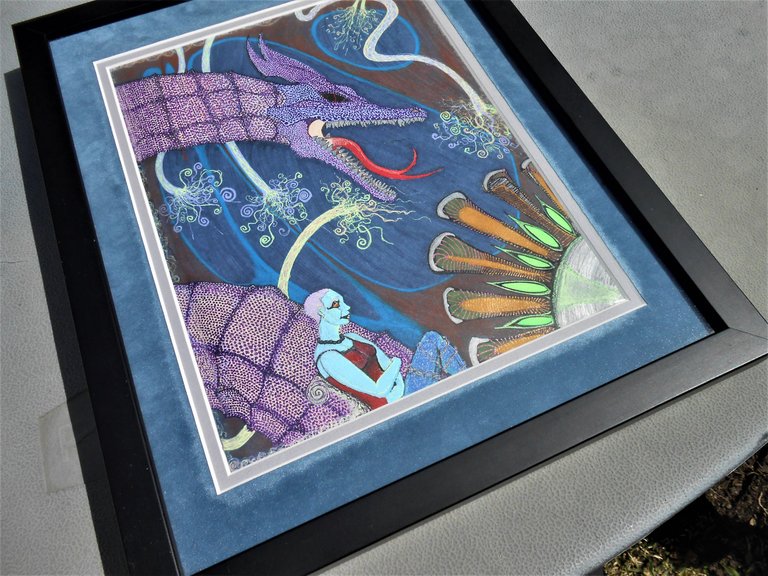
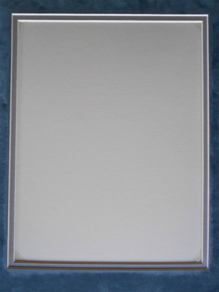
It was a nice and sunny day here in Texas so i decided to do the job outside. I originally created this piece in the early to mid 2000's. I framed it up in 2009ish. We had a custom frame that didn't get used and put on clearance so i used that. We also had some left over acid-free matboard so i found some coordinating one's that i liked and used those.
The top mat is the most expensive as it is a fabric mat and the blue is fuzzy. You will be able to see it in more detail later. The bottom mat was a light purple that i thought went well with the color palette i chose for the art. On top is some non-glare glass, the fanciest kind we had at the time. This was a pretty easy frame up but was always one of my favorite works because of the story behind it!
~ A Tale to Tell ~
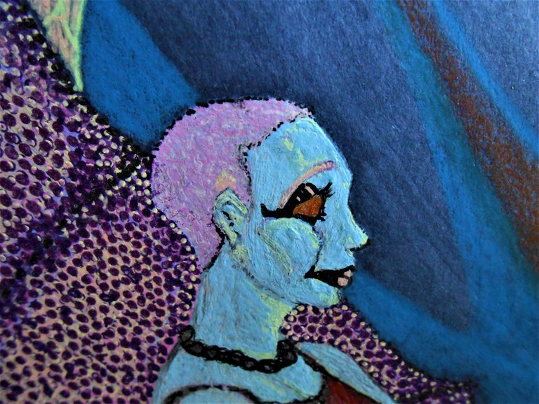
My parents were in a band and playing an outdoor gig in downtown Dallas. I helped load and unload the equipment for them. While they were in the middle of a set i saw a young woman sitting in the patio area. She caught my eye because she had a shaved head. This was more uncommon back then than it is now. She sat alone and had a confidence about her that i wanted to capture.
At this point in my art i was just learning to sketch females. I would oftentimes candidly capture a figure drawing or portrait in my sketchbooks in an incognito fashion. I sat from afar and sketched her sitting at the table as best i could. When i was partially complete in capturing her ambiance artistically i felt compelled to go show her.
Nonchalantly, yet with a mild amount of reticence, i approached her and asked if i could sit and show her something. She agreed and i went forward with revealing my sketch. As it turned out she was an old schoolmate of mine. I didn't remember her but she remembered me. She loved the art and the music.
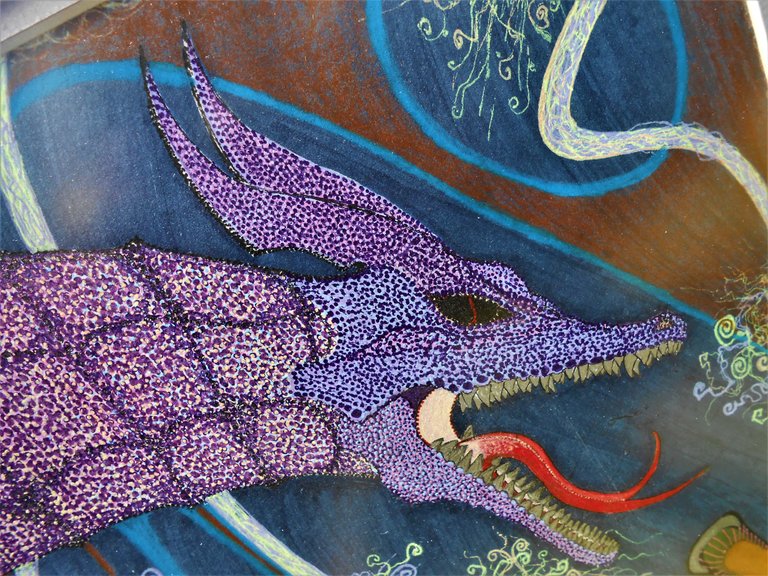
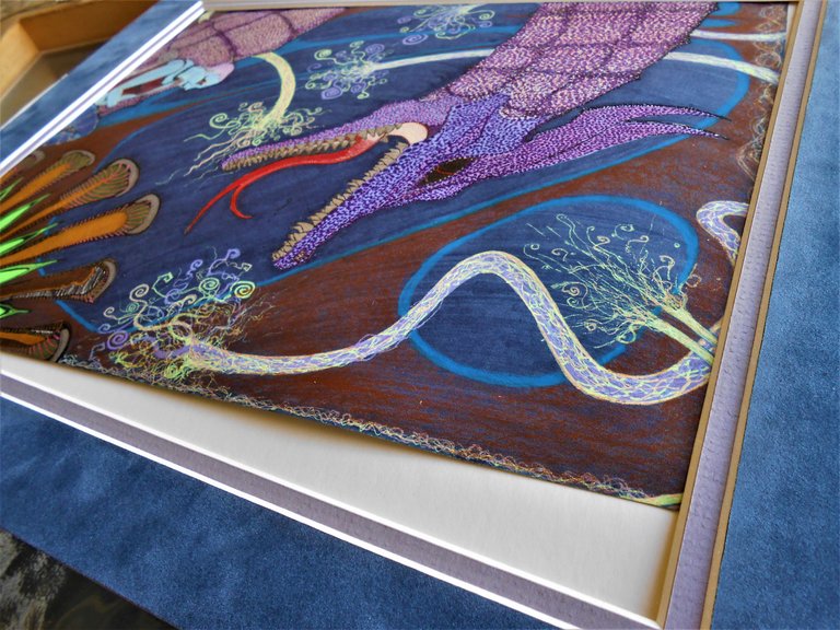
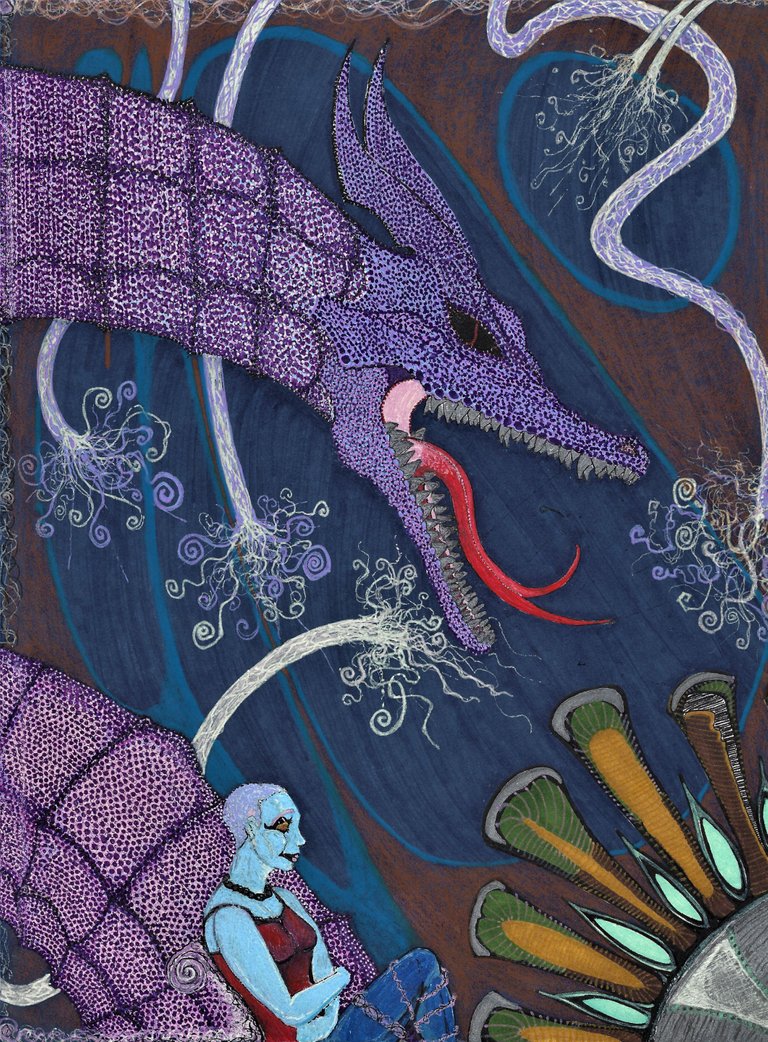
We had fun hanging out that night and did get to catch up a bit. I remember her name all these years later and will always think of her when i see this illustration. I felt the dragon symbolized her innate strength and silent power. I also shared many closeups of her in the art to try to show you the metallic copper in her eye and the textures of the gel pen layers that were used for her hair and skin.
~ Friends With Benefits ~
Before i got to work taking the art out of the frame... i wanted to get some shots in the sunlight so you could possibly see the metallic gel pens i used in this piece. Metallic copper, purple, black, red, and blue. This was a bit tricky because of the non-glare glass. I had to position the frame at the right angle to get the sheen of the metallic while not getting too much of the glare.
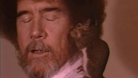
The non-glare glass does glare but only at certain angles. The sheen of the gel pen could be seen but not photographed unless at that particular angle. While i was trying to figure all that out i was visited by my friend with benefits.
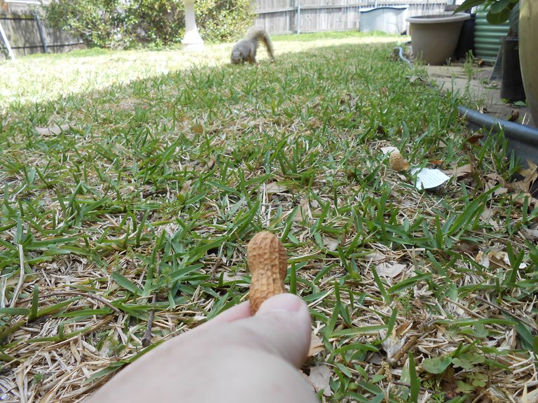
No, not like that!!! I have peanuts and my little squirrel buddy came to visit me for it's benefit. We have a mutually beneficial relationship. It took a while but i have been getting this little fella to eat out of my hand in true Bob Ross fashion!
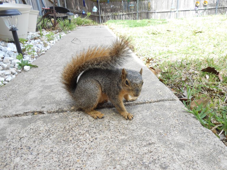
I will post more on that at another time as this post is already too long! But for proof this happened whilst i was getting my art on you can see in the image below a peanut in my hand. You can also see me in shadow form with my crappy point and shoot Nikkon! Cheers to all those that make the best of what they have to work with!!!
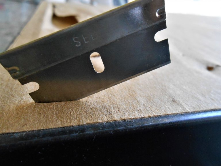
~ Deconstructed ~
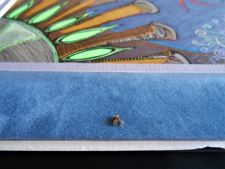
There was a bug that made it onto the matting you can see on the bottom third of the frame on the right side of the matting. This happens when the dustcover on the back either doesn't exist or has been ripped, as in my case. When i moved to Sweden many of my things were put into barns or closets. Bugs happen to live everywhere.
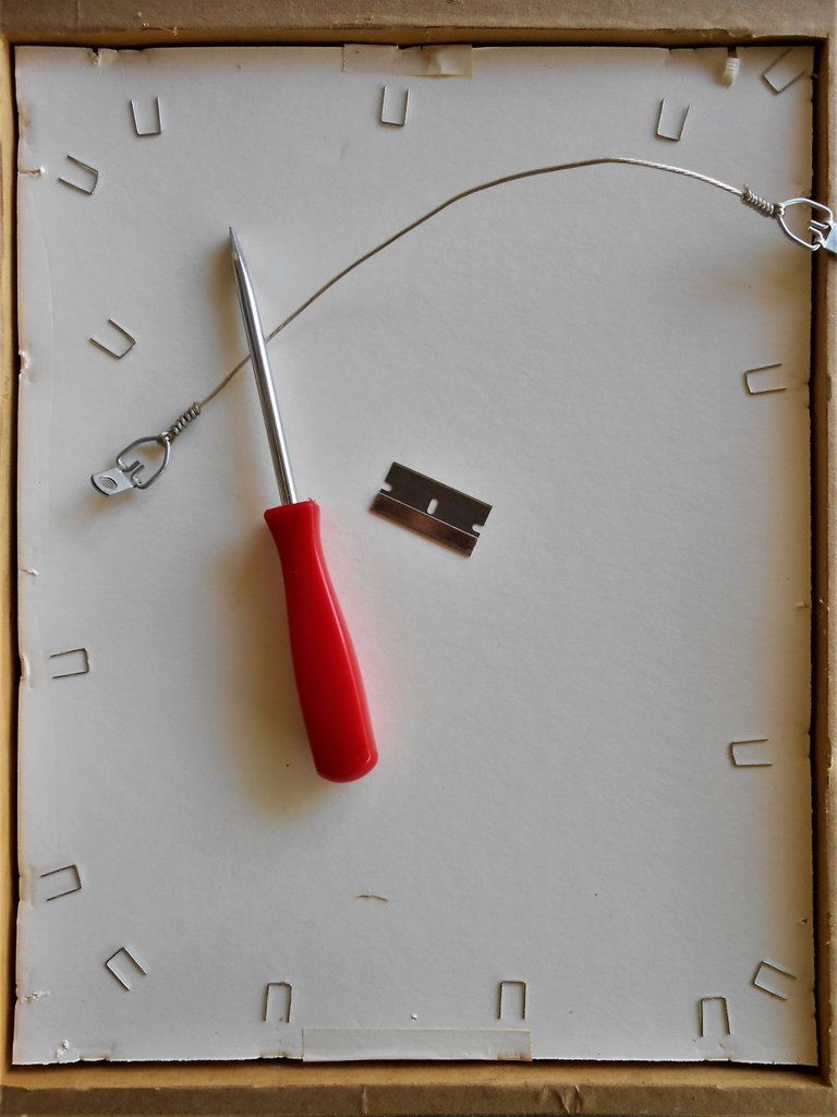
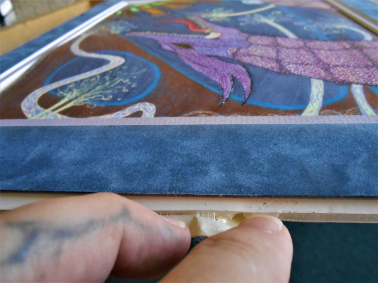
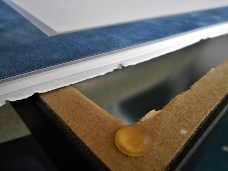
Below you can see the razor blade which is a framer's best friend and the screwdriver i needed to remove one side of the hanger. You can also see the rip in the dustcover paper backing. It's right at about the spot you would have a nail to hang it on. I made my paperbacks tight like a drum but this frame got some wear and tear over the years.
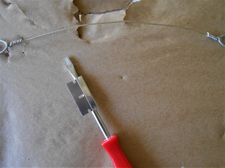
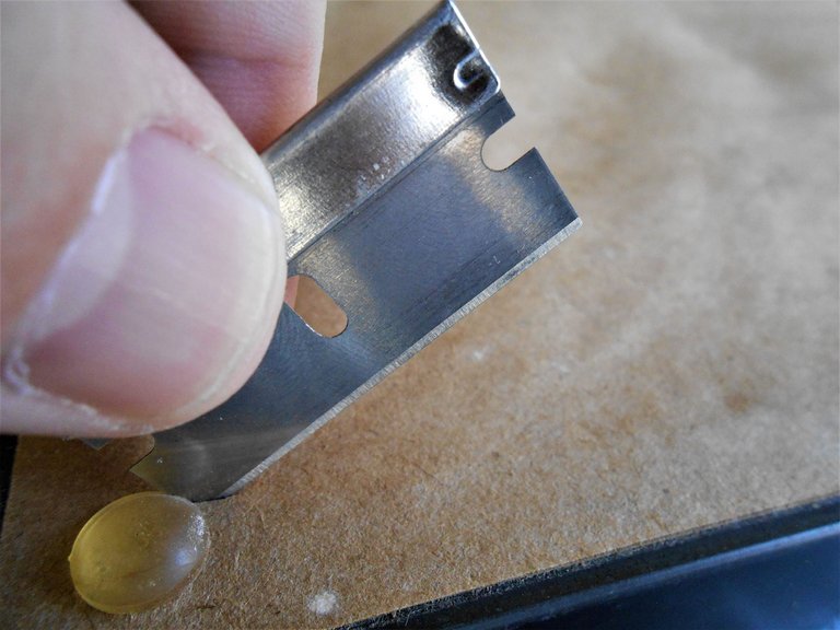
If you pinch the razor you can use the tip of a corner to find the frame inset and use it as a guide for removing the paper.
We would line the frame with double-sided tape and then overlay a large section of the paper. You would then trim the excess off and you are left with a nice backing. I was pretty meticulous in these steps so it irked me that this damage was done... but oh well!
In the image above you can see the rubber stopper. These help grip the wall so the frame doesn't swivel around. You can tell the age and weathering based on the yellowing of the rubber.
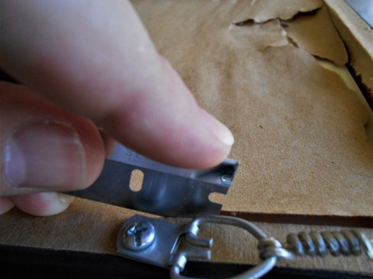
I took longer on this project than needed so i could show you the process. I am not left-handed and i don't grip the razor like that... but for demonstration purposes, i capitulated my technique. I followed the exterior of the frame to just cut away the paper necessary to get the guts out!
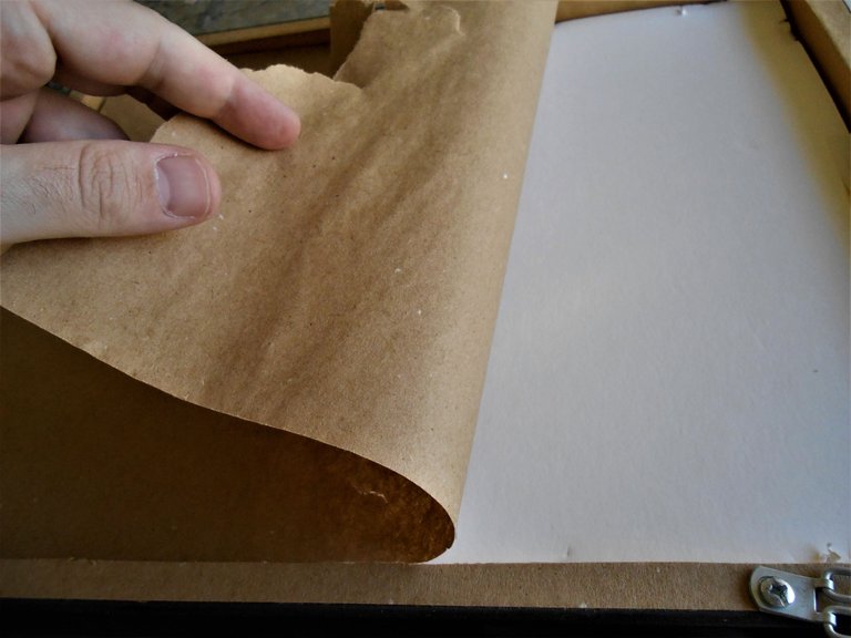
After removing the paper i used the screwdriver to wedge out the staples. When framing you work with the frame face down. So glass in the frame on the bottom, the mats on the glass (so the art doesn't touch the glass with some breathing room), the art in the mat, and an acid-free foam back. We stapled the foam into the frame. I put pressure on the areas being stapled, which you can see the indentions of in the foam, and used those areas to pressurize the glass to the face of the frame and stabilize the weak points with support.
~ Inside Out ~
After getting the guts inside out i needed to take apart the mounting. The mats, artwork, and foam back were taped together with acid-free tape. The whole point of acid-free elements is to ensure the art isn't discolored or aged any faster than nature will naturally permit. The biggest concern for that with this piece would be the UV rays coming in through the glass.
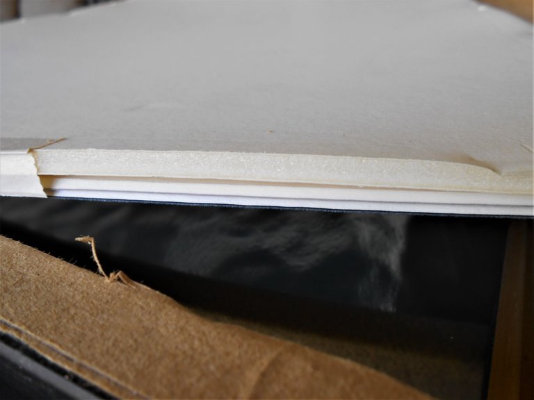
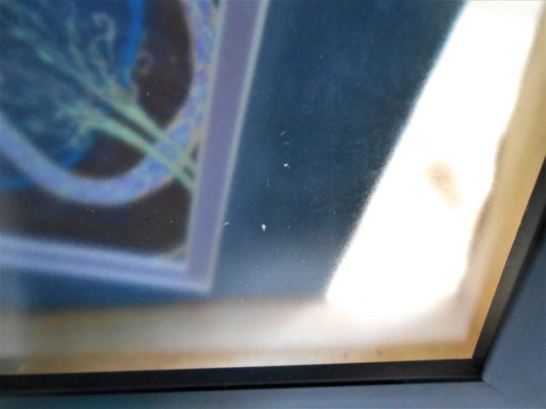
The further away the art is from the non-glare glass the blurrier it gets. I wanted to show you that aspect from an underneath perspective. Some fuzzies also made their way onto the glass... from my deconstruction or just from getting old i do not know.
Although it's safe to use acid-free tape to mount your art within the matting, i deferred using the clear acid-free photo corners instead. I didn't want to get the gum on my art even in the slightest. This is a more professional archival method of mounting either way.
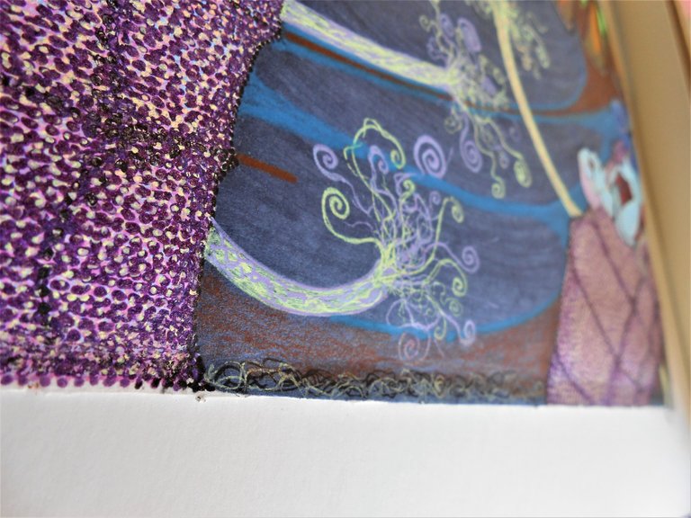
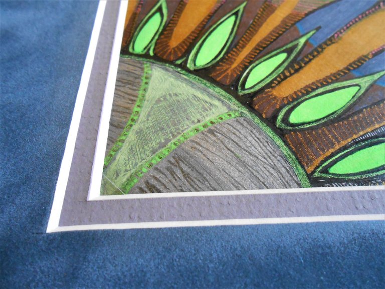
You can see the gum of the tape in the image below. You can also see the fabric of the top mat as well. I like how the fabric mat has a variance in it's color tone because of the texture. Plus, i like soft and fuzzy anyhow! Notice the stark white of the beveled edges running down each length of matting contrasted with the yellowed rubber stopper. An acid mat will yellow on the bevel over time as the paper pulp ages and deteriorates, or is exacerbated by the UV sunrays.
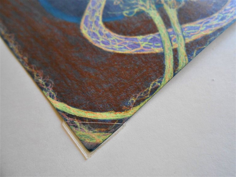
You can mildly see the richness of color is greater on the edge of the artwork where the mat overlapped the paper at the bottom of this image.
~ Fully Exposed ~
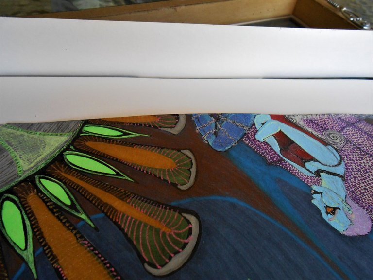
Now, we have made it completely out of the frame. The mat has come off and the only thing left is to take the art out of the photo corners which is quite easy.
I thought i would take this opportunity to photograph the artwork in the natural lighting while it was fully exposed. The colors are much more rich and the chance of capturing the metallic sheens is far greater!
The guts definitely look nake without the artwork incorporated! I guess i do have a mild case of Horror Vacui as pointed out by my friend!
Though you can't see the acid-free stark white beveled edge from this angle you can see the contrast of the stark white acid-free foam back compared to the rubber stopper.
You can see the stark white beveled edge here though. We had a burnishing tool, that i never used, but now i see what it was for! You can see in the corner of the top mat the line for the over-cut. On the bottom mat in the corner, you can see where the purple paper is flared up just a tad. The burnishing tool would have been used to smooth that flare out and get the paper to lay back down where it belongs. Wish i had one now that i see the flaw!
I don't know what kind of bug carcass that is but it's extraordinarily small. I have my camera set up taking macro shots and it's still small. That thing looks like it's been dead a long while. All things considered, especially for how old this frame is, things were pretty clean on the inside.
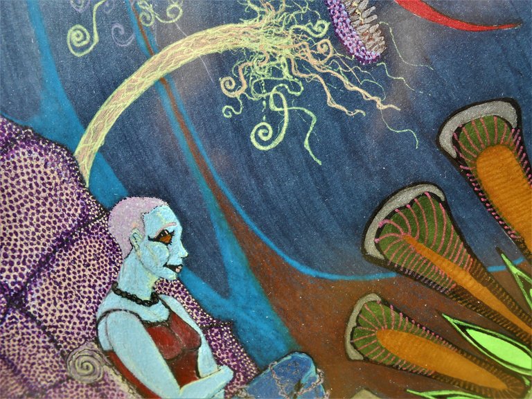
~ Dragă ~
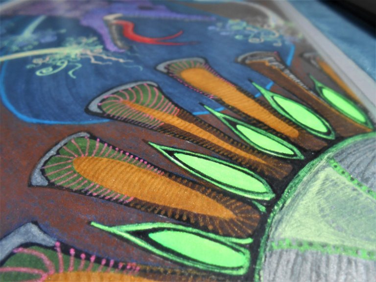
Now, for the art we have all been waiting for! The mediums i used for this artwork were pencil, ink, Sharpie marker, Prismacolor wax-based colored pencil, and gel pen... a lot of gel pen. In some areas, like the image below, i tried to combine pastel colors of gel to create an iridescence. I think the tubules portrayed it quite nicely... though it can be hard to see!
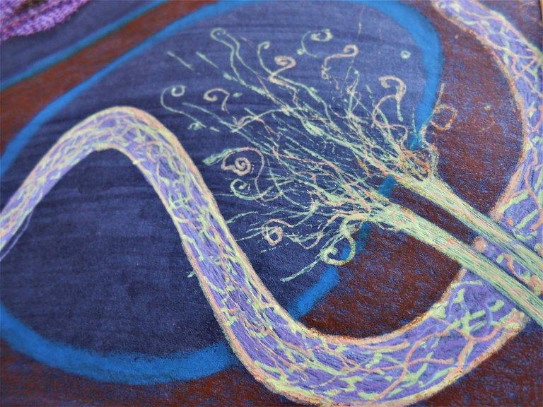
The metallic gel is similar in it's opalescence. You can see below the striations below having a luster. This was captured based on the angle of the camera and the lighting. These next two shots were also the ones to best capture the ghostly glowing green. Go back and compare them to the previous captures!
In the following image you can see how the striations almost disappear into the Sharpie and without the light catching the metallic sheen, it's almost as if it's not even there.
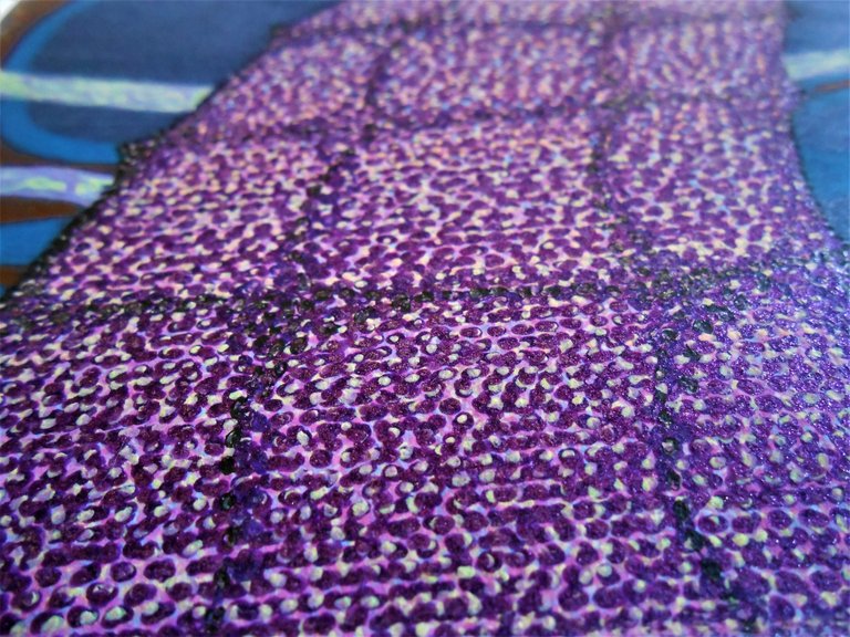
One technique i used for the dragon was pointillism. It's basically just using a lot of dots. I use layer upon layer and row upon row of dots to convey the look of scales. I thought it added a nice confusion for the eye in the field of depth and the metallic sheen added to the effect. The dot texturing was quite nice but gets lost in the photography and the digital scans.
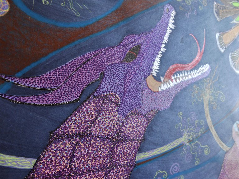
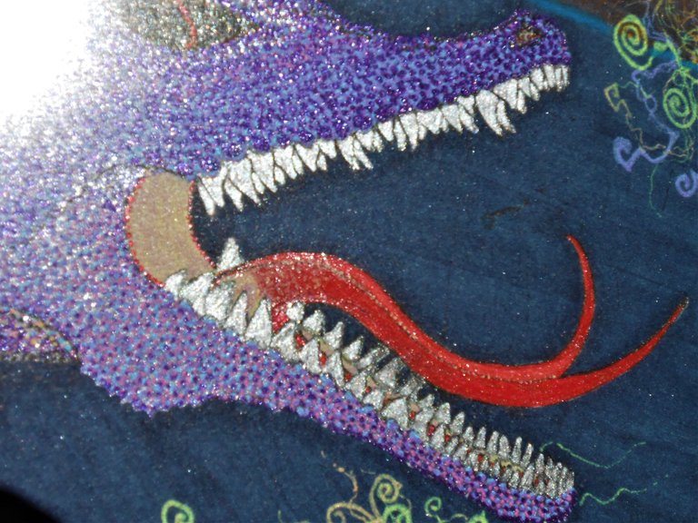
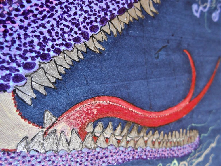
You can see the metal teeth shine better in the image above. I tried to capture it the best i could but am still unsatisfied completely. I would also recommend zooming into as many images as you are inclined to inspect more closely. The zoom will do the detailing much more justice!
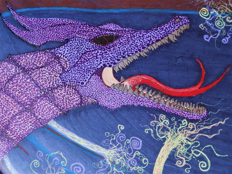
The dragon's tongue is a metallic red which gives it a wet glossy look at certain angles. In the image below you can see the bottom row of teeth glinting but the top row not so much.
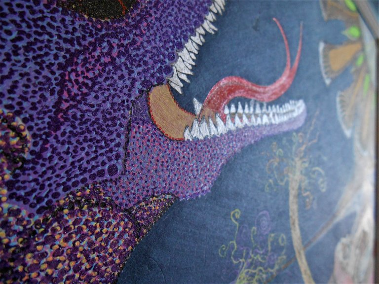
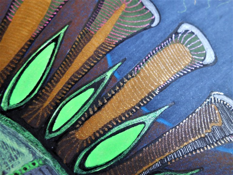
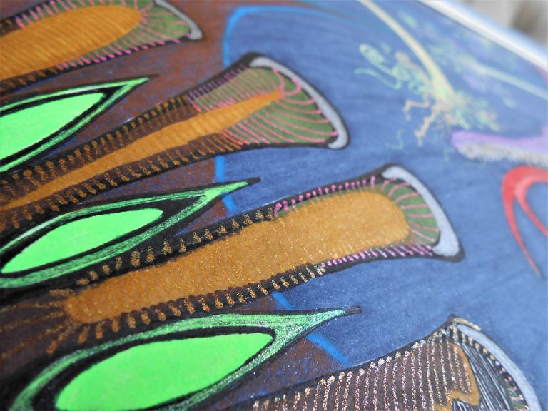
In this next extreme macro close-up you can see the detail within the smaller aspects of the design.
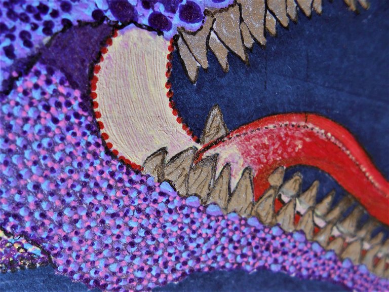
I particularly love the texture of the inside of the mouth. It's linear pattern and fleshy colorization gives it the feel of the softness of an underbelly. I also love the pink, blue, and purple dot matrix of the bottom jaw!
Something about zooming in makes me feel the Monet Impressionistic aspects to the smallness of what it takes to comprise some of the artworks. I wonder what he could/would have done with gel pens?!
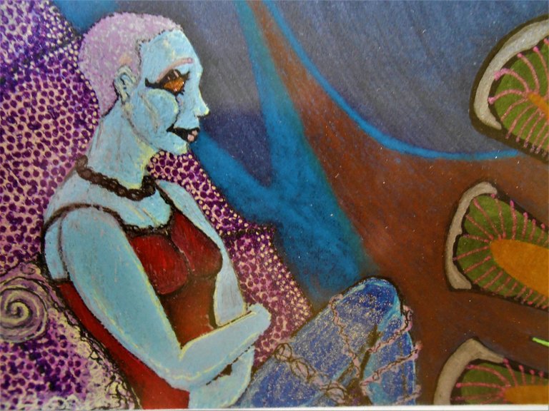
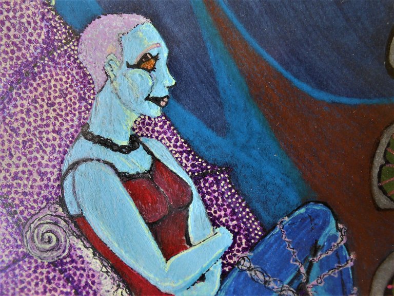
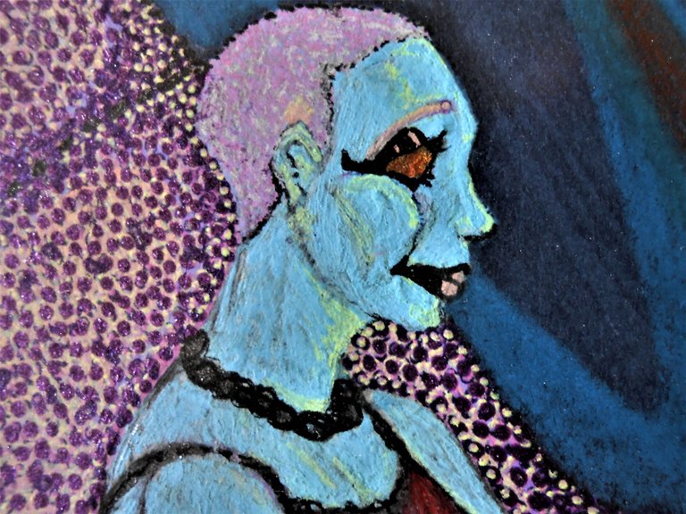
~ Dragă Femeie ~
These are the final capture of the main subject in natural lighting. It may seem repetitious, but i assure you i painstakingly edited each photograph and included only the ones with different elements i wanted to convey.
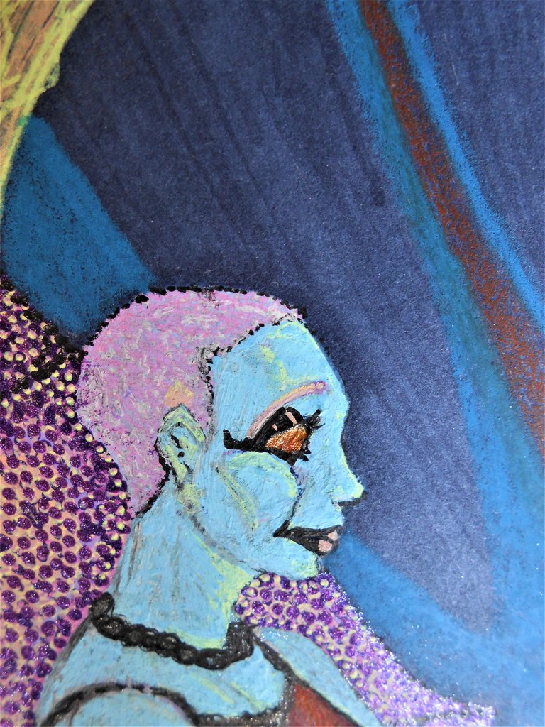
If the eyes are the windows to the soul, i truly wanted to convey the copper that shined her light. Her hair was also something that gets lost in the lighting. Hopefully, these macro shots will help translate the detail that expresses all that i tried to capture and present!
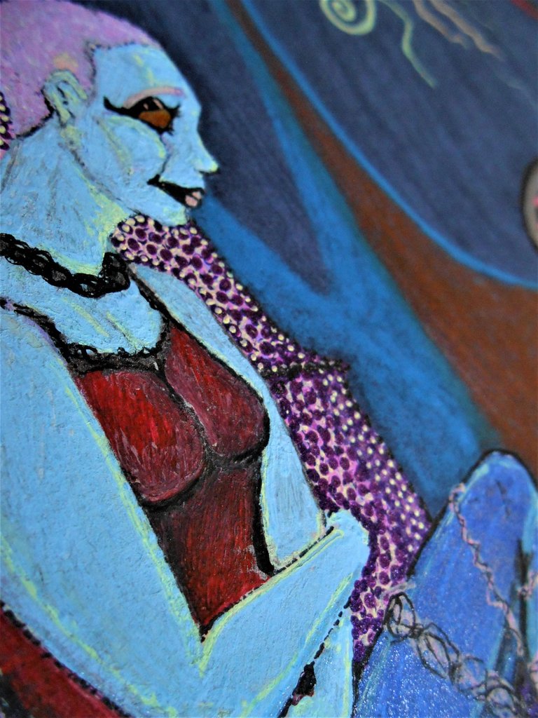
Her bluejeans were stylistically frayed and i used a metallic blue that never really transferred in this post. I do however like that, upon close inspection, you can see each gel pen stroke as if it were processed as a painting. I think it adds not just texture but contour and movement!
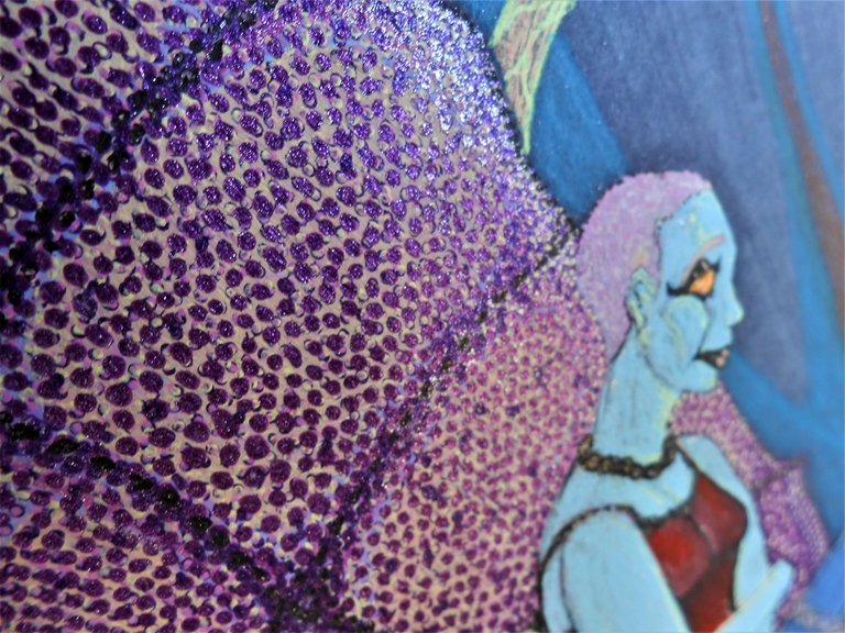
I tried to capture many perspectives of the same general imagery so that you could experience the art and not just look at and see it. Each shot and angle combined with the interplay of lighting give it's own unique experience to appreciate.
And lastly, i usually like to show the backside of the artwork. You can see the individual strokes and bleed-through of the ink and Sharpie.
And finally, thank you for making it this far into my post. I know it was a long read and probably pushing the blockchain to it's limits as far as how many images i shared! I hope you enjoyed seeing the framing aspects as much as the artwork itself. I didn't want to make this a series of posts to milk rewards... but i will be happy with whatever you all deem appropriate to my efforts. I think you all deserve to be rewarded for sticking with it to the end... so here is my scan of the final image.
Don't forget to zoom into the images you want to see in more detail! I appreciate you all and i will be selling some of these images as NFTs in My NFT Showroom Gallery. You can click that link to see what else i have for sale! I would be curious to hear in the comments which images from this post were the most impactful for you!
Thanks again for checking out my art!

Hey dude cool art! I like how you explain your intentions with the pieces. It helps me see (as a newbie art appreciator) what you were going for and to see into the mind of an artist. Your explanation of the artwork was exquisite as well.
Oh and thats so cool the squirrel! I want to feed it now. lol
I could have made this one into three or four posts. I have a difficult time condensing and not overexplaining things. So, i am glad you appreciated the explanations and description of the process. The art was one topic, the framing was another, and the backstory was a thing of it's own... along with my pet wild squirrel. hahha
I took art past the normal curriculum in school to the point they had to create new classes for me. However, i didn't pay much attention to the matting and mounting aspects. I learned custom framing on the job. The thing i learned is that nobody knows much about frames. So, i thought it would be cool to use my deconstruction as a demonstration to help inform.
In my mind the main point of the artwork was to convey the feminine delicate nature of the woman but translate the invisible silent strength and power of how she carried herself. Thanks for taking the time to read this novel and comment! I appreciate your time and interest!
It was definitely a reader, but you kept it interesting. I thought it was awesome that you showed your subject the art of her. I bet she loved that. You did a great job explaining the process of framing too.
Wow ... the art was amazing (the lady and the dragon not opposed, but chilling out and enjoying life together), and the journey through how it was made and mounted was even MORE amazing -- well done!
Thanks for the kind words and appreciation. I wanted to make this an abstract recreation of the invisible... so the dragon is really only there chilling because it's part of who she is. The silent and invisible strength that she carried with her did not go unnoticed by me and i wanted to capture the essence of that. I really enjoyed sharing the mounting and custom framing aspects too... even if it was in reverse! hahaha Thanks for taking the time to stop by, read, and comment on the post!
wow what beautiful paintings, i liked the mix of blues and purple colors you used on the woman, and her hair.... i also like the background is awesome, one question, from what age do you paint? greetings
I have been doing art since i was probably four years old or earlier. I think i was in my late teens or early twenties when i made this artwork. I think the blues and purples were my favorite elements creating the mood of this image. The background was a little more strange... so i am glad you liked it too! Thanks for taking the time to come check out my post and comment!
a pleasure to have commented, you have a lot of talent i love this kind of works, greetings friend! and thanks to you for responding
This is a wow artwork, wow process, and wow details i love this dude you made my day, thanks for blowing our minds and gives a special invitation to explore this masterpiece with you.
Thanks! I appreciate your kind words bro. Thanks for taking the invitation to explore and i am glad it was mindblowing. Those dots definitely blew out my eyes and mind! Thanks for taking the time to check out my post and comment!
That is so awesome. I love all the different textures and techniques in this one.
Thanks bro! It was tough photographing this to convey the textures. Much of the detail gets lost in the business... but there were many techniques implemented to get the job done! Thanks for taking the time to read, because i know you never really learned how! I also appreciate you taking the time to comment!
beautiful!
Thanks!
Cool!!!
Thanks!

Indah
Terima kasih banyak! Saya senang Anda menyukainya.
Congratulations @castleberry! You have completed the following achievement on the Hive blockchain and have been rewarded with new badge(s) :
Your next target is to reach 3000 replies.
You can view your badges on your board and compare yourself to others in the Ranking
If you no longer want to receive notifications, reply to this comment with the word
STOPSupport the HiveBuzz project. Vote for our proposal!