Good evening dears.
Hope all of you is great. 🙏❤️
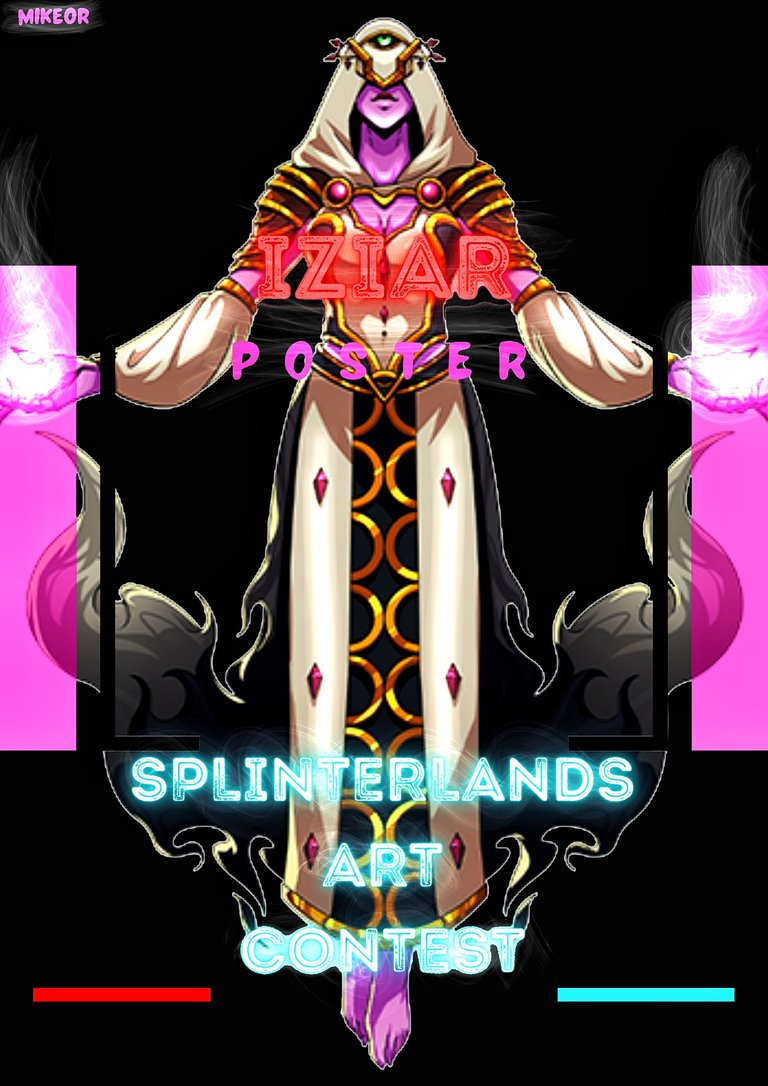
My entry for the Splinterlands art contest was a dedicated effort to create a captivating poster featuring the enigmatic character, Iziar. This creative journey, which spanned approximately four to five hours of focused work, was a fascinating exercise in hybrid digital artistry. I employed a strategic two-stage workflow, harnessing the unique strengths of two powerful applications: Canva for its foundational structure and design efficiency, and Autodesk Sketchbook for its nuanced, hands-on artistic control. This process allowed me to bridge the gap between template-based design and custom illustration to produce a final piece that truly embodies the spirit of the Splinterlands universe.
The steps of this poster :
From choosing the template to the last result..


The project began, as many do, with the challenge of a blank canvas. To establish a strong compositional framework and ensure a professional layout, I turned to Canva. This platform served as my initial workshop and source of structural inspiration. My first step was a targeted search through its extensive library of templates. I wasn't looking for a finished product but rather a robust architectural blueprint—a template whose underlying grid, balance of elements, and flow could be adapted to showcase Iziar. I sought designs that echoed themes of fantasy, mystery, and strategic power, filtering through options until I found one with a dynamic composition that could highlight a character portrait while effectively integrating key contest information and the iconic Splinterlands branding.
This chosen template was merely a starting point. The subsequent phase involved a deep and meticulous process of customization within Canva. I systematically deconstructed the template, altering every aspect to serve my vision for Iziar. The default color palette was completely overhauled. I selected hues that reflected Iziar's potential elemental affinity—perhaps deep aquatic blues, shadowy purples, or earthy tones, depending on my interpretation—to create a mood that was uniquely hers. Typography was carefully considered; I chose fonts that conveyed a sense of ancient magic and epic adventure while maintaining perfect legibility for the contest title and details.
Most importantly, I replaced all placeholder graphics. The central image zone was reserved for my rendering of Iziar. I also integrated official Splinterlands logos and icons, ensuring brand authenticity and a seamless connection to the game's world. Canva’s intuitive tools allowed me to adjust layers, apply initial filters for cohesion, and fine-tune the placement of every text box and graphic element, establishing a polished and professional base layout. However, while functional, the design still lacked a certain unique, hand-crafted artistic soul. It was precise but needed the imperfection and energy of an artist's touch.
This is where the second stage of the process began, marking the transition from designer to digital illustrator. I exported the refined Canva composition and imported it directly into Autodesk Sketchbook. This application became my digital drawing board, where I could infuse the poster with custom artistry. Using a stylus and Sketchbook’s extensive suite of brushes, I began the detailed work on Iziar herself. This likely involved painting over the base image I had placed in Canva, adding highlights and shadows to define her musculature, armor, or mystical attire. I would have focused on rendering her expression, capturing her personality—whether it was fierce determination, cunning intelligence, or mystical serenity.
Beyond the character, Sketchbook allowed me to unify the entire poster through hand-drawn elements. I added textural overlays to give the background a gritty, parchment-like, or magical energy field quality that pure digital templates often lack. I painted in custom lighting effects—perhaps a glow from a spell she was casting or a highlight from an unseen light source—to draw the viewer’s eye directly to her. I could add subtle, intricate borders, custom sigils, or magical runes that felt organic and drawn, not merely clipped. This step was crucial for blending the rendered character with the designed background, ensuring she didn’t look like a simple cut-out but an integral part of the scene.
The final hour was undoubtedly spent on the crucial process of refinement. Moving between the two applications, I compared versions, made minor adjustments to color balance to ensure consistency, and sharpened details. This back-and-forth ensured that the professional layout from Canva and the custom art from Sketchbook harmonized perfectly.
Hope you liked it.. And tell me if you found this poster beautiful. 🥰🙏
Thanks for sharing! - @cieliss
