Good evening dear friends..
How are you today ?
Hope all of you is doing great.
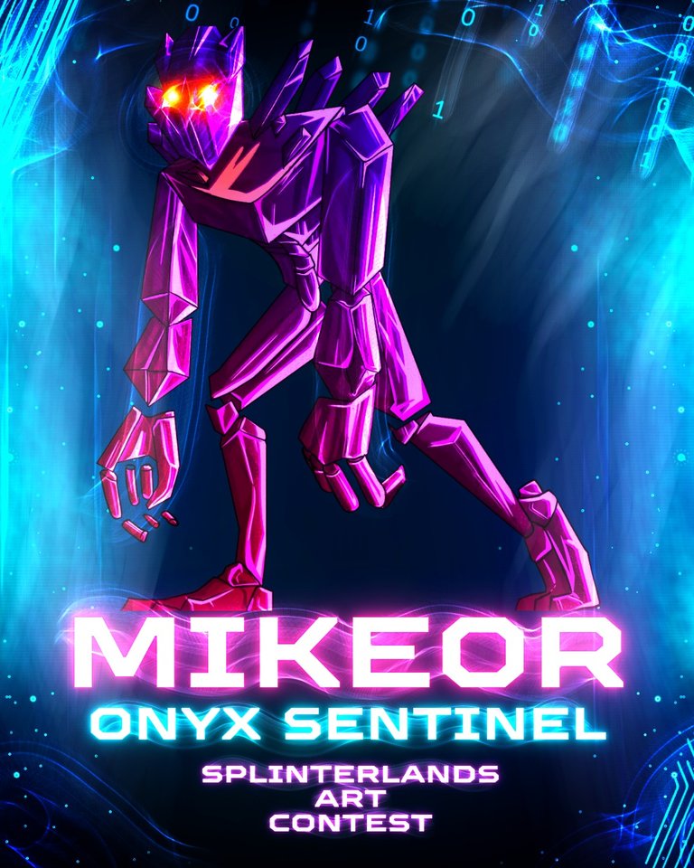
The world of digital art is a fascinating fusion of inspiration, technology, and meticulous craftsmanship. My recent project—a poster for the formidable Onyx Sentinel character, created for the Splinterlands art contest on the Hive blockchain—was a perfect embodiment of this process. This artistic endeavor was not born from a single tool or a moment of fleeting inspiration but was carefully constructed through a strategic two-stage workflow, leveraging the unique strengths of two powerful applications: Canva and Autodesk Sketchbook.
Let me show the steps :


The initial phase of any creative project often involves overcoming the intimidation of a blank canvas. This is where Canva, an online design platform renowned for its user-friendly interface and vast template library, became my foundational tool. The objective was not to simply use a template but to use it as a sophisticated springboard for my own vision. I began by entering search terms like "dark fantasy poster," "gaming character reveal," or "monolithic creature design" to filter through Canva's extensive collection. The goal was to find a template whose underlying composition, balance of negative space, and typographic hierarchy resonated with the ominous and powerful aura of the Onyx Sentinel.
Upon selecting the most promising template, the process of transformation began. This was far more than just swapping out images and text. It involved a critical deconstruction of the template's elements. I meticulously adjusted the layout to ensure the focal point would perfectly accommodate the Sentinel's imposing figure. The color palette was completely overhauled, shifting towards deep blacks, shadowy purples, stark greys, and perhaps an accent of eerie energy (a toxic green or a molten orange) to hint at the character's mystical power. The text elements were customized with fonts that echoed a sense of ancient, unforgiving strength—perhaps a heavy, gothic typeface for the title and a more legible, modern one for details to ensure readability. This stage in Canva was crucial; it allowed me to establish the poster's professional-grade structural skeleton—its spine—ensuring that the final piece would be visually coherent and impactful from a graphic design perspective before a single custom stroke was drawn.
With a robust compositional blueprint now in place, the project migrated to its true heart: Autodesk Sketchbook. This transition marked the shift from graphic design to pure digital illustration, where the personal touch and artistic flair could fully flourish. Sketchbook, with its intuitive brush engine and sensitivity to pressure (especially on a graphics tablet), is an ideal environment for bringing a character to life.
Importing the Canva design as a base layer, I began the intricate work of illustrating the Onyx Sentinel itself. Using custom brushes within Sketchbook, I painted over the placeholder image, defining the Sentinel’s iconic form. Every detail was considered: the texture of its stone-like skin, the deep, menacing crevices in its armor, the subtle glow emanating from its eyes or weaponry, and the interplay of light and shadow (chiaroscuro) that would give the figure a three-dimensional, weighty presence. The initial flat colors from Canva were now replaced with rich, textured gradients and deliberate shading, adding immense depth and realism.
The background, which might have been a simple gradient or stock image in the template, was now painted anew. I crafted an environment that told a story—perhaps the ruins of a forgotten temple or a desolate battlefield under a stormy sky, directly linking the Onyx Sentinel to the lore of Splinterlands. Furthermore, effects that are difficult to achieve in Canva were added with precision: a sense of atmospheric haze, particles of magical dust floating in the air, and strategic highlights to make the character pop from the canvas. This phase was all about imbuing the poster with soul, mood, and a tangible connection to the game's universe.
Finally, the two worlds were harmoniously merged. The typography laid out in Canva was refined within Sketchbook, perhaps by adding textural effects like a stone or metallic finish to the letters to make them feel integrated into the scene, not merely placed on top of it.
Congratulations @mike0r! You have completed the following achievement on the Hive blockchain And have been rewarded with New badge(s)
Your next target is to reach 3500 upvotes.
You can view your badges on your board and compare yourself to others in the Ranking
If you no longer want to receive notifications, reply to this comment with the word
STOPCheck out our last posts:
Congratulations @mike0r! You received a personal badge!
You can view your badges on your board and compare yourself to others in the Ranking