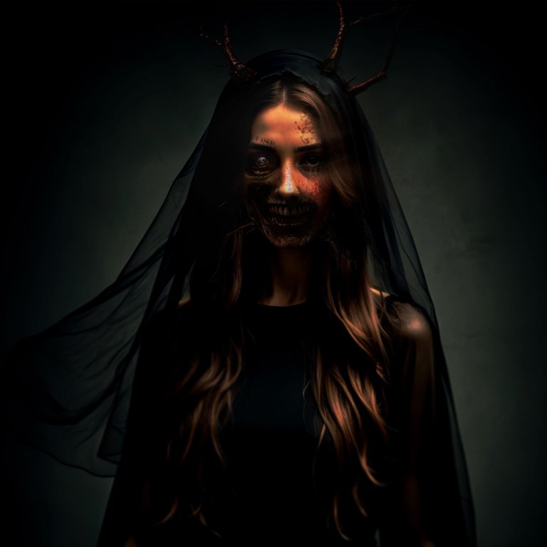
Hello Alien Art community, today I bring you a reinterpretation of the design inspired by my recent experience watching "The Walking Dead". This time, I decided to approach the image changes with a more professional mindset. I used multiple layers to achieve better skin texture and a more precise mask, which is reflected in the final result.
Hola comunidad de Alien Art, hoy les traigo una reinterpretación del diseño inspirada en mi reciente experiencia al ver "The Walking Dead". Esta vez, decidí abordar los cambios de imagen con un enfoque más profesional. Utilicé múltiples capas para lograr una mejor textura de piel y una máscara más precisa, lo que se reflejó en el resultado final.
PROCESS
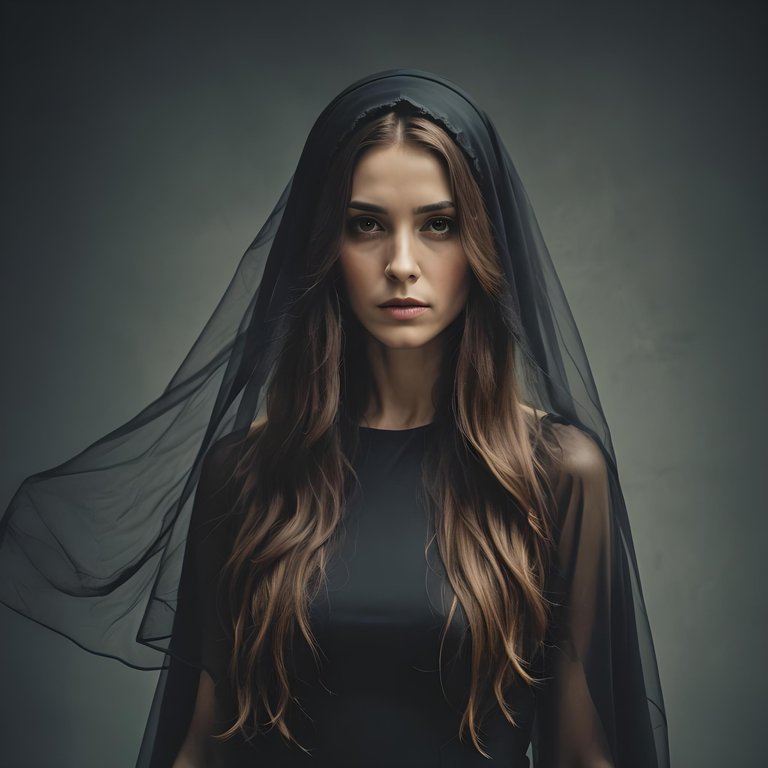
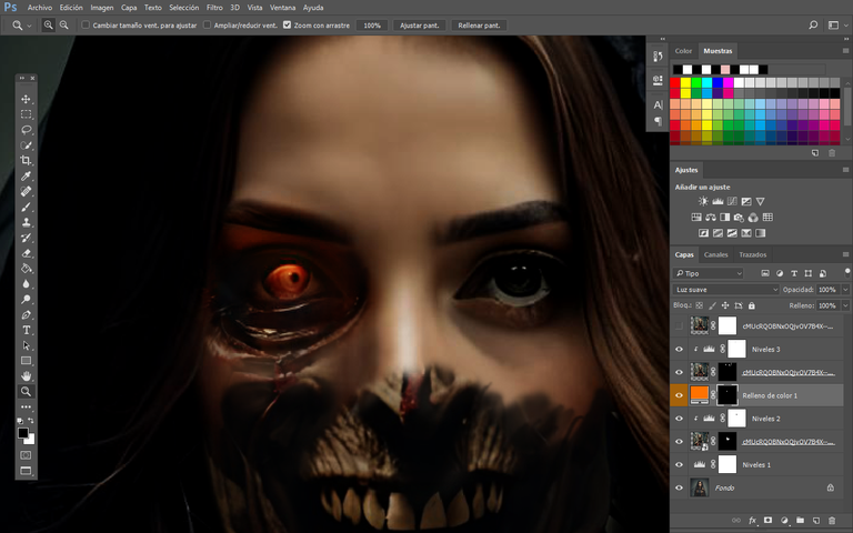
Starting from the initial image, I began overlaying an image of a necromorph on top, and once aligned with its perspective, I began working on its skin with a layer mask. This overlay could have been considered a simple step, but why not? Because the skin didn't match the appropriate tones of light and shadow. We understand it's a zombie, and its skin, torn and exposed to time, tends to rot, as movies and series have shown us. So, I took certain references and proceeded to refine the theory.
Comenzando desde la imagen inicial, empecé a superponer una imagen de un necrófago por encima, y una vez alineada con su perspectiva, comencé a trabajar en su piel con una máscara de capa. Esta superposición podría haberse considerado un paso simple, pero ¿por qué no? Porque la piel no coincidía con las tonalidades adecuadas de luces y sombras. Entendemos que se trata de un zombi y que su piel, desgarrada y expuesta al paso del tiempo, tiende a pudrirse, como nos han mostrado películas y series. Así que tomé ciertas referencias y procedí a refinar la teoría.
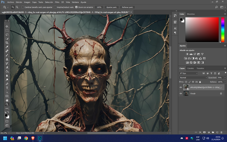
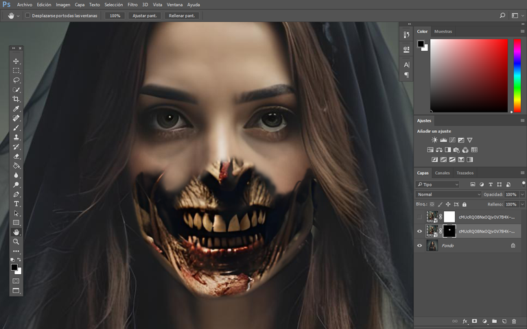
Once the initial levels and curves layers were applied, I focused on determining the shading around the eye and worked on matching the skin tones. Next, I added red-colored branches that would help create prominent veins or roots, similar to the famous Resident Evil game, where enemies often exhibit certain extremes. After trimming and correcting any imperfections, I proceeded to apply shadows.
Una vez aplicadas las capas iniciales de niveles y curvas, me concentré en determinar el sombreado alrededor del ojo y trabajé en igualar los tonos de piel. Luego, añadí ramas de color rojo que ayudarían a crear venas o raíces prominentes, similares al famoso juego Resident Evil, donde los enemigos a menudo muestran ciertas extremidades. Después de recortar y corregir cualquier imperfección, procedí a aplicar sombras.
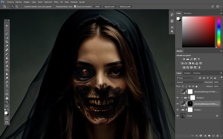
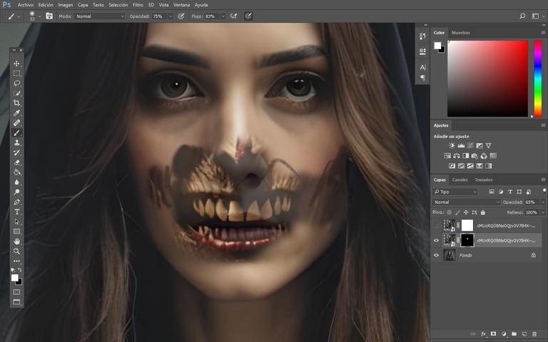
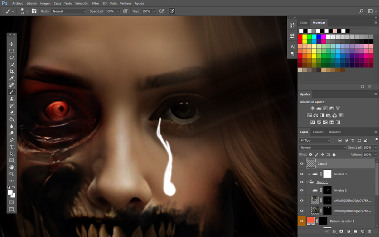
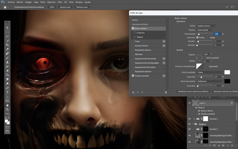
Once the facial details were finalized, I began creating tears, transforming the concept of suffering into change. The tears were created using a white brush, removing the fill from the same layer, and then applying shadows behind and a bevel to give it the reflection of nearby light. Then, I used the smudge tool to blend and eliminate the tear streaks to give it more shape and realism.
Una vez que los detalles faciales estuvieron finalizados, comencé a crear lágrimas, transformando el concepto de sufrimiento en cambio. Las lágrimas se crearon usando un pincel blanco, eliminando el relleno desde la misma capa, y luego aplicando sombras detrás y un bisel para darle el reflejo de la luz cercana. Luego, utilicé la herramienta de difuminar para mezclar y eliminar los trazos de la lágrima para darle más forma y realismo.
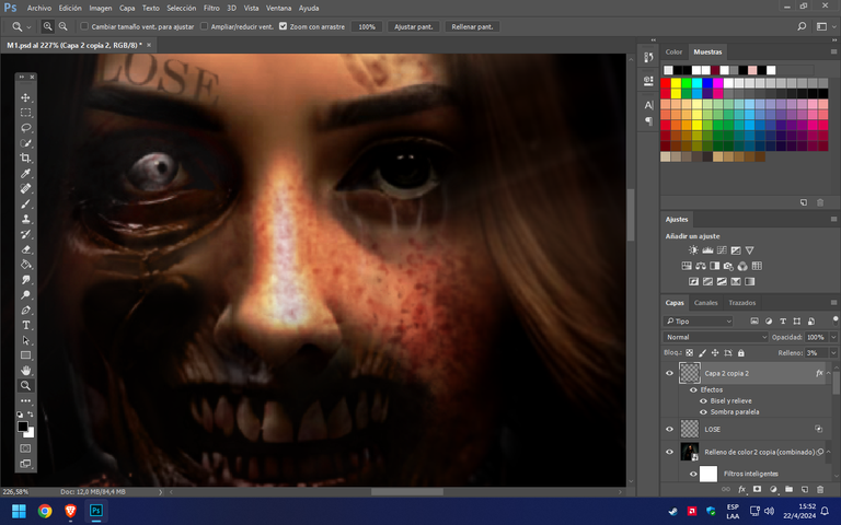
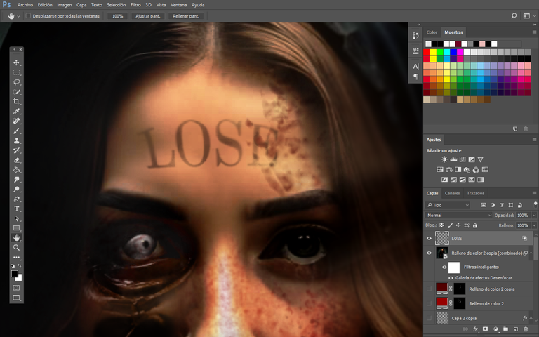
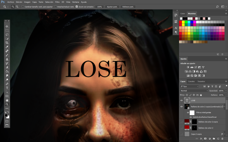
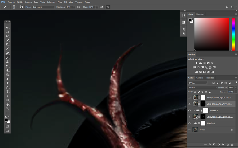
To finish the design, I placed branches under the chin with level adjustments, and then I used the text "LOSE" positioned above the eyebrows like a contemporary tattoo solely for aesthetics. Using dark burgundy and lightened red colors, I then applied a blood texture to complete the flow down the face. What would a zombie be without blood, right? I reiterate and emphasize the difference between adjusting shadows and layers as opposed to using just a superficial layer mask. It takes a bit longer in the process, but it results in a more realistic outcome.
Para terminar el diseño, coloqué ramas debajo de la barbilla con ajustes de niveles, y luego utilicé el texto "LOSE" ubicado sobre las cejas como un tatuaje contemporáneo solo por estética. Utilizando colores borgoña oscuro y rojo aclarado, luego apliqué una textura de sangre para completar el recorrido por el rostro. ¿Qué sería de un zombi sin sangre, verdad? Reitero y destaco la diferencia entre ajustar sombras y capas en comparación con usar solo una máscara de capa superficial. Toma un poco más de tiempo en el proceso, pero el resultado es más realista.

FINAL RESULT
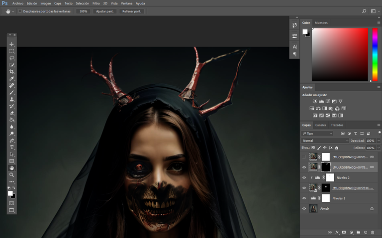
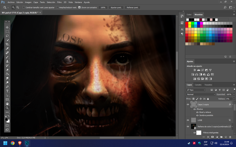
Finishing up, I used a motion blur effect on the face and added depth of field to emphasize certain parts of the face. I hope you liked this design, and we'll be seeing each other again in another session.
Terminando, utilicé un efecto de desenfoque de movimiento en el rostro y agregué desenfoque de campo para enfatizar ciertas partes del rostro. Espero que te haya gustado este diseño, y nos volveremos a ver en otra sesión.

Tools Used :
Photoshop
WACOM CTL 472
Font AI Style Cinematic
Congratulations @smile27! You have completed the following achievement on the Hive blockchain And have been rewarded with New badge(s)
Your next target is to reach 23000 upvotes.
You can view your badges on your board and compare yourself to others in the Ranking
If you no longer want to receive notifications, reply to this comment with the word
STOPCheck out our last posts: