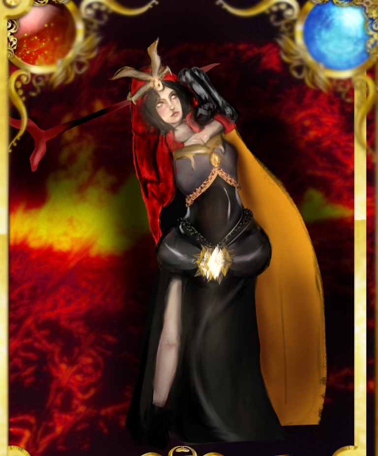
Creation of the Fanart
Greetings everyone, we keep going with the @splinterlands #fanarts game with different a card desing this time, including my style and interpretation of the character. I liked the red colors in her outfit and try to do them the best i could, also giving her another pose to be more dynamic as if she were about to fight. i never draw such kind of poses in my pjone so it was a bit challeging but i think for a first time is not so bad.
At the moment this and the rest of the digital drawings I'm doing them from my phone in the Ibis Paint App and with my fingers. Using resources of the app for the different works
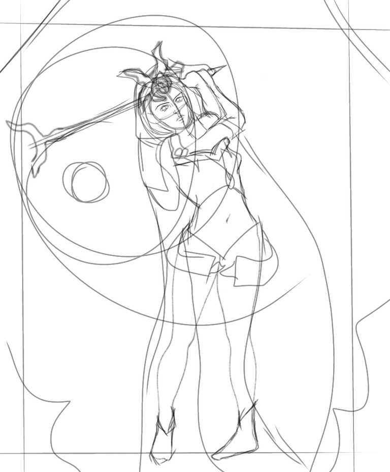
Sketch
this is the first part of any of my drawings, i was trying to make sure to have a good structure before painting to not make her look rigid like a robot, and all the lines behind are a little of a planning for what i wanted the card to be. Even though ended up being something different but that´s what usually happens when i start.
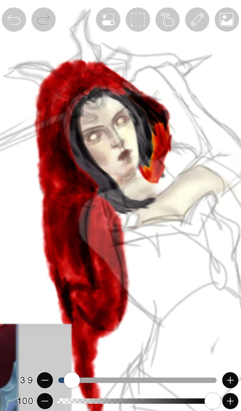
shaping with color
Here i was trying to make something different from what i usually do and is shaping with #color, that's a technic that i still practicing because it takes lots of time to make it right but i enjoyed to experiment, i used the same color pallet of the card to make her recognizable but i changed a little the final tones.
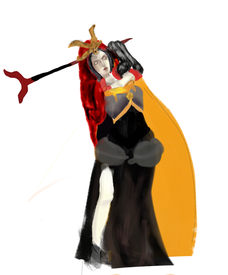
Coloring body
the #painting i did here has the base colors so i could use other layers on top of it and try different effects, i did a little different the part of the corset and hips, but i liked the volume of the new ones. now from here it was mostly to try to imitate different textures for the outfit such as the velvety cape and gold accesories,also the soft skin and a bit of the make up. that made me lose a little of the structure but i kept going.
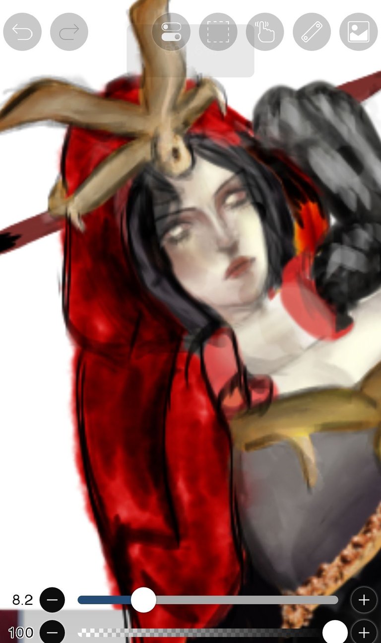
face
here i try to take astep back and give her more facial structure with a little make up, thick lashes, lipstick and eyebrows. even helping a little with some hair in her face. at the end i also had to do some hard lines to give a better understanding of the figure but having the blurred painting under it, so it looks more like as a realistic piece.

background
When i used that background i had a little hard time making her pop out but all i did was using a brush with a dark color to highlight her more. As you can see in the in the same layer that was above everything i put a little more color to help the shape and to make it stand out from the card.Here, after finishing the #drawing, I added some effects to creat something like a chaotic #background for her and trying to imitate the powers and some elements that the original card has such as the colored circles that were on the upper part of it.
i wonder how this characters would look like in typical situations such as going out doing their make up or other activities i think they would look fun. But maybe for other post, this time i also added a new banner i hope you like it!
Thanks for reading and your support for the previous posts, until the next post hive friends.
My Networks
https://www.instagram.com/Viktoria_artssss/
https://youtube.com/@viktoriaarts931?si=FeNqZ2QmKcouwRak

Congratulations @viktoriaarts! You have completed the following achievement on the Hive blockchain And have been rewarded with New badge(s)
Your next target is to reach 2000 upvotes.
You can view your badges on your board and compare yourself to others in the Ranking
If you no longer want to receive notifications, reply to this comment with the word
STOPCheck out our last posts:
Te quedó excelente!
graciaas