[ESP]
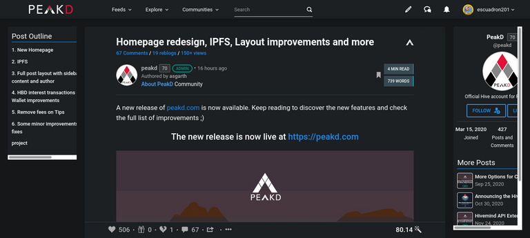
Esa parte de que ahora puedes ver el perfil del autor del lado derecho y la estructura del post del lado izquierdo esta muy bien, sin embargo el problema que le veo es que no está bien responsivo.
Por ejemplo en mi laptop que al ser pequeña pues no esta bien distribuido esas barras laterales
Por otro lado se me hace muy bien la parte del IPFS, aunque claro le faltan sus detalles y por mi cuenta ya me he puesto a hacer "pin" a la pagina y creo que la empezare a visitar con mas frecuencia en su version de IPFS.
Espero que la opción de añadir imágenes pronto sea también vía IPFS
[ENG]
That part that now you can see the author's profile on the right side and the structure of the post on the left side is very good, however the problem I see is that it is not responsive.
For example in my laptop that being small it is not well distributed those sidebars.
On the other hand, the IPFS part is very good, although of course it lacks its details and I have already started to "pin" the page and I think I will start to visit it more frequently in its IPFS version.
I hope that the option to add images will soon be also via IPFS.

Can you check again? We already did a few improvements to the layout.
I see it much better, although it is curious because in the image I just sent you, the right side is still not well visualized.
However, in this post you can see the right sidebar very well
Can you share the link of the first image? Thanks
Yes, it's my friend @gr33nm4ster's post, which I vote for from my curation account.
https://peakd.com/hive-140217/@gr33nm4ster/qatgzkcy