A little later than usual, I post the usual Glassnode metrics which I will comment on briefly.
I chose to wait until today for this post because Monday and Tuesday's movements were too important not to comment on immediately (read yesterday's post here).
The series of indicators signal the closing phase of the bear market...to be added to those seen in the past few days...
Here we follow the trend of accumulation and distribution phases.
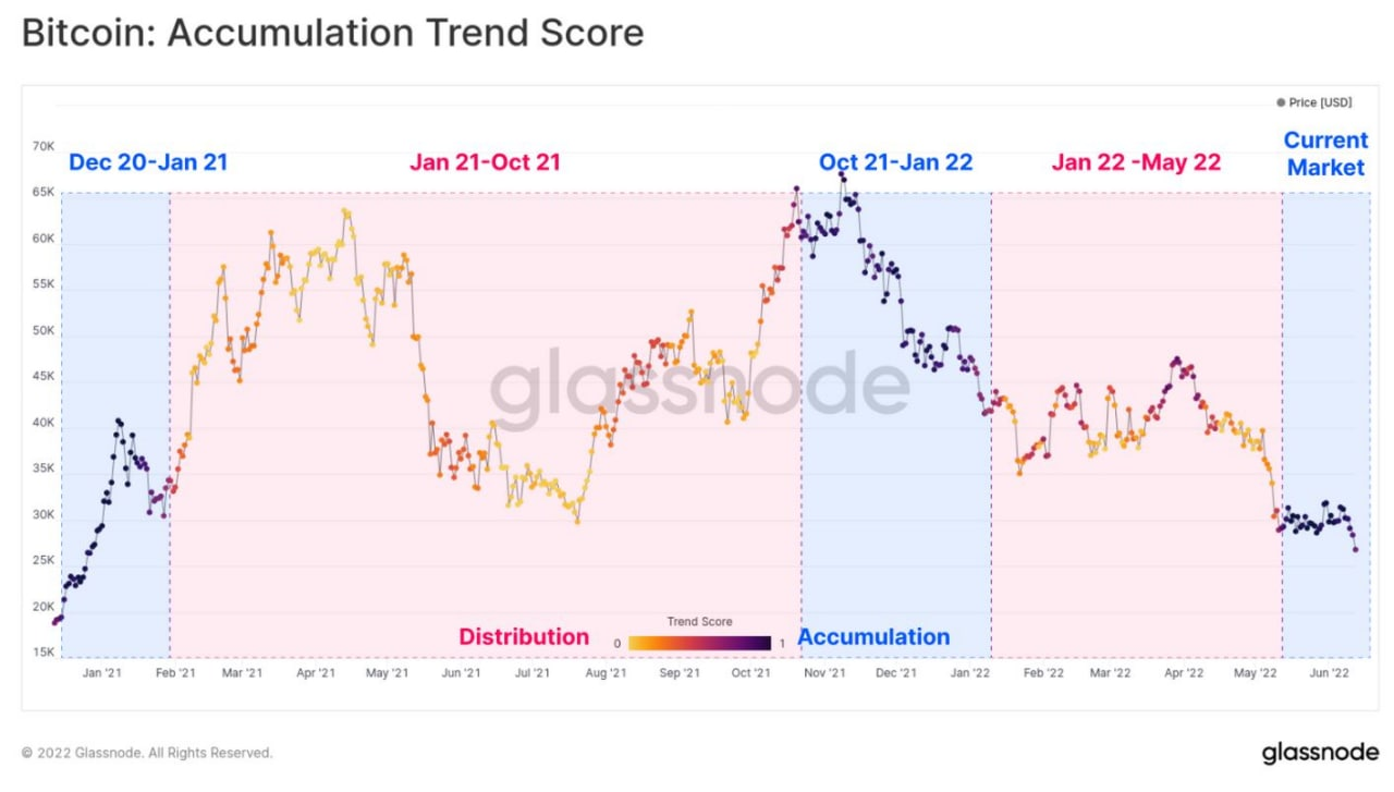
Whereas between January and May there had been an alternation between accumulation and distribution of btc, now, after the Moon sell-off, there is an almost exclusive prevalence of accumulation (the dots on the curve get darker and darker). A sign that investors are beginning to find the latest quotes very attractive, that is, with very little possible downside compared to the potential upside.
But who is taking the most advantage of these declines?
Right now the "whales" (those with more than 10,000 btc in their holdings) are accumulating the most, while average accumulators (with holdings between 1 and 100 btc) have reduced this activity.
This is not surprising: even on traditional exchanges, institutional investors are the only ones brave enough to accumulate in the most dramatic sell-offs.
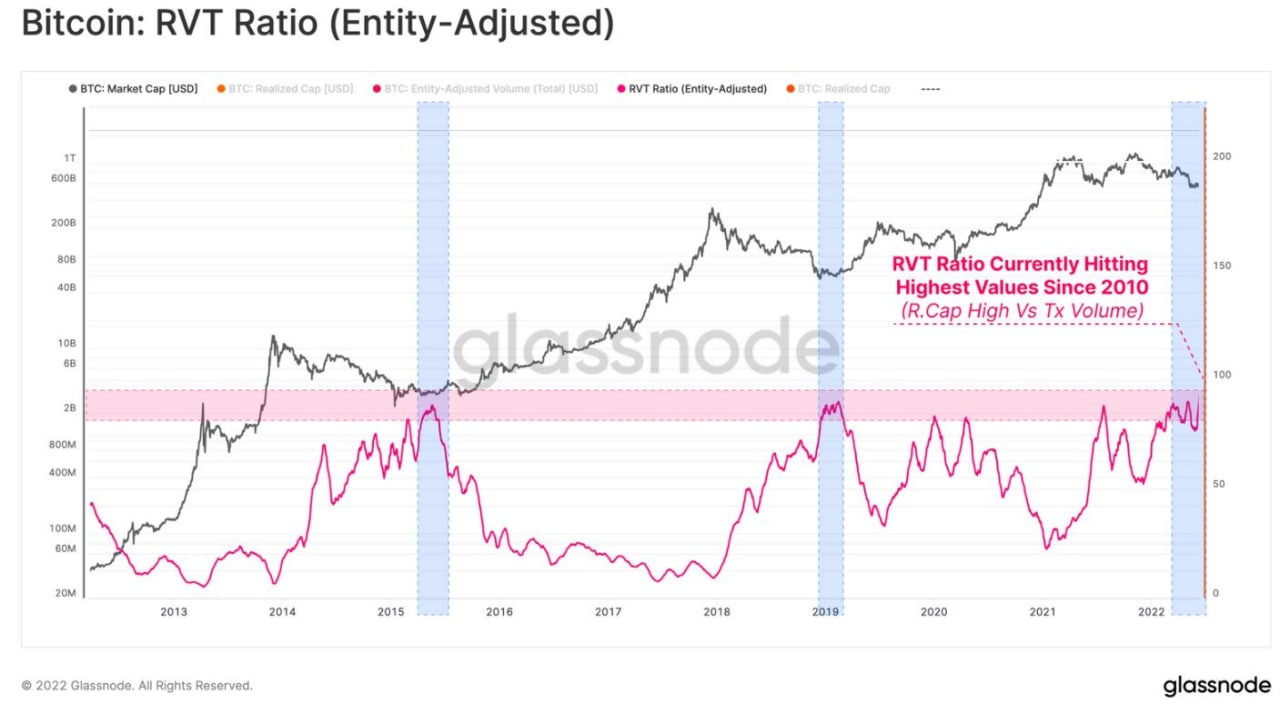
The RTV ratio, on the other hand, measures the degree of inadequacy of the btc network, that is, when the btc quote is excessive relative to the value of the coins actually transacted in the blockchain.
As can be seen, the index (red curve) has reached the pink band, indicating the highest values, which in the past (vertical blue bands) have always preceded the start of new bull markets.
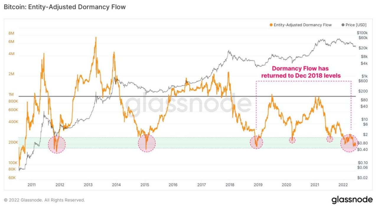
This indicator, on the other hand, measures the extent of "dormant" coins relative to the value of trades. In practice, the lower the orange curve goes, the thinner the age of "dormant" coins.
In other words, in phases of market collapse, even the "oldest" coins are spent, causing the orange curve to drop into the light green band, slightly anticipating the start of a new bull market (at least, that's what has happened in the past, as the pink circles show).
Looking at these metrics, it appears that the new bull market is indeed close.
But if we want to attempt a more precise measure of timing, here are two more indicators...
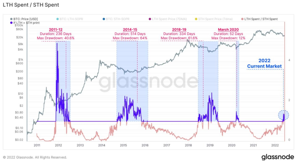
This chart is a more sophisticated version of the "Boom and Bust" chart published on June 13, which calculated the average duration of declines over 400 days.
Here basically, when the pink curve crosses the purple line and turns blue it means that the declines are so strong that not only traders but also holders start selling some of their coins (these are the mid-level holders we saw in the second post in this sequence).
The chart also measures the number of consecutive days during which the curve remains blue before the start of a new bull market.
If we exclude the episode due to the covid, which represents an atypical phenomenon, the other similar events lasted an average of 361 days before the next bull market.
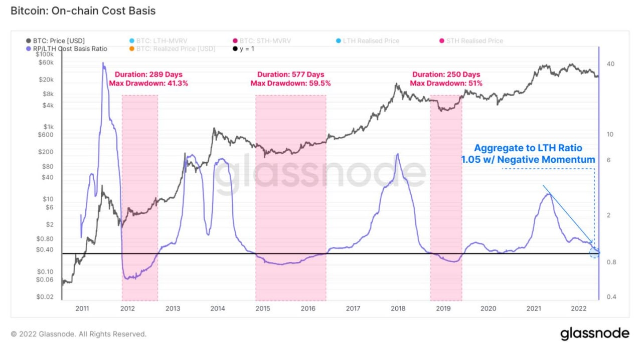
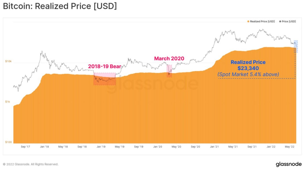
This other indicator represents the differential between the "Realized Price" of holders and that of the market.
When the two coincide, it means that the "advantage" gained by holders for accumulating coins at low prices in the past is thinning out, due to the collapse in prices.
In this case, the blue curve falls below the black line and settles there for an average of 372 days, before a new bull market begins.
CONCLUSION
In conclusion, all the metrics seen today and in recent days signal that this btc cycle is ending to finally give way to a new cycle.
To speculate how much longer until the end of this "agony," the charts considered here and in previous days vary between the space of a semester to just over a year.
Of course, no one here has a crystal ball, so the only way to anticipate the market is to follow it step by step. Those interested in measuring the progression of this phase each day to understand when to open speculative positions to use in the next bull market can consult the automated chart "Bitcoin Rainbow".
Although it gives the impression of being too simple, it is actually very reliable.
SOURCES
https://insights.glassnode.com/the-week-onchain-week-24-2022/
Posted Using LeoFinance Beta
Thank you for a clear explanation. Appreciate it.
Yay! 🤗
Your content has been boosted with Ecency Points, by @cryptomaster5.
Use Ecency daily to boost your growth on platform!
Support Ecency
Vote for new Proposal
Delegate HP and earn more