Designing Hive Business Cards (from scratch)
It has been a few months since I took part in a Hive marketing-related contest. In this blog post, I'll be sharing a bit of my process that will explain and show how I get to the final design, which will be my entry to the contest. I've said in that entry, that I rarely participate in contests, due to running my own company. But, got to say, why not share some of my expertise with the rest of you on Hive? It's also an opportunity for me to give you some more insight into how I work, and how I visualize, create, and present my work with a professional approach. This approach has shown me plenty of times how much of a difference it makes to think a little bit before jumping straight into the design process.
Hope you all enjoy it, and of course, love the design that I made.
Table of contents:
- About the Contest
- Analyzing the brief
- Pitching the brief back
- Concept phase
- Design
- Conclusion
About the contest
Onboarding users to Hive has always been a hot item for our protocol. And why shouldn't it be? Hive is an amazing place that more people should know about. The idea for this contest is to spread the onboarding worldwide but focused on geo-locations. This is a great approach to onboard users.
It also is a great opportunity for Hive to represent itself in physical form. Whether it be just a business card or a huge roll-up banner. Business cards are cost-effective, widely adopted, and most likely handed out the most in terms of networking. I'm quite excited to enter this contest as I can see a lot of potential in such an approach. If you'd like to read more about the contest, you can read more about it here.
Analyzing the brief
As I said in the beginning, understanding the brief is one of the most important things that we can do before working on it. It's a bit challenging since the brief is short (but clear). We have to look for some clues that will explain why and for what these business cards are going to be used.
Summarizing and identifying the requirements of the brief is pretty important. It will help us identify the Must-Haves, Should-Haves, and Wanna-Haves.
The request:
- 2-sided business card
- Both sides should have room for QR codes
- 1 for Hiveonboard.com
- 1 to Hive's Community Discord
- Sleek design
- Mass-production proof
- Preferred sample of slogans for presentation purposes (and ideas)
- Front should be Hive focused (universal)
- Back should be location-focused (variation)
Regardless of the design, I can identify 3 key features that the design must have.
- Universal
- Geolocation specific
- Onboarding QR codes
It might be a little bit too much to print on a tiny business card. I'm also missing one important thing: how is it going to be used? One may think that business cards are just business cards. But it kind of depends on how you are going to use them, and with what goal.
Let me explain the difference
When using business cards to network, the main goal is to make connections with potential entrepreneurs, business partners, customers, and so on. This is a super fast transaction made by handing out your business cards at network events, booths, when you chat with someone, etc. However, the goal is to create a lasting impression and provide a way for people to easily contact you in the future whenever they think about you (which is already a small chance).
Now, this isn't the case for these business cards. These business cards will be used to onboard users to Hive, which is different from the above. The goal is to get them to sign up for Hive. So, you can say that the business card is acting as a physical representation of Hive. No matter who distributes them. People would need to be incentivized to sign up. The latter is the challenge, so in this case, the information provided by OnBoarders must stick whenever they look at that business card.
The difference is the strategy. Both are used to achieve different objectives, networking is more about making connections, whereas onboarding is more about getting people to sign up for Hive.
Pitching the brief back with suggestions
All right, normally, before I would start working on a visual concept, I'd made sure that I understood the brief, and would definitely have tried to see how my client would respond to suggestions. This is rather important to determine the flexibility of the client, but also to make sure that I understood the brief. If I didn't understand the brief, the client can still get out or clarify, and personally, if I noticed some sort of friction, or just feel uncomfortable with the collaboration, I could pull out as well. Never deliver something if both expectations are off. It's a waste of time and has the potential to damage your reputation as a designer.
Besides, it's a waste of time and resources to create something that doesn't fit both your visions from the beginning. So, since this is a contest, I, unfortunately, don't have much room to pitch the brief back, and from this point on I'm navigating blindly. This is the biggest reason for me not to partake in contests, as I find it important to create something that is actually going to be used (and enjoyed).
The only thing I would've asked was a few targeted questions to make sure that the client is also aware of what they need, and rather not what they want. This is another pretty important thing. During the brief, you will discover the Must-Haves, Should-Haves, and Wanna-Haves. These three are worth talking about with your client and are also very important to identify. It's key that your client knows the difference between these, as well as that you should be able to answer these with a clear substance.
In this case, it's a bit difficult, since this is a contest, but I wanted to share this with you.
Concept Phase
Due to the nature of the contest, I've spent a little bit more on analyzing the brief. The goal and the usage are important here because as a graphic designer, I'll be responsible for how the final design will turn out, right? This is the Why, How, and What questions from Simon Cinek (or any other marketing book).
Working with a tight deadline gives some limitations, such as not being able to go too much in-depth, as there would be too little room to plan a session. So, I can do a few things that always have worked for me in the past. One of the methods is what I call calibrating, and identifying keywords. These keywords can be used as guidelines and also work as a confirmation check. I'll be asking myself a question, that needs to be answered as shortly and clearly as possible.
These Business Cards...
"... are going to be used in the Philipines, by OnBoarders, to get other people to sign up for Hive."
"... need to have a universal design for mass production that also illustrate the geolocation of the place/country where they are being distributed"
Keywords: #international #local #connect #signup #hive #engaging #personal #reusable #smartdesign #nextgeneration #uniquevariations #community |
Combined with the main keywords from the brief itself, I can answer these three simple questions with a clear understanding of what I should be working on.
Why? #OnBoarding people to Hive
How? With #personal and engaging 1:1 conversations with #local people
What? Distributing #smartdesign business cards with a #QR code on both sides
What I love so much about this brief is that these business cards are going to be used in the real world. This requires a different approach than online marketing. Old school.
Physical (personal) marketing
An important thing to understand about these business cards is that they are being handed out by Hive OnBoarders. I remember doing some similar work when I was a teenager. What stuck with me, was that a personal and positive approach is something that tends to stay. This opportunity also offers to connect with valuable, talented, and more important, real people.
What's the difference between physical and online marketing? Online is usually cold, objective, and focused on information. While physical marketing is more about taking a warmer approach with real people that represent Hive. Add the aspect of onboarding to it, and you can get quite comfortable and personal with your target audience. This gives us the chance to create something that's going to be used in the real world.
First impressions with print
Have you ever had a network meeting, and someone looked at your and smiled after you gave them your business card? Well, that's what a 300-gram (or more) matte business card will do for you.
I can highly recommend printing on 300/350/400-gram double-sided matte paper and avoiding the shiny and 180/225-gram options. This makes a lot of difference.
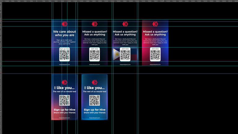
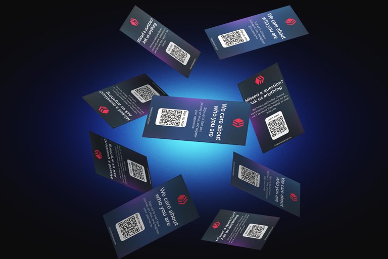
Design
I have a clear vision and idea of how I should design these (business) cards. I want to stay away from the traditional horizontal design that is usually used for business cards. This is mostly because I noticed in the brief that there might be not enough space for all of the information. So, I figured that a vertical design will be a lot better. Still, I know I will face the challenge to add everything to it.
As for colors, I chose deep dark blues, which makes the red and white font-color pop. Combined with adding neon-like graphics, I think it will look like a badass modern business card that does the trick for people around 16-35 years old.
Since I have done a lot of research for the Infographic that I made a few months ago, I figured it would only be best to use the same font.
Ratio: 5.1cm in width, and 8,9cm in height. Easy to adjust if the print requires to be slightly wider.
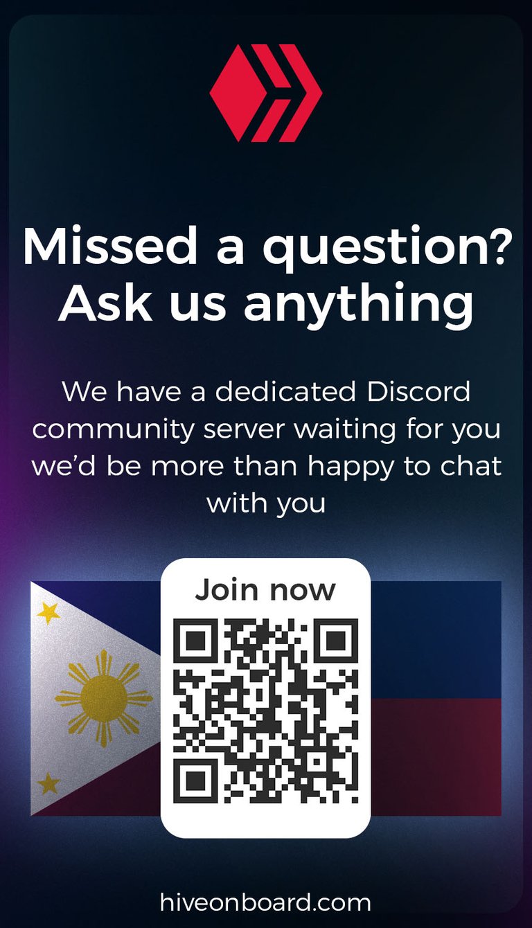
You might be wondering... where is the focus on the Philipines? Well... there is simply not enough room to include this and make it look inviting. Business cards are small. and I honestly think that stuff will fade away and will be unclear and more received as noise. The only thing that could maybe work, is adding the flag behind the QR code that takes you to the community discord. Like below. But I wouldn't print it like this, as it would make the design pretty packed and crowded.
Nonetheless, both the front and back designs are universal and smart. You can change the slogan in the native language (just keep an eye on the wording, or use a different catchphrase).
|  |
Conclusion
In conclusion, the design that I made for the contest turned out pretty nice, if I have to say so myself. If we look at the requirements in the brief, we can check things off. It has a sleek design, it has a global design, it's considered to be modern/bold/Gen Z proof, and so on. I think making it personal is a nice way of introducing Hive to people we talk to.
Notes: I made the QR code for Hiveonboard.com, and I have also generated a Discord invite link to the Hive PH Discord server that doesn't expire.
That being said, I hope you all enjoy this design. I also hope that those who found it interesting to read my process, also learned a bit or two. And of course, if you have tips/tricks to add, please feel free to share them with me in the comments below.
|
|
 |
|
Got feedback? Please share in the comments below
If you have any feedback, this is most welcome and appreciated!
Cheers,
Ruben

Follow me on Foundation | Follow me on Twitter | Follow me on Instagram
The rewards earned on this comment will go directly to the people( @rubencress ) sharing the post on Twitter as long as they are registered with @poshtoken. Sign up at https://hiveposh.com.
I Ruben! Here is my feedback ;)
I'm not a huge fan of full gradients on a business card but your card got pretty professional and might be the winner. Just let me correct something, there are no shine paper, I think you mean gloss paper, that actually can be 400gm like matte paper.
The use of matte or gloss it depends specially if the card have graphics or pictures, pictures/photos goes nice with gloss paper, graphics and very small letters goes better with matte. The rest is a question of taste. Also gloss can be more resistant than matte because if you want to give it an extra shiny touch it will be printed with an extra layer that gives it resistance.
By the way I'm also in the contest lol, so good luck to you 😁
Hey Doze, thanks man, tried my best to keep it pro 😎! Appreciate the feedback :) You're absolutely right, I meant Glossy indeed! Not shine (lol).
The difference of durability between 350gram Glossy Laminated or Matte Laminated is very slight, this has to do with the size of the business card. If you were to print a A4 for example, then yes, you're 100% correct as it will definitely be the Glossy paper that would outshine the Matte variant in terms of durability. But, did you know that it's actually harder to rip a 350 gram Matte Laminated business card than a 350 gram Glossy variant? This has something to do with the corner/sides of the Glossy lamination, it's a bit sharper, so if you can find a place to rip it, it will rip fast. The matte one will be a bit more flexible, so it will be a bit harder to rip.
You're right about taste, and this is a pretty important thing that you bring up. All of our cultures world-wide have different taste. Whatever is more common in the Philippines, we should go for the other one, as it will leave a bigger impact as people aren't used to holding it (making it unique once received). The 350-400 gram paper does the trick to give it a nice, professional, serious, and sturdy feeling, it's the opposite common material that will make people look at it.
I'll definitely have a look at what you have been working on Doze! 💪 Good luck to you too bro!
I guess its the translation. It's more or less a coating that they add as a finishing touch and to give it more durability. You got some professional business designs there! Nice!
Ah ok! Got you! ;)
Thanks!
I loved the logic and the thought process that led you to that simple yet sleek, elegant and to-the-point cards!
I love them - they say just what they are supposed to say, they are inviting and cool!
I would possibly change the "We care about who you are" with an easy to read hand writing, so that it would look more friendly.
Well done once more :)
!BEER
Thanks a lot Kat for the compliment and the feedback, much appreciated!
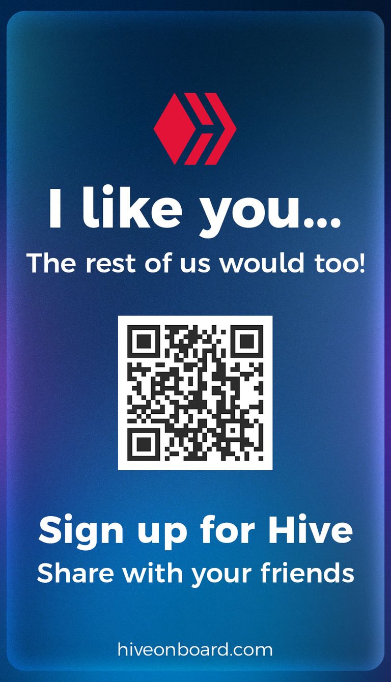
Hey Ruben I love the tag lines that you have used! They are warm and friendly. Can they be shared online and just change the QR code to mine?
Awesome! Which one do you want me to change to your QR?
Just checking: do you want your Hiveonboard referral link added to the QR, or a link to your personal profile?
This one is the one that I loved the most Ruben, somehow these words resonates to how Pinoy's might see Hive as something warming and with a sense of belongingness.
Qr code will be much better, so that it will not be ruining the design with long forms of text.
Nice, I adjusted the design and made a square for you so it easier to share on all Social Media platforms
The QR should take you to the following: https://hiveonboard.com/create-account?ref=tpkidkai
Awesomee Love them Ruben thanks!
You're welcome! You better be onboarding people now with that :P
These look great man. Your designs are so clean and very pleasing aesthetically.
Thanks a lot man! I'm quite satisfied with how they turned out! Hope I win so I get to see them in action! That would be epic :D
These are super awesome!
Thanks a lot TDC!
Great and amazing entries. The way you worked hard to make all these things we pray you win this contest.
Thank you DJBravo, let's hope so! :D
Welcome dear
that was a brilliant idea to promote hive! :D
All credits to @acidyo, and I agree, a brilliant idea to promote Hive!
greetings @rubencress
the cards are certainly very nice, the work is impeccable my congratulations for your art.
Thank you very much! I'm glad that you like the design. Thought going vertical was a nice way to get more on the card :)
This is such a clean design. I love it. I also like the fact that it's in portrait so it makes it unique and fully utilizes space well. Good job. 👍🏾
Hey there, thank you! Glad that you spot that difference, portrait/landscape. I thought it would make a nice difference as we usually tend to see horizontal designs when it comes down to designing business cards.
It definitely does! And it looks very clean.
Ah wow, This is very nice and unique Ruben, Bravo🔥
Now I'm over here thinking mine is just trash😂🚮 would decide if worth posting.
Thank you thank you QS! Haha, well... it is always worth sharing your ideas with others! You should definitely give it a go :))
Ahaha, indeed. You did really nicely, awesome.
I will make an entry, working on it. Gracias Ruben😊🌸
Your content has been voted as a part of Encouragement program. Keep up the good work!
Use Ecency daily to boost your growth on platform!
Support Ecency
Vote for new Proposal
Delegate HP and earn more
View or trade
BEER.Hey @rubencress, here is a little bit of
BEERfrom @katerinaramm for you. Enjoy it!Learn how to earn FREE BEER each day by staking your
BEER.https://hive.blog/hive-167922/@rubencress/contest-entry-designing-hive-business-cards-from-scratch