BTC MARKET CYCLE CHARTS
All this information about BTC indicators I have taken from the page LookIntoBitcoin
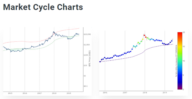
2 Year MA multiplier
https://www.lookintobitcoin.com/charts/bitcoin-investor-tool/
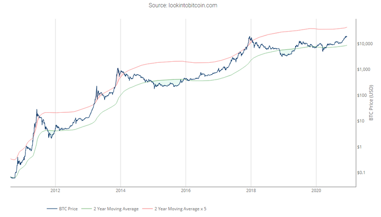
To do this, it uses a moving average (MA) line, the 2yr MA, and also a multiplication of that moving average line, 2yr MA x5.
Note: the x5 multiplication is of the price values of the 2yr moving average, not of its time period.
As you can see the periods where the price is over the MA111 is time to sell, while in the periods where the price is below the MA250 is time to buy.

As Bitcoin is adopted, it moves through market cycles. These are created by periods where market participants are over-excited causing the price to over-extend, and periods where they are overly pessimistic where the price over-contracts. Identifying and understanding these periods can be beneficial to the long term investor.
This tool is a simple and effective way to highlight those periods using MA. an indicator is well known by everybody.

200 Week Moving Average Heatmap
https://www.lookintobitcoin.com/charts/200-week-moving-average-heatmap/
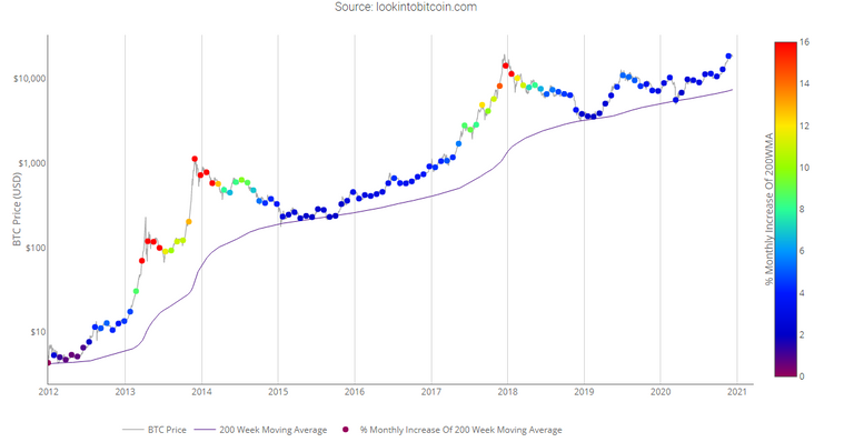
Historically, when we see orange and red dots assigned to the price chart, this has been a good time to sell Bitcoin as the market overheats. Periods, where the price dots are purple and close to the 200-week MA, have historically been good times to buy.
In each of its major market cycles, Bitcoin's price historically bottoms out around the 200 week moving average.
This indicator uses a colour heatmap based on the % increases of that 200-week moving average.
Depending on the month-by-month % increase of the 200-week moving average, a colour is assigned to the price chart.
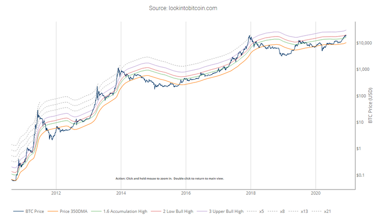
Pi Cycle Top Indicator
https://www.lookintobitcoin.com/charts/pi-cycle-top-indicator/

Pi Cycle Top is useful to indicate when the market is very overheated. So overheated that the shorter-term moving average, which is the 111-day moving average, has reached an x2 multiple of the 350-day moving average. Historically it has proved advantageous to sell Bitcoin at this time in Bitcoin's price cycles.
If you want more detail information about this indicator you can find it here.
The Pi Cycle Top Indicator has historically been effective in picking out the timing of market cycle highs to within 3 days.
It uses the 111 day moving average (111DMA) and a newly created multiple of the 350 day moving average, the 350DMA x 2.
Note: The multiple is of the price values of the 350DMA not the number of days.
For the past three market cycles, when the 111DMA moves up and crosses the 350DMA x 2 we see that it coincides with the price of Bitcoin peaking.
It is also interesting to note that 350 / 111 is 3.153, which is very close to Pi = 3.142. In fact, it is the closest we can get to Pi when dividing 350 by another whole number.
It once again demonstrates the cyclical nature of Bitcoin price action over long time frames. Though in this instance it does so with a high degree of accuracy over the past 7 years.
The golden ratio multiplier
https://www.lookintobitcoin.com/charts/golden-ratio-multiplier/
As Bitcoin becomes adopted over time, it's market cycle highs hit decreasing Fibonacci sequence multiples of the 350DMA. This is because the explosive growth of Bitcoin on a logarithmic scale is slowing over time. As it's market cap increases it becomes more difficult for the same log scale growth rates to continue.
If this decreasing Fibonacci sequence pattern continues to play out as it has done over the course of the past 9 years, then the next market cycle high will be when price is in the area of the 350DMA x3.
The Golden Ratio Multiplier is an effective tool because it is able to demonstrate when the market is likely overstretched within the context of Bitcoin's adoption curve growth and market cycles.

The Golden Ratio Multiplier explores Bitcoin's adoption curve and market cycles to understand how price may behave on medium to long term time frames.
To do this it uses multiples of the 350 day moving average (350DMA) of Bitcoin's price to identify areas of potential resistance to price movements. Note: multiples are of the 350DMA's price values rather than its number of days.
The multiples reference the Golden Ratio (1.6) and the Fibonacci sequence (0, 1, 1, 2, 3, 5, 8, 13, 21). These are important mathematical numbers.
These specific multiplications of the 350DMA have been very effective over time at picking out intracycle highs for Bitcoin price and also the major market cycle highs.
Social data
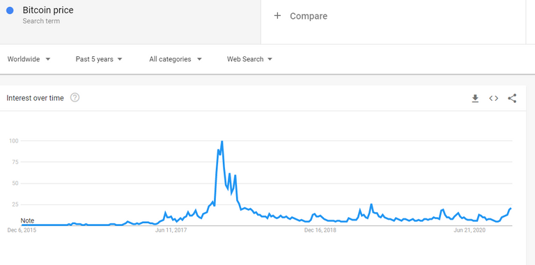
As has been pointed out from other publications (@jondoe by example), the level of social attention on bitcoin is currently relatively low compared to the peak in 2017 when ATH was reached, which has been maintained until now.
This means that the investors who are currently there are few, but much larger than those who invested in 2017 and therefore make less noise. We will see how things turn out during 2021, the end of the year promises to be a turning point.
I hope this post help you to find more information to know how to invest your crypto portfolio having account of altcoins always lag with bitcoin. Best regards.


Posted Using LeoFinance Beta