Hey!
Seems like these web design / programming posts are pulling off! 💸💰 I love both so why shouldn't I write more, huh?
I won't start showing you my to-do list on the website again, I don't think that is wise (I have a shitton of stuff I haven't done). I did make some things better though!
Navbar
I haven't thought much about mobile responsiveness yet. One of the biggest things, in my opinion, is making the navbar responsive. I have four links in my navigation and if they are pushed together into one big pile of text, it won't look nice.
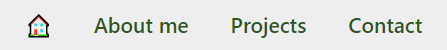
Because I use Bootstrap 4 in my development process, I used their collapsible navbar code.
The little bars button (taken from Font Awesome!) is clickable and a nice menu opens on the right side with a cute lil' animation. However, I stumbled upon a small bug, which I haven't had any ideas to fix yet. Maybe the community here can help me:
One of my problems was that whenever I click a link on mobile, I want the navbar to collapse, but adding the data-toggle identifier to the a tag didn't work (when I clicked a link, it didn't scroll to the right part of the page). What worked was adding the data-toggle identifier to the li tag, that surrounds the anchor tag. Now, when I am on the desktop view when I click the "house" or "home" icon/anchor, the navbar looks like it's reloading or something. Try it out here: poska.netlify.app. The other anchor tags work fine, but they are probably sort of "reloading" as well, but since it's scrolling into position, I can't see it. You can check out the code on GitHub.
Scrolling
I made the scrolling smoother! Now whenever you click a link, it smOoOoOoOthly scrolls to the right part of the page.

Another thing, which is very important, in my opinion, is that I put a small indicator right on the homepage that you should scroll down. It's this little arrow that you see on the right.
CV
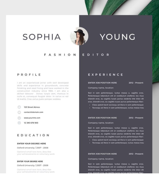
One of the things in my checklist was to redesign my CV. At least I have gotten started with it! I found some inspiration on Pinterest and while it doesn't look like it's supposed to, I'm making progress. I didn't want my CV to just look like a random page with lots of text - I wanted it to look aesthetic, beautiful and even fun to read. With this redesign, I hope to achieve that.
It is probably going to look something like the picture on the right. I just hope that until then, nobody will look at my CV section. I have ideas on how to make progress with this, but I am just simply too lazy to get started with it.
If you stumble upon the CV page, just look at it with the idea that it's going to look beautiful one day, at least I hope so.
And I guess that's it?
I did also add Google Analytics to the website, just to see if anyone even gives a damn about it. Once I start sharing it publicly, maybe someone will!
Let me know down in the comments if you have any ideas about the bug I stumbled upon. Otherwise, I'm going to have to fix it all by myself... and you don't want to see me angry, ha.
Well I'm obliged to look now. It isn't bad, it's waaay better than mine (I'm scared to look at mine 😳)
The devil 👿. You're not getting any pageviews from me with my uBlock. I've actually moved away from the ol' goog analtyics (as I was kindly given a more private set of analytics for free for a year [if you're a student - you can too]). It also doesn't get blocked by adblock/uBlock if you set it up fully with a subdomain!
Anyway, thanks for posting to the programming community!
Oh, thank you for the link! I didn't even realise I qualify for the GitHub student thingy - I'll be sure to try out Simple Analytics! <3
Yeah, I know. Many people don't. Glad I could introduce you to it!