Hello everyone, in my last grid practice,I shared the stages, and steps I took to resolve a not too complex grid, being a newbie to grid. Well, I'm still on making grids, and just 2 days ago, I came across this very cool looking but complex grid online.
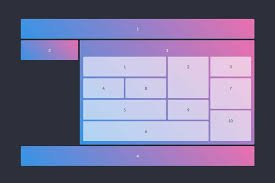
I must say this grid design scared me, because by mere looking at it, I could tell it was way complex than the previous one, but then I didn't let the design intimidate me but instead, I went in with full flesh for it, and I'm going to share with you my codes, for review, corrections, and probably for anyone who would like to implement the grid design into their work to save time. Let's get started!!!

A) First things first, I of course started with html, which is more like what houses our text/design in a webpage. So I called/used the pre-code for HTML, SHIFT+ ! + ENTER, did the trick for me giving me this as output put;
1 <!DOCTYPE html>
2 <html lang="en">
3 <head>
4 <meta charset= "UTF-8">
5 <meta name= "viewport" content= "width-device-width, initial-scale =1.0">
6 <title> Document </title>
7 </head>
8 <body>
9
10 </body>11 </html>
B) After the html pre-code has been called, the next stop is to start editing the title, and add/ link my stylesheet.
In my case, I first created a stylesheet, and named it "style.css.", there after I added it to my html;
6 <link rel = "stylesheet" href=" ./style.css
NB: The './' used here is used to source or create a path to where the file or data was saved on the device.
Next thing I did was to give the design a title, and I used ' GRID- PRACTICE' as the title this time;
7 <title> GRID-PRACTICE </title>
C) After the linking, and addition of title, I went further to the real part of the work which is setting a foundation for my grid design, and the first step I made was to create a ' section' that would house my grid design;
10

11        <body>

12                 <section>

13

14

15                 </section>

16       </body>

17

18       </html>
This section will house all divs that I will implement later on.
D) After creating the section, I created about 5 major divs/containers just like this;
12 <section>
13 <div class= "div-1"> </div>14 <div class= "div-2"> </div>
15 <div class= "div-3">
16
17 </div>
18 <div class= "div-4"> </div>
19 <div class= "div-5"> </div>
20
21 </section>
E) If you look at the design, you will notice the white/ near transparent boxes, on a bigger box... well, that's my div-3, so in other to achieve this complex design, I added more divs to my div-3 (Wheeewww this was really hectic for a beginner like me);
15 <div class= "div-3">
16 <div class= "div-6"> </div>
17 <div class= "div-7"> </div>
18 <div class= "div-8"> </div>
19 <div class= "div-9"> </div>20 <div class= "div-10"> </div>
21 <div class= "div-11"> </div>
22 <div class= "div-12"> </div>
23 <div class= "div-13"> </div>
24
25 <div class= "div-14> </div>
26 </div>
Thereafter, I added 2 extra divs in div-14;
25            <div class ="div-14">
26                  <div class ="div-15"> </div>
27                  <div class ="div-16"> </div>
28           </div>
With this, I could now move over to styling...but just before that, this is the full HTML code (starting from the body);
11 <body>
12 <section>
13 <div class ="div-1"> </div>
14 <div class ="div-2"> </div>
15 <div class ="div-3">
16 <div class ="div-6"> </div>
17 <div class ="div-7"> </div>
18 <div class ="div-8"> </div>
19 <div class ="div-9"> </div>
20 <div class ="div-10"> </div>
21 <div class ="div-11"> </div>
22 <div class ="div-12"> </div>
23 <div class ="div-13"> </div>
24
25 <div class ="div-14">
26 <div class ="div-15"> </div>
27 <div class ="div-16"> </div>
28 </div>
29
30 </div>
31 <div class ="div-4"> </div>
32 <div class ="div-5"> </div>
3334 </section>
35 </body>
After I was done with the html, I tried checking what my design looked like,and of course it was just blank lol...
This is because divs are like containers, and they only display their contents and since I didn't add any content, they will remain empty and blank, except I differentiate them with colors. Now this is where CSS comes in.
F) In my CSS, I also added the pre-code;
1       *{
2            padding: 0;
3            margin: 0;
4            box-sizing: border -box;
3         }
G) After the pre-code, I went on to design the body, and flexing the body content so that all that it will carry will be at the center of the screen;
The output;6 body{
7 display: flex;
8 background-color: hs1(233, 47%, 7%);
9 justify- content: center;
10 align-items: center;
11 height: 100vh;
}

In this output the only visible effect for now is the color, but going further we will see the usefulness of the code.
H) Next, I designed the section which carries directly the whole design design;
13      section{

14             width: 65%;

15             height: 60%;

16             background-color: hsl(235, 31%, 93%);

17             display: grid;

18             grid- template-columns: repeat(5, 1fr);

19             grid-template-rows: repeat(7, 1fr);

20             grid- gap: 6px;

}
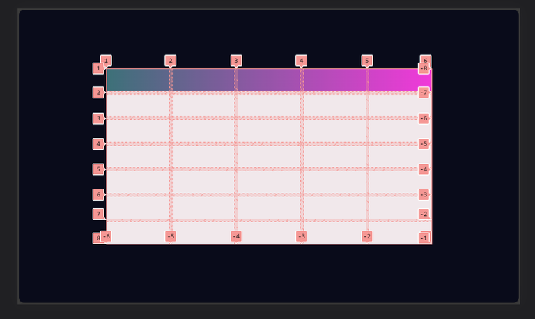
Here, the display:grid; was used to pass an instruction stating that I needed the box to be broken to grid.
The grid template was similarly used to give the number of rows and columns the grid should have.
NB: The color (white) that was used in my code above isn't the correct color. I only used it for easy identification, and will change it at the end of my code.
The output;
I) the next was to specify and position the divs, giving them similar colors as seen from the actual/ original design;
Here, the background: linear-gradient(to right, rgb(40, 108, 117), rgb(240, 47, 224)); was used to create a smooth and nice transition between more than one color.22 .div-1{
23 background: linear-gradient(to right, rgb(40, 108, 117), rgb(240, 47, 224));
24 grid- column: 1/6;
25 grid-row: 1/2;
26 border-radius: 2px;
27 }
The output;
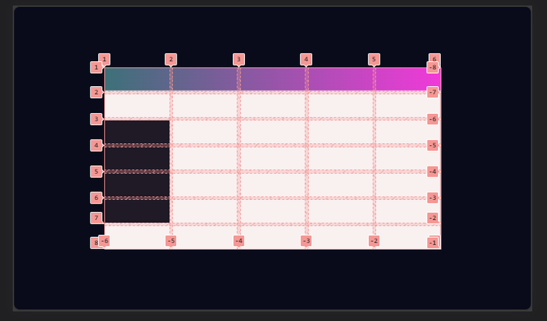
J) I went on to give div 2 a color that would match the background color perfectly, creating an illusion of that div not being existent.
28     .div-2{
29             background-color: hsl(233, 47%, 7%);
30             grid- column: 1/2;
31             grid-row: 3/7;
32     }
The output;
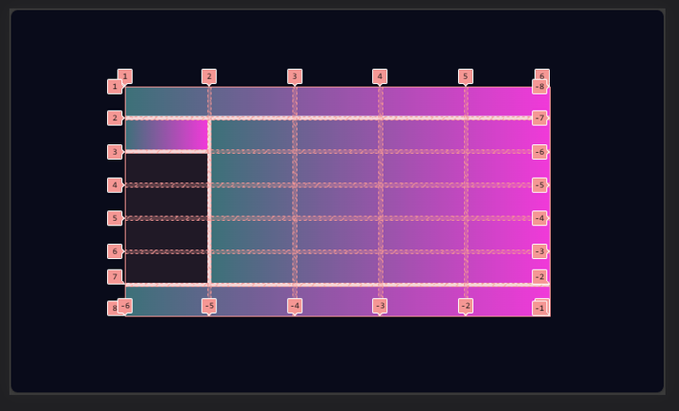
K) This was just more like the continuation of step (I), I used color gradient for div3 and div5;
33     div-3{

34          background: linear-gradient(to right, rgb(40, 108, 117), rgb(240, 47, 224));

35          grid-column: 2/6;

36          grid-row: 2/7;

37          padding: 0 6px 7.5px 6px;

38          display: grid;

39          grid-template-columns: repeat(4,1fr);

40          grid- template-rows: repeat(5, 1fr);

41          grid-gap: 6px;

42          border-radius: 2px;

43      }

50      div- 5{

51           background: linear-gradient(to right, rgb(40, 108, 117), rgb(240, 47, 224));

52           grid-column: 1/6;

53           grid-row: 7/8;

54           border-radius: 2px;

55      }
NB: The display grid was used because I wanted div-3 to carry those white boxes, so div-3 was definitely going to be a complex box from the beginning of my HTML structure.
Output;
L) I moved over to the divs in div-3, to style them with white color, and position them properly. I started with div-6;
56     .div-6{
57           background-color: rgb(181, 201, 221);
58           grid-column: 1/3;
59           grid-row: 2/3;
60           border-radius: 2px;
61     }
Output;

M) with step (L) done, I positioned div-7, to div-10 similarly;
62     .div-7{
63           background-color: rgb(181, 201, 221);
64           grid-column: 1/2;
65           grid-row: 3/4;
66           border-radius: 2px;
67     }
68     .div-8{
69           background-color: rgb(181, 201, 221);
70           grid-column: 2/3;
71           grid-row: 3/4;
72           border-radius: 2px;
73     }
74     .div-9{
75           background-color: rgb(181, 201, 221);
76           grid-column: 1/3;
77           grid-row: 4/5;
78           border-radius: 2px;
79     }
80     .div-10{
81           background-color: rgb(181, 201, 221);
82           grid-column: 1/4;
83           grid-row: 5/6;
84           border-radius: 2px;
85     }
Which gave this output;

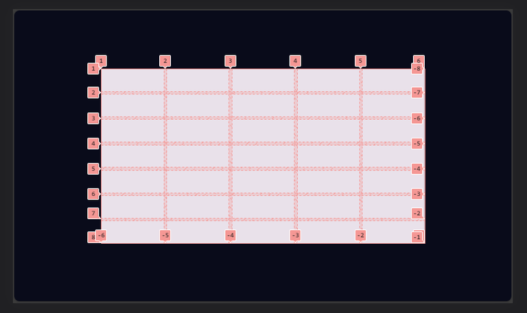
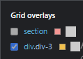
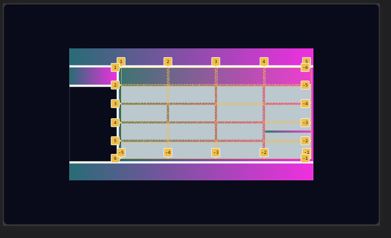
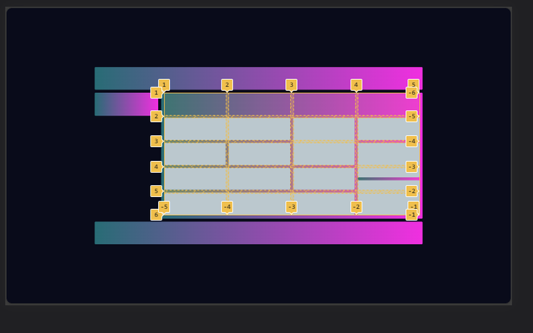
Before moving further, I went over to highlight the grid I was currently working on (div-3), so as not to make mistakes in the numbering;

Thereafter, I went on to style the other children divs within the parent div (div-3);
86     .div-11{
87           background-color: rgb(181, 201, 221);
88           grid-column: 3/4;
89           grid-row: 2/4;
90           border-radius: 2px;
91     }
92     .div-12{
93           background-color: rgb(181, 201, 221);
94           grid-column: 3/4;
95           grid-row: 4/5;
96           border-radius: 2px;
97     }
98     .div-13{
99           background-color: rgb(181, 201, 221);
100          grid-column: 4/5;
101          grid-row: 2/3;
102          border-radius: 2px;
103     }
104     .div-14{
105          background: linear-gradient(to right, rgb (40, 108, 117),rgb(240, 47, 224));
106          grid-column: 4/5;
107          grid-row: 3/6;
108          display:grid;
109          grid-gap:6px;
110          grid-template-columns: repeat( 1,1fr);
111          grid-template-rows: repeat(6, 1fr);
112          border-radius: 2px;
113      }
114     .div-15{
115           background-color: rgb(181, 201, 221);
116           grid-row: 1/4;
117           border-radius: 2px;
118     }
119     .div-16{
120           background-color: rgb(181, 201, 221);
121           grid-row: 4/7;
122           border-radius: 2px;
The output;
N) Remember in step (H) where I used color white for the box initially, so as to make my design visible? Yeah now is the time to take it off, and give the right color to the box;
13      section{
14             width: 65%;
15             height: 60%;
16             background-color: hsl(233, 47%, 7%);
17             display: grid;
18             grid- template-columns: repeat(5, 1fr);
19             grid-template-rows: repeat(7, 1fr);
20             grid- gap: 6px;
           }
Looking closely at this step N and H, the only difference is the color.
And this is the output;
You will notice in the above image, that the little white edges have disappeared...that's because I updated the color of the box, to match with that of the background.
And for the final unveiling, below is the what I created with all this code above;

All Images Used Here Are Mine Except Stated Otherwise.
Thanks For Reading.
Wow all i can say is wow, you really did justice to this, even better than the source image, i am now motivated seeing this, i think i am in the right coding community
Hehe thanks!!😁😁😁
Yep that's the spirit...it's the motivation that keeps us going.