It's not much but compared to where we left off last time, I've changed the looks of the navbar, added some text to the start of the page and band photos for the festival lineup cards. I didn't add them to all the bands yet since the design of the cards and / or photos will change a little in the future to look more consistent (see the 1 colorful photo between all the b&w ones).
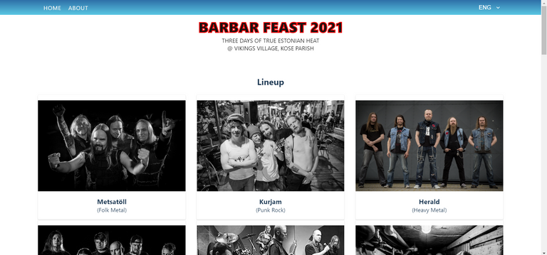
Speaking of the design, I decided to start off with light colors since the artwork for the festival is in lighter colors itself (see previous post). So white, blue and red.
I also added a footer but it's a bit buggy right now.

I actually got the image on the left working yesterday but it stopped working again at some point today, which is weird.
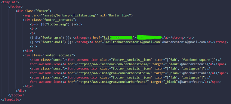
The footer itself is a single file component (for reminders, this is a Vue project). I'm doing all my styling in SCSS and I'm using the BEM naming convention (example: .footer, .footer_socials, .footer_socials_icon). The {{ $t("footer.msg") }} type lines are actually for the Vue i18n localization plugin. It fetches the needed messages from the locale files based on which language the site currently is set to be in.
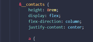
The first thing I fix is the middle part (.footer_contacts) of the footer so it would be centered vertically. All I have to do is set the display as a flex with the direction of a column and justify the content to be centered.
One of the huge plus sides of Sass is that styles can be nested. In this case I have written out styles for .footer earlier and inside of it added an &__contacts { ... } to style the .footer__contacts. (That's SASS and BEM cooperating!). Here's a little post about BEM + SASS by Andy Barnes I just found on Medium if you'd like to read some more about the two things functioning together. My first exposure to both of them was during a Vue course I took last month.
While we're here I'll also fix the .footer_socials section to have a little more space between the links. I made the height of the container be 6rem, made it display as a column directioned flex aswell and justified the content to space-evenly. (Told y'all I like to flex in an earlier post!)

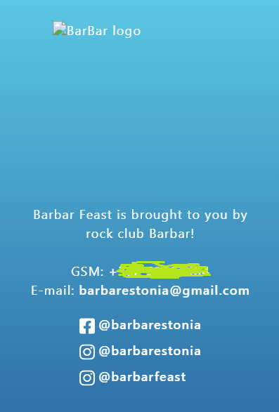
The footer already looks pretty decent on mobile too, just have to get the logo pic fixed.
When it comes to responsiveness I've already got a few things in mind that I definitely need to fix and change.
For example - for some reason the navbar currently exceeds the width of the HTML root of the document, so when you\re in mobile view and swipe the whole thing from right to left, everything goes to the left and there's an empty white vertical stripe on the right (plus the navbar continues).
I have to finish up for today, so time to push commit and go. I'll probably get some things fixed and a few new things added to the site before the next post.
o/
PS! I'm trying out @reward.app on this post's rewards. It's a service by @acidyo and @cardboard that allows authors to get up to 100% liquid rewards from their posts. By default 4% of the (liquid) posts rewards are also assigned inbetween the curators of the post.
Hello again...
I see you're having some fun with mobile layouts. I have never been a fan of designing CSS for mobile. Looking good 👍
Thanks for posting in programming!
Hahah, hello!
I think you're going to see a lot of my posts in the Programming Community. 😅
Yeah, designing for mobile is inevitable nowadays since (correct me if I'm wrong) but smartphones are used way more and are more popular than PCs and laptops.
Cool eh!