Portrait with Two different painting methods
Hello everyone, I hope you are doing very well, for today I want to show you the result of the practice that I have been doing in recent days, previously I had published a study of some parts of the body, more specifically a leg and some eyes and nose, all these parts were colored with different skin tones and with two different methods; so this time I wanted to make a complete portrait to expand more and more what I can do; Well, I have also painted the portrait with two different methods since I still haven't decided on either of them and even if I did decide, I think that the more knowledge I have, the more complete someone will make me; Then I will proceed to explain the phases in each of the painting methods that I am learning.
Hola a todos, espero les este yendo muy bien, para el dia de hoy les quiero mostrar el resultado de la practica que he estado realizando en estos ultimos dias, anteriormente habia publicado un estudio de algunas partes del cuerpo mas especificamente una pierna y unos ojos y nariz, todas estas partes las fui coloreando con diferentes tonos de piel y con dos metodos diferentes; asi que esta vez he querido realizar un retrato completo para ir expandiendo cada vez mas lo que puedo hacer; pues bien el retrato tambien lo he pintado con dos metodos diferentes ya que todavia no me decido por ninguno de los dos y aunque me decidiese creo que entre mas conocimiento tenga me hara alguien mas completo; a continuacion procedere a explicarles las fases en cada uno de los metodos de pintura que estoy aprendiendo.
Methods with Color Layers | Métodos con Capas de Color
Process 📝 Proceso
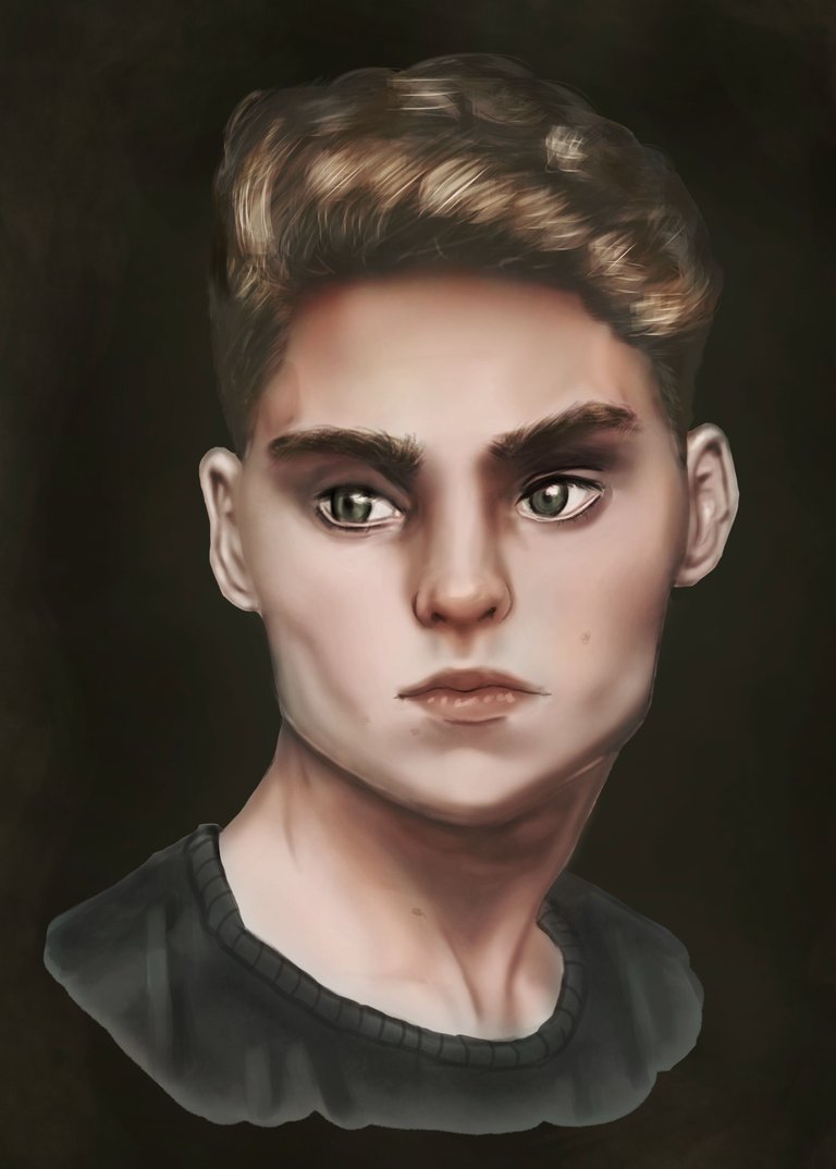
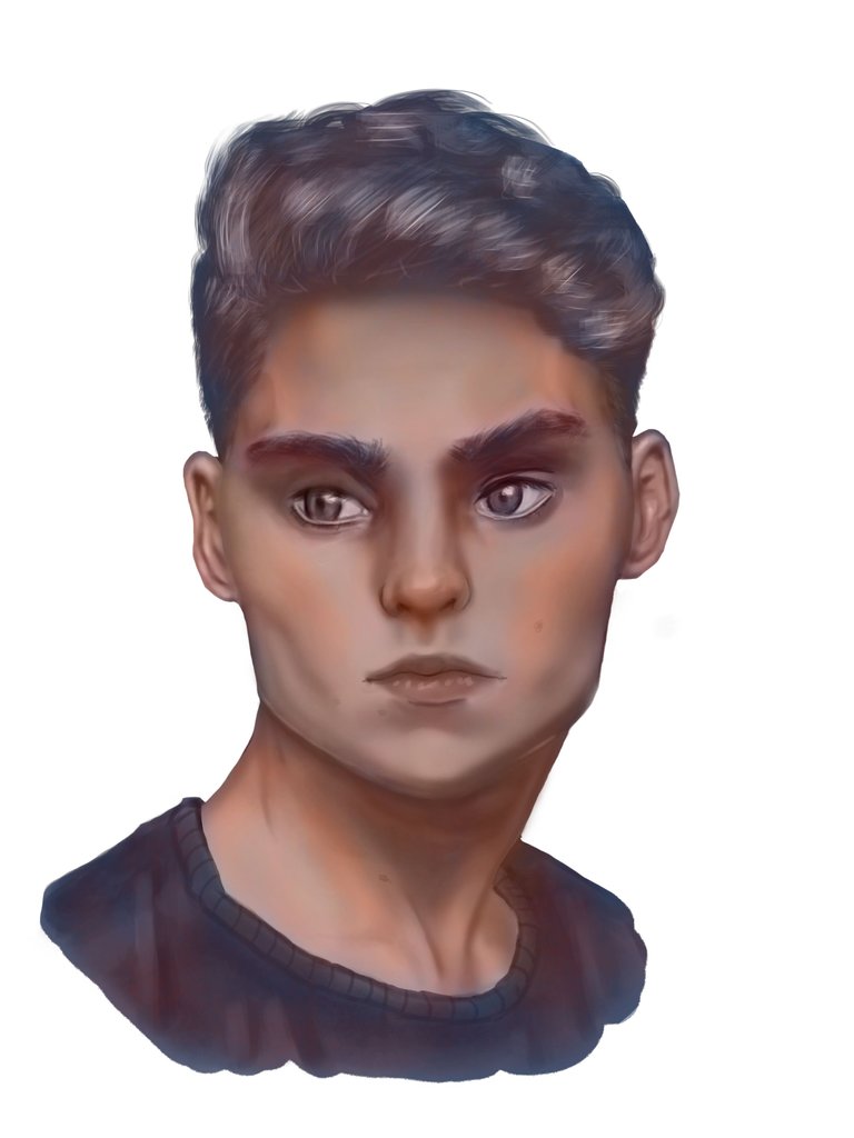
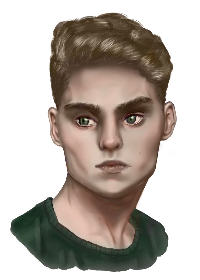
The first painting method consisted of the following; First of all, look for a reference photo that had marked shadows since that helps a beginner like me a lot to better understand the values, well, I started with a very soft sketch and then I defined it a little more by adding some shadows. which later would cover with the application of the gray scale which allows me not to worry about the colors and only pay attention to the values, then it is when the color process begins for which I make a copy to the gray scale layer , to this resulting layer I apply a color adjustment in which I change it to a kind of purple so that the portrait stops being gray and has a color base but keeping the values, in another color layer I start to make glazes with warm tones to resemble the areas with more accumulation of blood that a person has, after that I proceed to paint with the skin color that I wanted at first, all this leaving some areas that you Transparent the previous layers, after harmonizing the colors a bit and applying the color of the hair and clothes, I made a background with colors similar to the portrait and finally I applied some effects with strong light to give the portrait more illumination.
El primer metodo de pintura consistio en lo siguiente; primero que todo busque una foto de referencia que tuviese sombras marcadas ya que eso a un principiante como yo me ayuda mucho a entender de mejor forma los valores, pues bien inicie con un boceto muy suave y despues lo fui definiendo un poco mas agregando algunas sombras las cuales despues taparia con la aplicacion de la escala de grises la cual me permite no preocuparme por los colores y solo prestar atencion a los valores, luego es cuando empieza el proceso del color para el cual realizo una copia a la capa de escala de grises, a esta capa resultante le aplico un ajuste de color en el cual lo cambio a una especie de morado de manera que el retrato deja de ser gris y pasa a tener una base de color pero conservando los valores, en otra capa de color empiezo a hacer veladuras con tonos calidos para asemejar las zonas con mas acumulacion de sangre que tiene una persona, luego de ello procedo a pintar con el color de piel que queria en un principio todo esto dejando algunas zonas que transparentes las capas anteriores, luego de armonizar un poco los colores y aplicar el color de cabello y ropa, le hice un fondo con colores semejantes al retrato y por ultimo aplique algunos efectos con luz fuerte para darle mayor iluminación al retrato.
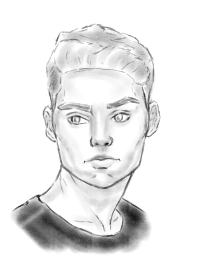
Sketch ✏️ Boceto
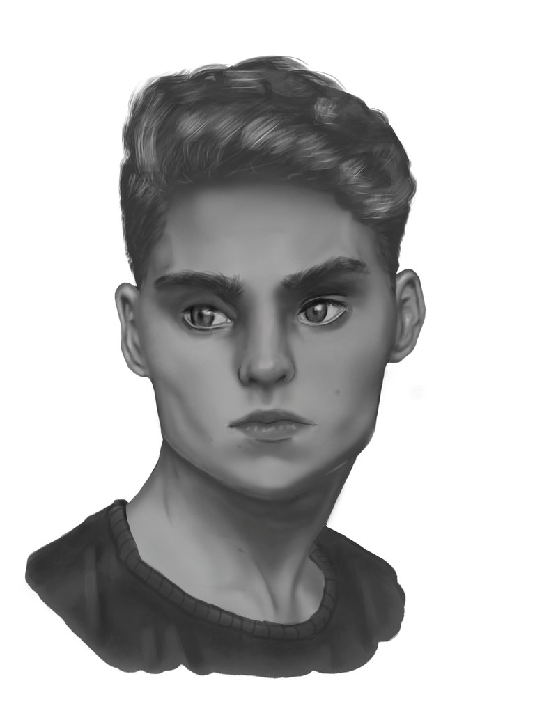
Grayscale ✏️ Escala de Grises
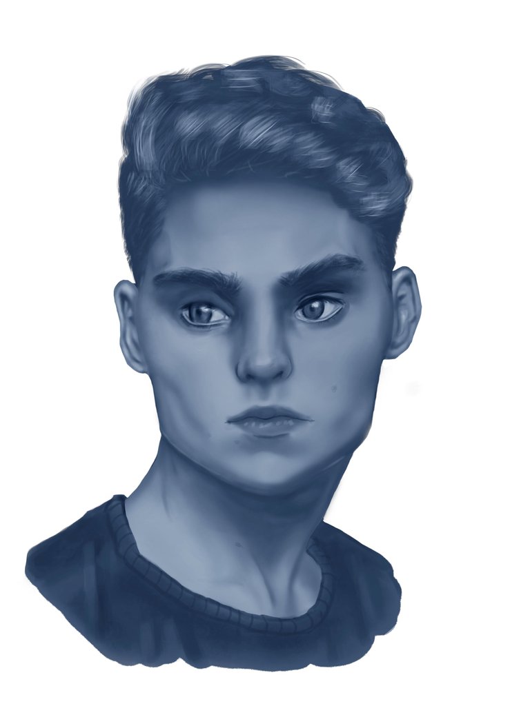
Replacement of Gray ✏️ Sustitución del Gris
Glazes with warm tones ✏️ Veladuras con tonos cálidos
Coloring of skin, hair and clothes ✏️ Coloreado de piel, cabello y ropa
Background ✏️ Fondo
Strong Light Application and Final Portrait ✏️ Aplicación de Luz fuerte y Retrato Final
Gradient Map Method | Método con Mapa de Degradado
Process 📝 Proceso
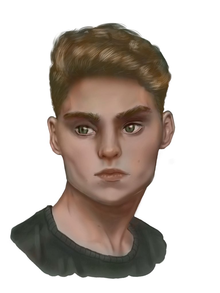
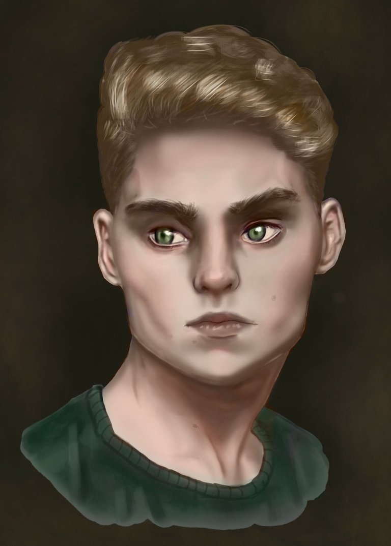
For this second method I have not placed the sketch and grayscale image since it is the same and it would only make this post heavier, so start from the beginning to apply the color, and the first step for this method is to perform on the grayscale layer an adjustment with the gradient map in which I will first select the black and white to keep the values but then for the middle of the gradient we will add a base color for the shadow and another for the lighting but always keeping the values, in this case a desaturated purple and orange also desaturated, once this is applied our portrait will stop having a gray base to have it in color but I repeat keeping the values; then we add the colors we want in different layers with blending modes according to the effects we want to achieve for our portrait, then make another background, join it with the portrait and to harmonize I gave some very soft brushstrokes to the edge of the portrait to combine it more with the background and this was the final result.
Para este segundo metodo no he colocado la imagen de boceto y escala de grises ya que es la misma y solo haria mas pesado este post, asi que empieza desde que inicio a aplicar el color, y el primer paso para este metodo es realizar sobre la capa de escala de grises un ajuste con el mapa de degradado en el cual primero seleccionare el negro y blanco para conservar los valores pero luego para el intermedio del degradado añadiremos un color base para la sombra y otro para la iluminacion pero siempre conservando los valores, en este caso un morado desaturado y naranja tambien desaturado, una vez aplicado esto nuestro retrato dejar de tener una base gris para tenerla en color pero repito conservando los valores; despues es ir añadiendo los colores que queramos en diferentes capas con modos de fusion de acuerdo a los efectos que queramos conseguir para nuestro retrato, posterior realize otro fondo lo junte con el retrato y para armonizar le di unas pinceladas muy suaves al borde del retrato para combinarlo mas con el fondo y este fue el resultado final.
Gradient Map ✏️ Mapa de Degradado
Coloring of skin, hair and clothes ✏️ Coloreado de piel, cabello y ropa
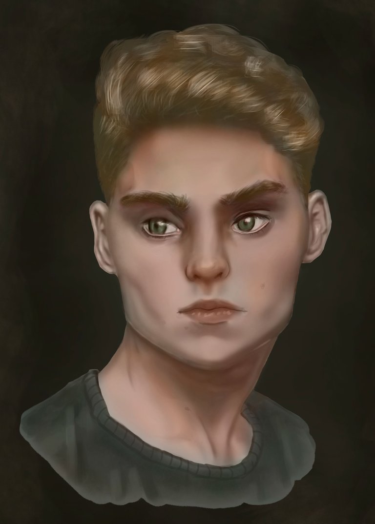
Background and Final Portrait ✏️ Fondo y Retrato Final
My conclusions for this practice after making this post is that perhaps they should not be called two different methods and rather they would be two different ways of transforming a gray scale into color, since in the end both consist of glazes, another of my conclusions is that I still haven't decided on either of the two hahaha, also that I still need to practice the structure a lot since I'm sticky and a few more mistakes; I liked both final portraits as for the first method, it is a little more laborious but I would say even more artistic since you really have to know where to combine colors and where to simply leave a rough look but the final result was more cartoonish which I suppose was due to what happened to me with the strong light, and the second method gave me the feeling that the skin, although a little off, was more natural, anyway; I won't bore you anymore with my ramblings, I hope to continue bringing you more of my practices and that you liked it and who knows maybe even helped, thank you very much for taking the time to see this post bye bye
Mis conclusiones para esta practica despues de realizar este post es que talvez no son deberia llamarlos dos metodos distintos y mas bien serian dos maneras direferentes de tranformar una escala de grises a color, ya que al final ambos consisten en veladuras, otra de mis conclusiones es que aun no me decido por ninguno de los dos jajaja, tambien que me falta practicar mucho la estructura ya que me quedo visco y unos cuantos errores mas; ambos retratos finales me gustaron en cuanto al primer metodo es un poco mas laborioso pero diria que incluso mas artistico ya que de verdad hay que saber donde combinar colores y donde simplemente dejar un aspecto rudo pero el resultado final quedo mas caricaturezco lo cual supongo fue debido a que me pase con lo de la luz fuerte, y el segundo metodo me dio la sensacion de que la piel aunque un poco apagada era mas natural, en fin; no los aburro mas con mis divagaciones, espero seguir trayendoles mas de mis practicas y que esta les haya gustado y quien sabe talvez hasta ayudado, muchas gracias por tomarte el tiempo de ver este post chauuuuuuuuuuu
Reference image 👥 Imagen de Referencia
Thank you very much for viewing this post, see you next time 😄 Muchas Gracias por visitar este post, nos vemos la próxima.
Congratulations @alarconzeu! You received a personal badge!
You can view your badges on your board and compare yourself to others in the Ranking
Check out the last post from @hivebuzz:
Support the HiveBuzz project. Vote for our proposal!
Queeee!!!! jajaja como pasa el tiempo 😁
¡Con mucho gusto! Esperamos verte por aquí mucho tiempo 😊
The rewards earned on this comment will go directly to the person sharing the post on Twitter as long as they are registered with @poshtoken. Sign up at https://hiveposh.com.
Acabo de visitar en Pinterest la imagen que te inspiró a realizar este trabajo y quedé más asombrado de lo que ya estaba, y lo mejor de todo es como vas explicando el proceso capa por capa y con el lenguaje técnico de tu mundo artístico. Felicitaciones, de verdad he disfrutado ver y leer este post...
Wow, me alegra que te haya gustado este post y muchas gracias por este comentario que me anima mucho a seguir publicando mi camino en el arte aquí en hive :)
¡Felicidades! Esta publicación obtuvo upvote y fue compartido por @la-colmena, un proyecto de Curación Manual para la comunidad hispana de Hive que cuenta con el respaldo de @curie.
Si te gusta el trabajo que hacemos, te invitamos a darle tu voto a este comentario y a votar como testigo por Curie.
Si quieres saber más sobre nuestro proyecto, acompáñanos en Discord: La Colmena.
Muchisimas gracias por el apoyo @la-colmena :)