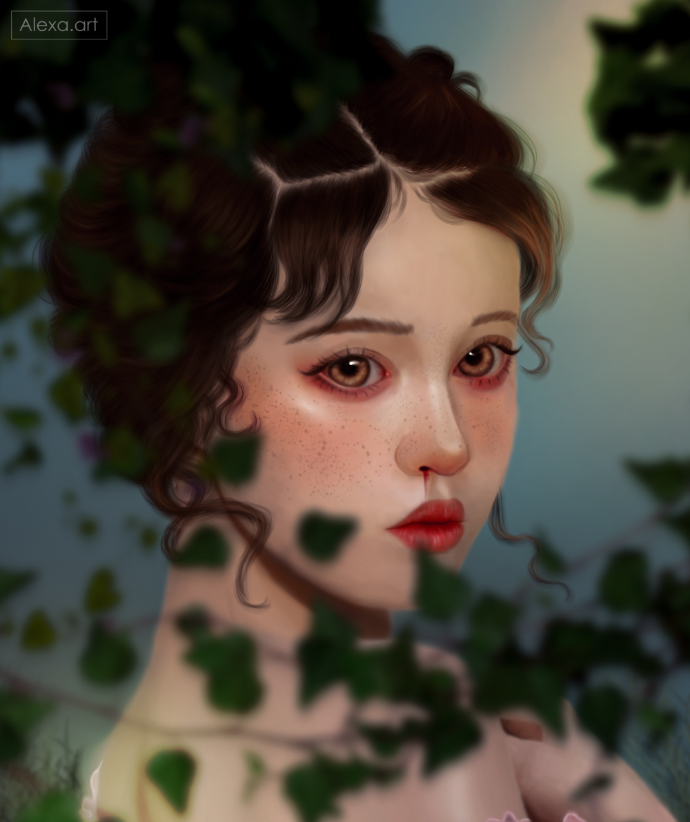
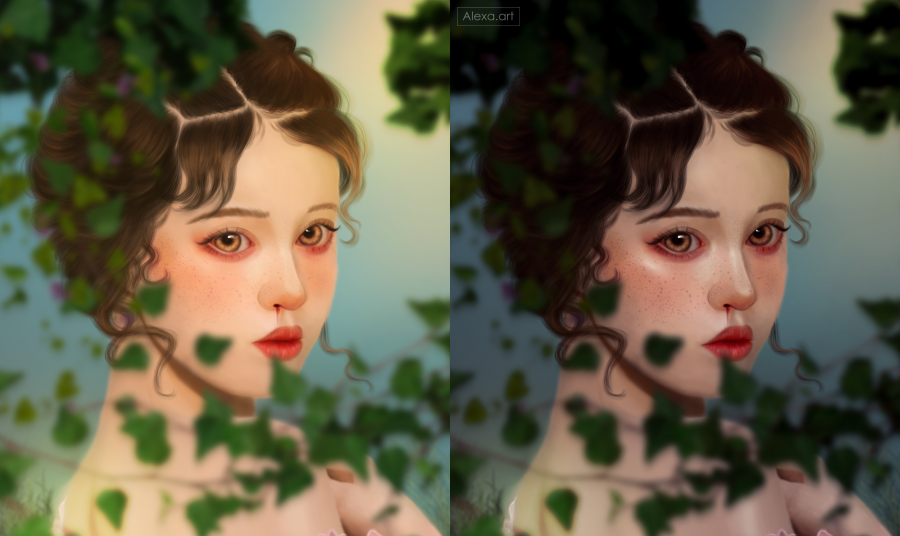
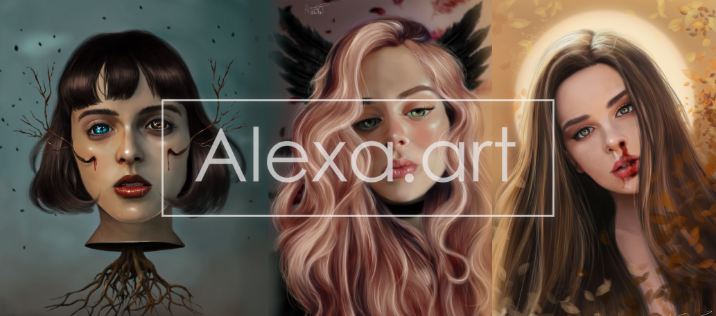
Greetings to all, today searching a little among some illustrations that I did a few months ago I came across this one that I never uploaded because I did not like it at all, at first I had an idea to make a quite colorful portrait with warm tones and I realized that it was too flashy for my taste, today I decided to make some color adjustments to improve the whole image and thus give it a better result, this time I liked it a little more although I still think there are many details that could be improved, with this adjustment I see everything with more harmony and not as bright and saturated as before.
As I mentioned I chose very saturated colors, I thought it would be a good idea to work with these tones which I have done before but not so often and it has turned out well, but this time I think the tones were too bright to work well, I even remember that i got a headache while painting with these colors, my eyes were crying out for help lol but i decided to go ahead and fill in her face completely “trust the process” i really felt that applying too many shadows to give her face more shape would ruin everything because it was as a very strong contrast, try to be as subtle as possible.
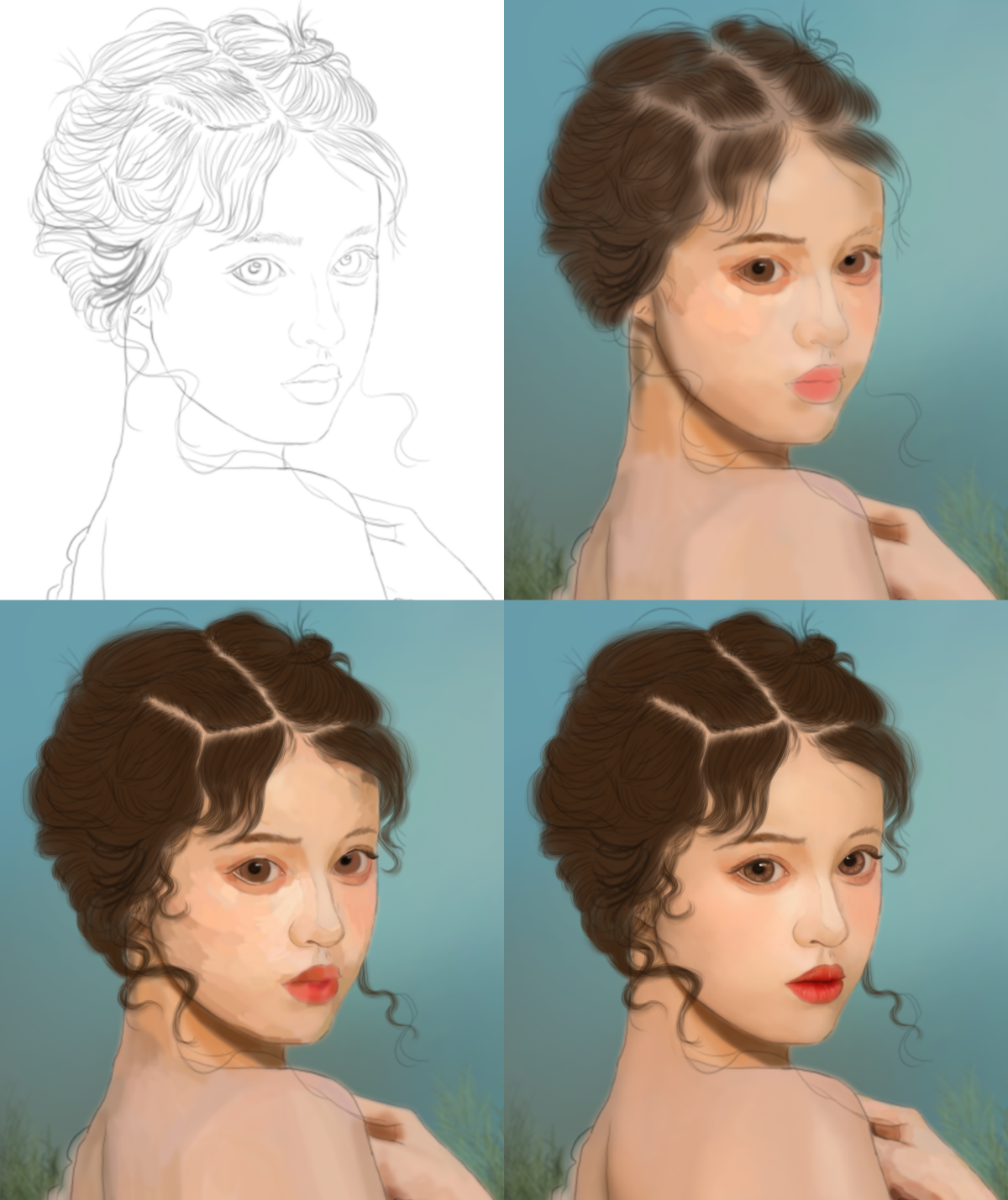
Little by little I was building each part of this drawing, I wanted it to look like someone is watching her from some bushes, so I added some leaves and applied a blur to them, her hair was quite difficult since the hairstyle was somewhat complicated.
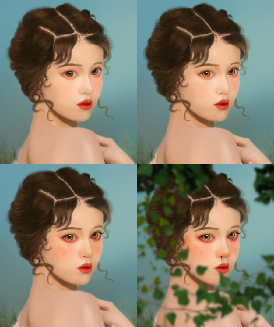
Back then, when I finished my drawing I added several color adjustments to it and I think I only managed to make it look even more saturated than it already was, today I have lowered all these tones a bit by adding a different lighting and contrast and it looks much better to my liking.
With this I learned to do things more calmly and work with my style without trying anything so exaggerated, work with colors that do not give me a migraine and I also learned that everything has a solution, even this is the second drawing that I improve of some that I have done previously.
Tools:
- Photoshop CC 2019
- XP-PEN deco 01 v2
Herramientas:
- Photoshop CC 2019
- XP- PEN DECO 01 V2
Foundation: alexa-artx
Rarible : alexaart
KnownOrigin: alexaart
Terra Virtua: AlexaArt
Opensea: alexa-art
Makersplace: alexaartx
Ghostmarket : alexa
NFT Showroom: alexa.art
Twitter: Alexa_Ys
Instagram : alexa.artx
This is beautiful. Makes me wanna make painting today!😊
Thanks dear @maxwellmarcusart go to paint! 😁
wow this is fantastic, i love the step by step procedure
Thanks 🤗
La mirada de esta mujer me cautiva un mejor, me alegra que hayas decidido cambiar las tonalidades porque se ve mucho mejor. El peinado a pesar de ser un poco complicado te quedó muy lindo, como todo en general. El efecto del arbusto te quedó brutal, me gusta mucho. Felicitacionees por tu arte, espero volver a leerte pronto. Saludos, ten un lindo día!!<3
Muchisimas gracias! es un dibujo que odiaba pero ahora me encanta, esos tonos cambiaron toda la atmosfera, saludos 🤗
gran pintura, gran edición, gran iluminación, gran trabajo sigue con el buen trabajo
Muchas gracias 😁
This is really breathtaking, I love it alexa
Thank you so much 🥰
Demasiado hermoso, me gusta esa expresión que tiene y la profundidad de esa mirada!
Gracias por apreciar este dibujo, saludos ☺
I like the gradual building ❤️❤️
Thanks alot ❤
Hermoso trabajo @alexa.art, me gusta el matiz y suavidad del color siempre en tus trabajos.
Muchas gracias!!! 😃
✨🤩😍😉😎👍✌️😁👈✨👌💖👏✨
Wow.. realmente muy hermoso y angelical ✨🧡
Es un dibujo demasiado precioso ❤️
Gracias 🥰