Design created by me in Photoshop / Diseño creado por mí en Photoshop
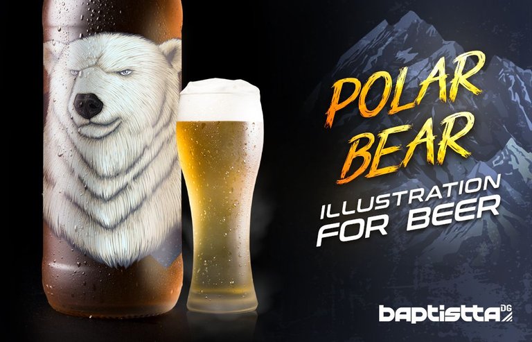
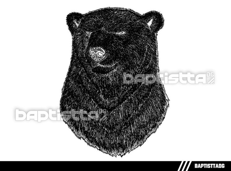
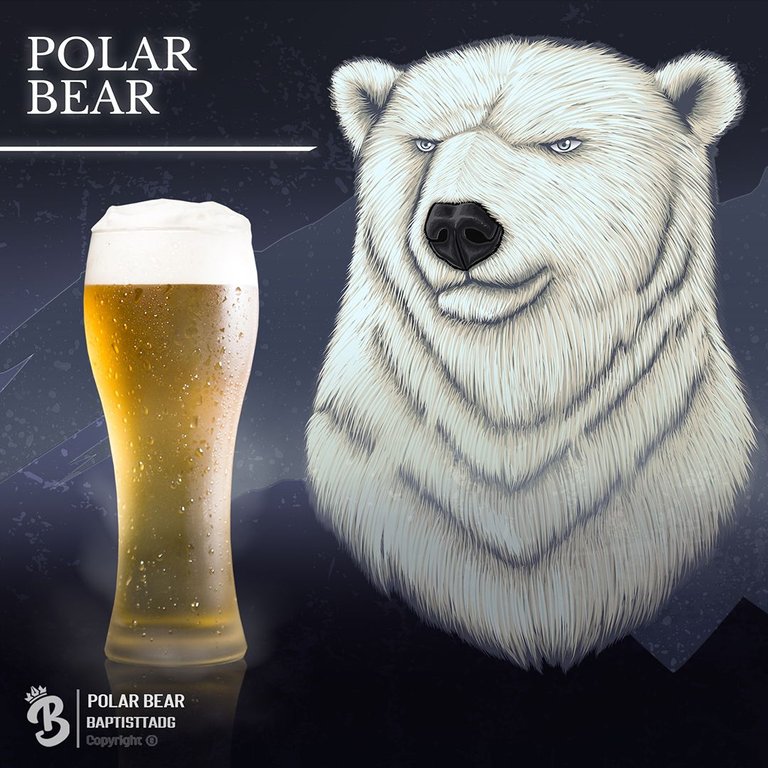
Hello people of the Hive community, today I share with you the continuation of the last illustration I made for this beer, in this case a polar bear, previously I said that this design is inspired by the client's family, since this person has children, so that's why I assume that they were three bears and in the end I choose to make a different race to represent each flavor, I'm glad to share this illustration, because it had a considerably dedicated process for the realization of this, I used the software Illustrator 2019 and for editing Photoshop CS6, thanks for seeing my post and I hope you enjoy it.
Hola gente de la comunidad Hive, hoy les comparto la continuación de la última ilustración que he realizado para esta cerveza, en este caso un oso polar, anteriormente dije que este diseño está inspirado en la familia del cliente, ya que esta persona tiene hijos, así que por eso asumo que eran tres osos y al final opto por realizar una raza diferente para representar cada sabor, me alegra compartir esta ilustración, porque tuvo un proceso considerablemente dedicado para la realización de este, utilice el software Illustrator 2019 y para la edición Photoshop CS6, gracias por ver mi post y espero que lo disfruten.
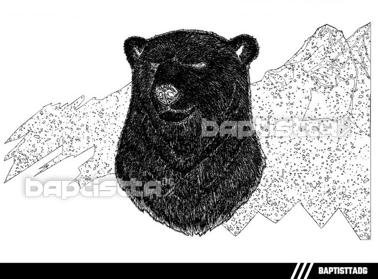
Sketch | Boceto
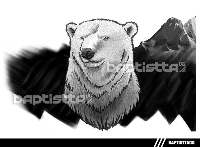
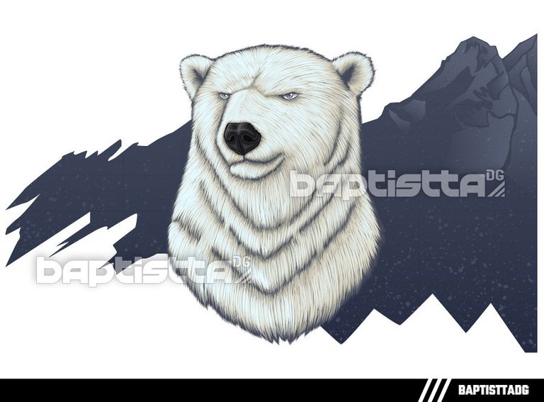
In the sketch of this design the bear was thought to have some glaciers or mountains behind him, a muted chromatic range is used to highlight the textures and nuances of the landscape. The sketch stands out for its simple and balanced composition, with a clearly identifiable focal point and an adequate distribution of space. The appearance of the landscape blends organically with the bear figure, resulting in a harmonious and coherent work. Overall, this design invites us to contemplate the beauty of the natural world and to admire the strength and determination of an animal adapted to this extreme climate of the earth. At the same time, it reminds us of the importance of protecting these landscapes and endangered species.
En el boceto de este diseño se pensó que el oso tuviese unos glaciares o montañas atrás de él, se utiliza una gama cromática apagada para resaltar las texturas y los matices del paisaje. El boceto destaca por su composición sencilla y equilibrada, con un punto focal claramente identificable y una distribución adecuada del espacio. La apariencia del paisaje se combina de manera orgánica con la figura del oso, dando como resultado una obra armoniosa y coherente. En general, este diseño nos invita a contemplar la belleza del mundo natural y a admirar la fortaleza y determinación de un animal adaptado a este extremo clima de la tierra. Al mismo tiempo, nos recuerda la importancia de proteger estos paisajes y especies en peligro de extinción.
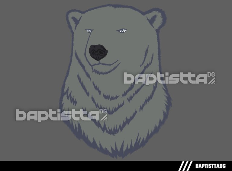
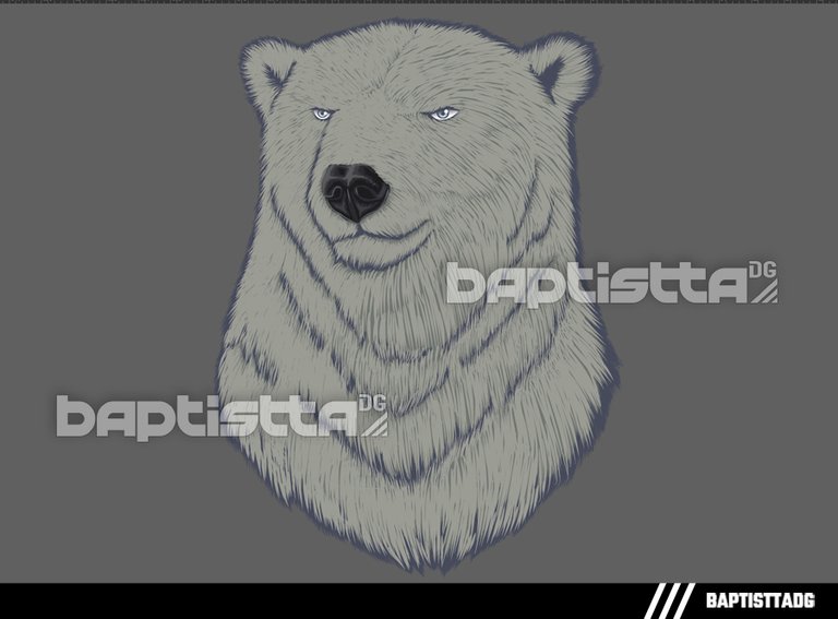
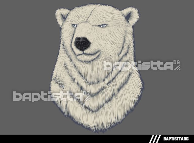
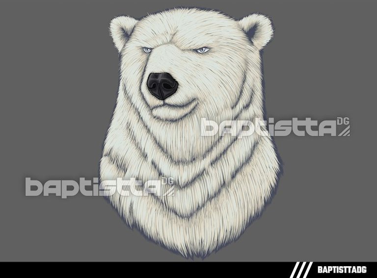
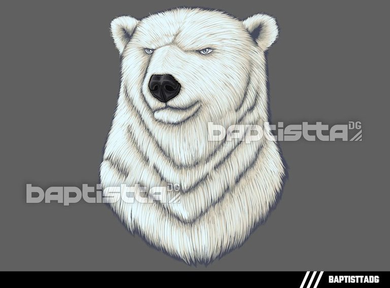
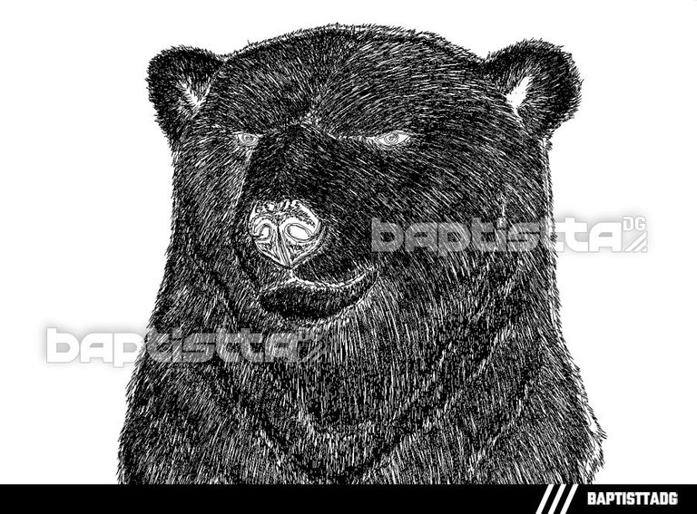
Process | Proceso
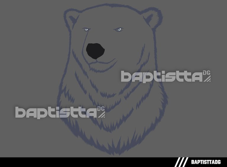
In the "lines" option, you can see that the design is composed of 1.188 lines.
En la opción "líneas", puede ver que el diseño está compuesto por 1.188 líneas.
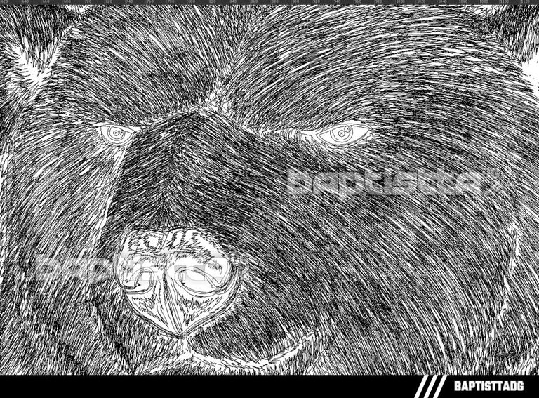
Already for the total of the illustration of the Bear together with the background in the "lines" option, it can be seen that the design is composed of 5,498 lines.
Ya para el total de la ilustración del Oso junto con el fondo en la opción de ver “líneas”, se puede apreciar que el diseño está compuesto por 5,498 líneas.
Vectorización completada
The typeface used is Wild Strokes / La tipografía utilizada es Wild Strokes
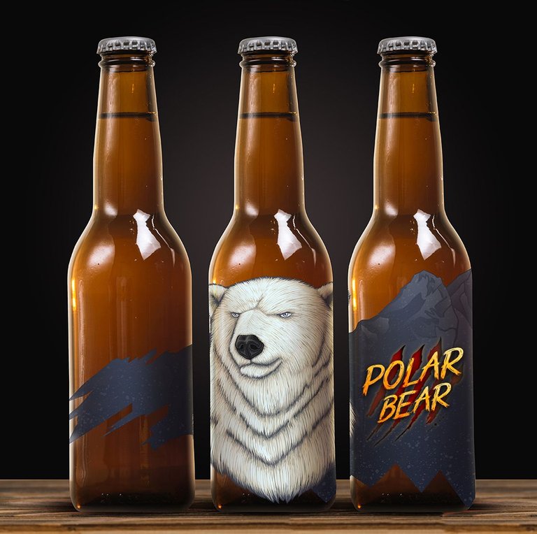
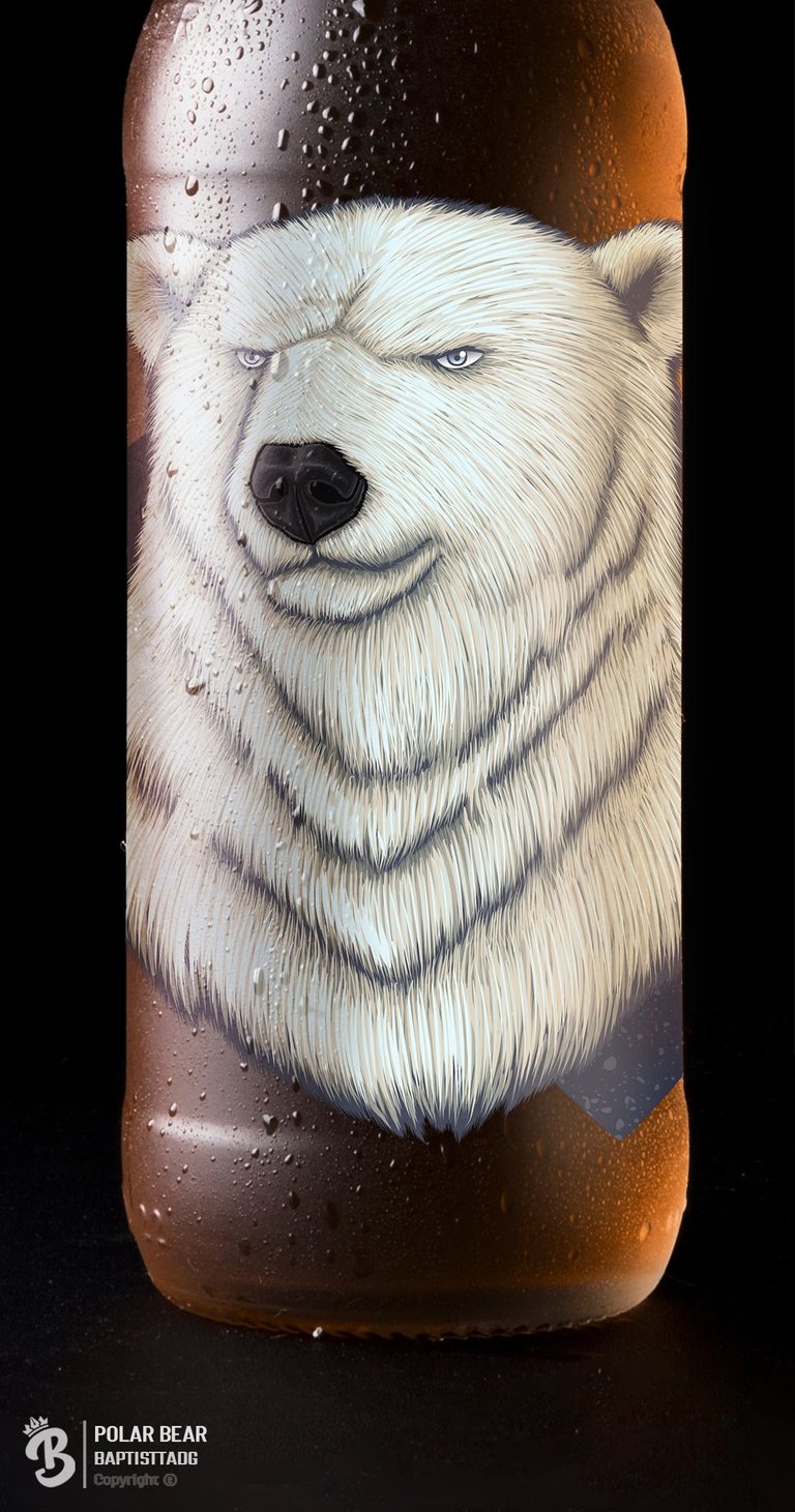
The design features an image of a polar bear in the center of the label. The figure is set against a background of different shades of blue, simulating skies, mountains and glaciers. It captures the idea of a snowy and mountainous environment, where this animal lives. A muted chromatic range is used to highlight the textures and nuances of the landscape.
This beer makes use of the digital illustration technique through vectors, which allows to obtain sharp and defined details of the bear. The shades of blue, symbolizing the natural environment of these special creatures, are created by combining different intensities and shades, creating an effect of depth and texture in the background. The final composition is very balanced, allowing a good legibility of both the elements and the typography used in the brand name.
The design seeks to stand out for the originality of its shapes and the combination of colors, which gives it a distinctive character compared to other brands marketed in the same segment. Its visual composition can be considered balanced thanks to the appropriate distribution of figurative elements and empty spaces. It is also worth mentioning that the logo of the beer "Polar Bear" The chosen typography is particularly striking, as it has thick and disorderly strokes, giving it a wild and rough look, it has been elaborated with a wild typography, which denotes its strong, intense and adventurous character.
The overall composition of the label stands out for its originality, as it uses unusual shapes for the edges. This element contributes in an important way to differentiate the label from the rest of the competitors' labels. This feature also adds artistic and aesthetic value to the image. The end result is a harmonious combination of image and content that attracts customers to the primordial instinct to buy something beautiful and unusual.
El diseño presenta una imagen de un oso polar en el centro de la etiqueta. La figura se encuentra sobre un fondo compuesto por diferentes tonalidades de azul, que simulan los cielos, montañas y glaciares. Recoge la idea de un entorno nevado y montañoso, donde vive este animal. Se utiliza una gama cromática apagada para resaltar las texturas y los matices del paisaje.
Esta cerveza hace uso de la técnica de ilustración digital a través de vectores, lo cual permite obtener detalles nítidos y definidos del oso. Las tonalidades de azules simbolizan el ambiente natural de estas criaturas tan especiales, son creadas combinando diferentes intensidades y matices creando un efecto de profundidad y textura en el fondo. La composición final resulta muy equilibrada, permitiendo una buena legibilidad tanto de los elementos como de la tipografía empleada en el nombre de la marca.
El diseño busca destacar por la originalidad de sus formas y la combinación de colores, lo que le otorga un carácter distintivo frente a otras marcas comercializadas en el mismo segmento. Su composición visual puede considerarse equilibrada gracias a la distribución adecuada de los elementos figurativos y los espacios vacíos. También vale mencionar que el logotipo de la cerveza "Polar Bear" La tipografía elegida es particularmente llamativa, ya que posee trazos gruesos y desordenados, dándole un aspecto salvaje y rudo, se ha elaborado con una tipografía salvaje, lo que denota su carácter fuerte, intenso y aventurero.
La composición en general de la etiqueta destaca por su originalidad, ya que utiliza formas poco comunes para los bordes. Este elemento contribuye de manera importante a diferenciarse del resto de etiquetas de la competencia. Esta característica añade además valor artístico y estético a la imagen. El resultado final es un conjunto armónico de imagen y contenido que atrae a los clientes al instinto primordial de comprar algo bello y poco común.
Finished Design | Diseño Finalizado
Thanks for reading my post! / ¡Gracias por leer mi post!
If you like my work, your support would mean a lot!
Si te gustan mis trabajos, tu apoyo significaría mucho!
Si quieres observar algunos de mis trabajos visita mi instagram


Such a detailed polar bear. The hair looks so good. I would not mess with that bear… might drink a bear with him though.
Thanks!, designing this fur didn't take me that long unlike the panda and the brown bear, plus I loved the cream color palette I used, and I would love to someday be able to try a little bit of each beer to see what they taste like.