Happy Friday folks ((although it's Saturday already 😜)! I was having some trouble with my SSD yesterday but here we are! 😉
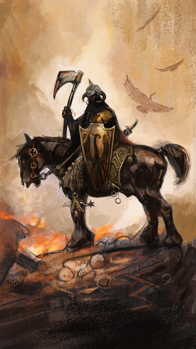
On today's episode, we're studying Frank's Death Dealer painting. It is without a doubt one of his most celebrated paintings and this character has appeared in so many other paintings from him.
It was originally painted in 1973 and had many spin-off uses like book covers, game merchandise, novels, statues, etc. Its primary use, however, was to serve as a cover for the rock band Molly Hatchet debut album in 1978.
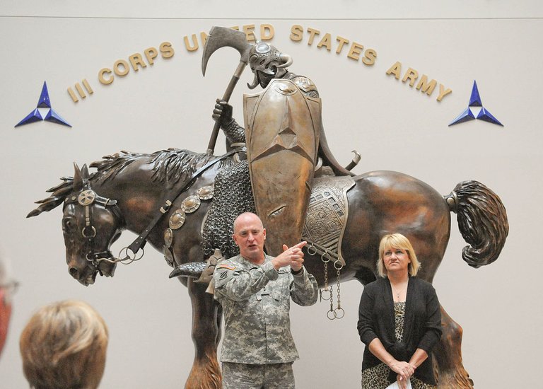
I was amazed that there is a statue of it at Fort Hood in Texas which is an Army's Premier Installation to train and deploy heavy forces.
Beyond its remarkable presence in our artist world, which we all appreciate, this piece brings in some nice composition choices which I believe are nice for us to delve into.
On composition
There are quite a few important topics on composition and visual storytelling that we can talk about here. Frank did a masterful execution of these key concepts in effective illustration:
- Effective composition
- Effective guidance of the eye
- Effective storytelling
Let's check some of the tricks that made that possible, as we have a look at the image below:
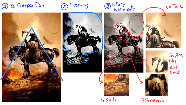
Trick 1 - 🔺 Composition
Frazetta was known for his powerful figures. The dynamics of power were conveyed through a well-thought placement of the subject matter. In most of his paintings, we see a triangular composition, where the subject matter is placed right on top of the triangle, like the pinnacle of a pyramid. This is extremely intentional. In composition, we have the concept of "guide lines" as presented by Andrew Loomis, James Gurney, and so many other masters. In a triangular composition, the lines that make the sides of the triangle start from the base and progressively approach each other until they touch. The eye is drawn to the point of connection between those lines because of the tension it creates. For that reason, that point is EXACTLY where you wanna place your most important subject.
Trick 2 - Framing
If we crank up the contrast on this piece, we can see an important (well-thought) choice of values here. "Values" is the artist term we use to describe the interplay between dark and light tones. In this painting, we can see how the subject is made of really dark tones, being framed by really bright tones as negative space. That bright tone is then framed by yet another really dark collection of tones made by the ground and the smoke rising from the flames. It is important to notice that more likely than not, the idea of the fire and the smoke as visual elements came AFTER the idea of framing the character with light and dark tones subsequentially, as value hierarchy tends to be one of the very first things to consider when crafting an illustration.
Trick 3 - Storytelling
Building from what we learned from Trick #2, it is no accident that the character (known as the Death Dealer) was painted in such a dark silhouette. He is supposed to be mysterious, dangerous, and unknown (very likely the last thing you'll see before your time comes). This was also a storytelling choice. There are many other elements here to cue pieces of the story and give us more hints of what this character is about:
- The skulls on the ground make it clear that humans were killed in this area. We don't know if they were killed by the main character or not, but the idea of death is 100% conveyed by this millennial symbol that is represented by human skulls.
- The vultures also bring the idea that putrid flesh and bones have been around for a while, as these are scavenger birds that feed almost exclusively on dead animals.
- The scythe-like axe head was a very interesting choice. I believe Frank initially thought about painting a scythe, which is the most recognized visual trope for Death or "That who brings death". It has been around even in comic books, cartoons, and whatnot. One thing for certain, Frank wouldn't want to be ordinary and could perhaps have thought that painting a scythe would be way too cheesy for him. He decided to paint an axe, which is more barbaric, and more unusual, but also curves a little. That REMINDS YOU of a scythe... so you get the reference. Hehe, Nice!
- The phoenix brings a nice twist here. Besides matching well with the fire burning in the background, it is an interesting design choice when most of your composition is full of death elements, it brings some visual relief and a philosophical consideration of a potential rebirth.
Interesting right?! So how did I paint it?
First of all, I painted it in an optimized pixel dimension for your phone... So it is fundamentally different in dimensions from the original piece by Frank. Had to make some adaptions like making the horse a tad smaller but bear with me. 😝
I started by reminding myself of the triangular composition, then started layering the outline sketch for where the subject should be placed. Soon enough I was blocking in some of the darker tones that composed the dark framing of the image (ground and smoke) while also making sure that the white negative space was serving its purpose of giving me a nice dark silhouette for the main character.
You can check the video below for the step-by-step on how I painted this, with my commentaries on top:
I hope you enjoyed this 3rd episode of Frazetta Friday!! Glad to be making this series with you!! It has truly been a blast!
Wishing you all the best,
Galiant.
Nice job analyzing all the elements about the composition! Loved it😻
Thanks! Frank was such a master of it! Some great knowledge from studying it. =)
Dark Knight
Haha it's funny that you mentioned that! Someone made a tribute to this painting featuring batman haha Check it out here 🤣