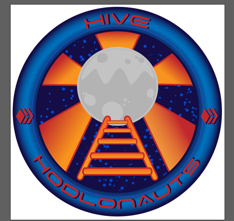
Thanks for the input! Hehe it really does look like NASA patch :D
I think that I kinda like this one. hmmm :)
Maybe an almost white background for the ring with gray transition and blue border is even better
I didn't understand this part. Do you mean outer ring to be like the one in the 1st logo but with blue border?
Yes, but only more white.
Like this? Looks interesting. I might play with it a bit and see what it looks like. Thanks!
Thanks for trying. I think the grey transition doesn't fit and it should be clean white. It should stand out more on a transparent background. It was just an idea. Don't worry too much about my opinion. 😅
Compared with the other ones I still like 6. most.
No worries, I'm not worrying xD But I also like it. I changed colors of the stars and it looks a bit better.
I want this transition to stay because it gives a bit of 3D feeling, but I made it a bit lighter :)
All I know for sure, it will be a tough choice to choose which one to use!
I really appreciate this version!!