The Graffiti Lettering Contest is run by @trippymane every other week.
This weeks word is HOME.
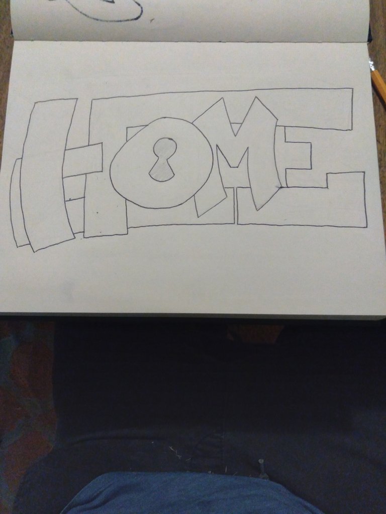
I opened up my sketchbook I got earlier this month for my birthday, and I started out lightly blocking in letters with a pencil. I have been using nothing but pens for the last couple of years so getting used to a pencil is a work in progress. It's hard for me to know when enough is enough and when to stop trying to make every line perfect. There was multiple times I had to stop myself from erasing and forced myself to just accept the line I have made. After I had a basic outline down that I liked, I took a 1.4mm rolling ball pen and outlined my letters with it.
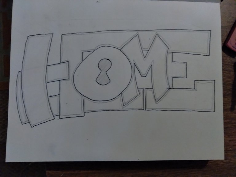
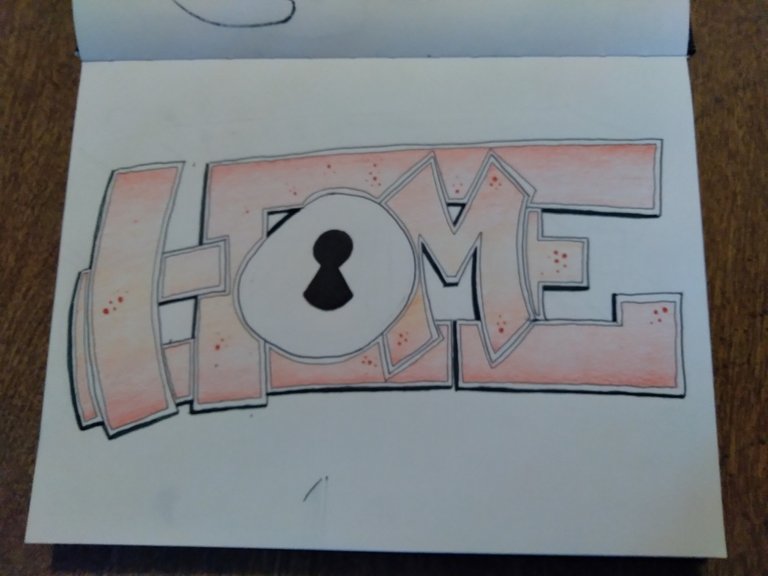
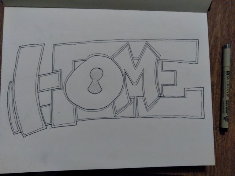
I liked the look of it but it was too flat. I wanted to make it pop and tried to add a big block 3D out behind it in an opposite direction I wasn't very comfortable with. It ended up looking like trash so instead I outlined the whole inside of each letter. I did this with a pencil at first to see how it would look and then committed to it with a pen after I liked what I saw. For the inside outline I used a 0.25 mm Pigma Micron. The varying line depths adds a nice look to it imo.
From here, I had no idea what to do with a shadow and fill yet but I knew I wanted to do some sort of fill. I really enjoyed the creativity of @moon-city and @digi-me last week and I saw the art from @ran.koree and @digi-me entrys this week. That inspired me to jump out of my comfort zone and I tried to do a gradient fill. The problem here is that I am colorblind (deutan) so I have troubles with red and green colors. I saw this pack of watercolored pencils when looking for a pen and I liked a few of the colors I saw placed together. I don't do fills that often because I have more of a scribble style but its something I would like to work on to better myself as an artist. I did a couple of tests trying to blend the colors together before going in on the letters themselves. I'm still not sure if I like it, but it looks better than it did when it was plain!
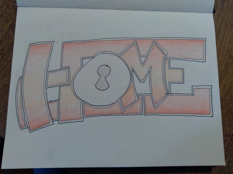
The last thing I did was add finishing doo-dads to it. This is where I really messed the piece up. I just went a little too crazy with it. Sometimes, less is more. The dots aren't very stylish and they look random. Sort of like my letters have freckles. I did enjoy the 3D I went with though. I just added a dark accent line against the bars that would have the shadow. Simple and effective. Just enough to make it pop. I planned on doing something cool with the "O" and that's why I left it plain. Since it had a key hole in it, I wanted to tie it into the Home theme but I fell short of both time and creativity.
I will update this post with the voting post, please vote for me! I got ZERO votes last week on what I personally thought was the rawest throw up! I get it though, it's all about perspective.
Big thank you to @trippymane for giving me a reason to draw more.
Ottimo lavoro…
Grazie
Brilliant work! I really like it and I'm glad I'm a reason to make you draw more! Really happy you say that.
I'm sorry last week you did not receive any vote and I want to tell you that if I had voted I would've voted for your work! (I chose to not participate or vote in the contest) I believe we ain't got that many graffiti artists in the contest as of yet and I'm so glad for our latest member @ran.koree ,I have seen some of your work and it's brilliant mate! Happy to have you in our contest! (Grande frate, rispetto! Sono veramente contento che il mio contest stia andando bene e attirando artisti che fanno graffiti anche sui muri come si deve ahaha da più giovane io ho fatto delle robe, devo ritrovare le foto e postare qui su Hive! Big up bro 😎) , I'm also sure he would have voted for your work had he been already in the contest! I personally appreciated your "street" add to the contest and I'm sure you'll get more votes this time!
I will see how the contest develops and if you all guys are happy with it I may start activity participating ang voting! I honestly wasn't expecting to get that much traction with this contest and I'm happy so far with the engagement and to see such level of creativity!
One last thing! Big up also for doing the gradient and challenging yourself with something that for sure wasn't as easy as for non color blind people! Respect and the best of luck for this week! 😎🤙💯
Thanks friend.
I'm having a lot of fun with it.
Happy to see some worthy challengers approaching! And good luck to all who've entered.
I really like your piece as well. That enlongated M is bangin. I also like the H and the E's flow together. Maybe that's where I subliminally bit that from haha
Also I haven't been voting either but that's because it's a lose lose situation haha either I vote for myself like a dink or I vote the competition ahead of me! Hahah so I just don't participate in that area.
Thank you! Happy you liked my job! 😎
No trouble about the voting :) good luck!
You work is really beautiful!
Congratulations @yems! You have completed the following achievement on the Hive blockchain and have been rewarded with new badge(s) :
Your next target is to reach 2000 upvotes.
You can view your badges on your board and compare yourself to others in the Ranking
If you no longer want to receive notifications, reply to this comment with the word
STOPCheck out the last post from @hivebuzz:
Great work. I love the breakdown images you provided. I look forward to seeing more.
This looks awesome man. I was never any good at graffiti type stuff. My brother liked to do it but that’s about it.
I think this one looks awesome and the colors look good even if you can’t see them appropriately from the color blind Avenue. The lock in the O was a badass touch!