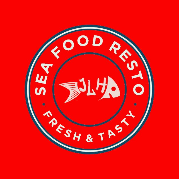
Did a trial design for an ongoing seafood restaurant in Mangalore.. Janatha Lunch Home was established in 2019.. Due to the pandemic they did suffer a bit.. And now are doing a bit of revamp for attracting new customers..
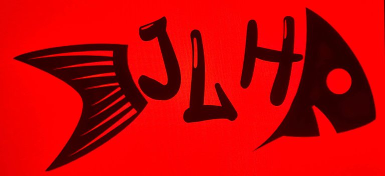
This is the final output:
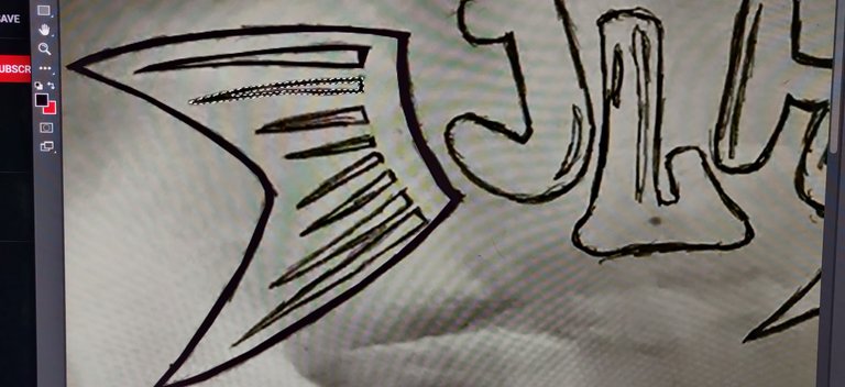
I had drawn what I wanted to do first..
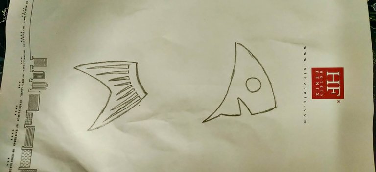
Had then shifted it to the system and used photoshop..

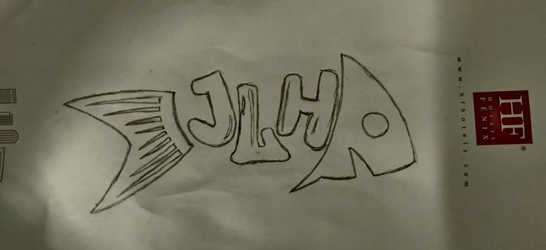
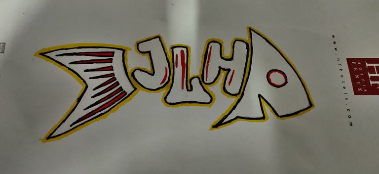
Since I was bored a bit, this is what I ended up doing with the hand drawing 🤣
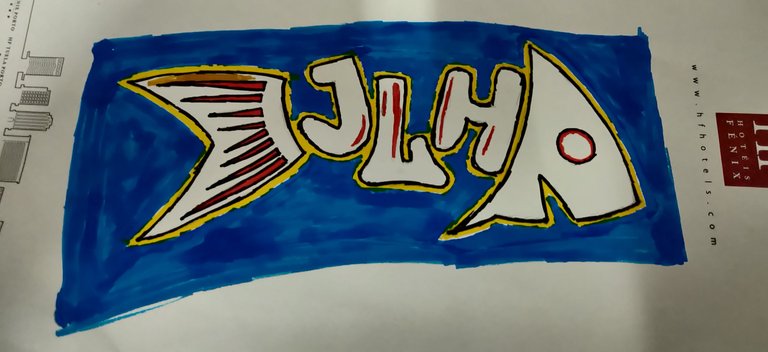
Did this only because the client rejected the logo saying it wasn't very colourful and so didn't want the hard work to go waste..
Any logo designers here with any suggestion on what could be done better??
Using thick letters might make the fish look more meaty and less bony. A seafood restaurant might want people to think about the food instead of the left overs.
Regardless, here is a wine to pair with your fish.
!WINE
Congratulations, @vagabondspirit You Successfully Shared 0.100 WINE With @varunpinto.
You Earned 0.100 WINE As Curation Reward.
You Utilized 1/1 Successful Calls.
Total Purchase : 24377.625 WINE & Last Price : 0.290 HIVE
HURRY UP & GET YOUR SPOT IN WINE INITIAL TOKEN OFFERING -ITO-
WINE Current Market Price : 0.290 HIVE
Oooo.. Good point.. Thank you.. Will try something around that..
I am not sure if a meaty version of the logo would sell more fish.
I am certain, however, that if you present the client with both a bony and meaty version of the logo; the choice will spark a conversation that might increase your rewards for the project.
Ah!! Will surely do so..