Old photos have tremendous nostalgic power, which even are able to affect the viewer's feelings.
For example, a romantic love scene from days long gone, a lost place photo, but also a retro collage can be enormously upgraded by using this effect.
In this tutorial I would like to reveal how you can easily achieve a vintage effect in GIMP for your collages and photos.
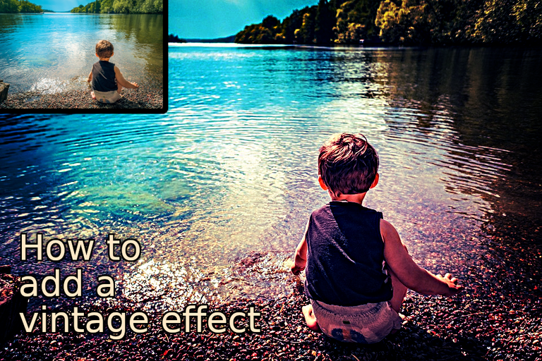
LMAC School - How to add a vintage effect
1. Requirements
You may need to have a copy of the GIMP software to understand this tutorial. GIMP is a free, open source tool for image processing of all kinds. Lots of people say GIMP is the open source Photoshop. I agree with this statement at least for the functionality I personally need.
You can download GIMP here: Click
I created this tutorial for GIMP version 2.10.32 (and newer).
We work with layers in this tutorial. If you do not yet know how to work with layers, just take a look into the LMAC School - How to work with layers post.
Since this tutorial is for advanced GIMP users and is focused on a specific topic, I can't explain every GIMP tool in detail.
1.1 GMIC Plugin
A little later in the text, I am going to talk about a great filter offered by the GMIC plugin. So you can try it yourself, here is the link to the plugin website.
2. Basics
2.1. What makes a vintage look
The term "Vintage Look" in photography is used to describe an appearance intentionally created to make a photograph look like it was taken using an old camera or a specific output medium (For example, photos of so called "instant cameras".).
However, it is also mostly used as a general term for artificially aged photos. This includes making adjustments to the color palette, and traces of use and damage are also often intentionally added with the help of various image manipulation techniques. You can combine all these things or some of them together to create beautiful results.
Basis effects:
- Fissures
- Stains
- Bleaching of the colors
- Aging of the colors
- Film scratches
- Adding a vignette
- Adding noise
- Palette manipulation
2.2. Fake a specific camera
If you're interested in making your photo look like it was taken with a specific old camera, you'll find a fantastic tool in the GMIC plugin.
It's the "Simulate Film" tool in the "Colors" section.
With the help of the presets included in it, you can adjust the color grading of your photo as if it was taken with one of the many camera models listed there. It even includes presets for some popluar instant cameras models.
A wonderful tool for adding a sigificant touch to a vintage effect.
3. Example, step by step
3.1. 1970s Vintage look
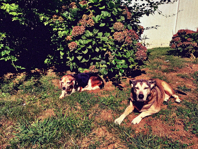
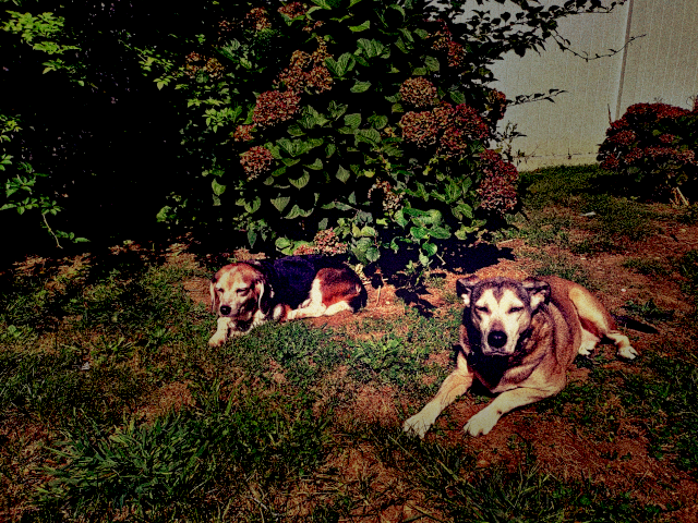
In this example, I'm creating an effect on a photo so it looks like we just found it in an old chest in the attic where it had been left for the previous 50 years.
To easily follow the example using your own copy of GIMP, you can download the image used here.
Download: LMAC Image Gallery link
(It was @agmoore who took this beautiful photo of these lovely dogs. Many thanks for it, agmoore.)
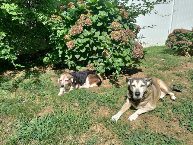
(Of course, all the values we use with GIMP tools in this tutorial will not apply equally to all photos out there. Each photo requires its own fine-tunings.)
3.1.1. Step by step
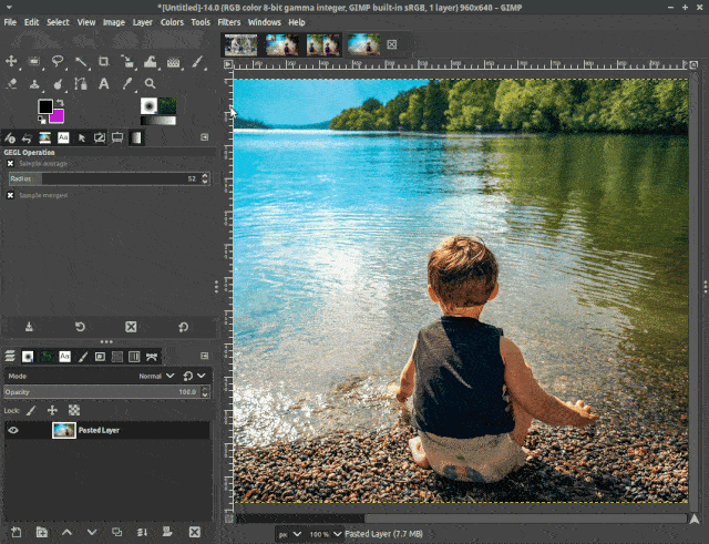
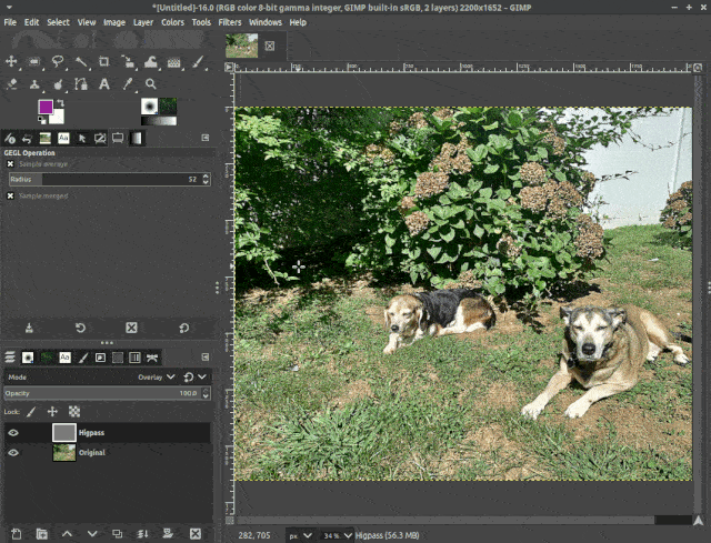
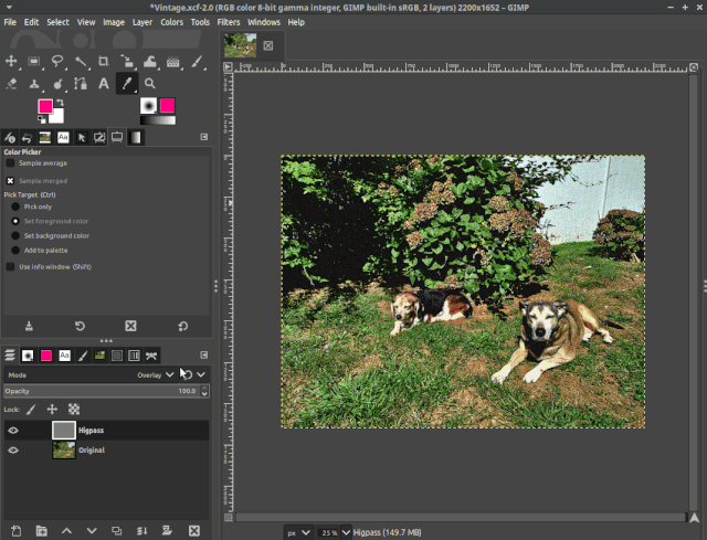
3.1.1.1. High pass
By using the high-pass filter, the essential details are extracted, and larger color variations are removed. We can combine the result of this tool with the original image to make the details more visible and to sharpen the image.
A high degree of sharpness, is what I would expect when thinking of a photo taken by a camera from the 70s. At least the photo album of my own childhood is full of sharp photos.
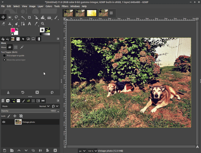
- Duplicate the original image layer. Name the duplicate "High Pass" and the original image layer "Original".
- Click the "High Pass" layer in the Layer Browser in order to select it.
- Open the "High Pass Tool" by clicking the "Filters" menu, clicking "Enhance", then clicking "High Pass".
- In the dialog box that has just opened, set the contrast to about 1.65 and confirm these settings by hitting the "OK" button.
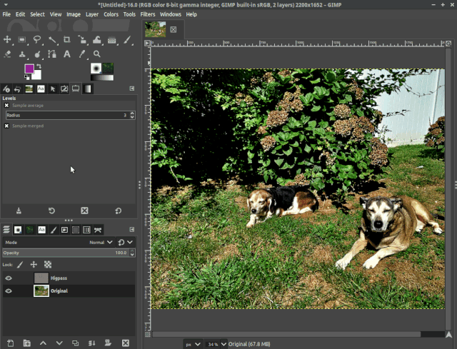
- Now we want to combine the result with the original image. This can easily be done by changing the layer mode of the "High Pass" layer to "Overlay".
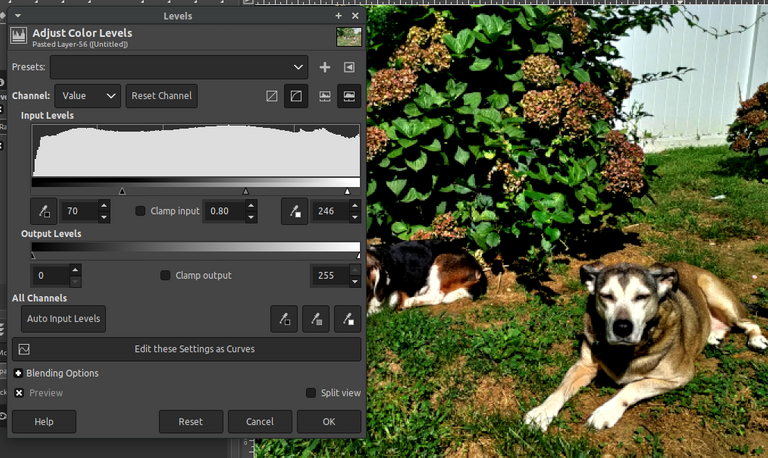
3.1.1.2. Levels
The "Levels Tool" allows you to change the intensity range of an image in every color channel. It is mostly used to adjust the lighting, shadows, contrast and hue.
Learn more about this tool in the LMAC School tutorial: "How to align light tones between picture elements".
Let's use this tool to make the shadows look like in a photo from the 70s. Often the shadows in photos from this time are very dark.
(Of course, all the values we use with the GIMP tools will not apply equally to all photos. Each photo requires its own fine-tunings.)
- Select the "Original" image layer and open the Levels Tool by clicking the "Colors" menu, and then clicking the "Levels" menu item.
- In the dialog box that has just opened, adjust the shadow slider of the input levels to about 70.
- Adjust the mid-tone slider of the input levels to about 0.8.
- Adjust the light tones slider of the input levels to about 246.
- Hit the "OK" button to confirm the settings you have made.
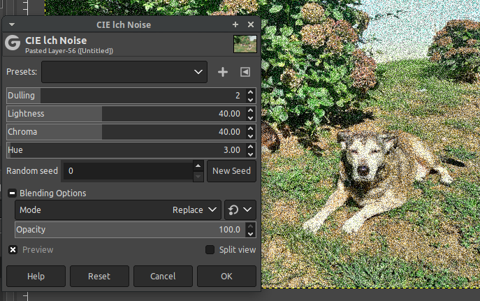
3.1.1.3. Noise
Often old photos have at least a little degree of noise. We can easily create the noise with the "CIE lch noise tool".
- Select the "Original" image layer and open the "CIE lch Noise Tool" by clicking the "Filters" menu, then clicking the "Noise" submenu and then clicking the "CIE lch Noise" menu item.
- Adjust the dulling factor to a value of 3.
- Hit the "OK" button to confirm the settings you have made.
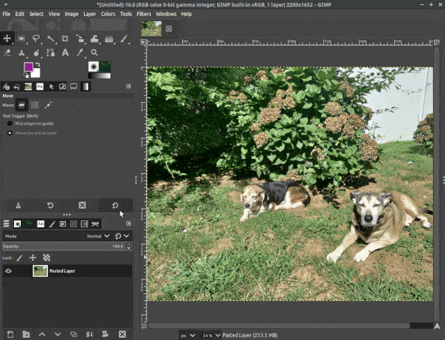
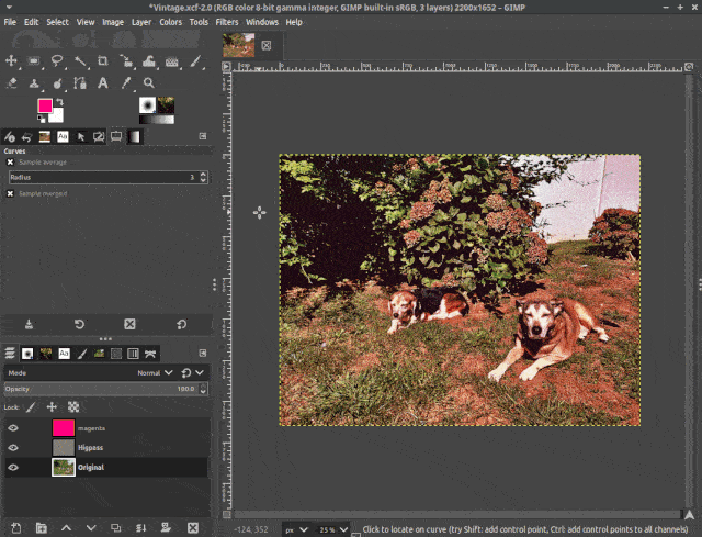
3.1.1.4. Magenta layer
Whenever we restore old photos, we also try to correct the aged colors and colors changed because of sun burn. In the case of this example, we need to do the opposite - we need that typical pinkish gradient that old photos often have.
To do this, we simply add another layer on top of the other layers and give it a specific color that, blended over the colors of the original image, is going to do the job.
- Change the foreground color in the Color Tool to * ff007f
 .
. - Add a new layer on top of all the other layers. In the "Create a new Layer dialog", set the foreground color you selected in step 1 as the background for this new layer, name it "Magenta" and then hit "Ok".
- Change the layer mode to Overlay and move the opacity slider to about 45.
* In fact, I found this specific color simply by trial and error.
3.1.1.5. Final touch
As a final touch, the photo needs a last color adjustment.
In the next few steps, we are going to enhance the highlights of the red and green color channels and downgrade the lower levels of these colors.
With the blue color channel we will do exactly the opposite.
This adjustment adds more typical color degradation to the photo.
- Select the "Original" image layer and open the "Curves Tool" by clicking the "Colors" menu, then clicking the "Curves" menu item.
- In the dialog box that has just opened, switch to the red color channel.
- On the diagram click onto the line at position x:64 and y:64 in order to create a move point at this position. Do the same at position x:190 and y:190. You can see the coordinates at the top left of the diagram box when you move the mouse pointer over it.
- Now move the lower point (x:64 and y:64) roughly to x:84 and y:64. Then move the upper point from x:190 and y:190 roughly to x:170 y:190;
Switch to the green channel and do the same with the green line. - Switch to the blue channel and to the opposite with the blue line. (x:64&y:64 to x:44&y:64, x:190&y:190 to x:210&y:190)
- Hit the "OK" button to confirm all settings.
Learn more about the Curve Tool in the LMAC School tutorial: "How to align light tones between picture elements".
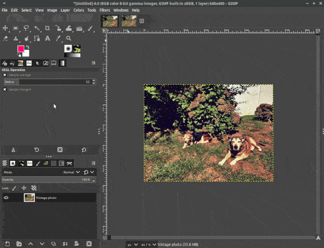
3.1.1.6. Actually finished
It's actually already finished.
We changed the colors to achieve the typical look of old photos, added noise, sharpened the edges, but it still doesn't look like we just found it in a box in our attic.
That's because the photo is still a little too perfect. Traces of use and decay are important to make it look really old.
In the next section I have a few ideas and recipes for you that can solve this problem well.
You can make the image look even older quite easily by simply turning down the saturation of the "Original" layer a little bit and increasing the opacity of the "Magenta" layer a little more.
4. Tips&Tricks
In the "Basics" section I mention some effects that can take the vintage effect to a higher level. Crackles, stains, vignette, ... A little further down, you'll find how to make all that happen.
4.1 Add a vignette
Vignetting, also known as light fall-off, is very common in photography. It simply means that, compared to the center or focus of the image, the corners are darkened.
I personally like to use this effect to give better expression to the focus of an image. But I also like to use it in vintage photos, because at least the old black and white photos often had vignetting and this effect is traditionally very popular in stylized photography.
Result:
4.2 Add a faded stain
Photos do not age evenly. It most likely depends on the amount of use and how much a photo is exposed to the elements, at which points the decay happens faster or slower.
Faded bright spots, as a result of aging, on the edges of old photos are not uncommon. You can easily imitate this by hand-painting a smooth white spot on a layer with "Linear Light" mode on the edges you desire.
4.3 Add fissures
Small fissures on the surface of old photos are also not uncommon. In fact, it's even quite common. After all, it's just paper.
Of course, you could also paint the fissures by hand, wouldn't be that difficult. But it is much, much easier to use a suitable texture and overlay it on the image.
For the example in the GIF, I took an image from Pixabay. You can download it here: Download
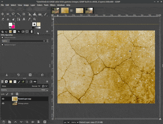
You can use the same technique to add dust lints, film scratches and the like. It's all just a matter of which textures are available to you.
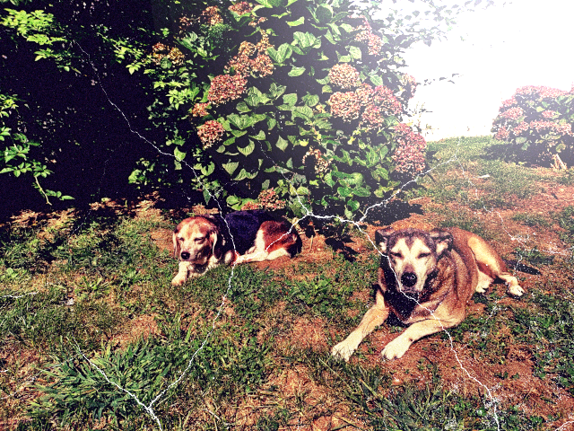
5. Here we go!
This is the result of all the color changes we have made above in the Examples section, plus fissures and a bright faded stain.
Of course, it's not that beautiful. However, that's because it just identifies itself as an old damaged photo. :-D
The cover image of this post was created in the same way (Original: Pixabay) as the image below.
For any questions left unanswered on that topic, I'll be happy to try my best in the comments section.
I will update this post whenever you or I find any mistakes in it. Of course, I appreciate any mistake you find.
Best regards
QuantumG
╭━━⋞ ☙ My NFT artworks ≻≺ ♖ My dCity ⋟━━╮
╰━━━━⋞ ♫ My Rising Star(s) ⋟━━━━╯
What a wonderful tutorial! I will definitely use this in the future. What lovely models. I love it. A great pleasure for me 🌷🐕🌷
Hello @agmoore.
Thanks for stopping by and for the generous tip. :-)
Indeed, I was also fascinated by these lovely models.
The dogs look like an old married couple and the big one still takes care of the smaller one after all the years. From first glance, it seemed somehow romantic to me. :-D
🌷🌞🌸
Both at least 13, females, very close. You see them with your heart. 🐕
Your tutorials are really great. They provide a good introduction to digital imaging. Thanks a lot!
Glad to read that. Thank you. :-)