So, the journey began when one of our previous client wanted to create a small jewellery shop in a very challenging space. Saying no was not an option.
You might be wondering how is it a challenge?, wait till I upload the plan.
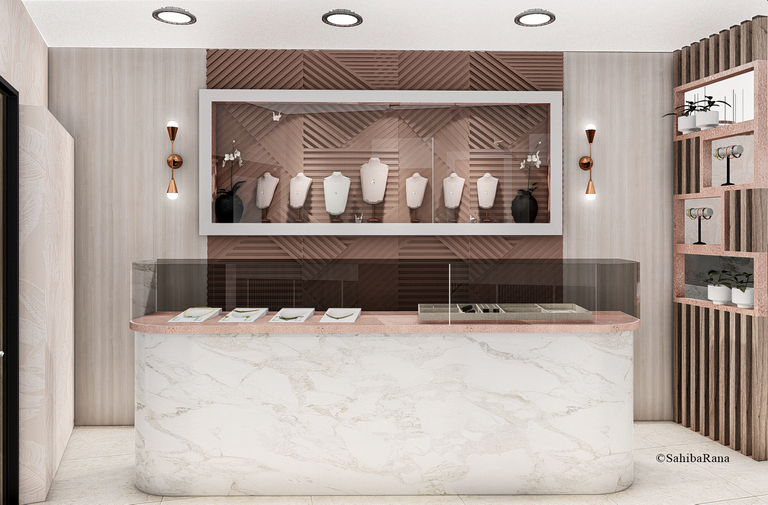
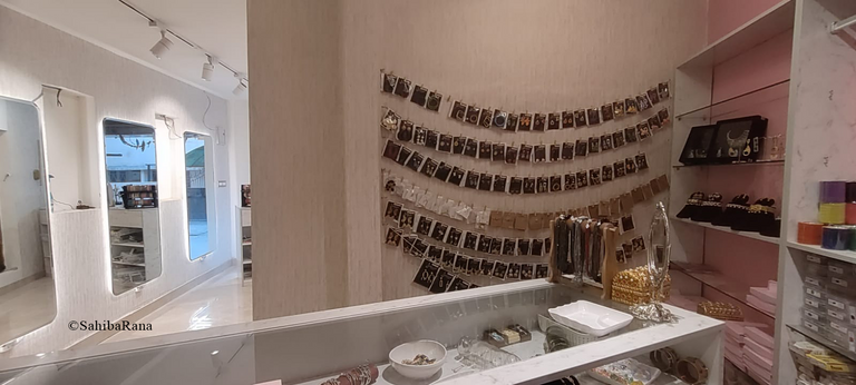
A glimpse of final results
Let The Journey Began!
As you all know by now we are a very young Architectural firm which is founded by @praditya and I.
Both us went to the site visit and took dimensions.
The site is in such a weird shape of trapezium that it took us time to think about how to transform the space.
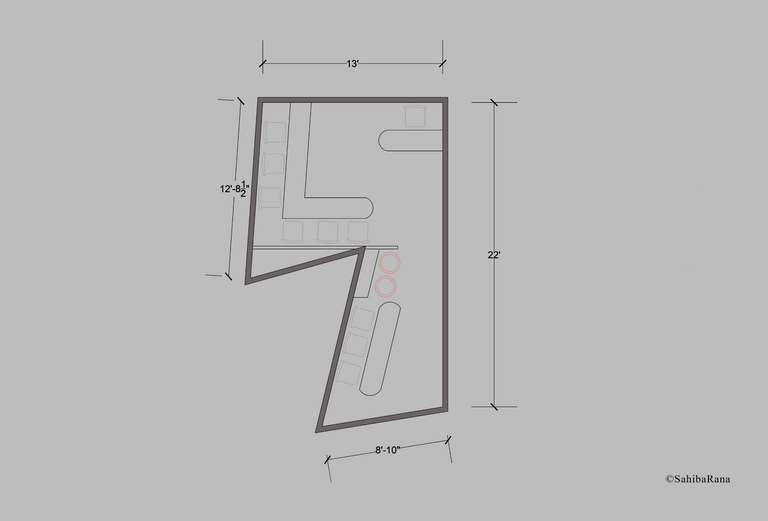
This is what we had. A site super compact from different angles , It was very challenging to create something luxurious, practical and under budget.
The main colour was pink in the theme requested by the clients.
I was assigned the designing part and my partner took care of execution on site.
So, I took couple of days and made a plan first which was divided into two sections and then made interior designs for the same.
The front part was just single counter.
So, I took pink colour and added beige and cream colour in contrast and applied the dominating pink colour in highlights of the design like the main designer board, the counter tops and inside the display boxes.
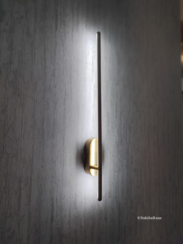
Another elements was to add some kind of wall sconces which would look sleek and modern. In addition to wall sconces we added recessed ceiling lights and the new trendy track lights which gives a spotlight effect.
Lighting is unquestionably the best element one can add to a space and specially when it comes to jewellery showrooms which generally needs ample of lights.
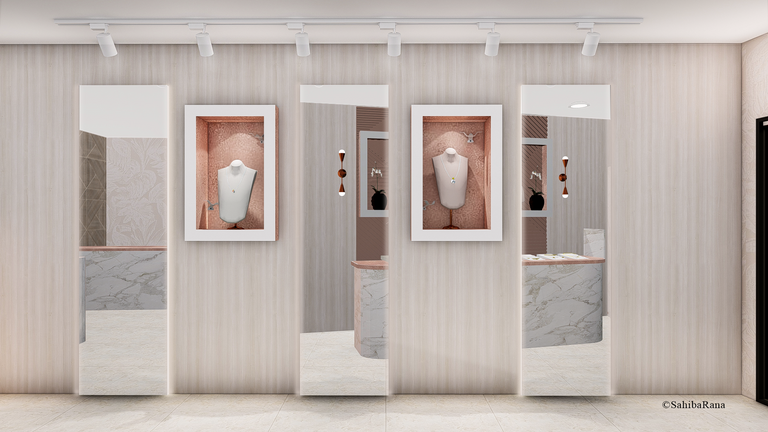
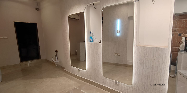
The most significant element is the three mirrors. Mirrors have tendency to make the space look larger as they reflects and refracts. The addition of strip lights behind the mirror highlights them and makes the space look more bougie in budget.
Let's dive into the execution process of the same space.
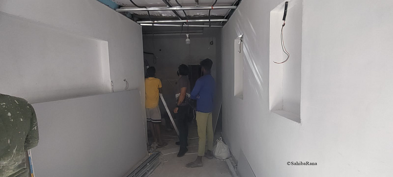
Above mentioned pictures are of same space but after few days of work on it.
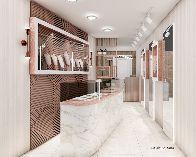
The next comes is the back side area of the showroom, which is comparatively larger than the first half. Also this space will host a small reception counter and a large counter.
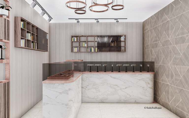
This side has been kept simple and with minimal efforts on wall but there will be pendant lights on ceiling and track lights as well.
This is the way to optimise space, that is adding a white counter table which reflects more of light and makes the space look more spacious and neat.
We didn't went mad on applying pink colour to each and every place, but kept it's dominance in a very subtle way possible.
Here are the execution pictures-
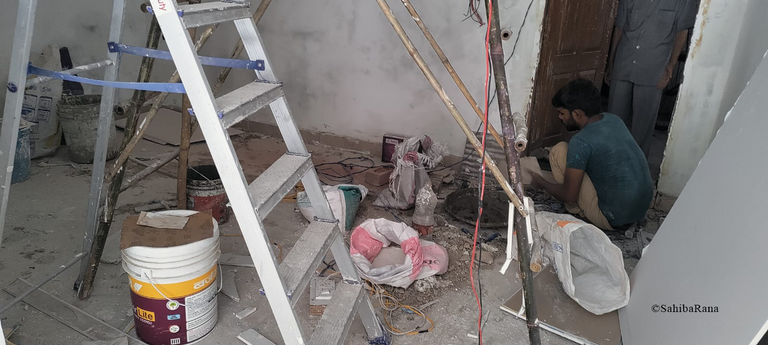
Right now it's under completion phase, but not completed yet.
On site Changes
There tend to be onsite changes, which are very common in practice. Let me highlight a few of them
We had to change the wall sconce near the main pink wall panel, we bought a more sleek design
Also we played with the edges of the mirror and added curve to them at an slight angle.
Instead of one large central chandelier , we added two smaller ones at the edges of the ceiling.
The last but not the least one was a slight change in the texture of wallpaper.
All these changes depends upon material's market availability.
Exterior time
For exterior we were looking for some white and gold aesthetics but the client had already purchased a black board with name of the showroom so we had to work with it.
The board colour is black and gold. so we jumped onto following the same scheme.
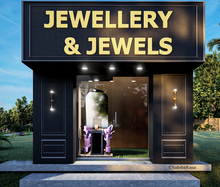
We rendered the exterior separately.
So, I added a mini showcase in front façade with all black wall having mouldings around and two sconces on the wall casting up and down lights.
The most exciting element for me personally was the addition of all pink planters around the jewellery showcase. It makes the space look elegant.
Hope my #hive family have enjoyed a sneak peak on journey of a compact design coming to life. Will bring an update on completion and add a video of it all done and dusted soon.
All the images belongs to me and are the property of me and my company Tiebeam Architecture studio.

The rewards earned on this comment will go directly to the people( @praditya ) sharing the post on Twitter as long as they are registered with @poshtoken. Sign up at https://hiveposh.com.
It is a very beautiful and elegant work. The floor plan is a pain to work with, but they have managed to make it look very spacious. I like the lighting in combination with the colors makes the place look spacious.
But the truth is that the board delivered by the client does not match the design you created for him. I hope I changed it to pastel colors.
Hi @tibaire
Thank you for appreciating, Actually true, we had planned to do elevation something matching with interior theme pink pastel or light toned colours, but the clients bought the dark board and informed us after the purchase which was a literal pain, we had to make an elevation based on that single board.
Anyways, Thanks again and have a great day .
It's good that they presented us with a part of their projects, I really liked the game of the color palette and how they make the necklaces stand out in the different counters
Hi @ginethchira2301 Thank you for appreciating, hope you have a great day ahead:)
Thank you for sharing this post on HIVE!
Your content got selected by our fellow curator priyanarc & you received a little thank you upvote from our non-profit curation initiative. Your post will be featured in one of our recurring curation compilations which is aiming to offer you a stage to widen your audience within the DIY scene of Hive.
Next time make sure to post / cross-post your creation within the DIYHub community on HIVE and you will receive a higher upvote!
Stay creative & hive on!
Thanks friend @priyanarc and @diyhub
Wow! What a beautiful live project! You're right. One of the toughest challenges of the profession of architecture is planning spaces on irregular plots of land. But as they say, this is where our creative juices get tested to their limits - the more design restrictions, the more imaginative we should be as Architects and Designers. 👍
Here are a couple of my observations:
Where are you placing the security vault for important jewelry and profited cash (this is probably not a good question to ask because this would reveal sensitive information)? Are the perimeters around it safe, stable, and durable to discourage thieves from robbing it?
If I'm not mistaken, you've installed mirrored panels on the wall, right? Are they there to visually increase the space dimensions? Are they also there to assist in monitoring the commercial activities inside?
Great to see you again! Welcome back dear Sahiba @sahiba-rana! 😊
Hey dear ERNE @storiesoferne hope you're doing well.
Thanks for appreciating. As your questions follows, I would like to say that the clients have a huge property of around 500 sqyards which is all set up on rest as commercial shops, between them in the center is this shop located.
Also there is a door at the back wall of teh property which is leading to a lobby with couple of rooms one of which is occupied for securing jewellery and other is used as seating which already exists.
so we are covered on security part.
Thanks again for your wonderful comment, I hope to keep writing in our community.
Oh, I see. If that's the situation, no need to worry about the jewelry shop as it's securely surrounded by the owner's commercial properties. Excellent work of architecture dear Sahiba @sahiba-rana! Have an enjoyable weekend! 😊
Absolutely! Hope a wonderful weekend for you as well :)
Hi Buddy!
Indeed a cool and interesting project.
Dear @sahiba-rana, sorry to jump in a bit off-topic.
May I ask you to review and support the new proposal (https://peakd.com/me/proposals/240) so I can continue to improve and maintain this service?
You can support the new proposal (#240) on Peakd, Ecency, or using HiveSigner.
Thank you!