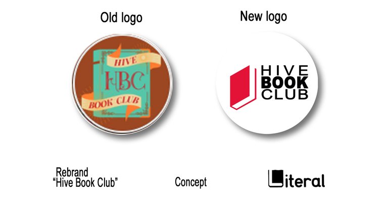
Hello community, this is my entry for the graphic design contest. I present my proposal for the rebranding of the @hivebookclub
The habit of reading is having an upsurge in recent years among adolescents and young people. That is why the conceptual idea of my proposal is to rejuvenate the brand, using a minimalist, simple, fresh and attractive design. The image that reading is only for adults, nerds or scholars is a cliché that has been left in the past. Nowadays, we can see many young people boasting of their readings on social networks, the increase in accounts related to literary themes on the web 2 is appreciable at a glance, the Bookstagramers of Instagram, those who make reviews on Twitter (X) and specific platforms such as wattpad and Godread are a clear example of the rebirth of this habit. That is why I advocate that the image of the reading club must be adapted to this reality, and show novelty, freshness, especially for a community hosted on the web 3 where we are pioneers of a new technology.
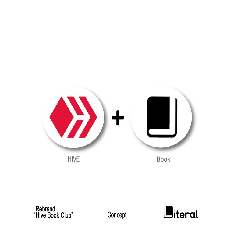
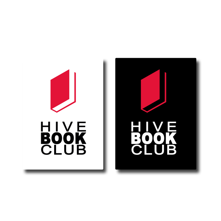
The conceptual idea of the proposal comes from the combination of two recognizable graphic elements: the Hive logo and a simple book design. From the fusion of both elements this proposal of imagotype arises that recalls, by color and by design, to both elements.
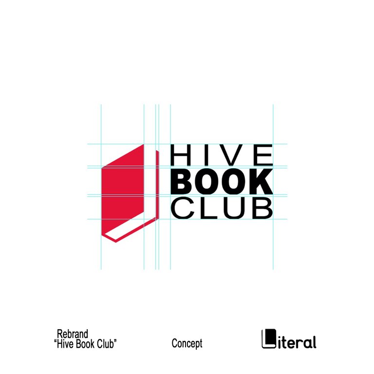
The new proposal provides a greater visual impact, better legibility and visual retention of the brand.
These are the designs for horizontal use:
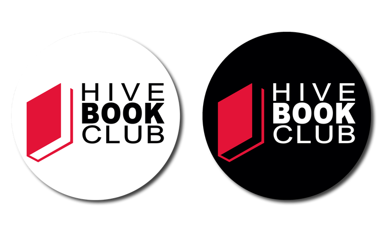
And these are the designs for vertical use:
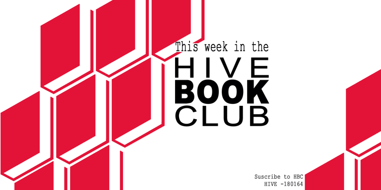
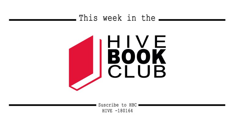
BANNERS AND THUMBNAILS:
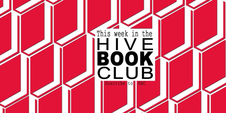
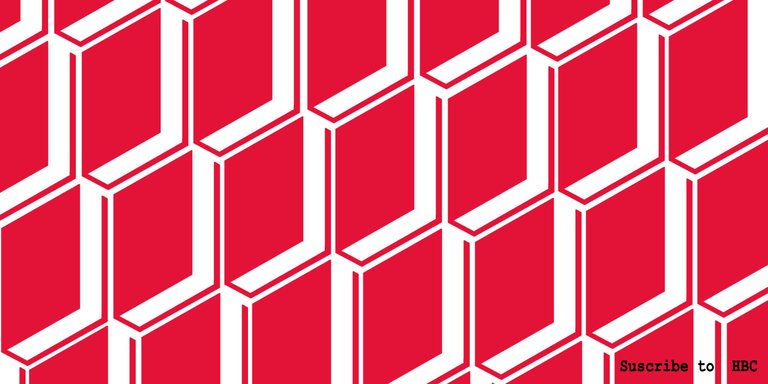
DIVIDERS:


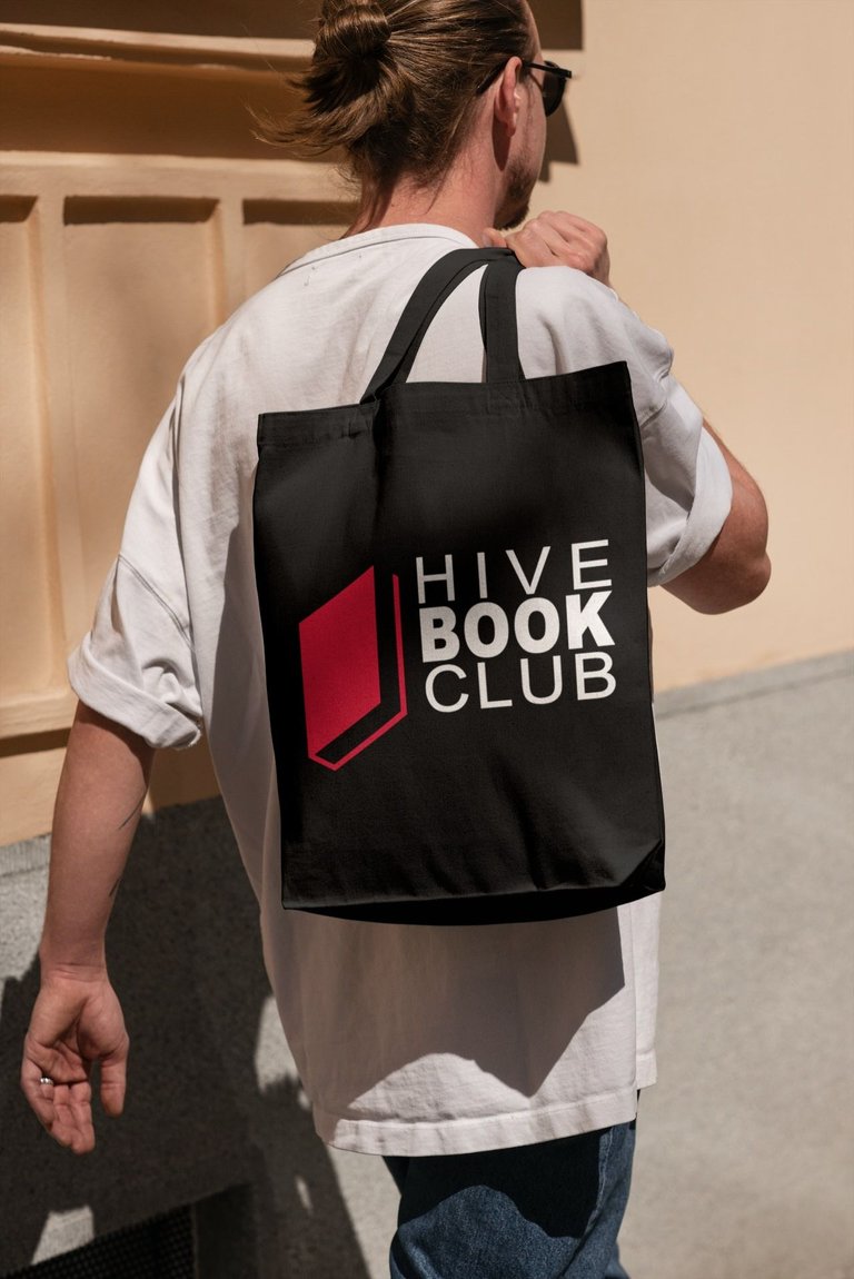
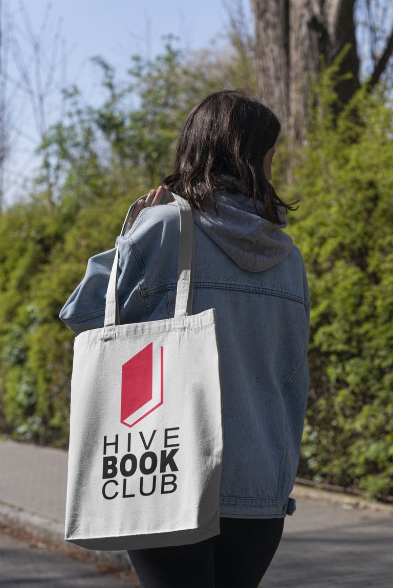
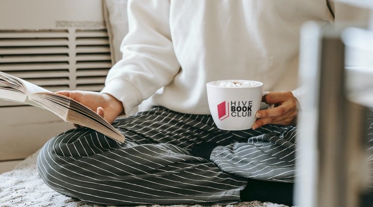
Some Mockups:
This is the end of my proposal, I hope you liked it, any ideas or suggestions I read in the comments, and we talk about it. A big hug and Merry Christmas
Resources:
The Mockups was made with Smartmockups
The logo design was made with Adobe Photoshop CS6 software.
English is not my native language, the translation was made with Deepl, I apologize if it is not the most appropriate
Congratulations @literal! You have completed the following achievement on the Hive blockchain And have been rewarded with New badge(s)
Your next target is to reach 40 posts.
You can view your badges on your board and compare yourself to others in the Ranking
If you no longer want to receive notifications, reply to this comment with the word
STOPTo support your work, I also upvoted your post!
Check out our last posts:
Very nice combination include your proporsal.
Thanks a lot 🙏
que bueno te quedó eso!!! me gusta mucho😍
Muchas gracias 💙🙏
No seria mucho pedir que el logo aparezca en la pasta del libro?
Si la pasta es roja, el logo podría ser dorado, o de cualquier otro color, o viceversa.
I loved this design. Very creative, serious and professional. It fits the community and its members perfectly. Great job
!discovery 40
!LUV
literal, chacald.dcymt sent you LUV. 🙂 (1/1) tools | trade | connect | daily
Made with LUV by crrdlx.
Muchísimas gracias 💙💙💙🙏
This post was shared and voted inside the discord by the curators team of discovery-it
Join our Community and follow our Curation Trail
Discovery-it is also a Witness, vote for us here
Delegate to us for passive income. Check our 80% fee-back Program
Muchas gracias 💙🙏
Oh this is cool
Thanks 🙏