
¡Hola a todos!
Hoy hablemos de los storyboards en la animación.
Los storyboards son una parte muy importante en la creación de los proyectos de animación. Estos son una secuencia de dibujos los cuales sirven de base para la construcción del proyecto de narración visual.
Cuando empecé a estudiar animación, una de las preguntas que siempre me hacía es ¿Por qué los animadores usan colores en específico en sus storyboards?
Buscando información, pude encontrar que la selección del azul y el rojo para representar luces y sombras no era una elección aleatoria, sino que tenía un propósito específico y esto era fundamental en la comunicación visual.
El azul, se convirtió en un estándar para representar las sombras en los storyboards de animación. Esto tiene sus raíces en la teoría del color y en la forma en la que el ojo humano percibe las sombras.
Considerado un color frío, el azul es ideal para representar áreas de sombras ya que evoca oscuridad sin que se pierda la claridad del dibujo. De esta manera, los animadores pueden comunicar efectivamente la profundidad y la atmósfera de la escena.
Por otra parte, el color rojo se utiliza por lo general para representar las luces en los storyboards de animación.
El rojo, sugiere iluminación y resalta áreas de interés al ser un color cálido. Con esto, los animadores pueden indicar lugares o fuentes de luz y crear el impacto visual entre las partes sombreadas ya en azul y las áreas iluminadas.
Esto, no sólo ayuda a los animadores a planificar la iluminación de la escena, sino que también facilita la comprensión de la composición al resto del equipo de producción.
Adicional al azul y rojo, se emplean otros colores que tendrán roles específicos en los storyboards. Estos otros colores sí he notado que cambian mucho entre un estudio de animación y otro. Al parecer, los roles son asignados internamente. No obstante, hay usos que suelen ser específicos.
A menudo, el amarillo se utiliza para resaltar elementos que son importantes, mientras que el verde se emplea para representar la naturaleza. El violeta se emplea para denotar surrealismo o misterio. También he encontrado que se usa para hacer las sombras más oscuras (por lo general, en el ánime se usan sólo un tono para base, uno de sombra y uno de iluminación, pero algunas escenas con más iluminación, requieren una segunda sombra para dar profundidad).
Hice una práctica con Gersiel.
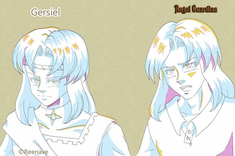
Me gustó mucho el resultado. Creo que empezaré a usar esta técnica más seguida para hacer el estudio de luces y sombras en los bocetos antes de pasar al color final.
Espero que les haya gustado y que la información les sea de utilidad.
¡Hasta el siguiente artículo!
Mis blogs: Noise Steemit Hive Publish0x Medium
Mis redes sociales: Instagram Facebook Twitter YouTube TikTok
Mis tiendas: Redbubble
Comisiones Abiertas: Fiverr
Suscríbete, dale like y comparte si estás disfrutando la historia para que recibas notificación al haber actualización!

Hello everyone!
Today let's talk about storyboards in animation.
Storyboards are a very important part of creating animation projects. They consist of a sequence of drawings that serve as the basis for the visual narrative project construction.
When I started studying animation, one of the questions I always had was, "Why do animators use specific colors in their storyboards?"
Looking for information, I found that the selection of blue and red to represent lights and shadows was not a random choice, but had a specific purpose and was fundamental in visual communication.
Blue became a standard for representing shadows in animation storyboards. This is rooted in color theory and how the human eye perceives shadows.
Considered a cool color, blue is ideal for representing shadow areas as it evokes darkness without losing the clarity of the drawing. In this way, animators can effectively communicate the depth and atmosphere of the scene.
On the other hand, the color red is generally used to represent lights in animation storyboards.
Red suggests illumination and highlights areas of interest as it is a warm color. With this, animators can indicate places or light sources and create visual impact between the shaded parts already in blue and the illuminated areas.
This not only helps animators plan the lighting of the scene, but also facilitates the understanding of the composition to the rest of the production team.
In addition to blue and red, other colors are used with specific roles in storyboards. These other colors seem to vary significantly between animation studios. Roles are apparently assigned internally, but there are specific uses that are common.
Often, yellow is used to highlight important elements, while green is used to represent nature. Violet is used to denote surrealism or mystery. It is also used to make shadows darker (generally, in anime, only one tone is used for the base, one for the shadow, and one for illumination, but some scenes with more illumination require a second shadow to add depth).
I practiced with Gersiel.
I really liked the result. I think I will start using this technique more often to study lights and shadows in sketches before moving on to the final color.
I hope you liked it and found the information useful.
Until the next article!
*Disclaimer: *English is not my native language. Even when I have a conversational level, I can make a lot of mistakes in the structure of the sentences. Feel free to kindly correct me. It will help me in my learning process. Thanks for your understanding. **
My blogs: Noise Steemit Hive Publish0x Medium
My Social Networks Instagram Facebook Twitter YouTube TikTok
My shops: Redbubble
Commissions Open: Fiverr