Few months to this present moment, I have been practicing how to design logo for brands and business using alphabet combining with shapes to present a conceptualizing visual that speak out and grab attention. Choosing graphic design as a skill requires dedication and consistency to allow one to stand out among the crowd. Tutorials from YouTube and other sources has fostered my knowledge in graphic design field. Recently, I worked on two projects the first one is a logo for my friend which you can see the picture below and I would like to hear the opinion of designers in the platform regarding this.
The name of the brand is “Zohar Scent” A brand that sells perfume of all kinds. So, I decided to work on the letter “Z” coupled with shapes to create a combination logo. With the aid of Corel draw, I typed the letter Z using Arial font. Thereafter, I drew few rectangular shapes of the same width but different length placing them together to form a square and then highlighted them and turned into one shape with empty fill. The letter Z was later placed on the new shape, highlighted together, and converted into a single curve object with single fill and outline. As we might all have known, Mockups designs help to bring idea to life and helps to visualize the main design aspects.
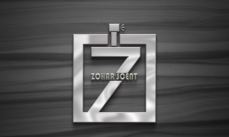
Various free mockups design which are photoshop documents can be found online, some of these photoshop documents can be recreated freely. Prior the main design, I’d downloaded some mockup files which I always use to finalize my logo designs. So I made use of this and it turned out to be fascinating.
Secondly, I designed a logo for a gaming center who also run laundry services alongside. Before any designer would embark on a project, one must get proper detail from the client as this would help the designer to think and probably have a sketch of what is to be designed. One of the most important things to note is the name of the brand or what the brand has to offer to the public.
The brand was named “Deluxe Nexus Spins (DNS)” Like I wrote earlier, It is a blend of laundry spins and the enjoyable experience of a game center. Considering the name given and the services to be offered, I decided to go for a Monogram logo combined with little shapes. Monograms logos usually consist of brand initials. As usual, I launched my CorelDRAW application and started by typing the alphabets, breaking them apart and converting each letter into curves. The next step was overlapping the letters in a meaningful position and then highlighting them followed by trimming of the overlapped areas of the letters.
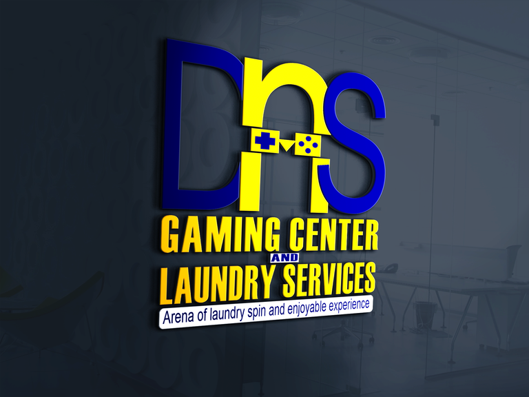
Many might not be used to playing games but at least we all know what a game pad looks like, this led to the idea of designing something that resemble a pad with the use of various shapes including circle, square and triangle. To create a space for insertion for the game pad design between the letter ‘N’ in the middle. it requires drawing a rectangular shape of the same size as the game pad design, placing it on the already made “DNS” logo, highlighting it together then cutting out the portion of the letter ‘N’ with the rectangular shape. With these few steps above, I was able to create a space for the insertion of the game pad design. Finally, after designing, overlapping, cutting out and trimming, there is a need to highlight everything and convert it to a single object which was later exported as PNG file for further mockup using Photoshop CC 2019.
Dear designers on the platform, these has been my little steps of designing logos. I would welcome comments, corrections and further ideas pertaining this.
**Thank you all. ****
💕💕