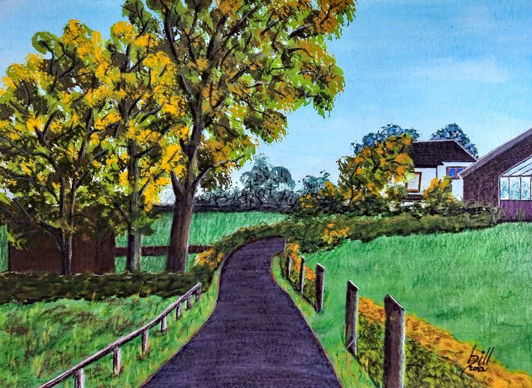
"Around the House"
Soft Pastel Sketch on Paper
425gsm, 40cm x 30cm (15¾" x 11⅞")
This post is not about the crummy little soft pastel sketch shown above. This post discusses a problem all soft pastel and color pencil artists face, and how to solve it. Soft pastels, pastel pencils, and color pencils are wonderful media to create art on paper. However, the paper substrate we use has a direct influence on the look and feel of the finished art piece before we even make the first mark.
In order to get pigment to paper, the paper must have sufficient "tooth" to grab the pigment particles and hold them firmly. Unlike in paints, there is no binder to glue the pigment down. In addition, there is no color mixing in dry media. Mixed color effects are usually created by layering multiple colors. Even if we have 100+ pastel chalks, there never seems to be the "right" color in the kit. Once again, to layer and mix multiple colors, we need plenty of tooth in the paper.
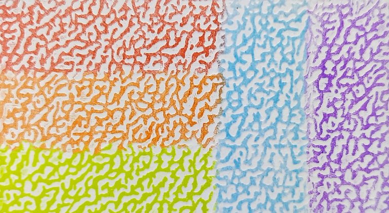
Paper tooth: Faber-Castel Polychromos color pencil on textured paper.
Papierkörnung: Faber-Castel Polychromos Buntstift auf texturiertem Papier.
In diesem Beitrag geht es nicht um die ganz oben gezeigte, hingeschlunzte Softpastell-Skizze. In diesem Beitrag geht es um ein Problem, mit dem alle Softpastell- und Buntstiftkünstler konfrontiert sind, und wie man es lösen kann. Pastellkreiden, Pastellstifte und Buntstifte sind wunderbare Medien, um Kunst auf Papier zu bringen. Das verwendete Papiersubstrat hat jedoch einen unmittelbaren Einfluss auf das Aussehen und die Haptik des fertigen Kunstwerks, noch bevor wir den ersten Strich machen.
Um die Pigmente auf das Papier zu bringen, muss das Papier genügend Textur oder Körnung haben, um die Pigmentteilchen zu greifen und sie festzuhalten. Anders als bei flüssigen Farben gibt es kein Bindemittel, das das Pigment festhält. Außerdem gibt es bei trockenen Medien keine Farbmischung. Mischfarbeneffekte werden in der Regel durch das Übereinanderlegen mehrerer Farben erzielt. Selbst wenn wir mehr als 100 Pastellkreiden haben, scheint es nie die "richtige" Farbe im Set zu geben. Um mehrere Farben übereinander zu schichten und zu mischen, brauchen wir wiederum viel Textur im Papier.
Paper tooth: Stabilo CarbOthello pastel pencil on textured paper.
Papierkörnung: Stabilo CarbOthello Pastellstift auf texturiertem Papier.
Unfortunately, no matter the paper, the tooth fills up with pigment and gets clogged eventually, and no further application of pigment is possible. To overcome this issue, pastel papers with a special micro texture have been developed. Collectively, they're referred to as "velour papers", among them the well known Pastelmat by the renowned French paper mill Clairefontaine. With a little care, up to 5 layers of pastel are possible on Pastelmat, less with color pencil. Also, color pencil may turn out a bit spotty with increased pressure, although this is hardly noticeable at a normal viewing distance.
In any event, those special velour papers are very expensive! My favorite format is 40cm x 30cm (15¾" x 11⅞") which hits the wallet with roundabout 4.00 EUR ($4.50 USD) per sheet when using Pastelmat! While this is fine for painting a "masterpiece" it is pretty much unacceptable for practice and sketching. Even artists like to eat occasionally...
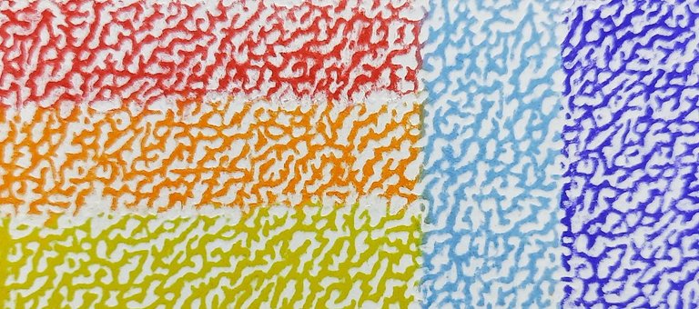
Velour paper: Polychromos color pencil (t) and CarbOthello pastel pencil (b)
Velourpapier: Polychromos Buntstift (o) and CarbOthello Pastellstift (u)
Leider füllt sich die Textur unabhängig vom gewählten Papier mit Pigmenten und wird letztendlich verstopft, so dass kein weiteres Auftragen von Pigmenten möglich ist. Um dieses Problem zu lösen, wurden Pastellpapiere mit einer speziellen Mikrotextur entwickelt. Sie werden als "Velourpapiere" bezeichnet, darunter auch das bekannte Pastelmat der renommierten französischen Papierfabrik Clairefontaine. Mit ein wenig Sorgfalt sind auf Pastelmat bis zu 5 Schichten Pastell möglich, weniger mit Buntstift. Auch kann der Buntstiftauftrag bei stärkerem Druck etwas fleckig ausfallen, was aber bei normalem Betrachtungsabstand nicht allzusehr auffällt.
Auf jeden Fall sind diese speziellen Velourpapiere sehr teuer! Mein Lieblingsformat ist 40cm x 30cm (15¾" x 11⅞"), das bei Verwendung von Pastelmat mit rund 4,00 EUR ($4,50 USD) pro Blatt zu Buche schlägt! Das ist zwar in Ordnung, wenn man ein "Meisterwerk" malen will, aber zum Üben und Skizzieren ist es einfach zu teuer. Auch Künstler müssen ab und zu was essen...
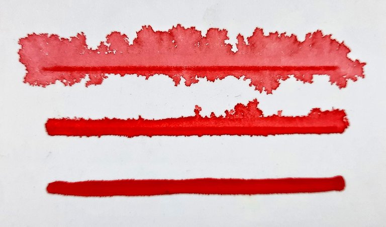
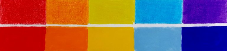
Wet media will bleed on Pastelmat and ruin the underpainting. (See text below.)
Nasse Farben auf Pastelmat bluten aus und ruinieren die Untermalung. (Siehe Text unten.)
To conserve cash, many pastel artists are working under the assumption that a structured paper like the beloved Canson Mi-Teintes will exhibit the most tooth, so they're using that. It's cheaper than velour papers, and also comes in many colors which cuts down on underpainting. Pastel is most often painted dark to light, so having a midtone to begin with is a good thing. However, as we can see in the macro shots further up, structured paper doesn't grab much pigment to begin with.
In truth though, many artists and art lovers like it just fine when the texture of the paper shows, and there are many paper textures to choose from to suit any taste and budget. With careful planning and a large enough color selection in the artist's kit, the layering issue can be overcome, and the paper texture may actually add to the appeal of the finished piece.
In addition, pastel art is often underpainted with wet media, or it may be beneficial to combine wet and dry media. If we want to use the expensive velour paper, it may be a no-go because the paper may not be able to deal with the moisture at all (like Sennelier Pastel Card) or it may exhibit awful color bleeding which ruins the picture. I have illustrated this above by applying watercolor to Pastelmat paper, over a pencil line showing the original position of the brush stroke. The consistency of the watercolor on the bottom was that of heavy cream, and going up, the more watery the paint the worse the bleeding!
Um Geld zu sparen, gehen viele Pastellmaler davon aus, dass ein strukturiertes Papier wie das beliebte Canson Mi-Teintes die beste Struktur aufweist, also verwenden sie das. Es ist billiger als Velourpapier und außerdem in vielen Farben erhältlich, so dass man weniger untermalen muss. Pastell wird meist von dunkel nach hell gemalt, daher ist es gut, wenn man einen Mittelton für den Anfang hat. Wie wir jedoch in den Makroaufnahmen weiter oben klar sehen können, nimmt strukturiertes Papier vorneweg nicht wirklich viel Pigment auf.
Viele Künstler und Kunstliebhaber mögen es jedoch, wenn die Textur des Papiers sichtbar ist, und es gibt viele verschiedene Papierstrukturen für jeden Geschmack und jedes Budget. Bei sorgfältiger Planung und einer ausreichend großen Farbauswahl in der Künstlerausrüstung kann das Problem der Übereinander-Schichtung überwunden werden, und die Papierstruktur kann den Reiz des fertigen Werks sogar noch erhöhen.
Darüber hinaus jedoch werden Pastellbilder oft mit nassen Farben untermalt, oder es kann von Vorteil sein, nasse und trockene Medien zu kombinieren. Wenn wir das teure Velourpapier verwenden wollen, kann das ein No-Go sein, weil das Papier möglicherweise überhaupt nicht mit der Feuchtigkeit umgehen kann (wie Sennelier Pastel Card) oder es kann ein hässliches Ausbluten der Farben aufweisen, was das Bild ruiniert. Zur Veranschaulichung habe ich oben Aquarellfarbe auf Pastelmat aufgetragen, und zwar über eine Buntstiftlinie, die die ursprüngliche Position des Pinselstrichs zeigt. Die Konsistenz der Aquarellfarbe war unten die von dickem Rahm, und nach oben hin, je wässriger die Farbe, desto stärker das Ausbluten!
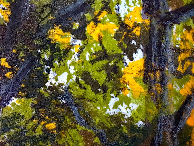
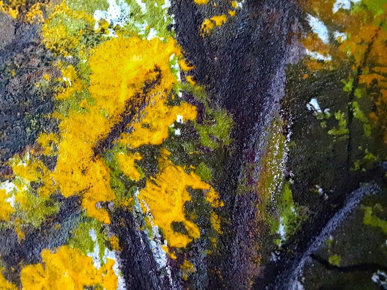
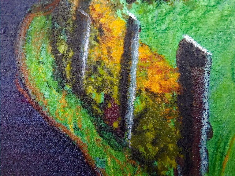
Back to my crummy little sketch from the beginning: the closeups reveal a richness of pigments on the paper that is simply mind-boggling, wouldn't you agree? You can also clearly see that I layered colors to my heart's content without paying much attention to whatever was on the paper already. The painting was done on a cheap plain white paper, cellulose watercolor paper for pennies a sheet. I underpainted the sky with blue watercolor and only used about six pastel sticks for all the rest. Excluding drying time, the whole thing took about 20 minutes.
Naturally, this sketch is only a proof of concept. I will follow up with a "proper" painting tomorrow or the day after. So what is the big secret for a cheap and perfect pastel painting surface? How do we fix all the issues I discussed above? Enter Liquitex Clear Gesso:
Zurück zu meiner hingeschlunzten kleinen Skizze vom Anfang: Die Nahaufnahmen offenbaren einen Reichtum an Pigmenten auf dem Papier, der einfach umwerfend ist, findet ihr nicht auch? Ihr könnt auch deutlich sehen, dass ich nach Herzenslust Farben geschichtet habe, ohne darauf zu achten, was schon auf dem Papier war. Das Bild wurde auf einem billigen, einfachen weißen Papier gemalt, einem Zellulose-Aquarellpapier für ein paar Cent pro Blatt. Ich habe den Himmel mit blauer Aquarellfarbe untermalt und für den Rest nur etwa sechs Pastellstifte verwendet. Abgesehen von der Trocknungszeit dauerte das Ganze etwa 20 Minuten.
Natürlich ist diese Skizze nur ein Proof of Concept. Ich werde morgen oder übermorgen ein "richtiges" Bild posten. Was ist also das große Geheimnis für eine billige und perfekte Pastellmalfläche? Wie lassen sich all die oben genannten Probleme lösen? Hier kommt Liquitex Clear Gesso ins Spiel:
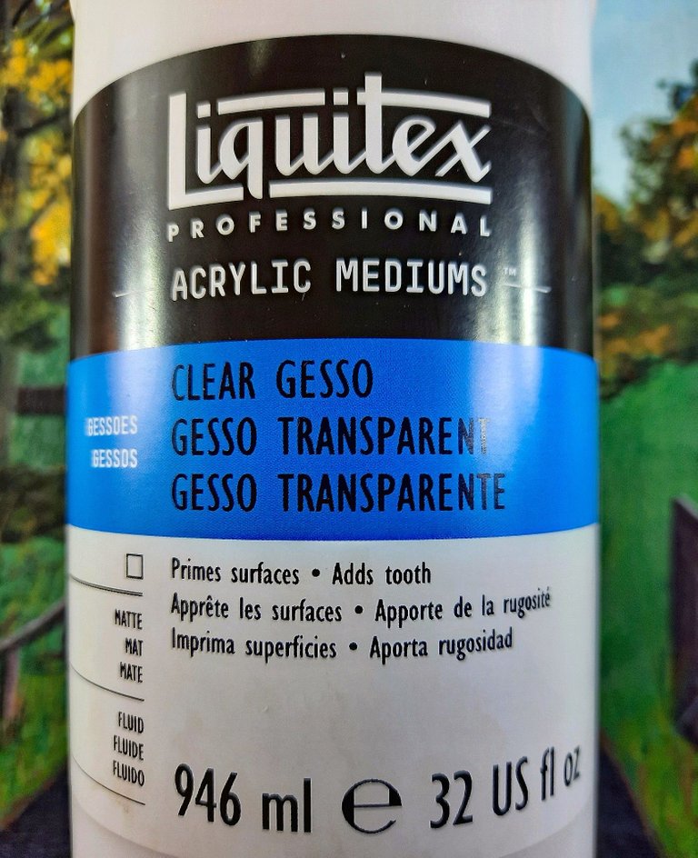
Liquitex Clear Gesso is a transparent acrylic matte medium which can be applied to any surface that will take acrylic paint. Wood, MDF, canvas; and of course paper - any paper of sufficient grammage! The stuff is cheap enough, 946 ml (32 US fl oz) run me only about 20.00 EUR ($22.50 USD) here in Germany, which should be enough for dozens of paintings at least. To save even more money, or to avoid brushstrokes from showing, the gesso can be diluted with up to 25% of water.
The miracle ingredient (I suspect) is finely ground glass, which gives paper a sandpaper-like roughness after an application of only one coat. Liquitex Clear Gesso is the only matte medium I have found with the right consistency to add just enough abrasion for the application of soft pastels and color pencil. Depending on application, this gesso will add no additional visible texture to the paper, or you can put it on thick in multiple coats with brushstrokes showing for that "painterly" appearance of the finished pastel work.
Unfortunately, there is no product number and Liquitex makes a bunch of different acrylic media and gessos. This is why I have included a photo of the label in this post. Pay attention to the words "Adds tooth" and make sure you're buying the right one!
Liquitex Clear Gesso ist ein transparentes, mattes Acrylmedium, das auf jede Oberfläche aufgetragen werden kann, die Acrylfarbe aufnehmen kann. Holz, MDF, Leinwand, und natürlich Papier - jedes Papier mit ausreichender Grammatur! Das Zeug ist billig genug, 946 ml (32 US fl oz) kosten mich hier in Deutschland nur etwa 20,00 EUR ($22,50 USD), was mindestens für Dutzende von Gemälden ausreichen sollte. Um noch mehr Geld zu sparen oder um zu vermeiden, dass Pinselstriche sichtbar werden, kann der Gesso mit bis zu 25 % Wasser verdünnt werden.
Die Wunderzutat (so vermute ich) ist fein gemahlenes Glas, das dem Papier nach nur einem Auftrag eine sandpapierartige Rauheit verleiht. Liquitex Clear Gesso ist das einzige matte Medium, das ich gefunden habe, das die richtige Konsistenz hat, um gerade genug Abrieb für das Auftragen von weichen Pastellkreiden und Buntstiften zu erzeugen. Je nach Anwendung fügt dieser Gesso dem Papier keine zusätzliche sichtbare Textur hinzu, oder ihr könnt es in mehreren Schichten dick auftragen, so dass die Pinselstriche zu sehen sind, für das "gemalte" Aussehen des fertigen Pastellbildes.
Leider gibt es keine Produktnummer, und Liquitex stellt eine ganze Reihe verschiedener Acrylmedien und Gessos her. Aus diesem Grund habe ich ein Foto des Etiketts in diesen Beitrag aufgenommen. Achtet auf die Worte "Adds tooth" und stellt sicher, dass ihr das richtige Produkt kauft!
Tips and Tricks
Underpainting:
For your underpainting, or to tone an entire sheet of paper, mix watercolor, gouache, or acrylics under the gesso. Naturally, the more paint you mix in, the less tooth the finished mixture will have. The thicker the paint (e.g. gouache), the less abrasion. Experiment on scrap paper to find the right consistency for your style.
You can also lay the gesso down clear and use wet media on top of it. The gessoed surface will take watercolor, however, some effects may not be possible as the acrylic gesso lowers the paper's absorption. Also, any pigment, whether wet or dry, will fill the tooth you just created. Keep that in mind when underpainting.
Untermalungen:
Für eure Untermalung oder um ein ganzes Blatt Papier zu tönen, mischt Aquarell-, Gouache- oder Acrylfarben unter den Gesso. Natürlich gilt: Je mehr Farbe ihr untermischt, desto weniger Rauheit hat die fertige Mischung. Je dicker die Farbe (z.B. Gouache), desto weniger Korn. Experimentiert auf Papierabfällen, um die richtige Konsistenz für euren Stil zu finden.
Ihr könnt den Gesso auch klar auftragen und nasse Medien darauf verwenden. Die gessoierte Oberfläche nimmt Aquarellfarben auf, allerdings sind einige Effekte nicht möglich, da der Acrylgesso die Saugfähigkeit des Papiers verringert. Außerdem füllt jedes Pigment, ob nass oder trocken, die gerade erst entstandene Textur. Berücksichtigt dies beim Untermalen.
Use with PanPastels:
The Liquitex Clear Gesso works with PanPastels just like with pastel sticks. However, the abrasion tears the SofftTools like it's going out of style! Use a light touch and load your SofftTool with pigment often.
If you're using PanPastels for your underpainting, apply them before the gesso on the plain paper. You get nicer blends that way and save on your SofftTools. Seal your finished PanPastel underpainting with a waterproof spray fixative before applying the gesso to prevent brush smearing.
Verwendung mit PanPastels:
Der Liquitex Clear Gesso funktioniert mit PanPastels genauso wie mit Pastellkreiden. Allerdings zerreißt der Abrieb die SofftTools, als ob sie morgen verboten würden! Geht also schön zart beim Malen vor und sorgt dafür, dass immer genug Pigment im SofftTool ist.
Wenn ihr PanPastels für eure Untermalung verwendet, tragt sie vor dem Gesso auf das glatte Papier auf. Auf diese Weise erhaltet ihr schönere Farbübergänge und spart an euren SofftTools. Versiegelt eure fertige PanPastel-Untermalung mit einem wasserfesten Fixierspray, bevor ihr den Gesso auftragt, um ein Verschmieren durch den Pinsel zu verhindern.
"Clear Sketching" for a Painterly Look
A neat trick is to draw your sketch with pencil on the naked paper as usual. Tone down the graphite strength with a kneaded eraser if necessary. Then give it a spray with a waterproof fixative. Now it's time to get creative: guided by your sketch envision how an oil painter would place his brushstrokes and mimic the same strokes with the undiluted clear gesso. The object here is, to make the brushstrokes as noticeable as possible, so don't be afraid to slap it on thick!
As you add your soft pastel pigments, try to keep your marks and blends directional in line with the gesso brush strokes. The end result is a pastel painting with the look and feel of an oil or acrylic!
"Transparentes Skizzieren" für einen "gemalten" Look
Ein raffinierter Trick besteht darin, dass ihr eure Skizze wie gewohnt mit Bleistift auf das nackte Papier zeichnet. Schwächt die Graphitintensität gegebenenfalls mit einem Knetradierer ab. Versiegelt die Bleistiftskizze dann mit einem wasserfesten Fixiermittel. Jetzt ist es an der Zeit, kreativ zu werden: Stellt euch anhand eurer Skizze vor, wie ein Ölmaler seine Pinselstriche setzen würde, und ahmt diese mit dem unverdünnten klaren Gesso nach. Das Ziel ist es, die Pinselstriche so deutlich wie möglich zu machen, also scheut euch nicht, richtig dick aufzutragen!
Wenn ihr eure Pastellpigmente auftragt, versucht, eure Striche und Übergänge in einer Richtung mit den Gesso-Pinselstrichen zu halten. Das Endergebnis ist ein Pastellgemälde mit dem Aussehen und der Haptik eines Öl- oder Acrylgemäldes!
The Tooth Is Gone - Now What?
The Liquitex Clear Gesso makes for a wonderful pastel surface, but as so often in life, there is a limit. If you slapped on too much pigment in too many thick layers, the tooth of the paper may have filled up and can take no more. To remedy this, seal the work with a waterproof acrylic fixative spray. Often the fixative will bring back some of the tooth, and this may be enough to finish gracefully.
If not, paint on another thin layer of diluted clear gesso. Be aware, however, that both fixative and gesso will darken your pastel work, sometimes considerably so. In the future, you may want to invest in some additional colors to prevent you from having to layer too much.
Die Struktur ist weg - was nun?
Der Liquitex Clear Gesso bietet eine wunderbare Pastelloberfläche, aber wie so oft im Leben gibt es auch hier eine Grenze. Wenn ihr zuviel Pigment in zuvielen dicken Schichten aufgetragen habt, kann es sein, dass die Textur des Papiers verstopft ist und nichts mehr aufnehmen kann. Um hier Abhilfe zu schaffen, versiegelt euer Werk mit einem wasserfesten Acryl-Sprühfixativ. Oftmals bringt das Fixiermittel einen Teil der Rauheit zurück, und das kann ausreichen, um das Bild anständig zu beenden.
Wenn nicht, tragt eine weitere dünne Schicht aus verdünntem Gesso auf. Seid euch jedoch bewusst, dass sowohl Fixiermittel als auch Gesso eure Pastellbilder abdunkeln, manchmal sogar erheblich. In Zukunft solltet ihr vielleicht in ein paar zusätzliche Farben investieren, damit ihr nicht so viele Schichten auftragen müsst.
Mixed Media Painting / Felt Tip Markers
Paper coated with Liquitex Clear Gesso is ideal for any kind of dry media like soft pastels and color pencils. In addition, many wet media like watercolor, gouache, acrylics, or ink can be applied alongside. Also no problem is the use of water based felt tip or brush markers, albeit at the cost of risking to tear apart the marker tips. Ink nibs will probably suffer from the abrasion of the substrate, so use a gentle touch or forgo the use of nibs.
An absolute no-go are alcohol based media like Copic markers or alcohol inks. The alcohol softens the acrylic of the gesso which leads to unpredictable, mostly unsightly results. In the case of Copic markers, the softened acrylic sludge will even clog up your expensive marker tip, so don't do it! To me, this is not really a limitation, as these types of marker inks aren't lightfast in the first place, so I don't use them.
I have not tried the use of oil based media like oil paints and oil pastels. Perhaps you will do that and tell us in the comments what your experience was...
Mixed Media Malerei / Marker / Filzstifte
Mit Liquitex Clear Gesso beschichtetes Papier ist ideal für alle Arten trockener Medien wie Pastellkreiden oder Buntstifte. Darüber hinaus können auch viele nasse Medien wie Aquarell, Gouache, Acryl oder Tinte aufgetragen werden. Auch die Verwendung von Filzstiften oder Pinselmarkern auf Wasserbasis ist kein Problem, wenn auch auf die Gefahr hin, dass die Spitzen der Marker zerfetzen. Tuschefedern werden wahrscheinlich unter der Rauheit des Gesso-Substrats Schaden nehmen, also geht zumindest behutsam vor oder verzichtet auf die Verwendung von Federn.
Ein absolutes No-Go sind Medien auf Alkoholbasis wie Copic-Marker oder Alkoholtinten. Der Alkohol weicht das Acryl des Gesso auf, was zu unvorhersehbaren, meist unschönen Ergebnissen führt. Im Falle von Copic-Markern kann der aufgeweichte Acrylschlamm sogar die teure Markerspitze verstopfen, also lasst es einfach! Für mich ist das keine wirkliche Einschränkung, da diese Art von Marker-Tinten von vornherein nicht lichtecht sind, weshalb ich sie nicht verwende.
Ich habe die Verwendung von Medien auf Ölbasis wie Ölfarben und Ölpastellkreiden noch nicht ausprobiert. Vielleicht könnt ihr das ja machen und uns in den Kommentaren mitteilen, welche Erfahrungen ihr damit gemacht habt...
Thanks for reading, and please don't forget to upvote and reblog if you liked my post. Also, visit my NFT Showroom Gallery if you're interested in collecting NFTs of my paintings. Until next time!
Danke fürs Lesen, und vergesst bitte nicht das Upvoten und Rebloggen, wenn euch mein Beitrag gefallen hat. Besucht auch meine NFT Showroom Gallery, wenn ihr NFTs meiner Bilder sammeln möchtet. Bis zum nächsten Mal!
The rewards earned on this comment will go directly to the person sharing the post on Twitter as long as they are registered with @poshtoken. Sign up at https://hiveposh.com.
Da kommt die Vorfreude auf die wärmeren Jahreszeiten auf! :-)
Naja, eigentlich sah das bei mir im Dorf morgens im Spätsommer so ähnlich aus. Ohne Referenzfoto aus dem Kopf so hingekloppt, um das neue Produkt zu testen.
Test erfolgreich absolviert, würde ich sagen. (Sry, habe Deine Antwort gerade erst entdeckt gehabt)
!discovery 30
Thank you for your support 😀
For me, the complexion of a great post is one in which I have no real investment in the subject matter, but find myself absorbed by the delivery. This is such a post!
I am not an artist, but your description of the problems, solutions, and applications involved with getting more pigment onto paper was pretty riveting! Well done!
There is so much texture in these drawings, and that drives home your point regarding the worth of these processes and products. I was also interested in the economics involved, in the different types of papers and their cost. Again, I['m not an artist, but it was so interesting!
Stellar job! And the leaves and trees drawing was amazing! Thank you for sharing this post!!
Cheers!
Thank you kindly for this extensive comment. I grew a full two inches reading that. 😉
I'm actually still learning to paint and I have profited so much from the experience so graciously shared online by established painters. So if I can contribute a kernel of experience occasionally, I like to pay it forward.
Cheers - Folker
This post was shared and voted inside the discord by the curators team of discovery-it
Join our community! hive-193212
Discovery-it is also a Witness, vote for us here
Delegate to us for passive income. Check our 80% fee-back Program
That's super interesting. It's like the science behind the art. I wouldn't have thought that the gesso spray had finely ground glass in it, but it makes sense when you consider what you said about the paper's "tooth." Smart.
The close ups of the sketch are pretty cool too.
Thanks Dane. It's not a spray, though, it's a paint. I'm mentioning spray acrylics to seal underpaintings before gessoing, so as to not smear the underpainted water media with the wet gesso.
Okay gotcha. I misunderstood that part. Thanks for clarifying.
👍👍👍👍