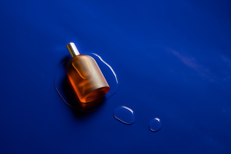
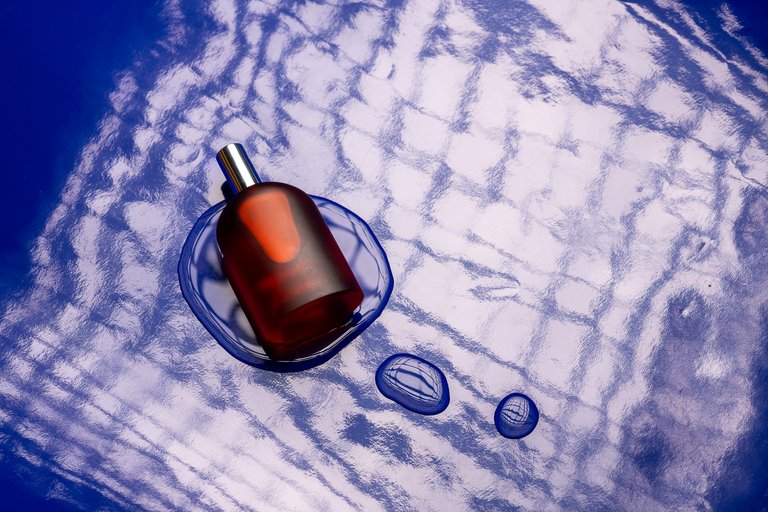
My wife gave me a perfume from a local brand in an orange bottle for Valentine's Day. I immediately had the idea of portraying it against a blue background. I had a few meters of adhesive vinyl of that color, I placed it on the ground and my external flash away so it wouldn't cause reflections. I then edited the surface to remove defects, scratches and dust grains.
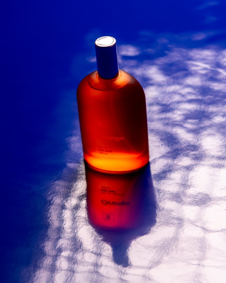
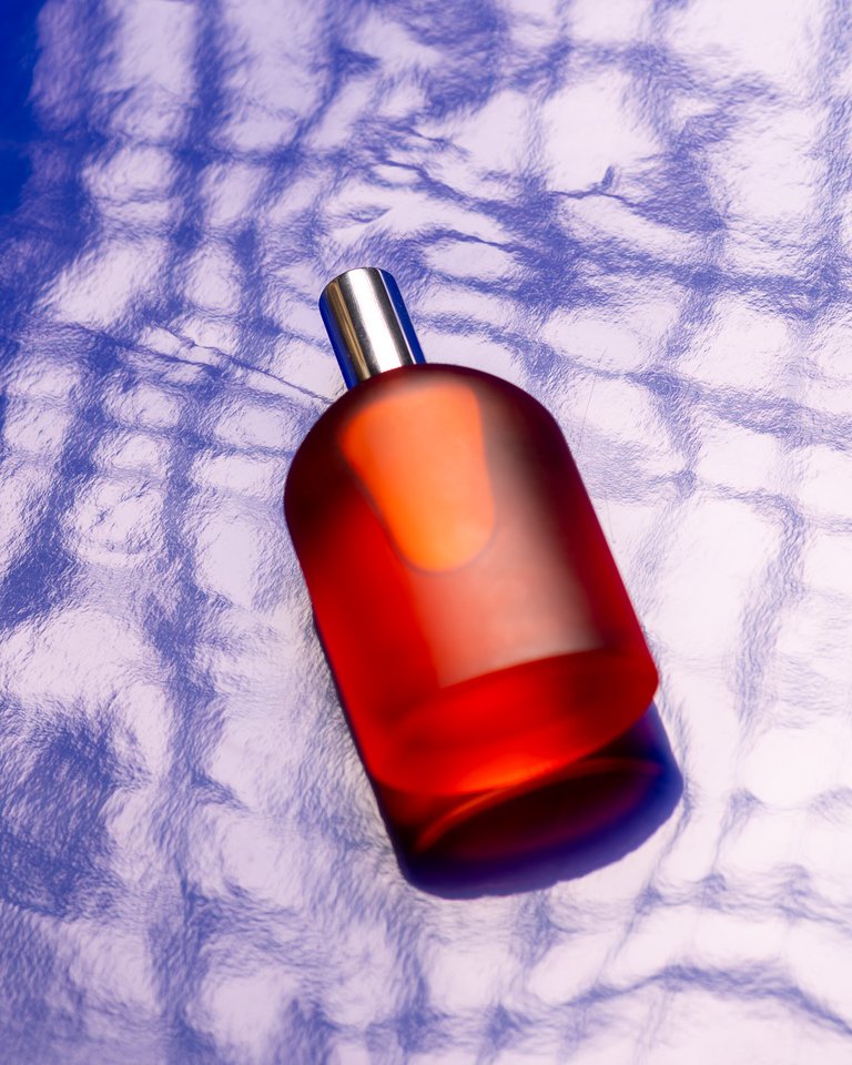
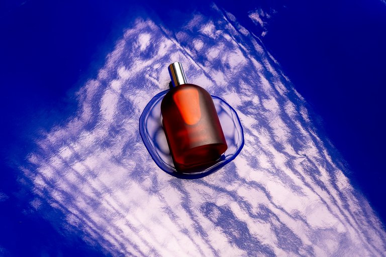
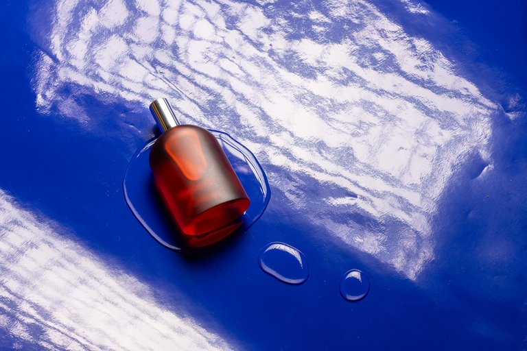
Once again, 52frames making me move my neurons for their weekly challenges. This time they wanted complementary colors applied in product photography. In my case, I did not focus on the brand itself, I was more interested in the color contrast. The cover is what I consider the final result, and the sequence following it is the path I took to get there. I thought that just the bottle against a blue background was very boring, I placed the soft box with its honeycomb grid to create a texture on the surface and achieve some interest, until it occurred to me to add water and when I had my three small puddles, the textured reflection was no longer necessary, so I removed the light source farther more so that it was no longer an actor in the scene. What do you think?
Mi esposa me regaló un perfume de una marca local en un frasco de color naranja para el Día de San Valentín. Inmediatamente tuve la idea de retratarlo sobre un fondo azul. Tenía unos metros de vinilo adhesivo de ese color, lo coloqué en el suelo y mi flash externo lo alejé para que no causara reflejos. Luego edité la superficie para eliminar defectos, rayones y granos de polvo.
Una vez más, 52frames haciéndome mover las neuronas para sus retos semanales. Esta vez querían colores complementarios aplicados en fotografía de productos, en mi caso, no hice hincapié en la marca en sí, me interesaba más el tema del contraste por color. La portada es lo que considero el resultado final, y la secuencia a continuación es el camino que tomé para llegar ahí. Pensaba que solo el frasco contra fondo azul era muy aburrido, coloqué el soft box con su rejilla de panal para crear una textura en la superficie y lograr algún interés, hasta que se me ocurrió añadir agua y ya cuando tuve mis tres pequeños charcos, la textura del reflejo ya no me fue necesaria, así que retiré la fuente de luz un poco más para que ya no fuera un actor en esa escena. Qué opinan?
Thanks so much for the opportunity!
Follow me:
 |  |  |  |  |  |
Excelente decisiones para un resultado de primera. Felicitaciones @abelfotografia
Gracias! Me alegra que coincida con mi criterio!
It’s not just the contrasting colours that make it pop. The liquid on the bottom seems so unthought of, I’ve seen misty bottles being shot. But this is just so cool 😎
Thanks so much, you are very kind! ☺️🙏