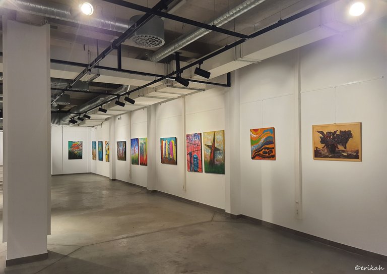
After a short break, I'm back to sharing art again. I'm not sure about you, but I have missed art. The break I mentioned wasn't really a break for me, it was more like a forced break from my usual routine, which covers blogging and visiting galleries among other things.
Today I'd like to put you to a test, to see if you can see more than I can see, or understand more than I can. For this exercise, I'm going to use Erzsébet Kulcsár's art. None of the paintings had a title, which gives you the chance to have your own title and see things how you want.
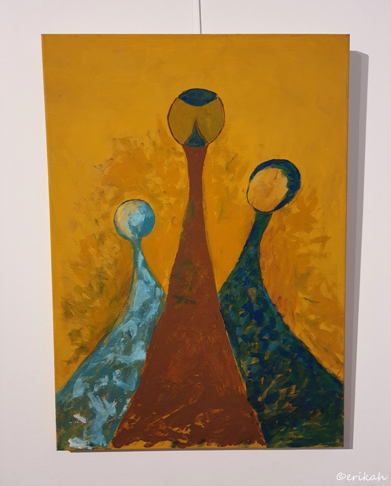
This was a difficult one for me, most likely for you too. What I could see here is most likely three people? But I'm not sure. Maybe a mother with two children?
Similar idea, but it seems to me the silhouette is under water and what you see floating around it could be fish and underwater vegetation.
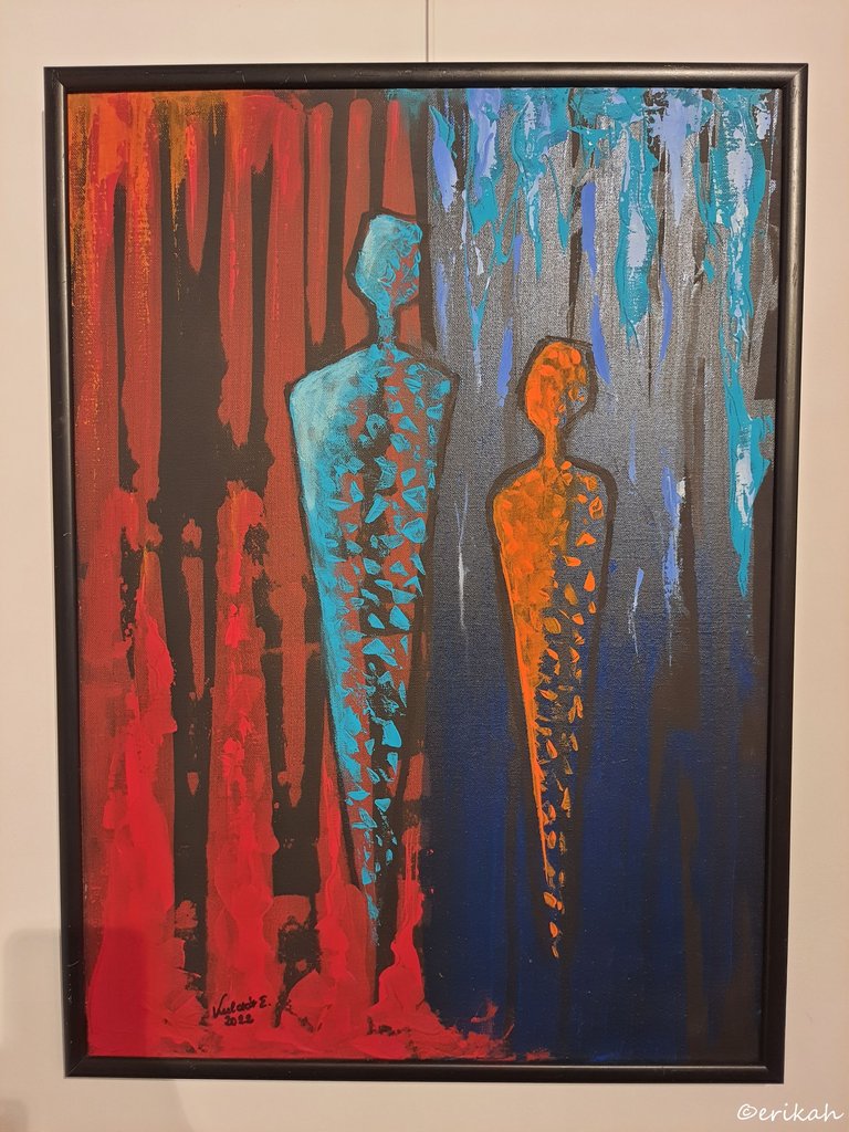
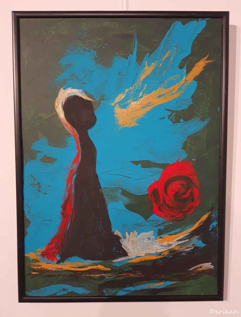
I's say I can see a similar concept here, however, the shape of the silhouette is different. Could be a male and a female and the different background color may support my theory. While looking at this painting, was thinking about how you can depict amazing concepts by using just a handful colors. I like simple when it comes to art. It leaves room for your imagination. Or confuse you more? You decide.
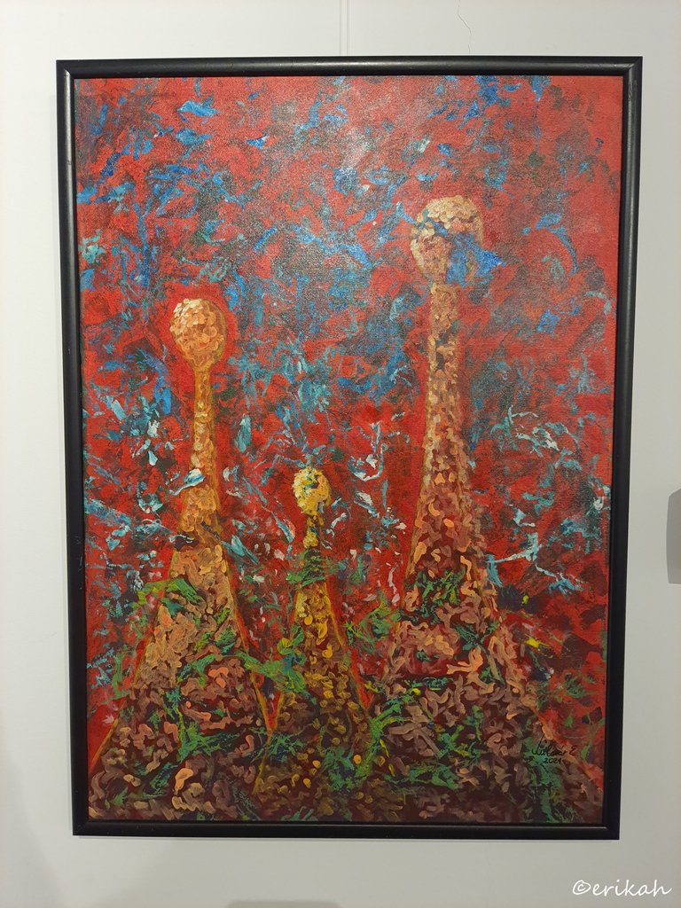
Here things get a little bit complicated. The silhouettes we know already, we saw these earlier. Could be a family of three, mother, father and a child. As you can see, the whole canvas is covered with small brushstrokes. The blue could mean the sky. Their clothes are covered with small flowers, which in my eyes could mean happiness. But at the end of the day, this one is too confusing for me.
Apart from the somewhat similar silhouette and the strong colors, I can see the dress here. I'll leave this to you.
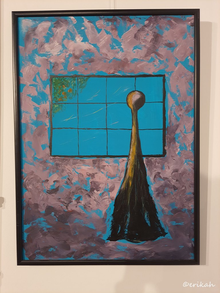
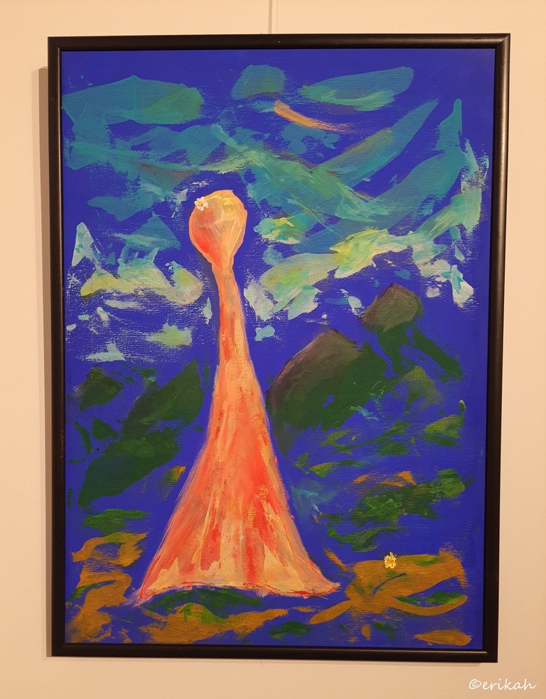
Most likely I don't have to say much here, except one thing. What do you think? Is the lady looking inside the room from outside, or looking out of the window, standing in the room? Would love to know how you see this one.
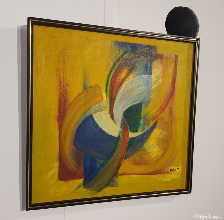
This was a total mystery for me, but liked the colors. That mustard yellow goes well with the blue.
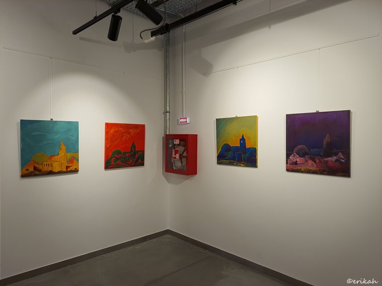
This is where things started to get interesting. This is something you don't see every day. Four paintings, all depicting the same thing, but in different colors. It was almost like Andy Warhol style, but on separate canvases.
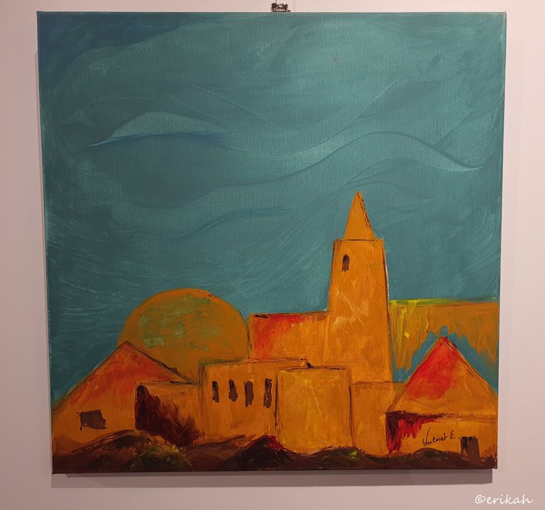
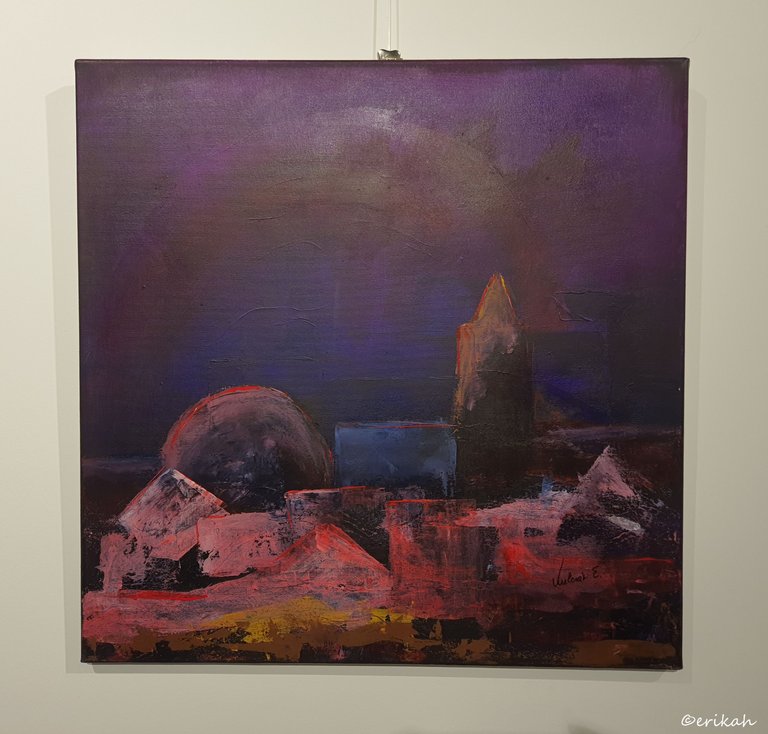
If I were to guess, I'd say this is a scene from the Middle East, but I'm basing my opinion solely on the shape of the buildings and might be wrong. I like the turquoise sky and the dark yellow color combination.
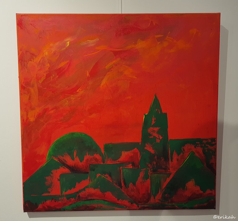
At first glance you'd think the painting is the same as the one above and just the colors differ, but it's not. Look at the red marks on the buildings. That makes it different from the first one.
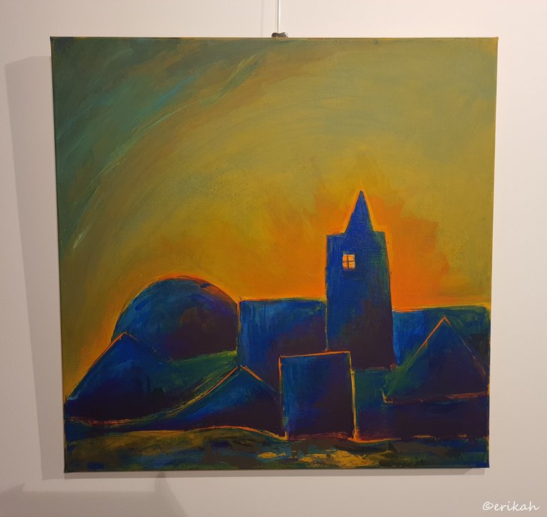
Same buildings, different colors, but there's something else. See how the yellow highlights the blue buildings from behind? It's kind of cool, adds to the effect, quite a lot.
You know what's interesting? I didn't see any of this at the exhibition. I was convinced only the colors differ. Yet, at a second look, while I'm writing this post, the differences are obvious.
This is a bit different in sense of the difference between the style of the others is a bit bigger. The buildings have the same shape, but their color is not the same. Some are pink, others are dark.
As I mentioned above, I've never seen such a series, but I'm glad I had the occasion of seeing this one. It's a very interesting concept and wish I could ask the artist was was in her mind when she decided to create this series. What was she wanted to pass on to the viewers.
Remember I told you none of the paintings had titles? I was thinking how fun it would be to write down what you think about each painting and then listen to the artist about what she has to share about them. Imagine the shock when you realize you missed most of it and see a totally different thing. Fun game though. Don't you think?
Let's see, which one is your favorite today? If you have any. I hope you do.

If you're a newbie, you may want to check out these guides:
- Communities Explained - Newbie Guide
- Cross Posting And Reposting Explained, Using PeakD
- Hive Is Not For Me
- How To Pump Your Reputation Fast - Newbie Guide
- Tips And Tricks & Useful Hive Tools For Newbies
- More Useful Tools On Hive - Newbie Guide
- Community List And Why It Is Important To Post In The Right Community
- Witnesses And Proposals Explained - Newbie Guide
- To Stake, Or Not To Stake - Newbie Guide
- Tags And Tagging - Newbie Guide
- Newbie Expectations And Reality
- About Dust Vote And Hive Reward Pool, by libertycrypto27

The series of four with different colors is cool. I feel such series should be kept together to try and experience what the artist intended. I like the mustard colored one best. I like painting that are about color and form. Can be appreciated on that level. Without any symbolism.
The four paintings making the series were close to each other, so you could realize it was a series.
Your write up is so nice and captivating. I love the way you gave meaning for each art working, describing the way you feel seeing each if those Art paintings.
Thank you @sonionovoart. I just write about what I see or how these artworks make me feel.
Then I would always love to feel the way you feel, because art also makes me so happy. I am so sorry for the late replies I am just checking my notifications and seeing this. I would be having an Exhibition coming up by this year ending though.
Wow... every art has it own beauty and stories... 👍🏻
That is true.
I love the abstract ones so much! It inspires me to paint something similar.
Then my post had a good effect on you. Start creating :)
Exposure is like a time bomb for the mind. Don't stop imagining things. If you visualise the first painting it could be a family, but why are the heads different? There is something hidden in the message that is perceived, I think they are different people, something that caught my attention even more was the brushstrokes. It is as if each one expresses the identity of a planet. I say this because of the shape of the fall and the brushstroke of the paint.
Another striking case is the window, the black color emits sadness, emptiness, and loneliness. It is what you feel, I think the concept was a person who has lived a long time and now has no one. Or it could be the opposite, the person feels an immense emptiness and would like to be in the place he is looking at from the window.
This was the work I liked the most. It is difficult to interpret. There is nature, there is life, it may be a family, but the red puts you on alert. There is a feeling of danger, it is perhaps a hidden critique of human degradation.
I was inspired, I love art so much. :3
That could be in general, but I don't think you can say that about a window. Most likely the artist chose black to separate the window from the other colors, but then again, who knows.
I'm a bit surprised about your pick as the one you liked the most, but I'm also glad. It's a strange one.
Each painting has its form. The window for me has many meanings. Of course, only the artist knows what it fully means. But the interesting thing is to be able to see something artistic and be intrigued.
In the case of the work I liked it was because of the elements. It is not for the simple perception; but what it transmits.
It is an interesting art exhibition. :3
Very interesting. I like all works of art. Thanks for sharing. 😊
I'm glad to hear that.
Congratulations @erikah! You have completed the following achievement on the Hive blockchain And have been rewarded with New badge(s)
Your next target is to reach 95000 upvotes.
You can view your badges on your board and compare yourself to others in the Ranking
If you no longer want to receive notifications, reply to this comment with the word
STOPCheck out our last posts:
Beautiful colors, this is good and different in every way!