Today I'd like to return to the exhibition I visited almost ten days ago and show you some interesting works and styles. Visiting an exhibition with paintings from the 20th century brings you a set of surprises and also gives you the opportunity to broaden your knowledge.

There were a few paintings with some unique and strange technique that I want to show you today.

Dimitrie N. Cabadaief - Summer afternoon in Sibiu (Carpenter's Tower) - oil on canvas
This place is real, I've been there several times and can even guarantee, the shadow is right as well.
However, have a look at the painting style, or the brush strokes. I'm not saying I've never seen anything similar, but this is different. Different, not in a good way though. I found it tiring and bothering for the eye. My admiration and respect for the artist, but for me it creates a visual discomfort and not something likable.

Ernst Honigberger - Erna (the artist's wife) - oil on canvas
When I first looked at this painting, had the impression it's the previous artist, due to the similar style, but it wasn't, which makes me think this painting style was common back then. Although not my style, this portrait is not so unpleasant to look at.
Looking at it, with technical eyes (not that I have any), most likely it's not easy to create a portrait by using small dots, or dot like brushstrokes.

Dimitrie N. Cabadaief - The Baia Mare Colony Court (1926) - oil on canvas
Different landscape, or cityscape,same stile from the same artist as the first painting. There's not much to say here honestly, but I have to mention the frame, I can't move on without saying how pompous it is, in the good sense of the word. Most likely you can only see how it would not fit on your room, which i understand as I feel the same, I'd never choose a frame like that, but this doesn't mean I don't appreciate the art in it. As I am always mentioning, back in those days the frame counted just as much as the painting. Today you don't see such pompous frames anymore and the simpler, the better. Yes, times change and that's not a bad thing.

Ipolit Stranbu - In the garden - oil on canvas
A lovely oil painting featuring three young ladies, from those times when they had nothing better to do all day, than to get ready to be a good, obedient wife.

Arthur Coulin - Portrait of a woman (1898) - oil on cardboard
This portrait is different from the others for two reasons. It is painted on cardboard and although not the first one I see, it's not very common either. It would be interesting to know what it feels like painting on cardboard. The other reason this portrait is different is the sad look. Maybe it was just a coincidence, maybe the artist ordered the model to look sad, but you can see the sadness and deep thoughts her eyes. Not that it's a bad thing though.

Károly Hajós - Madame Hajós reading (1925) - oil on cardboard
A portrait from a bygone era, when reading books was one of the most common form of relaxation among those who didn't have to worry about tomorrow.

Aurel Kessler - Sighisoara (1926) - oil on cardboard
A realistic street view of a medieval Transylvanian city, that most likely it looks the same today as these old houses are considered historical heritage and protected by law. Would be nice to go search for this street. Maybe I will next time I visit Sighisoara.
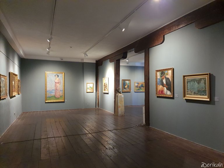
Here you can see the size of some of the paintings and the lovely gallery, which is one of my favorite.

Dávid Jándi - Pathetic self portrait (1924) - charcoal on paper
Before I tell you what I think, let me know about my exhibition routine. First I have a look at the artwork, make my first impression, then have a look at the title, if there's any and realize that I didn't understand anything 😂.
When I first looked at this drawing, my first impression was that the man is either sad or angry, or both. All this judging by the look in his eyes. Then I checked the title and started laughing. Have you ever seen a self portrait labeled or titled as pathetic? I have never. I love the courage of the artist, especially that this was 100 years ago, 101 to be precise, in a very conservative society. We will never find out why the artist named it pathetic, but I have a huge admiration for him.
This is it for today. Let me know what you think and if you like any of it. Also, let me know if you've seen this painting style I was talking about at the beginning of my post. I'm curious to know if it has a name.

If you're a newbie, you may want to check out these guides:
- Communities Explained - Newbie Guide
- Cross Posting And Reposting Explained, Using PeakD
- Hive Is Not For Me
- How To Pump Your Reputation Fast - Newbie Guide
- Tips And Tricks & Useful Hive Tools For Newbies
- More Useful Tools On Hive - Newbie Guide
- Community List And Why It Is Important To Post In The Right Community
- Witnesses And Proposals Explained - Newbie Guide
- To Stake, Or Not To Stake - Newbie Guide
- Tags And Tagging - Newbie Guide
- Newbie Expectations And Reality
- About Dust Vote And Hive Reward Pool, by libertycrypto27

It reminds me of the picture frames that were in my grandmother's house, they loved them and so did my mother, so I think they are spectacular. They match with antique furniture like the ones in that house.
I have also seen the paintings of the first technique, I wouldn't have them in my house but I recognise the different style.
I like the picture of the three women, very classic and the one painted on cardboard is beautiful. I painted on cardboard twice and the texture is very smooth, even more so than on board. I even used enduido to create relief on the cardboard and then painted over the two textures... I remember it was a deer.
What a beautiful sample even if the artist calls himself pathetic... courage, yes!
I really like the three young ladies (haha, @erikah, I like your humour! "...get ready to be a good, obedient wife" and the oil painting of the sad lady.
I absolutely agree about the first couple of paintings!
hmm i don't really like the style of the first paint too, i don't know it reminds me too much videogames from 40 years ago or stuff like minecraft... i just don't like the style
Dimitrie N. Cabadaief - The Baia Mare Colony Court (1926), the frame is good for the historic period when it was painted, i wouldn't like it too, but considering 1926 it suits
so overall, my favorite on this shots goes to: Arthur Coulin - Portrait of a woman (1898). It's painted quite well and pretty realistic
Dávid Jándi - Pathetic self portrait (1924): lol at the title, self irony i guess? or maybe he failed as an artist and was depressed and titled it like this 🤣 the style is not bad though
I like the older paintings. I believe the interesting style of the first couple of paintings is Pointillism I don't have a lot of knowledge about art but I do like this style and the impressionist movement that it developed out of.