PHYSICAL ASPECTS OF COLOURS IN LIGHT PAINTING
The first two parts of Colours in Light Painting article, was more of a theoretical nature. In this part, we are gonna deal with the technical implementation in light painting. Which colours are easy to use, which are not? Can I mix different colours in the Light Painting, and if so which and how?
Das Thema der ersten beiden Teile des Artikel war je eher theoretischer Natur. In diesem Teil beschäftigen wir uns nun mit der technischen Umsetzung im Light Painting. Welche Farben sind einfach zu benutzen, welche nicht? Kann ich verschiedene Farben im Light Painting mischen, und wenn ja welche und wie?
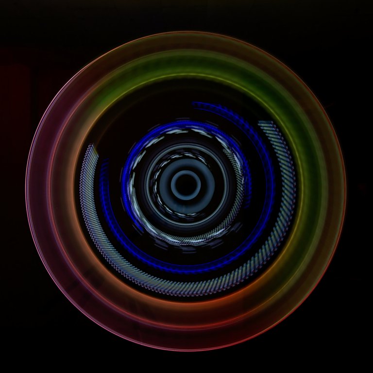
In the Light Painting, you can use with the proper torch and the necessary experience almost any colour in any desired saturation and brightness. However, when trying to mix different colours, we are very often doomed to failure. Displaying “all” colours in an image like the “Photonenrotor” above is anything but easy. I worked on this picture for several days. The exposure time was 131 seconds. The blue light I achieved with a small torch with blue colour gel, both attached to a piece of acryl. On another piece of acryl, I stuck a second torch without gel. On this acrylic blade, I had attached outside two small pieces of colour gel (red and yellow). The third part was exclusively white (middle). By changing the focal length during the exposure, the traces of the blades are visible several times in this Light Painting. The outer ring with the colour gradient, I have realized with an torch with colour change mode. The difficulty was to adjust the rotation speed to the speed of the colour change and to determine the number of rotations for the desired effect. This soft light with the clean colour gradient can hardly be converted with a single rotation.
However, such light paintings only work without further light. By illuminating the room, I probably would have shone off half the outer ring again. It would also be impossible to make the outer ring much brighter. But why is it like that?
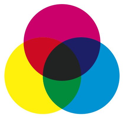
Back in school, we learned how to mix colours after subtractive colour mixing. From the 3 primary colours yellow, cyan and magenta all colours can be mixed. The more colours I apply to the sheet, the darker the mixed colour will be. If I paint all 3 primary colours in equal proportions on the sheet, the result is a dark brown, ideally black. However, in the physical sense, black is not a colour but the absence of light. Almost all printing processes use 4 colours: cyan, magenta, yellow and black.
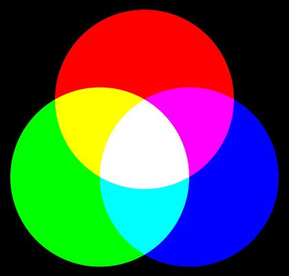
The subtractive colour mixing, however, has no validity when I work with light. The more light I put on each other the brighter the result will be. In additive colour mixing, the 3 primary colours red, green and blue do not turn black but white. Neither can I mix brown with red and green light. I have no way to colour parts in the picture with light black, Black is in Light Painting always only parts of the picture without any light.
So in light painting, we first have to forget the knowledge of colour mixing that was learned at school and stored in our memory.
m Light Painting kann man mit den geeigneten Lampen und der nötigen Erfahrung fast jede Farbe in jeder gewünschten Sättigung und Helligkeit darstellen. Beim Versuch verschiedene Farben zu mischen sind wir allerdings sehr oft zum Scheitern verurteilt. "Alle" Farben in einem Bild darzustellen wie beim Photonenrotor links ist alles andere als einfach. An diesem Bild habe ich mehrere Tage gearbeitet. Die Belichtungszeit betrug 131 Sekunden. Das blaue Licht habe ich mit einer kleinen Taschenlampe mit blauer Farbfilterfolie, beides an einem Stück Plexiglas befestigt, ins Bild gemalt. An einem weiteren Plexi steckte eine zweite Taschenlampe ohne Folie. An diesem Plexi hatte ich außen zwei kleine Stücken Farbfolie (rot und gelb) angebracht. Das dritte Teil war ausschließlich weiß (Mitte). Durch Veränderung der Brennweite während der Belichtung sind die Spuren der Plexiglasteile mehrfach in diesem Light Painting sichtbar. Den äußeren Ring mit dem Farbverlauf habe ich mit einer LED-Lampe mit einem Farbwechsel-Modus realisiert. Die Schwierigkeit bestand darin die Drehgeschwindigkeit an die Geschwindigkeit des Farbwechsels anzupassen und die Anzahl der Umdrehungen für den gewünschten Effekt zu ermitteln. Dieses weiche Licht mit dem sauberen Farbverlauf lässt sich mit einer einzelnen Umdrehung kaum umsetzen.
Solche Light Paintings funktionieren allerdings nur ohne weiteres Licht. Durch Ausleuchtung des Raumes hätte ich mir vermutlich die Hälfte des äußeren Ringes wieder weggeleuchtet. Den äußeren Ring wesentlicher heller zu machen wäre ebenfalls nicht möglich. Aber warum ist das so?
In der Schule haben wir damals gelernt wie man Farben nach der subtraktiven Farbmischung mischt. Aus den 3 Primärfarben Gelb, Cyan und Magenta werden alle Farben gemischt. Umso mehr Farbe ich auf das Blatt auftrage desto dunkler wird die gemischte Farbe. Wenn ich alle 3 Primärfarben zu gleichen Anteilen auf das Blatt male ist das Ergebnis ein dunkles Braun, im Idealfall Schwarz. Schwarz ist allerdings im physikalischen Sinne keine Farbe sondern die Abwesenheit von Licht. Fast alle Druckverfahren arbeiten mit 4 Farben: Cyan, Magenta, Gelb und Schwarz.
Die subtraktive Farbmischung hat allerdings keine Gültigkeit wenn ich mit Licht arbeite. Umso mehr Licht ich übereinander lege desto heller wird das Ergebnis. In der additiven Farbmischung wird aus den 3 Primärfarben Rot, Grün und Blau nicht Schwarz sondern Weiß. Genauso wenig kann ich aus rotem und grünen Licht braun mischen. Ich habe keine Möglichkeit Teile im Bild mit Licht schwarz zu färben, Schwarz sind im Light Painting immer nur Bildteile ohne jegliches Licht.
Im Light Painting müssen wir also zuerst einmal das in der Schule gelernte und im Gedächtnis fest abgespeicherte Wissen über die Farbmischung vergessen.

Theoretically, in light painting, you can render any colour as you would on an RGB monitor. Practically, this is very difficult. In the monitor, the individual pixels are cleanly separated from each other and do not affect each other. Every single pixel in the monitor is controlled with exact values for colour mixing and brightness. In light painting, we usually work with torches. These light up always a larger area, unlike the micrometre-sized pixel of the monitor. Also, there is no torch which has the brightness evenly spread across the light cone. Consequently, when using colour gels, the colour in the light cone is also not uniform.
In theory, the primary colours mix as follows:
RED – GREEN = YELLOW
GREEN – BLUE = CYAN
RED – BLUE = MAGENTA
RED – GREEN – BLUE = WHITE
In practice, this often looks different. I have a clean mix only if the brightness of the colours is identical, the colours are “clean” and the illuminated area is hit evenly by the light and the area reflects the light neutrally.
Here are some test shots on the white cellar wall:
Theoretisch kann man im Lightpainting ähnlich wie auf einem RGB-Monitor jede Farbe darstellen. Praktisch wird das allerdings sehr schwierig. Im Monitor sind die einzelnen Bildpunkte sauber von einander getrennt und beeinflussen sich nicht gegenseitig. Im Monitor wird jeder einzelne Bildpunkt mit exakten Werten zur Farbmischung und Helligkeit angesteuert. Im Light Painting arbeiten wir meist mit Taschenlampen. Diese leuchten, im Gegensatz zum Mikrometer großen Bildpunkt des Monitors, immer einen größeren Bereich aus. Die Helligkeit innerhalb des Lichtkegels ist bei keiner Taschenlampe absolut gleichmäßig. Bei der Verwendung von Farbfolien ist demzufolge die Farbe im Lichtkegel ebenfalls nicht gleichmäßig.
In der Theorie vermischen sich die Primärfarben wie folgt:
ROT - GRÜN = GELB
GRÜN - BLAU = CYAN
ROT - BLAU = MAGENTA
ROT - GRÜN - BLAU = WEIß
In der Praxis sieht das oftmals anders aus. Eine saubere Mischung habe ich nur wenn die Helligkeit der Farben identisch ist, die Farben "sauber" sind und die beleuchtete Fläche gleichmäßig vom Licht getroffen wird und die Fläche das Licht neutral reflektiert.
Hier mal einige Testaufnahmen an der weißen Kellerwand:
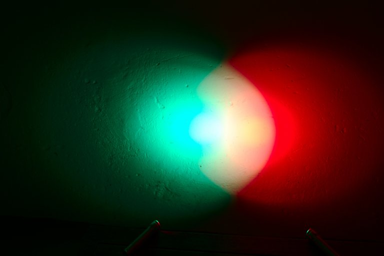
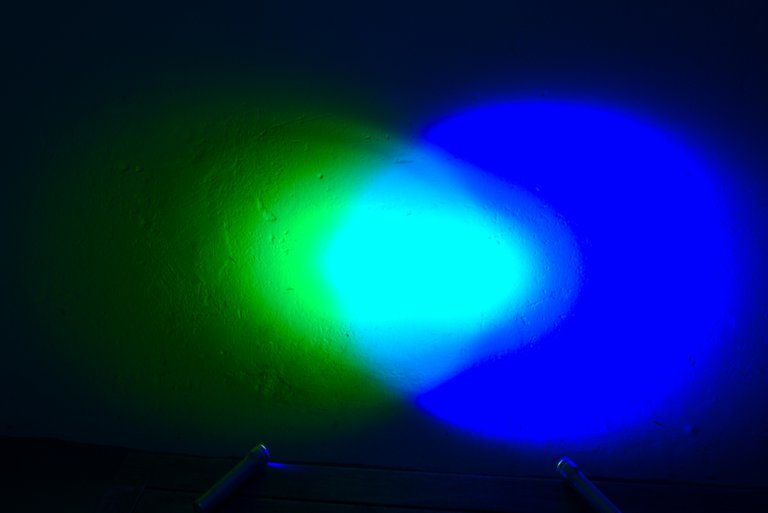
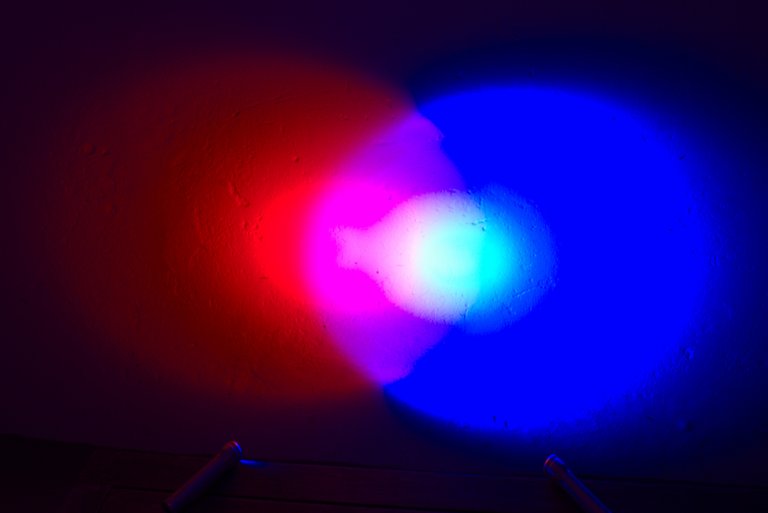
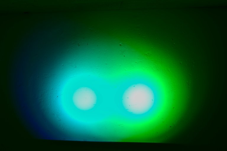
As you can see, a clean mix of colours is not possible. I used two identical RGB torches here. The distance of both torches to the wall was the same. The torches do not project a clean, uniform cone of light. However, the secondary colours yellow, cyan and magenta are recognizable in some areas of the overlap. If I mount the torch on an acrylic blade or another light tool, which distributes the light quite evenly, it looks different. In that case, the light will not finally be reflected off the wall or any objects. If I do not know how to illuminate an object or part of a building with 2 colours, the result is even less clear.
Mixing the primary colours produces the 3 secondary colours yellow, cyan and magenta. What happens when mixing the primary colours with the secondary colours?
RED – CYAN = WHITE
GREEN – MAGENTA = WHITE
BLUE – YELLOW = WHITE
Wie man sieht ist eine saubere Mischung der Farben so nicht möglich. Ich habe hier zwei identische RGB-Taschenlampe benutzt. Der Abstand beider Lampen zur Wand war gleich. Die Lampen projizieren keinen sauberen, gleichmäßigen Lichtkegel. Erkennbar sind die Sekundärfarben Gelb, Cyan und Magenta allerdings dann doch in einigen Bereichen der Überschneidung. Wenn ich die Lampen an einen Blade aus Plexiglas oder einen anderen Lichtformer, welcher das Licht recht gleichmäßig verteilt sieht das anders aus. In dem Fall wird das Licht schließlich nicht noch von der Wand oder irgendwelchen Gegenständen reflektiert. Wenn ich mit 2 Farben einen Gegenstand oder Gebäudeteil der nicht weiß ist anleuchte ist das Resultat vorher noch weniger zu erahnen.
Durch Mischen der Primärfarben entstehen die 3 Sekundärfarben Gelb, Cyan und Magenta. Was passiert beim Mischen der Primärfarben mit den Sekundärfarben?
ROT - CYAN = WEIß
GRÜN - MAGENTA = WEIß
BLAU - GELB = WEiß
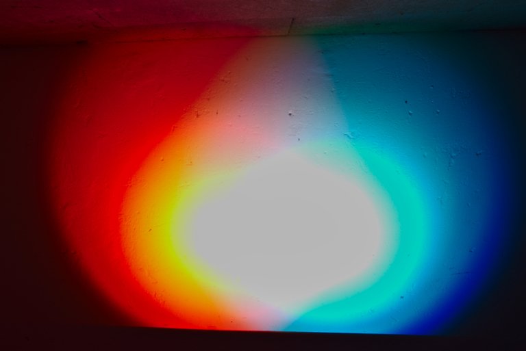
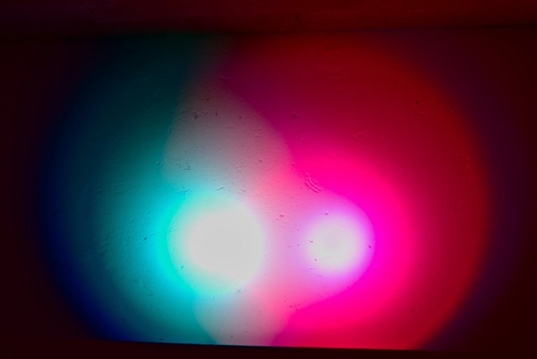
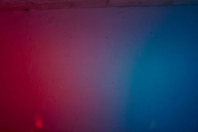
In large areas, the light is burned out here. Above the burned out spots it is easy to see how the colours mix. This is becoming more or less grey, and only in theory does this become white. If a larger area is lit up, it usually does not look good. Apart from that, I could then illuminate the scene with white light.
When working with several secondary colours or a primary colour and a secondary colour, you should always take care that you separate the colours in the illumination cleanly from each other to avoid these ugly grey areas. This is not so difficult in most rooms. For the illumination of people or objects, however, this can quickly become a major challenge.
In großen Bereichen ist hier das Licht ausgebrannt. Über den ausgebrannten Stellen ist gut zu sehen wie sich die Farben mischen. Das wird immer mehr oder weniger grau, weiß wird das nur in der Theorie. Wird ein größerer Bereich so ausgeleuchtet sieht das meist nicht gut aus. Abgesehen davon könnte ich dann auch gleich mit weißem Licht die Szene ausleuchten.
Bei der Arbeit mit mehreren Sekundärfarben oder einer Primärfarbe und einer Sekundärfarbe sollte man also immer aufpassen, dass man die Farben bei der Ausleuchtung sauber voneinander trennt um diese unschönen grauen Bereiche zu vermeiden. Das ist in den meisten Räumen auch gar nicht so schwierig. Bei der Ausleuchtung von Personen oder Gegenständen kann das allerdings ganz schnell zur großen Herausforderung werden.
When working with colour gels, nothing else happens when working with RGB torches as in the pictures above. The colour gel does not colour the light but only blocks all wavelengths except its own. A red filter allows only red light, the rest of the spectrum is blocked.
With colour gels, however, I can use other torches or flash units. With surface torches or a flash with a softbox, the light is softer and thus more evenly distributed. It does not burn out as fast as in my example pictures above. However, the area in which both colours illuminate the wall at the same time will be larger.
Bei der Arbeit mit Farbfilterfolien passiert grundsätzlich nichts anderes als bei der Arbeit mit RGB-Lampen wie in den Bildern oben. Die Farbfilterfolie färbt ja das Licht nicht ein sondern blockiert nur alle Wellenlängen außer der eigenen. Ein rotes Filter lässt nur rotes Licht durch, der Rest des Spektrums wird blockiert.
Mit Farbfilterfolien kann ich allerdings andere Lampen oder auch Blitzgeräte benutzen. Mit einer Flächenlampe oder einem Blitz mit Softbox wird das Licht weicher und somit gleichmäßiger verteilt. Es brennt nicht so schnell aus wie in meinen Beispielbildern oben. Allerdings wird auch der Bereich in dem beiden Farben gleichzeitig die Wand beleuchten größer.
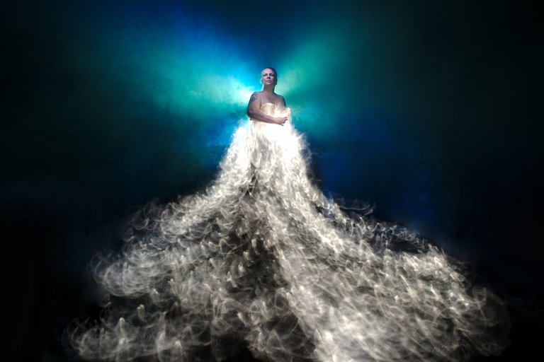
Above a practical example. Behind the enchanting @marlasinger666, I fired two flashes, one with a blue and the other with a green colour gel, several times. This created blue and green areas, areas in which the light burned out, that is white, is and which mix in which the two colours to cyan. In darker areas, the colour then goes somewhat towards grey, but this is mainly due to the reflection properties of the fog. After all, fog is not a clean reflector. But exactly this structured light with the many nuances I wanted to have here, a “clean” area behind the model would be very boring as I think.
Oben mal ein praktisches Beispiel. Ich habe hinter der bezaubernden @marlasinger666 zwei Aufsteckblitze, einer mit einer blauen und der andere mit einer grünen Farbfilterfolie, mehrmals abgefeuert. Dadurch entstanden blaue und grüne Bereiche, Bereiche in denen das Licht ausgebrannt, also weiß, ist und welche in denen sich die beiden Farben zu Cyan vermischen. In dunkleren Bereichen geht die Farbe dann etwas in Richtung grau, das ist allerdings hauptsächlich den Reflektionseigenschaften des Nebels geschuldet. Nebel ist schließlich kein sauberer Reflektor. Aber genau dieses strukturierte Licht mit den vielen Nuancen wollte ich ja hier haben, eine "saubere" Fläche hinter dem Model wäre sehr langweilig wie ich finde.
Part 1 can be found here: @lichtkunstfoto/colours-part-1-light-painting
Part 1 can be found here: @lichtkunstfoto/colours-part-2-light-painting
Stay tuned for Part 4
WHAT IS LIGHT PAINTING?
LICHTKUNSTFOTO
If you like my art visit www.lichtkunstfoto.de for more Light Art Photography and informations about Light Painting. Join me on Flickr Twitter
For more great Light Art Photography, Light Painting and inspiration check these light painters: @marlasinger666 @fadetoblack @fastchrisuk @dawnoner @oddballgraphics @martbarras @stepko @rod.evans.visual @yo-hoho @maxpateau @gunnarheilmann @neilru75 @maximepateau @ryuslightworks @lightstabeu @candelart

WE ARE LIGHT PAINTERS
To help and support the LightPainters community here on Hive I would appreciate your delegation of HivePower. Any amount is appreciated. It does not require much to get started, we are happy for any gesture. @lightpainters
How to delegate?
Delegate 50HivePower, [50HP]
Delegate 250HivePower, [250HP]
Delegate 500HivePower, [500HP]
Delegate 1000HivePower, [1000HP]
All the Hive Power will help to upvote the artist's contribution as part of the LightPainters community.

More quality content Sven. Great stuff once more
Cheers Tim 🙂
Physics is there to help us, especially for what concerns light. Red + green + blue = white. Light is not… well paint for instance :D
You may be amused (or not in fact) that in quantum chromodynamics, elementary quarks are green, red or blue and when three quarks of three different colours combined into a composite particle, the latter is white, and not black. It is similar to light painting ;)
Thanks tor this interesting blog! Cheers!
Cheers :-)
Excellent quality write-up. Keep them coming.
Thanks mate :-)
Ich danke Dir für das "bezaubernd".
😘
Good job.
Thanks
Wow, wieder sehr interessant und informativ. Klasse Beitrag!
Danke 😊
Very interesting post about light, once again 👌🏻❗️
Thanks Maxime :-)
This was a super quality post. Thanks for sharing the tricks of the trade with us!
Thanks for reading the long post. :-)
I'm notorious for writing my own long posts! hahaha It's never too long if it's informative imho. Cheers
The rewards earned on this comment will go directly to the person sharing the post on Twitter as long as they are registered with @poshtoken. Sign up at https://hiveposh.com.