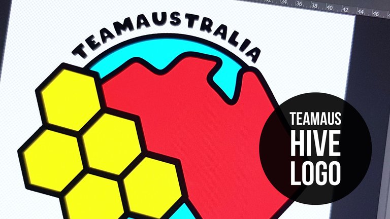
Hey Team!!
It's been a while and I'm over a year late with this but I've been feeling a team aus revival coming so I'm hoping a new team logo can help that along.
ONE
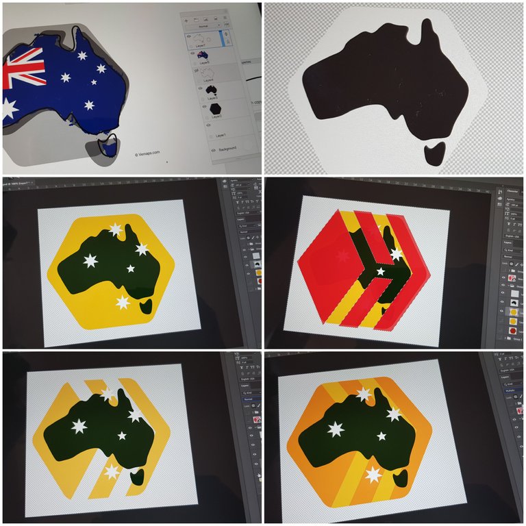
There was a lot of design options going through my mind. One was to see if I could incorporate Australia's hexagon'ish shape to the design, and to achieve that I loosely traced a map of Australia.
I filled in that image and fit it in a hexagon and added the southern cross which was the main distinguishing feature of the previous logo.
The Hive logo was overlaid to see how the logo felt with the Hive lines cut or coloured.
I presented a couple of colour options in the PAL/teamaustralia discord server and while waiting for more feedback, the more I looked at the logo, the more I hated it.
It reminded me too much of the old logo and I wanted the new one to have it's own personality while still being instantly recognisable as Team Australia on Hive.
So back to the drawing board I went.
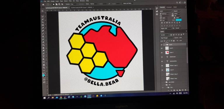
TWO
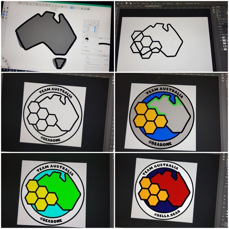
I retraced the map again but this time more simplified than the before and with sharper angles.
I added honeycomb to represent Hive, one circle around Australia to represent the sea where minnows, dolphins, orcas and whales swim together, and another circle representing the world at large and to complete the design.
Lines were deleted, the images tidied up and colour added.
THREE
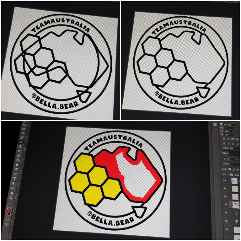
Three is pretty much Two but with Tassie.
I did, very seriously, consider leaving Tassie out citing "creative license" but decided to add it in last minute.
Had I known Sketchbook would flatten all my Photoshop layers upon saving, I would have saved it under a different name.
But I didn't and so I had to retrace and recreate TWO again, but this time fitting Tassie into the design.
After a quick edit to Tassie making it smaller and in line with the east coast here is the final design proposal.
Final colours to be determined and I'm welcome to suggestions.
Personally I'm feeling the bright neon colours but it could be because it's ridiculously cold up here in the mountains today (it's snowing 4 suburbs up...) and the neons are burning my eyeballs. 🤷🏻♀️🤩🤦🏻♀️
Huge thanks to @ryivhnn for her input and help with the design. Kinda reminds me of old days when we worked on the old logo 😁
Please vote Yays or Nays in the comments and share far and wide so lurking Aussies can get involved and weigh in.
Looks great, thanks mate :)
Thank you :) 3 Yays! I reckon maybe a couple more and we have a new team logo?
I think it came together beautifully. Top effort :)
Cheers Matt! I'm pretty happy with it.
I counting you as a Yay :D So you and me is 2 Yays!
Hey lovely, I really like it as always your designs are brilliant <3
Aww thanks hun ❤ and thanks for dropping by!
I like the red and yellow now, think the blue should be less neon but probably not as flag dark as the first round of that went. And I still think you should either turn Tasmania (or just something with the right edge seeing as it looks like you've liked up the top edge) to line it up with the pointy east cost and reflect the honeycomb a bit more as it's jutting a bit atm.
Pretty much in love with this design now :)
😵 Say what now? lolol
You lost me after not as flag dark 🤣 sorry!
I did round off the top left tip of tassie if thats what you meant?
Glad you love this design, I love it too 😍
I'm not sure that made things any clearer but it was hard to get a colour to stand out enough XD
Alternately (and actually maybe the better option now that I've been looking at it longer, bring in the east coast slightly to line up with Tassie:
Hm maybe I should have used yellow the first time too XD
and also probably shouldn't have been so lazy and actually moved the annotation screen onto my tablet rather than fudging it as my point is way off
Your first blue ocean was pretty dark like the blue on the flag XD And while I think a lighter blue is definitely the go I don't think it should be quite this light :)
It is a great design, how many more votes needed?
Right!! I moved tassie instead, was easier :D
I think we have 5? Ausbit, Matt, Krystle, You, Me and I think Choo? I'm happy with 6 🤷🏻♀️ I'm keen to move on to the next task which is organising the virtual meet up.
Congratulations @bearone! You have completed the following achievement on the Hive blockchain and have been rewarded with new badge(s) :
Your next payout target is 10000 HP.
The unit is Hive Power equivalent because your rewards can be split into HP and HBD
You can view your badges on your board and compare yourself to others in the Ranking
If you no longer want to receive notifications, reply to this comment with the word
STOPCongratulations @bearone! You received a personal badge!
You can view your badges on your board and compare yourself to others in the Ranking