My entry:
Hello friends. This is my proposal for the propolis logo.
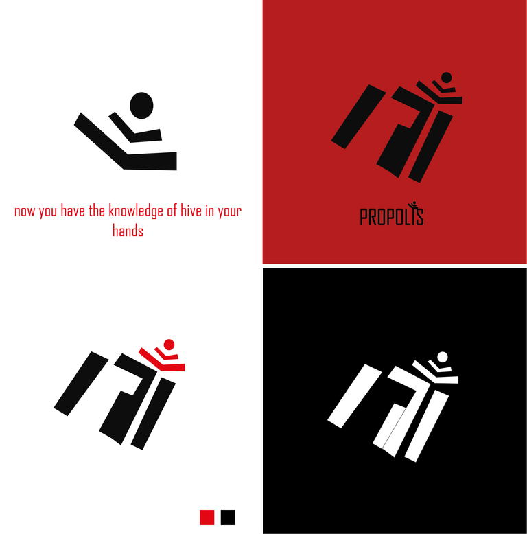
I opted for a minimalist design without losing the roots of the official hive logo so that it generates a great recall in people.
On the other hand the logo has a symbol in the upper right side that is like a person reading a book, as it can also be the symbol of the internet which gives us access to much knowledge.
In the central part, in the single area, we can see a P that symbolizes the propolis brand.
The typography used is Agency FB or it could be some similar to palo seco. You also have its various versions in positive, negative, simplified and variants. I hope you like it.